
Cohort Analysis enables you to easily compare how different groups or cohorts of people behave over time, allowing you to draw insight regarding trends and business processes.
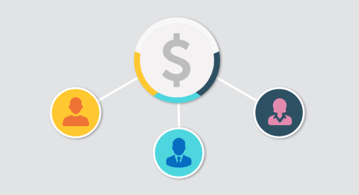
Cohort Analysis enables you to easily compare how different groups or cohorts of people behave over time, allowing you to draw insight regarding trends and business processes.

Everybody has their own baggage when they start using new software – specifically for BI and analytics software. Here are 5 things I wish I'd known when I started using Dundas BI.

Netflix has a lot of original content, meaning it also has a lot of data. Using Dundas BI, let's tap into that data, visualize it using a relationship diagram, and uncover hidden relationships!

Adoption is vital to the success of a business intelligence project, and a superior navigation experience can act as a catalyst for retaining a higher volume of standard users.
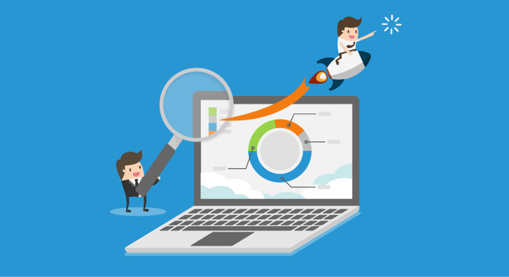
Data visualizations empower you to drive instant decision-making, leading to better results. Let's dive deeper into the importance of data visualizations for effective consumption of BI and analytics.
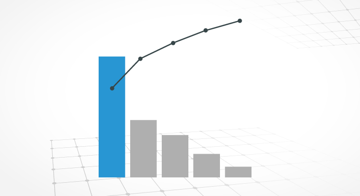
The Pareto Chart is a data visualization that contains both bars and a line graph. It's a derivative of the Pareto principle, which states that roughly 80% of the effects come from 20% of the causes

The Parallel Coordinates Chart is a uniquely valuable visualization in the sense that it allows you to examine large quantities of data at-a-glance, while simultaneously analyzing individual measures.

With Dundas BI, you're able to calculate the distance between two locations using a built-in formula.

For analytics projects to transform the way people manage their decisions, speed is often a necessity. This blog focuses on Dundas BI's in-memory engine and the role it plays in optimizing performance
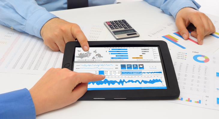
Automatic data prep reduces the steps required to progress from data to desired visual. It allows users to be proactive, and focus on the data they need, and from there, easily enrich and share it.

Discover 25 unique and smart data visualizations you can easily create in our modern BI and analytics platform, Dundas BI.

Differentiate your applications with beautiful analytics and better serve your customers.