What does it mean to be king? Just ask content creator and distributor extraordinaire, Netflix. In a recent study, Netflix was shown to have the best original content in comparison to not only other on-demand streaming services but to any television subscription service (sorry HBO and Game of Thrones).
The driving force behind Netflix’s immense success? Original Content.
Since its inaugural, self-commissioned, original content series, House of Cards, in 2013, Netflix has slowly and dramatically assembled a large repository of original content. And yes, while House of Cards marked Netflix’s triumphant emergence as a content creation giant, its early success was aptly followed by the release of tens of dozens of productions that commanded the attention of the TV bingeing masses; Orange is the New Black, Sense8, Stranger Things, The OA, Marvel’s Daredevil and The Santa Clarita Diet to name a few.
That’s all fine and well, but what we want to know, is if there’s more to this success than meets the eye? What insights are we able to discern from Netflix’s growing pile of original content, if any? And most importantly, how can we use Dundas BI to get remarkable insights into Netflix’s original content data.
Enter the Relationship Diagram.
The Relationship Diagram, also known as a Force Directed Graph, displays a collection of nodes (i.e. circles) and links (i.e. straight or curved lines) that connect the different nodes together. This visual is great at uncovering hidden relationships within data that other visualizations easily miss. While other visualizations show many of the relationships implicitly within the visualization, the Relationship Diagram displays explicit connections between many different data points at a glance.
The history of the Relationship Diagram can be traced to psychiatrist, psychosociologist, and educator, Jacob L. Moreno. Moreno, one of his eras leading social scientists, and the foremost pioneer of group psychotherapy, developed Sociograms, which helped him analyze choices or preferences within a group. The Sociogram’s purpose is to diagram both the structure and patterns of various group interactions. Much like the Sociogram, Relationship Diagrams depict the direct linkages between nodes and the indirect linkages between shared attributes and affiliate commonalities.
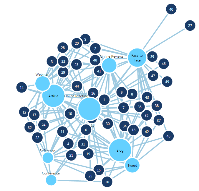
Using Dundas BI, I can compile publicly available data on Netflix’s original content (genre, title, sub genre, premiere date, seasons, status, IMDB scores, etc.), and visualize it as a Relationship Diagram.
Beautiful isn’t it?
However, as it is, this doesn’t tell us much, other than that there is a lot of information to interpret. So rather than attempting to analyze this initial visualization, let’s step-back, and start small. I’m going to start with one dimension, Genre, which will be used to create our first Node.
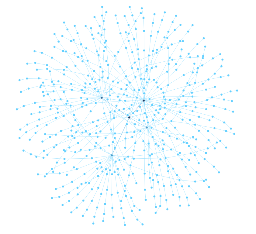
Obviously, this doesn’t tell us much, as we’ve not applied any additional dimensions or measures for further analysis. So with that said, I’ll take the dimension, Title, and add it to our Metric Set. We’ll now be able to identify which Titles Netflix is producing under each Genre.
Now the clusters are beginning to tell a story, albeit a short one. With these dimensions (Genre and Title) we’re able to identify in which Genres, Netflix is producing higher quantities of original content.
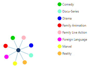
Time to take it to the next level, by assigning data to nodes and links, to uncover greater insights.
VOILA!
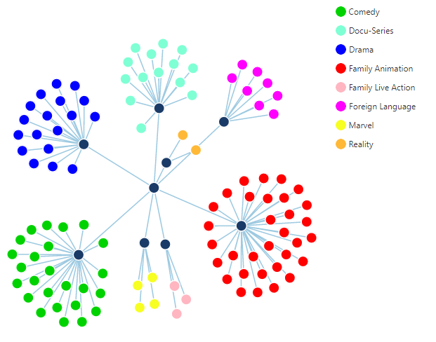
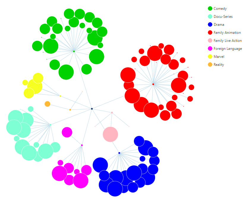
Here, I’ve organized Netflix’s original content by Genre and sized the nodes based on each Title’s IMDB rating (the larger the node, the higher the score). In addition to this, I’ve attributed the measure, # of Episodes, to the length of each link, so Titles with more Episodes will have longer links. We’re able to explore the visualization easily, as the nature of the Relationship Diagram uses forces to ensure there are as few overlapping nodes and links as possible.
What becomes immediately apparent, is that Netflix is emphasizing the creation of Family Animated and Comedic content and is increasing the volume of Episodes of each Title in these genres, despite their poorer ratings from viewers.
The Genre,Drama, which includes smashing successes such as House of Cards, Stranger Things, Orangeis the New Black and Sense8 (all series that are synonymous with Netflix’s original content), has distinctly scored consistently higher than Family Animation and Comedy on IMDB, yet Netflix continues to produce the latter Genres. Even Marvel as a genre has heavily outperformed Family Animation regarding viewer preference, yet Netflix continues to provide more of the same (granted, with the early success of MarvelTitles, it will be interesting to track and see if this genre is populated further).
These insights are readily discernable from the visualization. What we can also do, is use the Relationship Diagram to make predictions about the direction Netflix’s original content may take. First, it’s safe to assume that many future releases from Netflix will ultimately fall under the Genres of Family Animation or Comedy. The basis for this assumption being the current trend. However, we can also identify potential areas of growth. Due to the overwhelming success of the GenresDrama and Foreign Language, and their tendencies to produce shorter series, it wouldn’t be surprising to see Netflix release one-season wonders that combine the two Genres. It also wouldn’t be surprising to see Netflix axe the creation of Reality series, as they’ve seen limited success and longevity.
To see how the Relationship Diagram was built in Dundas BI, take a look at the video below:
As we’ve seen, the Relationship Diagram is a unique visualization for analyzing and uncovering the hidden relationships between hierarchies. In addition to what insights I’ve found, there were other relationships I could have uncovered had different dimensions been used (Premiere Year, Seasons or SubGenre) and measures (Max and Min_Length of episodes).
I invite you to try Dundas BI today, and create your own Relationship Diagrams showing what else could have been done, by combining other measures and dimensions!.
Follow Us
Support