Everyone probably has more relationships in their data than they realize.
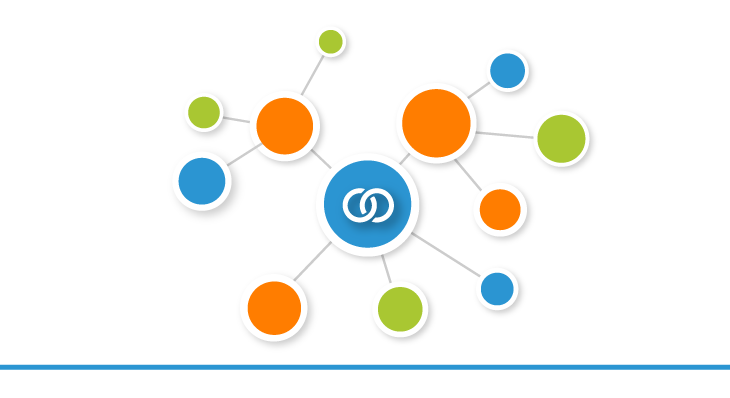
Everyone probably has more relationships in their data than they realize.
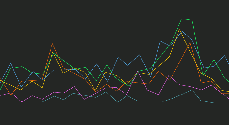
Finding an alternative to simply jamming too many series onto a single chart.
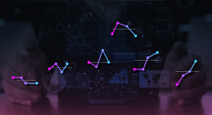
Cycle plots are an elegant visualization very few people have heard of but especially usef...
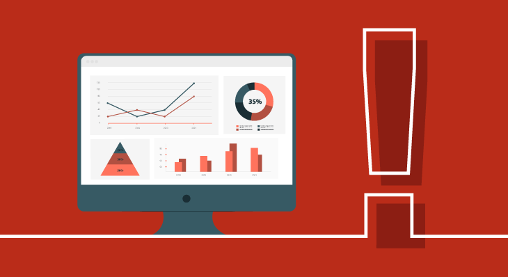
Dashboards are meant to give insights. Don't just treat them like 'pretty reports'.
...
Finding a perfectly clean database is like finding a unicorn, and sometimes I question if ...
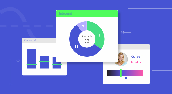
The best way to build and facilitate a Sales culture – one that rewards hard work and reco...
Dashboard design is as important as the data itself. If you want to evoke emotion and keep...

Tracking employee performance and monitoring an increasingly distributed workforce is a to...

All sales activity is measurable, meaning sales teams can leverage business intelligence a...
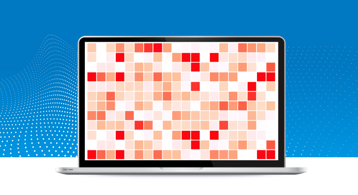
Analyzing and making sense of large volumes of raw data is dizzying. By using Heat Map Cha...

Dundas BI is able to interact with social networking platforms like Facebook. Let's use Py...

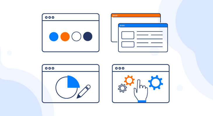
Venturing into a new Business Intelligence (BI) project can be as exciting as it is daunti...
Follow Us
Support