Excel is an indispensable tool, however, it simply cannot hold its own in respect to all d...

Excel is an indispensable tool, however, it simply cannot hold its own in respect to all d...

How can you operationalize your machine learning model and apply it to new data coming thr...

The use of icons in reports within the market research community is increasing, whether as...
Dashboards are a great way to visually represent your data to track, analyze and display K...

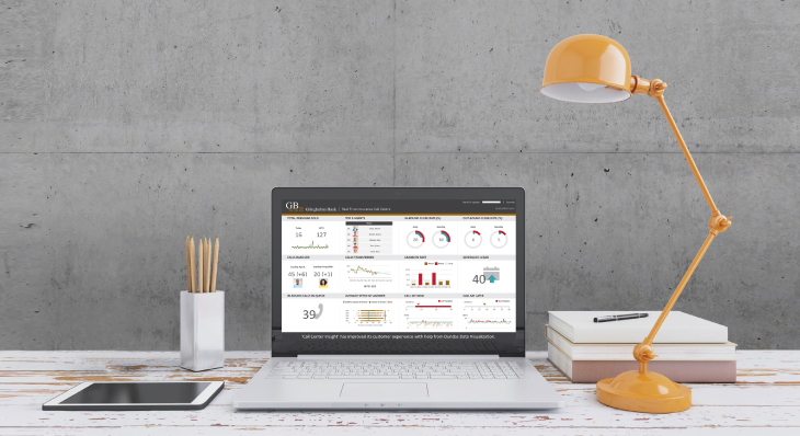
Using Dundas BI, Absorb Software whipped up a few dashboards to display some Key Performan...

The ability to group data on-the-fly is incredibly powerful. It's helpful when correcting ...

With Dundas BI 5, we’ve added two new visualizations to the relationship category. Dundas ...

With Dundas BI 5, we’ve taken our existing Map Visualization and set its functionalities a...
Word Clouds (or Tag Clouds) are excellent options to help visually interpret text and are ...

We draw inspiration from our incredible community and provide content based on the topics ...

A Slope Graph is a line chart variation that is typically used to emphasize change in time...

Voice has the potential to completely revolutionize how BI systems are designed, built and...
Follow Us
Support