The presentation layer of your business intelligence (BI) & analytics stack is your window into your company’s performance. By using data visualizations, you’ll be able to drive instant decision-making, which will lead to better results.
Data visualizations are able to assist in solving many complex problems, but in order to understand what specifically they’re solving, it’s important to identify the various ways by which data is analyzed and consumed today. There are three (3) major ways in which data is consumed: via reports, dashboards, and through ad-hoc analysis. Before getting into the importance of data visualizations for effective consumption of BI and analytics, I’ll quickly define each of the prior methods.
Data Consumption Methods
Reports
By taking data and presenting it using Microsoft Excel, Access, or some other form of specialized reporting software, you are ultimately creating a report. Reports are primarily text and table based, periodically including visual components, and it’s their simplicity that makes them so useful. Reports can span multiple pages, can show very high-level or granular data, and more often than not, are comprised of background data and other decision-informing information. Reports are extremely multi-purpose, whereas dashboards are not. Reports can span many pages; dashboards should fit on a single screen.
Dashboards
Conversely, dashboards present the most important information required to achieve specific business objectives, at a glance. A dashboards’ focus is primarily on driving decisions as opposed to informing, and are heavily targeted towards Key Performance Indicators (KPIs) or other decision-making information. Dashboards are generally visual and interactive, and are designed for at-a-glance monitoring.
Ad-Hoc Analysis
Ad-hoc reporting, although included in the reporting world, differs from reports and dashboards, as it is usually designed for very particular purposes, often without much planning in advance. Ad-hoc, by definition, is for something to be done for a particular purpose only. This is why this method of reporting is self-service, which allows for the reports to be easily built with the exact information users require without consuming developer resources. The reports are created to analyze specific questions that cannot be answered by an existing set of reports and/or dashboards.
For a greater understanding of reports, dashboards and ad-hoc analysis, and which you should select, read our more detailed blog, Dashboards vs. Reports: Which One Should You Go With?
Data Visualizations
Now onto data visualizations. The most effective way to demonstrate the importance of data visualizations in BI and analytics, is through visuals (surprise!). Let’s begin with a report:
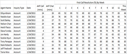
Although being highly detailed and granular, at a quick glance, it’s difficult to identify whether there is any striking information. So what happens when we re-visualize this as a dashboard, and include multiple data visualizations based on additional information? Let’s see:
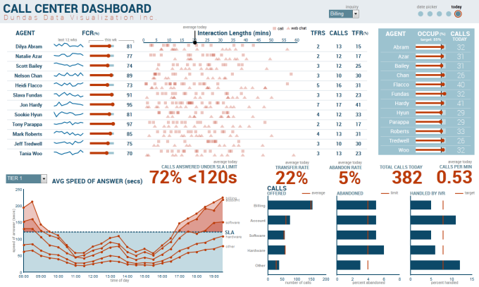
What’s immediately noticeable, is that reading the table (as if it were actual words and numbers), is much more difficult and takes much longer than viewing the data as visualizations. The charts and imagery on the dashboard interacts with our visual system, and as such, makes insights that much more apparent. By looking at the top-left data visualization (derived from the report), we’re able to quickly identify which agents have the highest average percentage of first call resolutions, and can easily see the direction they’re trending in.
How Many 4’s Are There?
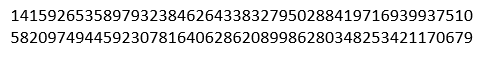
At first this seems near impossible to calculate without meticulously looking at each number individually and hoping one isn’t skipped or counted twice. Let’s add hue (such as red), to help separate the visual elements we’re interested in to save ourselves from performing a visual search through the data.
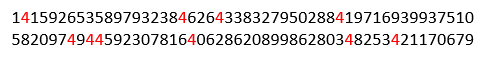
The 4’s are now more obvious, however the remaining numbers aren’t saturated enough to allow us to accurately count the amount of times they occur. By reducing the intensity of the remaining integers, the 4’s become increasingly more visible.
 This is an example of pre-attentive processing, which refers to the body’s processing of sensory information that occurs before the conscious mind starts to pay attention to any specific objects in its vicinity. In essence, the eye and the brain can process a pre-attentive property of any image in less than half a second. In other words, certain properties such as color, form, movement and spatial positioning (all synonymous with data visualizations), can make it easier for users to understand what is being presented, and save them the hassle of combing through endless lines of data.
Visual Perception
The human brain is the most advanced pattern recognition technology on the planet. It was not, however, designed to store names and numbers. Take a football quarterback for instance. In a matter of seconds, he must identify countless patterns, from the opposing defense, to the routes his receivers are taking, all while avoiding a lineman intent on knocking him down. The same can be said for any endeavor. As humans, we’re more adept at recognizing and analyzing patterns than we are rows upon rows of numbers. In fact, 70% of the body’s total sense receptors are in our eyes, and nearly 50% of our brain is devoted to the visual sense. It’s for these reasons that data visualizations enable us to make better, faster decisions. As American mathematician and statistician, John Tukey once said:
“The greatest value of a picture is when it
forces us to notice what we never expected to see”.
By utilizing data visualizations, you will be able to better consume business intelligence and data analytics, and discover insights you’d previously never expected to see.
Now to summarize, this isn’t to say dashboards are better than reports and vice versa, or ad-hoc reporting is more efficient than multi-page reporting. Nor is this to say that every report needs data visualizations and every dashboard needs to be visually stunning. What we’re saying, is that as humans, we’re hard-wired to naturally interpret visuals faster and more efficiently than we are rows of data. This is why the addition of data visualizations should be considered when analyzing data, in order to ensure users more effectively consume BI and analytics.
Follow Us
Support