With our latest release, the process of getting answers just got a whole lot simpler with new interactions and advanced visualizations that are designed to eliminate the need to spend more time preparing data for every question. One of these such visualizations is the Heat Map.
Phew! Check your AC, because things are heating up with Dundas BI 5!
Maps, in general, are practical tools for spotting spatial patterns in geographical data, population details, office locations, regional performance of certain measures and more. With Dundas BI 5, we’ve taken our existing Map Visualization and set its functionalities ablaze by incorporating Heat Maps.
Heat Maps are graphical representations of data, whereby the individual values contained in a matrix are represented as colors. The Heat Map’s primary purpose is to visualize the density of locations/events within a dataset and help users focus quickly on the geographical areas that matter most.
I hope you’re wearing something fire-proof because we’re about to get up close and personal with this radiant visualization.
What we’ve done here, is begun by creating a new Map visualization. We’ve then taken a dataset that includes data on the locations of vehicle thefts in the Vancouver, BC area. Each data point in this dataset represents the position of a stolen vehicle and is identifiable by the latitude and longitude of each vehicle at the time of the theft. These latitude and longitude coordinates will bind to the Symbols element on the Map, producing the following result:
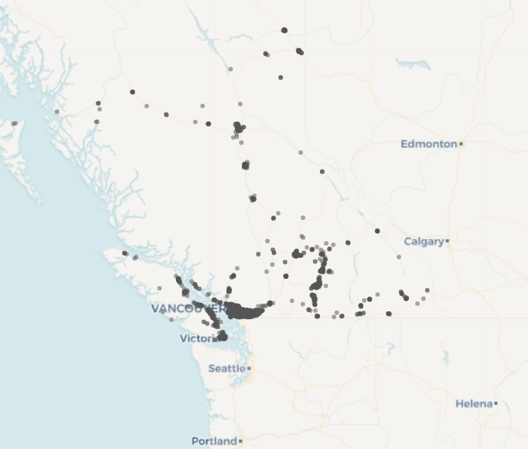
Figure 1: Vehicle thefts visualized as individual events
As it stands, all we’re seeing is a large amount of different points in a lot of different locations, and it’s difficult for us to discern any actionable insights from this visualization. While zooming into this Map is an option for greater analysis, it will require a lot of zooming in and out to locate specific areas of interest. Plus, with so many data points on this Map, it’s difficult to see which data points are hiding other data points. There are likely areas where a lot of events (in this case vehicle thefts) have taken place, but are hard to identify as they appear as single dots on the Map.
Don’t sweat it (pun intended).
We can go into the visualization properties of this Map, and directly from here, can bind the data from our vehicle theft dataset to the visualization Heat Map binding, and have it represent the density of different events, instead of having it represent each event in a single point. We’re now able to quickly see the spread of these events across different neighborhoods in Vancouver and its surrounding areas. The more events occurring in an area, the hotter (i.e., more red) the area will be.
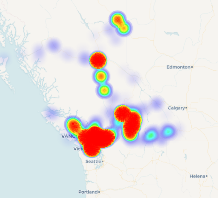
Figure 2: Vehicle thefts visualized as a Heat Map
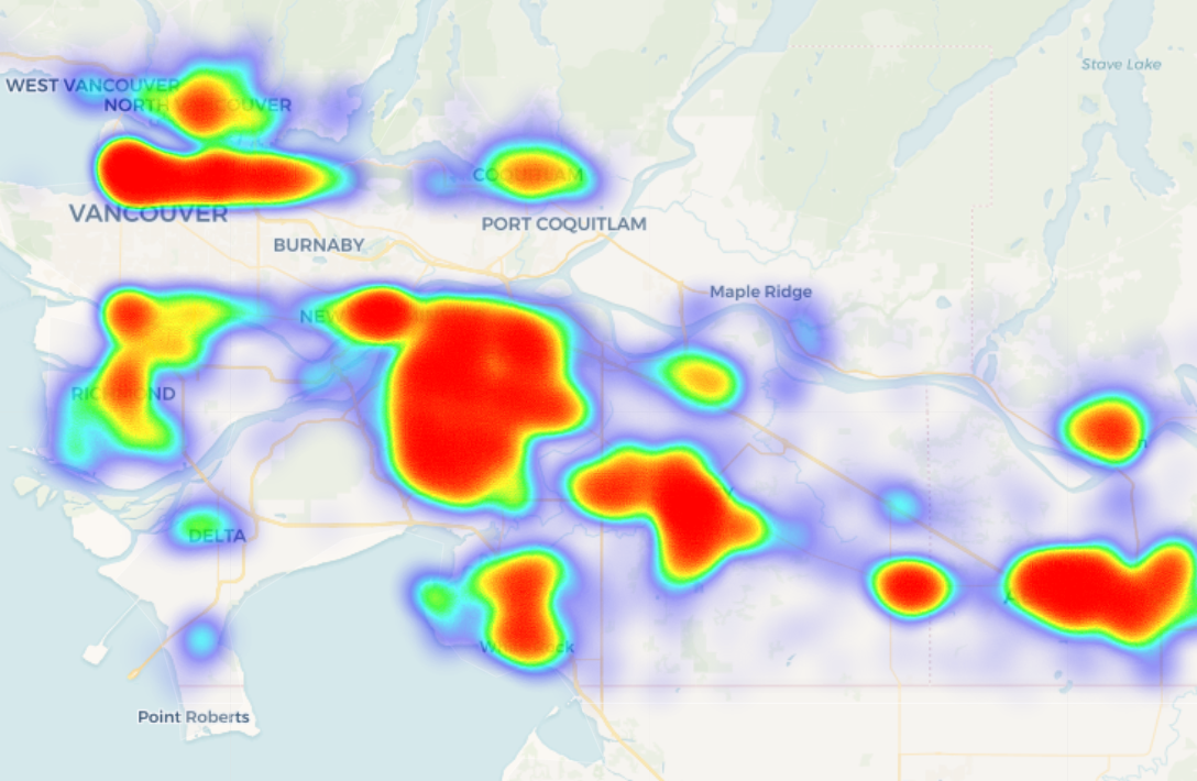
Figure 3: Zoomed in – Vehicle thefts visualized as a Heat Map
And there you have it! The Heat Map has enabled us to better analyze our dataset at a glance, and we’re now able to quickly identify which Vancouver areas have played host to the majority of vehicle thefts. Now that you’ve got this fiery feature at your fingertips, there’s no excuse to let your Map visualizations fizzle out. It’s time to spark your creativity with Heat Maps in Dundas BI 5.
Interested in seeing what else Dundas BI 5 has to offer? Schedule a personal live demo with a Dundas Solution Architect and experience for yourself how we’ve made unlimited analytics possibilities even easier.
Follow Us
Support