Everyone probably has more relationships in their data than they realize. Any two columns may be describing a relationship such as origins & destinations, a sender & their recipients, a user & their social connections, or website navigation from one page to another. If the same set of values can occur in either column, just these two columns can be used to map out some complex connections or networks between entities that you might not even expect.
Dundas BI has built-in and full-featured relationship diagrams ready to use data like this for exploratory analysis or for visualizing and better understanding these connections. Like different chart types, each type of relationship diagram is best suited to different situations, so you may want to use our Re-Visualize option to switch between them depending on the scenario.
Relationship Diagram
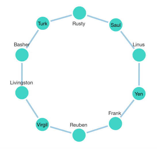
A great place to start is what we just call the Relationship Diagram in Dundas BI, which displays a graph or network diagram of circular ‘nodes’ connected by ‘links’. This type of diagram can visualize absolutely any kind of relationship structure as determined by your data. It is a ‘force-directed’ graph meaning it can take a few seconds for all the nodes to lay themselves out in an optimal way, but then depending just on what your source and target values are, it could be anything from a circle:
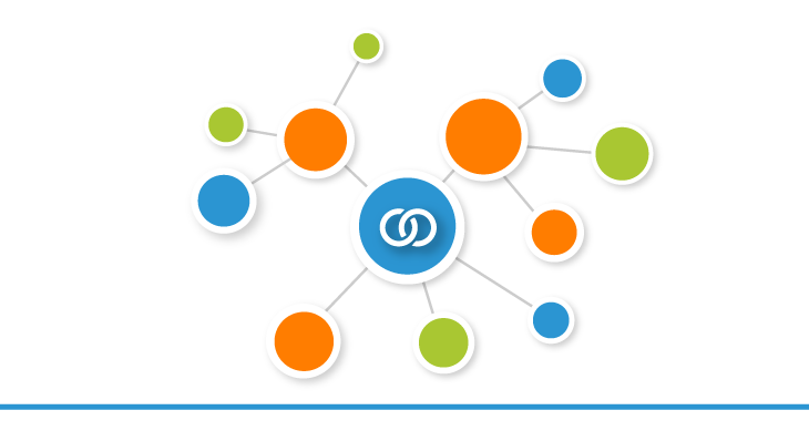
To an interconnected web where clusters and more complex patterns can emerge:
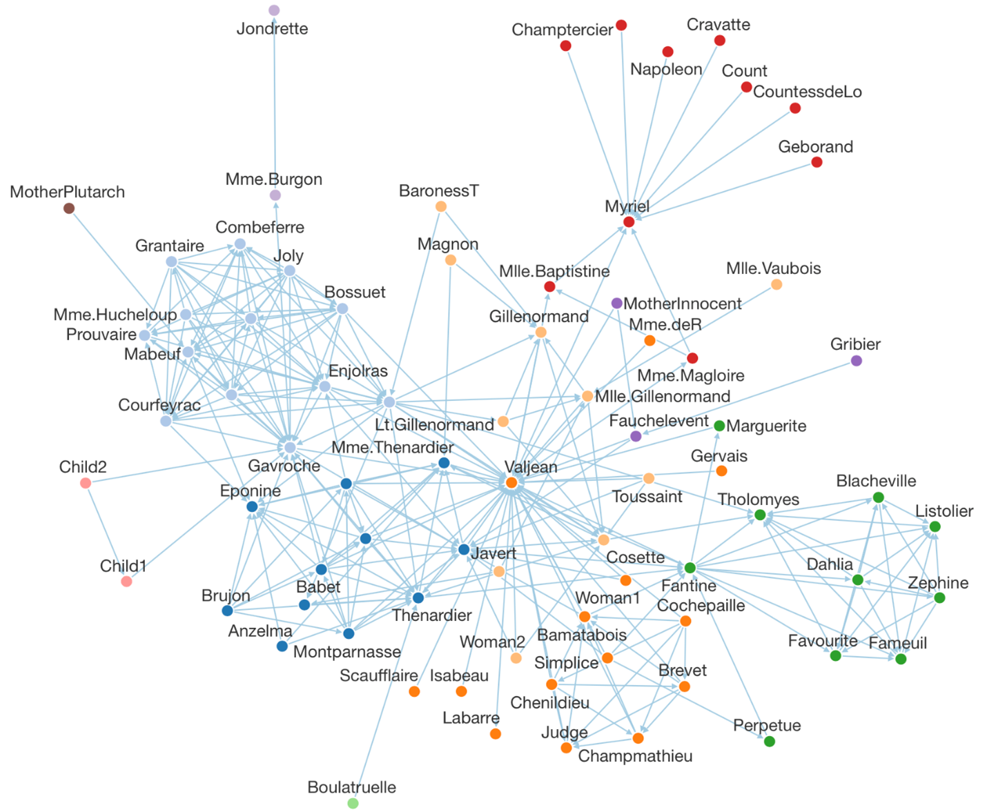
Dundas BI itself uses a built-in version of this kind of diagram to display relationships between tables in your data sources. Right-click any table of data in the Explore window or transform in a data cube, and choose Relationships in the context menu to view that table and all its related tables:
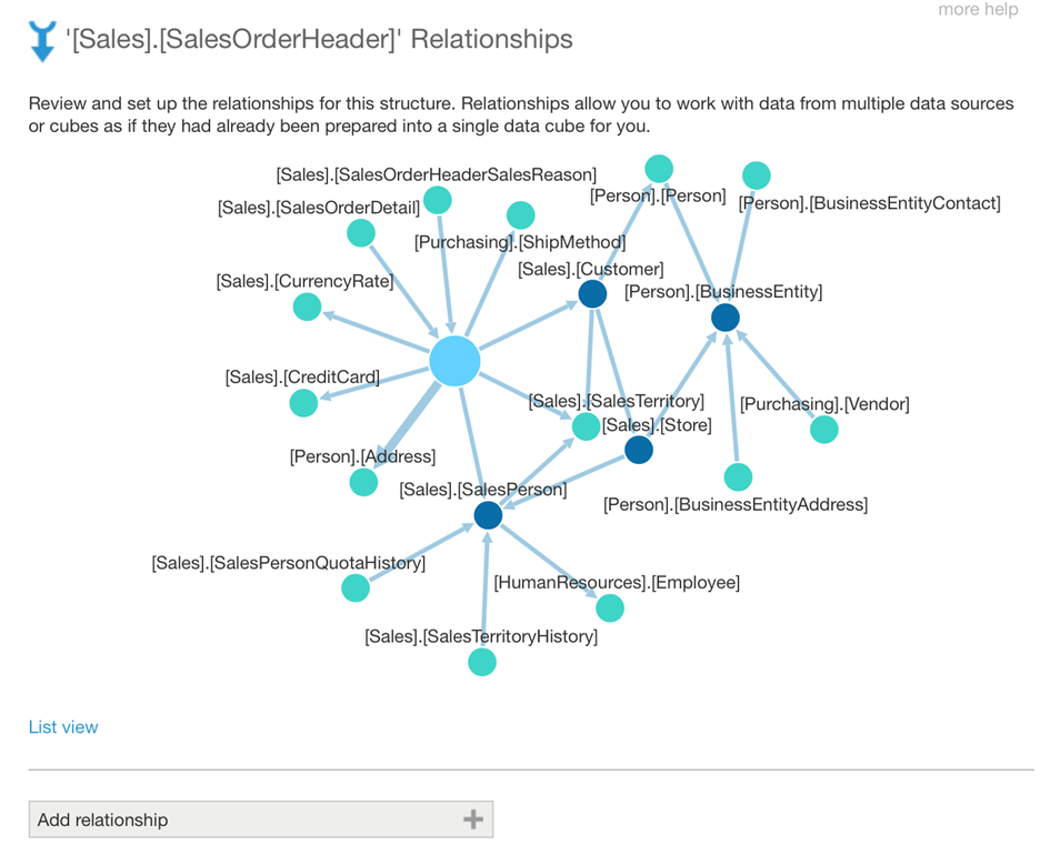
You can use this to explore related data, right-clicking a table ‘node’ in the diagram and clicking Expand to keep expanding the diagram outward (the diagram above was expanded a few times).
Sources & Targets
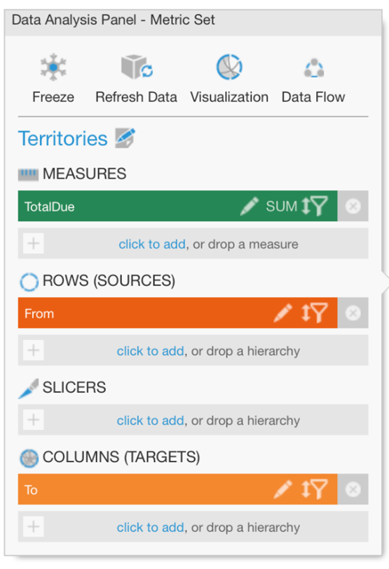
To take full advantage of most of these diagrams for making sense of some potentially complex relationships, all you need to do is determine which column is your “source” (or “from”) field and which is your “target” (or “to”) field. In a Relationship Diagram or Sankey Diagram, switch to the Visualization tab in the Data Analysis Panel and make sure these are assigned under Source Name and Target Name:
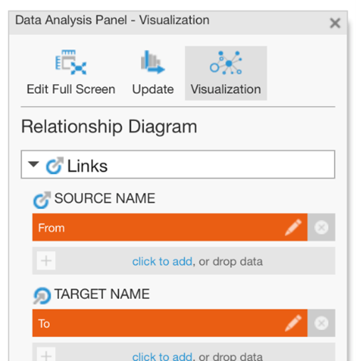
In many cases there is an obvious direction associated between the two columns, such as from a sender to a recipient. If there isn’t any specific direction, just assign each column as either the source or the target.
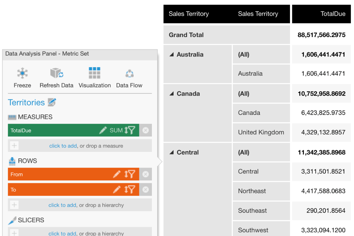
Let’s look at a specific example where we have two sets of territory IDs, one from a salesperson table and one from a customer table (related by sales orders):
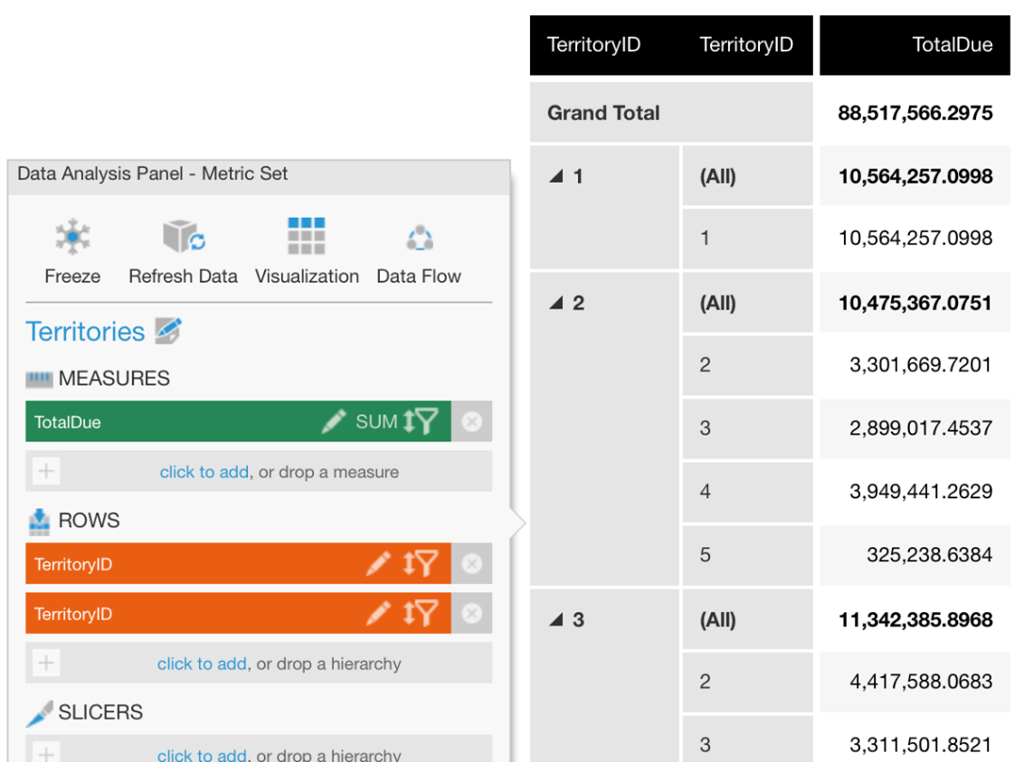
These IDs represent the same set of sales territories, but each salesperson’s location can easily be different from their customer’s.
Your data could instead consist of regular text that is ready to be visualized, but in this particular case, we’d like to turn our numeric ID codes into friendlier territory names first. We can use a hierarchy quickly created from the main menu with TerritoryID as member keys and Name as the caption, and drag this hierarchy onto both ID columns. You could also use a data cube to ‘lookup’ each TerritoryID’s Name instead:
Visualizing
After assigning the Source and Target in the Visualization tab, we can already see which locations are connected. Adding our data containing the total dollar amounts of the transactions under Width also visualizes what are relatively the stronger connections:
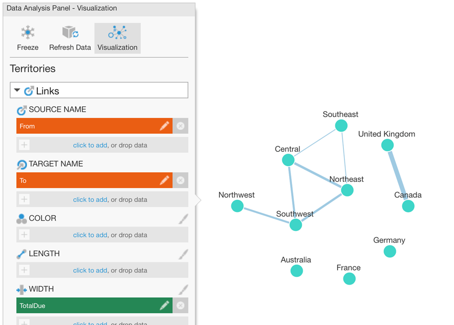
Some of these locations are ‘on their own’ because we only have sales within each of those locations and not between them. We could choose to filter those out. (Tip: one quick way is with a formula measure like if ($From$.Caption == $To$.Caption) return 1 filtered to the return value 1.)
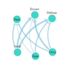
In our case, we can have sales transactions in both directions between each pair of locations, so using the Show Link Arrows and Link Type options in the Properties window, we can show curved connections like this that distinctly visualize each direction:
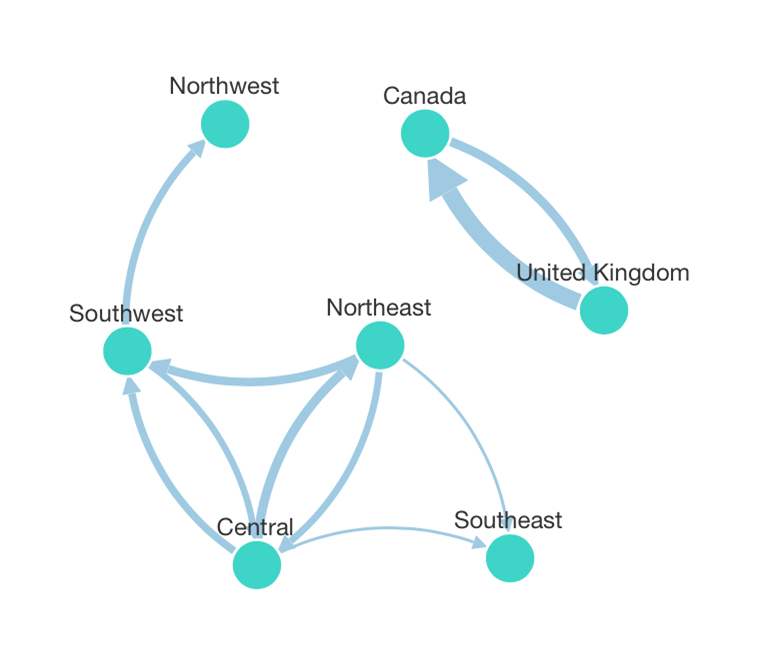
You can click and drag around nodes if you want to get a better view or ‘untangle’ some closely interconnected ones, and hover over or press and hold a link to see details in a tooltip.
Geographic Relationships
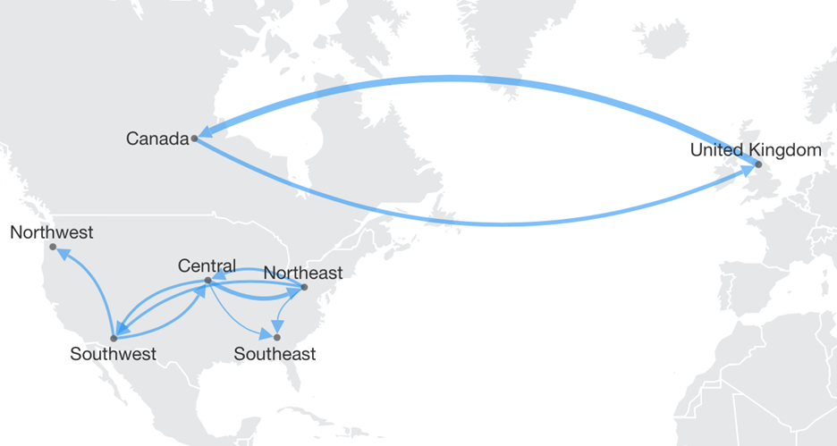
You may have noticed that the example above is actually locational data. It could very well be beneficial to plot these on an actual map with predictable and realistic locations, which you can do once you have a map with these locations as points (called ‘symbols’).
In the map’s Data Analysis Panel, this time assign the same data but as Symbol Link Start and Symbol Link End under Paths. We can similarly size the links based on our transaction dollar amounts and show curved directional links like in the previous diagram:
You can also do this with Dundas BI’s Diagram visualization, which can plot your data against a custom diagram that could be displaying something like a large floorplan or campus map.
In some cases your locations may be harder to view this way, for example if some are very close together and others far apart. Not all geographical data always needs to be viewed in a map, just as a chart is better for comparing individual values than relying on colors or bubbles on a map.
Sankey Diagrams
Sankey diagrams can visualize the same links between data, but in a more specialized way that focuses more on the quantities moving between each node, and typically where they move from left-to-right.
We can re-visualize our Relationship Diagram above to a Sankey Diagram, and Dundas BI will oblige, but as we can see, this particular set of data is probably not a great fit:
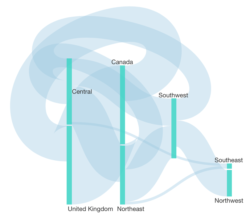
Here is a better example, where quantities are usually moving in a particular direction:
This has advantages over a Relationship Diagram of the same data. The above is better organized with a more predictable layout without having to drag to re-arrange nodes, and we can better compare the links’ widths:
Sankey diagrams can also help you make sense of more complex scenarios like Relationship Diagrams can, based only on what values you have as your sources & targets. This diagram shows energy in terawatt-hours moving in a multi-step flow or in multiple stages between the start & end:
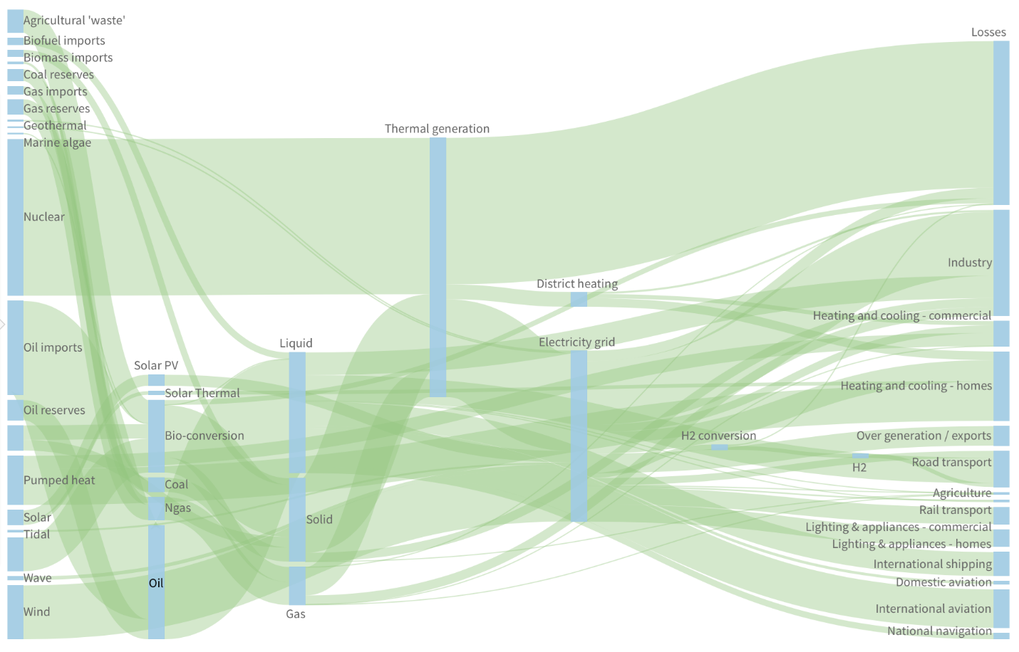
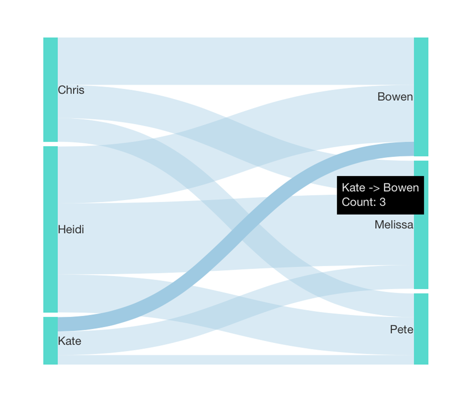
These diagrams are very interactive in case of overlapping links, so you can move your mouse over different links to highlight them or drag nodes around to explore their connections.
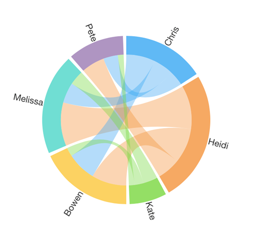
Chord Diagrams
Chord diagrams in Dundas BI are similar to Sankey diagrams, but don’t need to represent data mainly flowing in a particular direction. Instead, with a single set of nodes arranged around the outside of a circle, they can represent quantities moving in both directions.
Chord diagrams again use data assigned as Sources and Targets, this time placed directly in the Metric Set tab of the Data Analysis Panel.
Here is our original example from the Relationship Diagram, this time visualized as a Chord Diagram:
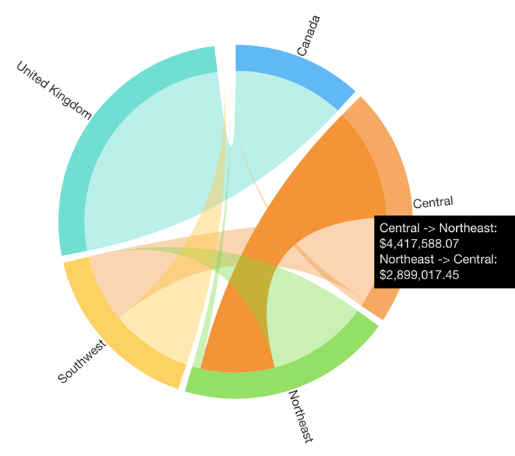
Each link or “chord” between the nodes around the outside is sized like a Sankey diagram, allowing you to compare the quantities represented by their widths. Each end of each chord is different because they represent two directions.
The central-northeast chord is highlighted above, which is color-coded as orange because the value for Central to Northeast is larger than for Northeast to Central.
Our Sankey Diagram example could also work as a Chord Diagram:
But this case is probably more confusing here than the original Sankey diagram – compare how long it takes you to determine what direction the values are flowing. It’s actually less confusing in this case than this circular arrangement makes it look, because quantities are flowing in one direction (from the right half to the left half). Chord diagrams may be a better choice when data is moving in multiple directions like the original chord diagram example or when the left-to-right movement of a Sankey diagram isn’t a good fit.
Hierarchical Relationships
A hierarchical relationship is like a common organizational hierarchy you’ve seen before, where there are “top” or “root” items, and every item below always has one parent above. This special case of a relationship structure is called a “tree” (even though they aren’t usually visualized from the bottom up starting from the root). The Tree Diagram specializes in these kinds of relationships:
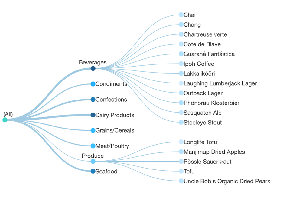
Tree diagrams don’t use Source and Target data, and you don’t need to assign those to display hierarchical data in a Relationship Diagram or Sankey Diagram. Here is the same territory data we used above but without assigning Target:
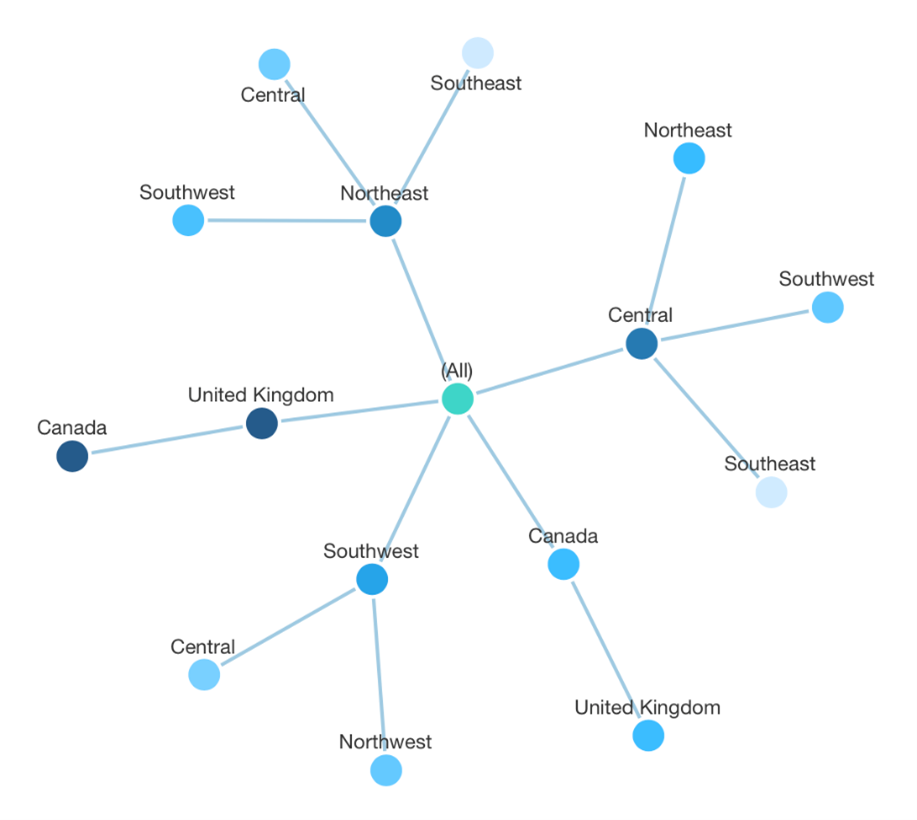
Notice how each location is now split up into multiple nodes spread out across the ‘tree’, and we lose the ability to easily compare all of their connections and their amounts.
There are plenty of other situations where this will make more sense, because Dundas BI allows you to create Hierarchies, use Time Dimension hierarchies, or just group your data into a hierarchical structure, so you are almost certainly already working with hierarchical data today. For this you could use a Relationship Diagram, Sankey Diagram, Tree Diagram, Table, Treemap, Sunburst, or another chart type to explore, analyze, or visualize that data, but this is a whole other topic to look at another time.
Summary
Each type of relationship diagram is a good choice in different situations:
- Relationship Diagram: flexible for visualizing all kinds of relationships and networks. The layout is determined using a physics engine and somewhat unpredictable.
- Map & Diagram: visualizes relationships between locations on a map or a custom diagram. The layout is geographically accurate but not flexible.
- Sankey Diagram: best for visualizing quantities moving between items generally in one direction, although there can be multiple “stages”. It arranges the items from your data into a predictable left-to-right layout.
- Chord Diagram: best for one interconnected group of items, where quantities can move between them in both directions or with more complex connections than in a typical Sankey diagram.
- Tree Diagram: exclusively for hierarchical relationships or structures, providing a tidier layout than the other diagrams.
Try out a relationship diagram if you haven’t before with some of your data, and consider switching between them depending on what you find!
About the Author

Jamie Cherwonka is the R&D Director for Data Visualizations at Dundas Data Visualization. His visual designs that follow best practices are known to turn data novices into visualization champions
Follow Us
Support