The idea of dashboards in business has been around for a significantly long time now, but many companies still do not use them. One of the biggest problems that I have seen is that they were not correctly implemented and did not provide value for those consuming these dashboards. Over time, the initiative to implement dashboards will be abandoned due to a lack of utility. Let us keep this simple; I have one tip that will instantly improve the dashboards you are building. Let's go.
Stop treating your dashboards like 'pretty reports'. If dashboards have been around for a long time, reports have been around even longer. Of course, when I say 'reports,' I am talking about long-form dumps of data. These data dumps are usually in excel and always in a table format. The problem is that if you have never built a dashboard before, a common ask from management will be to 'rebuild our current reports as dashboards.' If you hear this, run! Your project is already on the road to failure.
I hear and see this all the time, and the result is always a dashboard full of nothing but tables and provides very little new value to people using them. If you are in this situation, you need to take some time and help whoever is making this request understand that dashboards are about assisting people in finding insights, not drinking from the proverbial firehose of data. It would be best if you interviewed the people who would consume the dashboard that you are creating. Try to get them to tell you the questions they would ask themselves when looking at long-form data. No one needs raw data, and they ask for raw data because they do not have answers to the questions required to do their jobs. If there are too many different job roles that fall into the target consumer for the dashboard, split it up. Create a new dashboard for each job category you need to support. In short, please keep it simple!
Think about what is really going to help someone.
Raw Data?

Or
A dashboard answering specific questions you need to have readily available?
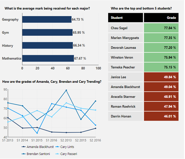
The dashboard above shows a great technique to allow you to get back to basics. Focus on question and answer. Ask a question and answer it with data, and you will quickly get the following benefits:
- Greater User Adoption: Give people the answers they need and never force them to work for their data.
- Easier Understanding: Less overwhelming content and simple insights to simple questions.
- Better Data Performance: Since you are not providing all the information possible but rather specific summaries, there will be fewer data points and better data performance.
- Increased Productivity: Up-to-date information meaning that the time spent processing and restructuring information should be near zero.
Give it a try. Interview the end-user, and do not stop digging until you have specific questions they regularly ask. Once you have these questions, build a dashboard to answer those questions. You will find that by focusing on your content consumers' needs, you will have a much easier time getting dashboards rolled out across your organization.
About the Author

Jeff Hainsworth is a Senior Solutions Architect at Dundas Data Visualization with over a decade and a half of experience in Business Intelligence. He has a passion for building, coding and everything visual – you know, shiny things! Check out "Off the Charts... with Jeff", his platform for great content on all things analytics, data visualizations, dashboards, and business intelligence. There’s something for everyone!
Follow Us
Support