A Slope Graph is essentially a line chart variation that is typically used to emphasize change in time for different categories in your data and how each stacks up against the other.
Defined by Edward Tufte in his 1983 book, The Visual Display of Quantitative Information, this type of chart is useful for visualizing:
- The order of different categories over a period of time.
- The specific numbers associated with each category in each of those years by displaying the data value next to their names.
- How each category’s numbers have changed over time using their respective slopes.
- How each category’s rate of change compares to other categories rates of change by comparing the slopes with one another.
- Any notable deviations in the general trend
In Dundas BI, you can create a Slope Graph using a Line Chart with a few configurations. The example used in this blog is based on a visual from the recent BARC BI Survey 17 that ranked the different BI vendors over time based on performance satisfaction. We are happy to share that Dundas ranked #1 in this category!
Here is the visualization that is shown in the BARC BI Survey 17 (Left) and the interactive view that was created in Dundas BI (Right):
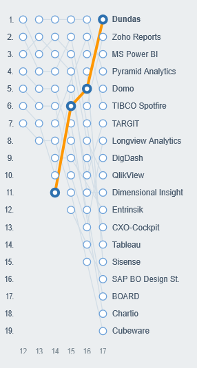
Figure 1: BARC BI Survey 17 results & the interactive Slope Graph created in Dundas BI
Here’s how one can create this type of visualization in Dundas BI:
Dataset
The dataset to be used will typically contain numeric data over time for different categories, i.e., you will have three columns at a minimum, one showing Dates typically aggregated into Years/Months, one showing the Categories that split the data and one showing the numeric quantity being measured.
In our example, the dataset contains the ranking of 10 different vendors over the course of 6 years:
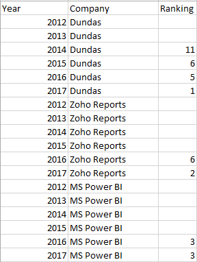
Figure 2: Data structure to create a slope graph
Create a Metric Set
In the Data Analysis Panel, place the Numeric column as a Measure, Date as the Row and Category as the Column. If your date column has not yet been aggregated, you can use the built-in Time Dimensions in Dundas BI to group the Dates into Years/Months/Days.
In this example, we place Ranking as Measure, Year as Row and Company as Column.
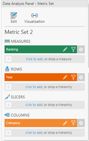
Figure 3: Data Analysis Panel for the Metric Set
Re-visualize as a line chart. The result will look something like this:
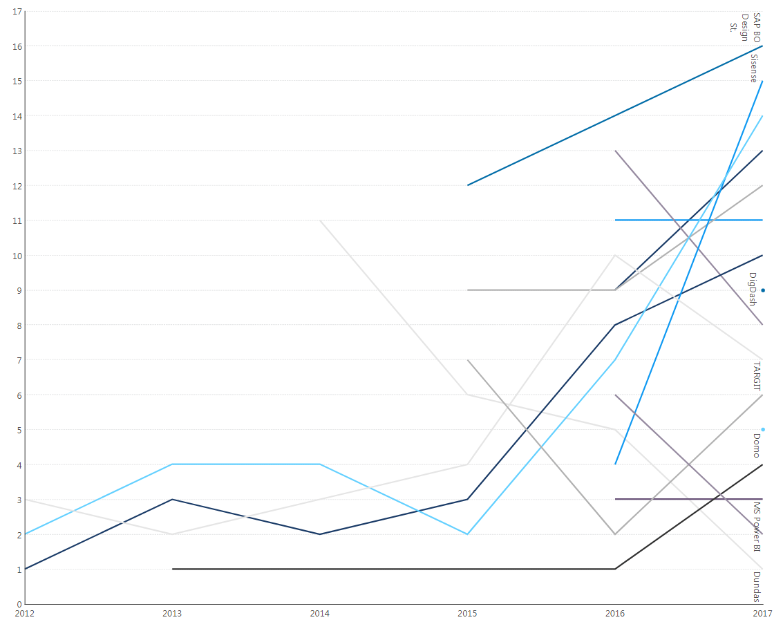
Figure 4: Re-visualize as a Line Chart
Modify Chart Properties
Next, we are going to modify the above chart to make it look like a Slope Graph by modifying a few properties.
The first step is to reverse the Left Axis from the chart properties. To do this, go to the Left Axis and reverse the axis by checking the “Reversed” property to reorder the axis display:
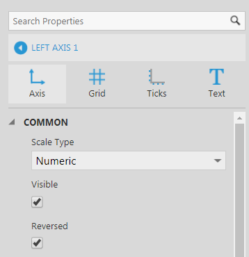
Figure 5: Reverse the Left Axis
You may want to hide 0 from showing on the axis by unchecking the “Round Minimum & Maximum” and “Always Include Zero” properties or by setting the minimum and maximum values for the scale.
Next, click on the Data Point Series of the chart, and in the Main section, set the Horizontal Axis to New Bottom Axis.
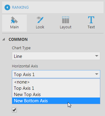
Figure 6: Change Horizontal Axis to New Bottom Axis
Select Bottom Axis 1 from the dropdown list:
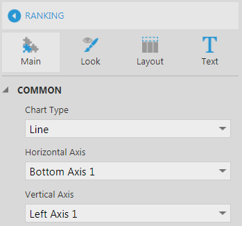
Figure 7: Bottom Axis added
Go into the Text section, click on the Series Label property, and set the Placement to “Outside”, Rotation to “None”, Outside Alignment to “Right” and check both the “Can Overlap Data” and “Can Overlap Text” properties to make sure the labels always show up on the lines, and not hidden due to lack of space.
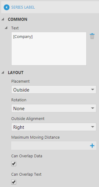
Figure 8: Change the series text properties
Next go to the Bottom Axis properties and change the margin properties to reserve space for the labels in order to make sure they show up on the lines. To do this, in chart properties, click on Bottom Axis 1 and scroll to the layout section. Set the Maximum Margin either as a percentage of the axis length or in pixels. In this example, it’s been set to 10%.
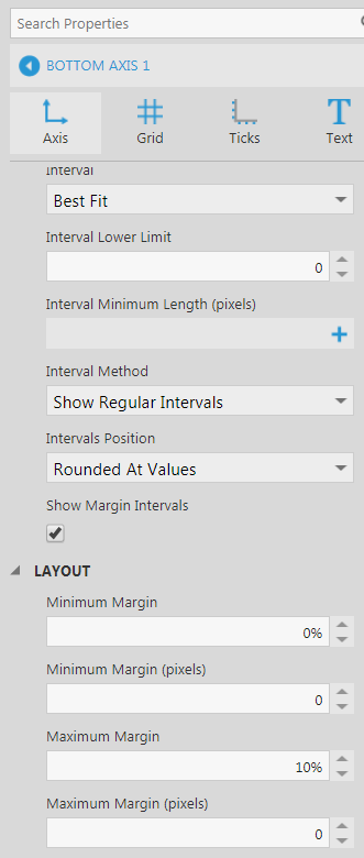
Figure 9: Change Maximum Margin property
Result
The result will look similar to this after hiding the grid lines:
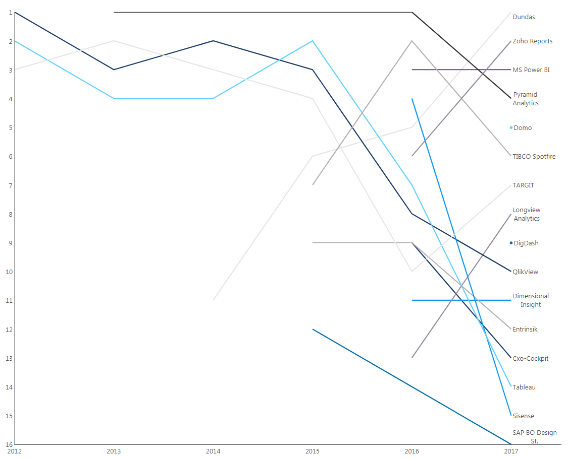
Figure 10: Slope Chart/Graph
By modifying the look and feel of the chart using the properties panel, you can get the chart to look like the one shown in the BARC BI Survey 17. For example, you can add a Right Axis to display the values, change the chart background, and change the series colors as well as highlight the selected series as shown below:
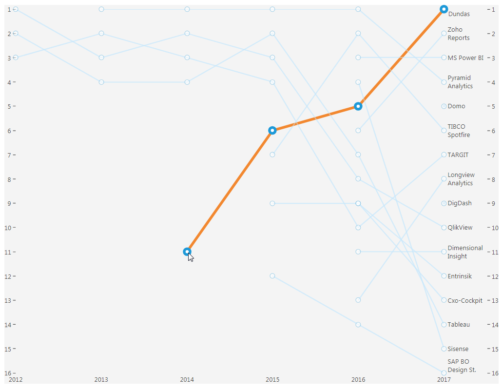 Figure 11: Result after formatting
Different colors to each line can help in differentiating the different categories but this will fail to clearly distinguish the lines beyond about 8 to 10 colors. By labeling the lines directly as shown above, different colors aren’t necessary. However, if there are too many lines on the chart, to make it easier to read, you can highlight the series you want to focus on by modifying the selected series styles as shown in Figure 11.
Let’s see how to do this:
Highlight the Series
As you can see from the chart, since there are too many lines, it becomes cumbersome to analyze if you want to focus on one category and how it’s trending over time; for example, such as we’re analyzing above, the Company ranking over different years. To make the analysis simpler, you can highlight the Category you want to focus on, as shown above, by taking advantage of the Selected and Unselected Series Style properties, which you can find in the Selected Data Styles section of the Look properties of the chart.
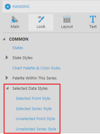
Figure 12: Selected Data Styles
For the above chart, the selected series has been highlighted by changing its Selected Series Style and setting the related properties for the fill and the markers as shown here:
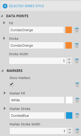
Figure 13: Selected Series Style
For the series that have yet to be selected, the Unselected Series Style properties have been changed as shown here:
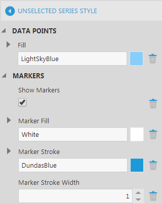
Figure 14: Unselected Series Style
To see the interactivity of the chart, simply refer to the gif at the beginning of the blog.
Most Slope Graphs show changes over two data points at a time to compare how the data changed by comparing their slopes and spot changes in their ranks by looking at the line crossings. For example, in the above chart, if you filter for two years, you can see the change in rankings between last year and this year as shown below:
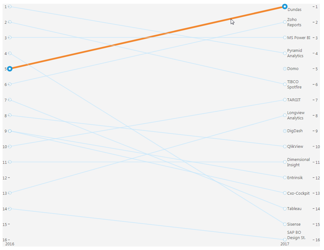
Figure 15: Slope Graph for two years
However, using the interactive highlighting using the selected series styles as shown above, you can easily look at the changes over longer periods of time for one category and compare it with the others over the same duration of time.
Conclusion
You can see from the above examples how the Slope Graph has helped to visualize the ranking of different vendor’s changes over time, and how each was stacked against another over various years. For example, Dundas radically improved in performance satisfaction within the last four years, resulting in a #1 ranking in 2017 – this is probably due to its product line transition from Dundas Dashboard into Dundas BI.
In summation, a Slope Graph is useful if you have data segregated into multiple categories and you want to:
- Compare magnitudes and directions of how data changes for different categories
- Compare values at same points in time
- Compare rates of change
- Spot changes in rank
Follow Us
Support