The use of icons in reports within the market research community is increasing, whether as standalone images within reports, or as a means of data representation via infographics.
This not only follows the pattern of improving the visual impact of presentations, but also has benefits in content communication. Studies have shown that imagery has more impact, both in terms of the speed our brain processes data, as well as the quality of impact that readers will receive from the report.
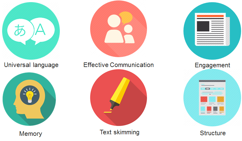
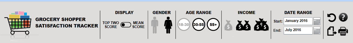
At the simplest level, standalone icons can be used in a number of ways, primarily as titles or labels. You can see some examples in screenshots from some of our dashboards:
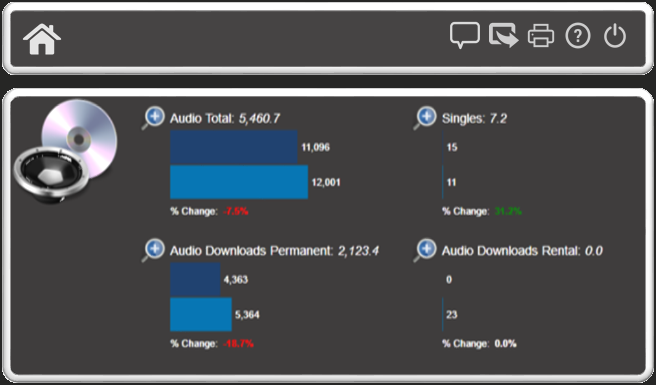
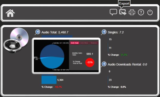
When it comes to applying icons to dashboards, we can make the icons interactive by using them as functional buttons. This can help to save space on your canvas and often delivers a more intuitive user experience. When using icons in this way we generally disable the right-click option and provide functionality via a toolbar - in the following screenshot we have applied the functionality of ‘comment’, ‘export’, ‘print’, etc. to icons in the top right of the canvas:
One benefit of having interactivity applied to icons is that in the unlikely event that the users don’t understand the icons that we have chosen, we can have unobtrusive tooltips appear on hover, over the buttons.
Within this dashboard you can also see magnifying glass icons. Clicking or hovering over them will bring up popups with more detailed information. We find that using icons in this way is much more elegant than having buttons saying ‘click here for more information’:
As well as navigation, we also use icons for buttons and indicators to filter the dashboard, like in the following examples. Unselected items can turn grey, for example, so it’s simple to see what is selected and what is unselected. This is a nice alternative to the more standard drop-down menus, although it does take up more room:
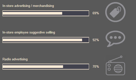
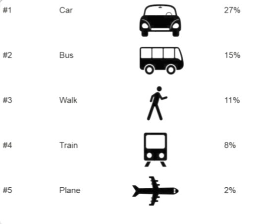
We can also use icons to accompany the data as you can see in this example table below. We have added an image column, which pulls in the correct image based on the row data. This enables the viewer to identify at a glance, which data point they are most interested. This results in faster recognition of the information being portrayed:
Finally, we can use icons to display the data itself in an infographic format. It’s this use of icons that excites us the most.
Our company (E-Tabs) does a lot of PowerPoint reporting, and we are currently working on a product called E-Tabs Vizualz, which will enable easy creation of data driven infographics for PowerPoint. Below is a promotional slide with some examples of infographic elements the product can produce. These include filling icons up to a value, repeating filled icons to represent a percentage, and sizing icons proportionally to represent the data.
We asked ourselves, why should we on the dashboard team, not have such striking infographic charts too?
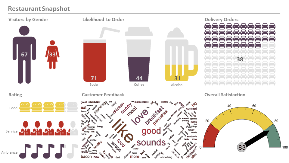
By using Dundas BI, it turns out that we actually can! Here’s a screenshot from a grocery dashboard demo we’ve produced using Dundas BI:
What we did to create this infographic effect was take an image with a transparent cut-out and place it on top of a standard bar chart. One bar chart is behind the stars, and another behind the shopping cart. Very simple to implement, with an engaging looking result. The same concept can also be applied using gauges as shown in this live interactive sample.
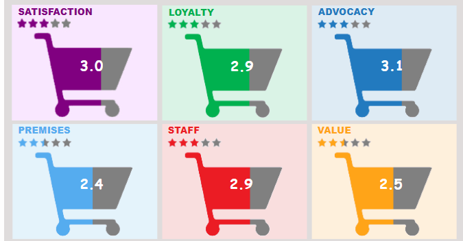
Here is a screenshot from another dashboard in Dundas BI, which shows repeating images:
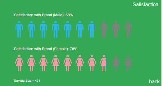
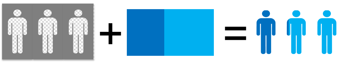
To achieve this, we use the same idea as we did with the shopping carts - transparent images on top of bar charts:
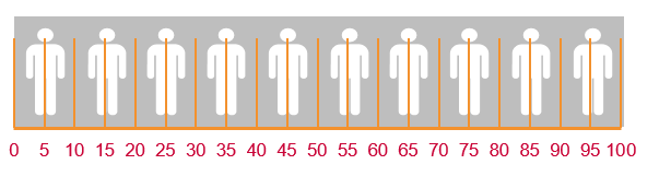
However, this one is slightly more complicated due to the need to take into account the gap between the images. As you can see in the following example, a data point of 81 won’t actually show in the chart:
We could have used 10 charts, one per icon. However, what we did in the end for this one was to have a rectangle behind the images, and use a script to set the rectangle width based on a calculation of the value we wanted to show and the width of the images and gaps. Slightly more complicated than a single icon, but not too difficult.
These are a few of the things we have done to combine icons and images to create more visually appealing dashboards. With Dundas’ moto of making 80% simple and the other 20% possible, together with our imagination and ingenuity, we intend to keep up with or outdo the PowerPoint department with the visual impact of our data visualizations!
More Information & Free Trials
You can read more information about E-Tabs and how we easily create visually appealing, data-driven reports from our website. Full market research dashboard samples are also available on our dashboard page.
If you want to download a trial of Dundas BI, you can visit Dundas’ website for more information. Download a free trial and try your hand at combining meaningful data visualizations with icons and images to create truly unique and engaging dashboards today.
About the Author
David is a Dashboard Implementation Consultant at E-Tabs. E-Tabs, a partner of Dundas Data Visualization, has been providing cutting-edge data visualization and reporting solutions to the market research industry for over 25 years. We’ve reached out to David so he can share his expertise on how icons can be used in conjunction with data visualizations to create maximum wow factor!
Follow Us
Support