Business intelligence software – like Dundas BI – helps software vendors and enterprises alike strike while the iron’s hot. By transforming raw data into actionable insights in the form of dashboards, reports and visual data analytics, businesses are able to more effectively analyze their data, and make critical business decisions faster.
Dashboards in particular, are a type of output/view that is in incredibly high demand. From Marketing, to Operations, to Sales, and everything in between, Dashboards present users with a simple, succinct view, allowing them to explore, analyze, monitor and act on their data. The definition of what a dashboard actually is has varied over time, but one of the more agreed-upon statements comes from Stephen Few:
“A dashboard is a visual display of the most important information needed to achieve one or more objectives that has been consolidated on a single computer screen so it can be monitored at a glance.”
As for what I believe – and in much simpler terms than Mr. Few – I’m content with simply defining a dashboard as a preview of whatever information is deemed most critical for the user who’s looking at it. The user should be able to see, at-a-glance, useful data visualizations and analytics that show trends, updates, KPIs, metrics and other key data points that will allow them to monitor the status of some process or department. Dashboards in business intelligence after all, are direct derivatives of dashboards in cars, which are used for the same purpose. You’d never fix your car using its dashboard, but you’d certainly look to it first to understand the health of your vehicle and to understand its status at that particular time.
Now that we’re all clear on how to define a dashboard – don’t worry, I won’t judge if you use a different definition – let’s dig into the meaty stuff – most importantly, what a good dashboard is comprised of and how you can design better dashboards. We’ll then share a few examples of creative dashboard designs and discuss why they work so well!
And if you’re not interested in my little dashboard ‘pedagogy’, feel free to skip straight to our examples of creative dashboard designs!
What is a good dashboard comprised of?
There are a lot of business intelligence and data analytics vendors who think they’ve got the best dashboards on the market and that they know what makes up a good dashboard. I’m here to set the record straight and tell you that they are wrong! And why are they wrong, you ask? Because we here at Dundas make the best dashboards – no doubt about it! In the not-quite-accurate words of J.K. Simmons and Farmers Insurance:
“Dundas knows a thing or two (about dashboards), because they’ve won an award or two.”
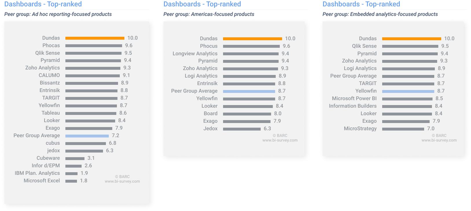
Dundas is nothing, if not well-known for our dashboards. Not to toot our own horn or anything (toot toot!), but we recently cleaned up big in BARC’s The BI & Analytics Survey 21. In fact, our performance in the ‘Dashboards’ category prompted BARC’s analysts to proclaim:
“Dashboards and interactive analytics applications are Dundas’ dominant use case, revealing the vendor’s origins as a provider of specialized dashboard solutions.”
Now that you know we’re *ahem* the best Dashboarding solution around, how about I get into telling you what a good dashboard is comprised of? The best dashboards tend to share four common traits. More often than not, they:
- Take what’s complex and make it simple to understand – Business intelligence by nature, is complex. There’s nothing simple about corralling millions of bits of data (that’s constantly changing, I might add) and presenting it in a manner that answers the questions of different users. A good dashboard designer understands this and is able to condense overwhelming amounts of information into digestible views.
- Tell a clear and concise story, taking the reader from start to finish – A dashboard must tell a story. It cannot simply display data in hopes of the user comprehending what’s being told. A user will have specific questions they want answered, and those questions will progress logically. The dashboard must be able to not only answer the user’s questions but must also predict the order in which they’ll occur and present the data accordingly. Visual layout of the dashboard will play a critical role in ensuring a story is well told. Keep in mind how your audience typically reads when designing – i.e., left-to-right, top-to-bottom.
- Give meaning to raw data, and help users make sense of it – Data on its own is meaningless. Data presented using the wrong data visualization is even less meaningful. It’s important your dashboard gives meaning to the data it presents, and the best way to do this, is by choosing the best data visualizations for the task at hand. Take the time to understand what the best representation type is for your data. Are you looking to see relationships, comparisons, compositions, or distributions? Correctly represent your data and the information you want to extract will become immediately apparent.
- Present the right amount of data; not too much, not too little – Don’t give your users access or visibility into data they don’t need. Let me repeat that. Don’t give your users access or visibility into data they don’t need. Present your users with the precise amount of data they need to get their jobs done. Too little, and they won’t have enough information. Too much, and they’ll be overwhelmed.
Keep in mind that all dashboards are different, and that each serves a different purpose. There will always be unique requirements, limitations and goals, but what should always remain relevant are those four traits. Audit your existing dashboards to ensure these four characteristics are applied or keep them in mind when creating anew.
How can you design better dashboards?
A good dashboard is the culmination of complex business intelligence processes, comprised of gathering myriad requirements, aggregating and cleaning data, defining and prioritizing metrics, and finally the design itself. There’s a lot of work that goes into designing a dashboard and having the high-level knowledge of what to apply will only get you so far. There comes a point in every dashboard designers journey where they need to make technical decisions based on their research.
From empathizing with your users and having a complete understanding of the tasks they’re hoping to complete, to ensuring the right KPIs and metrics are selected based on that understanding, to the types of data visualizations chosen to display said KPIs and metrics, to the layout and positioning of all elements on the dashboard, to the color scheme and UI guidelines… There are too many dashboard design principles to list, and were I to go into detail on even half of them, I’d be better off creating an eBook – hey, now there’s an idea…
What I will do, however, is provide a repeatable framework for how you can consistently design better dashboards
- STEP 1: Know your audience better than they know themselves – The dashboard you design may be stunning, but it certainly won’t be impactful or useful if you don’t design it with your end users in mind. First and foremost, you’ll need to understand who the key stakeholders are. Take the time to empathize with them, understand the problems they’re facing, and determine how they’ll be using your dashboard. The dashboard will only be a success in the context of who’s using it, so put yourself in your users’ shoes and ensure they are at the heart of your design.
- STEP 2: Precisely define the problem your dashboard will solve – Ensure you have a clear understanding of the problems your users are facing, and how your dashboard will solve them. At this stage, you’ll also want to define the metrics that matter most to your users and begin to conceptualize which data visualizations work best at representing them. Here, you’ll want to be in constant communication with your data teams to ensure your suggestions are aligned with what’s technically feasible – you wouldn’t want to recommend a tree map if the problem was to identify outliers, now would you? As a side note, make sure you define what each user is hoping to get from the dashboard.
- STEP 3: Generate as many ideas as possible – At this stage, you’ll want to ideate all the ways you’re able to present the data. You’ll want to prioritize the layout and flow of your design and begin to create a basic structure – or skeleton – for your design. Come up with as many rough sketches as possible; you never know which will work best unless you try! As the frame of your dashboard comes into focus, you’ll want to start arranging your data visualizations intelligently. Remember, you’ll likely need to organize a lot of information in an easily digestible manner. When making decisions on where information should go, do so rationally and tie your decisions back to what the user wants to achieve.
- STEP 4: Prototype your dashboard in increasing fidelities – You should have a good idea of what your dashboard is going to look like at this point. Now, you’ll want to understand its usability and performance, ensure the data is correct, and start to refine it. To do so, you’ll want to iterate, iterate, iterate and get as much feedback from as many stakeholders as possible. This is the ONLY way to ensure your dashboard design hits the mark the first time. You’ll also want to start applying some finishing touches – this includes applying color and UI elements to match branding, labels and data formatting, and so on. You’re almost there!
- STEP 5: Test, test, test, launch – While you’ve been rigorously testing your designs throughout the entire process and gathering feedback, there finally comes a time for you to launch your dashboards and push them into production. Once you’ve done so, be sure to observe your users to gauge what they’re thinking, how they’re behaving, and what they’re feeling. Your dashboard design process should never truly end, and you’ll continue to make alterations and refinements to rule out any problems that may arise or may not have been accounted for.
And remember, these steps are not law, merely guidelines to follow. They can further be broken down into very detailed specifics, such as…
- Labeling and data formatting
- Inclusion of interactive and animated elements
- Margins and white (negative) space
- Whether or not the dashboard is optimized for different devices
- Where the dashboard will live (i.e., embedded in a website, or exported to PDFs)
… but without going into excessive detail, the above steps should be plenty for getting started. By now you should have more than a solid foundation on which to build your dashboards.
3 examples of creative dashboard designs (and why they work!)
I truly apologize for taking so long to get to what you’ve likely come here to see! This is the blog’s titular section, after all. I do, however, hope you’ve learned a little bit about dashboard design along the way, and can put some of your learnings into practice the next time you take to designing a dashb— nay, a piece of art that elevates your users’ ability to effectively communicate data insights.
Let’s get right into it! Here are 3 examples of creative dashboard designs that absolutely work:
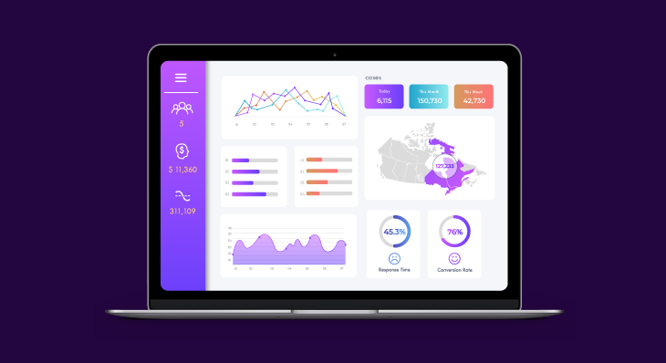
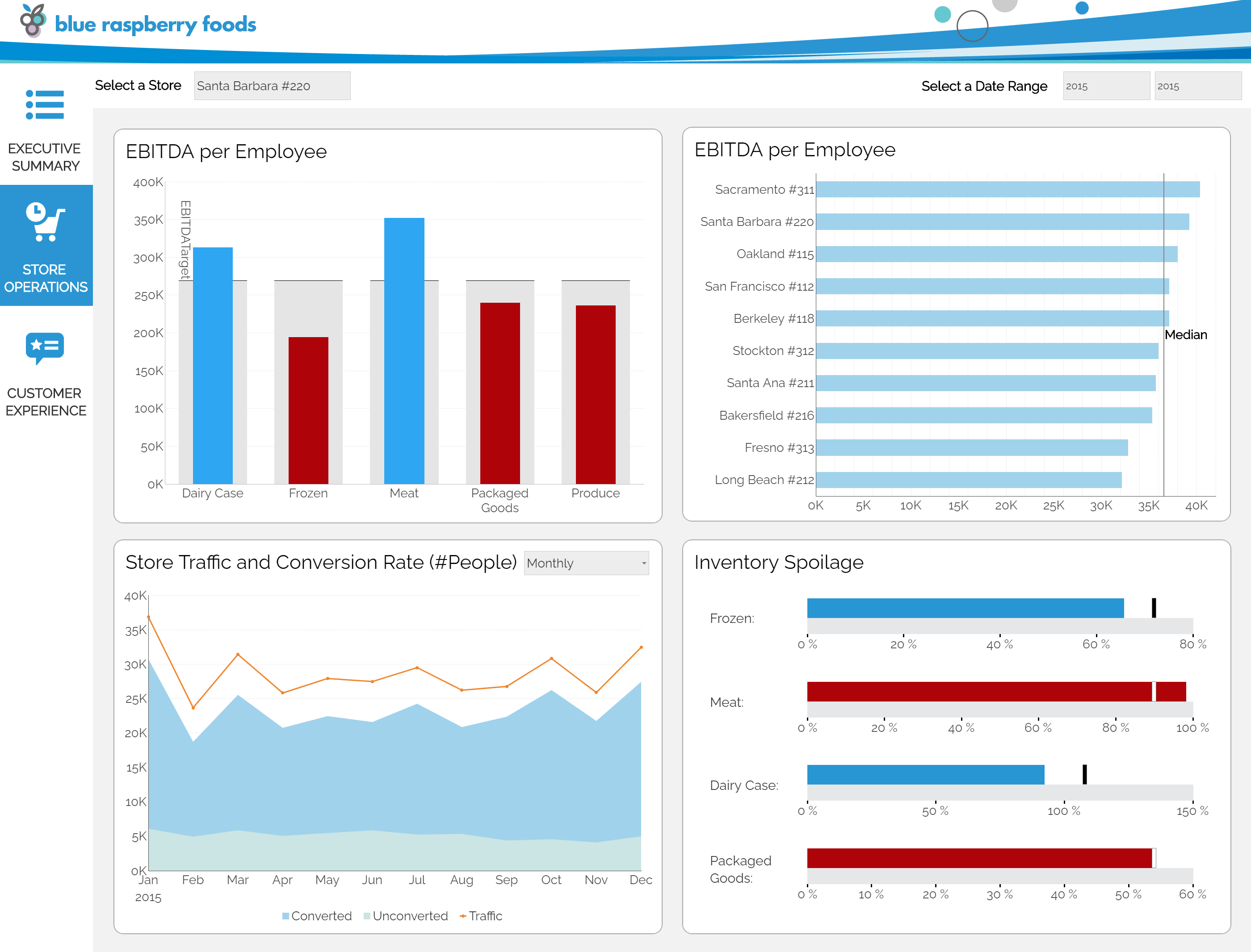
STORE OPERATIONS DASHBOARD
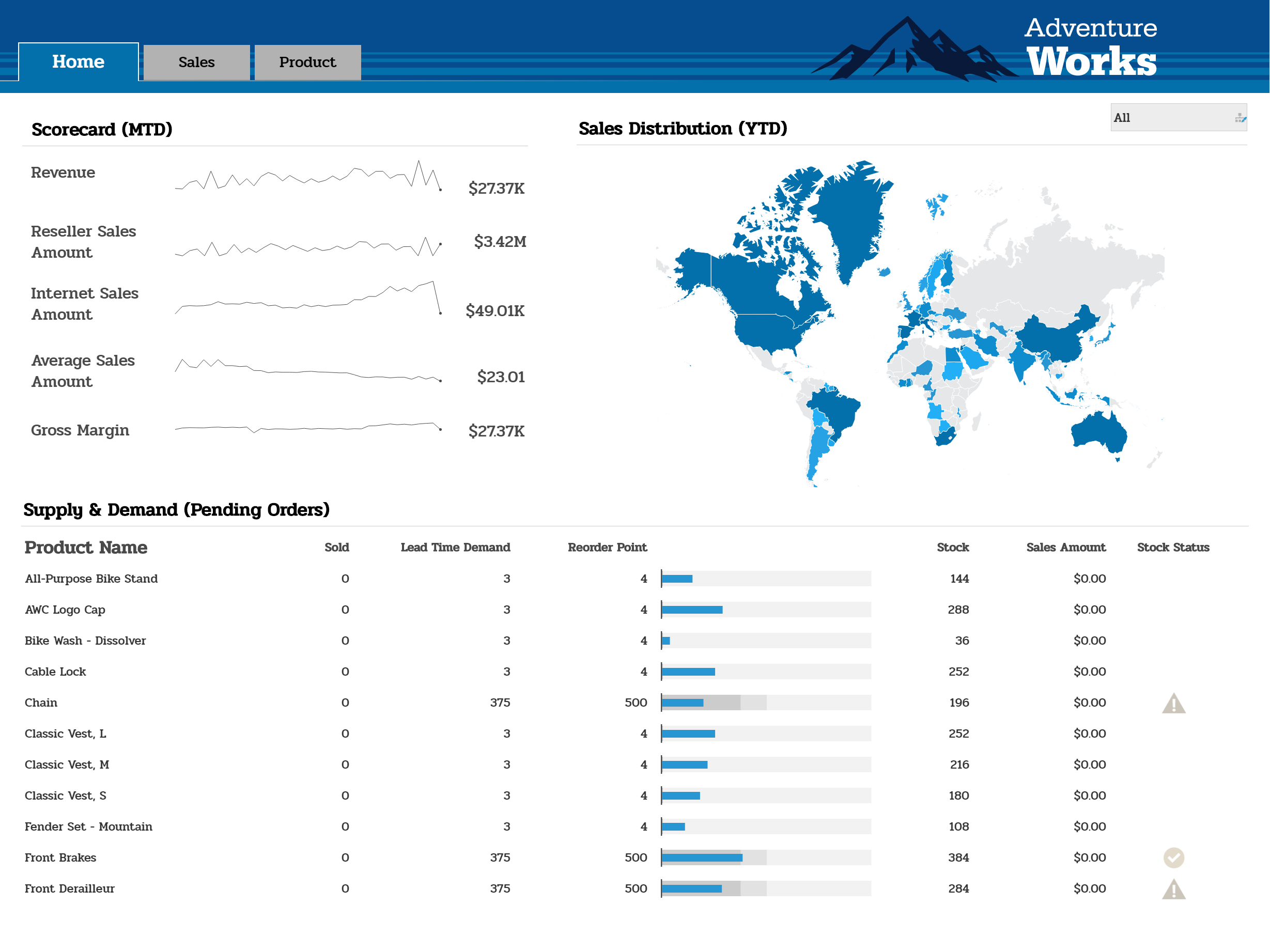
RETAIL SALES PERFORMANCE DASHBOARD
CALL CENTER DASHBOARD
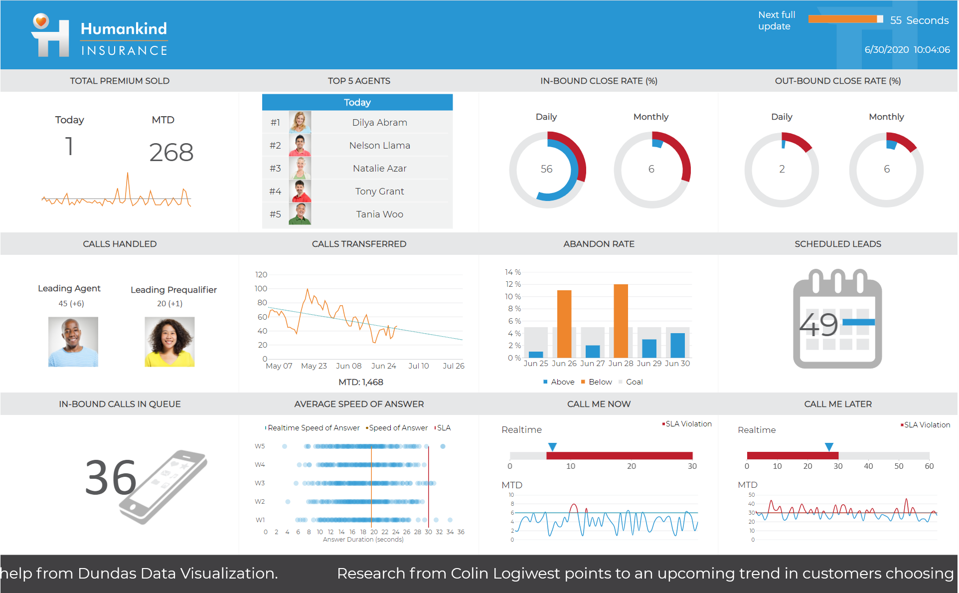
I’ve chosen to not detail individually why each dashboard is designed well – there’s simply too much overlap between all three – and quite frankly, you’d get tired of hearing me say the same things. Instead, I thought I’d outline some key design principles the dashboards as a whole follow.
- The ‘5-Second’ Rule – It’s immediately evident which problem each of these dashboards is solving, and at-a-glance, each dashboard is able to answer the most frequently posed business questions – in regard to each specific case. Each of these three dashboards provides all the relevant information a user would need, and anything that is not readily available can be accessed via drill-downs or on secondary pages that are clearly indicated – rather than shoving everything onto the Home Page.
- Thoughtful, Logical Layouts – Each dashboard is logically organized, with significant insights arranged in a manner that makes sense. Business intelligence dashboards are all about storytelling, and these dashboards all tell stories. They do so, by including the most substantial findings in locations that are likely to be noticed first – i.e., top left to bottom right, in order of diminishing importance. High-level insights are displayed first, then trends – which contextualize the insights – and finally, items of increasing granularity.
- Quality Over Quantity – With the exception of our third example, none of these dashboards contain more than 5 data visualizations. We’ve opted to include more in the third by introducing animations and imagery. The reason for this is that animations make data exploration and analysis as interactive, intuitive, and effective as possible, and allow the viewers to keep track of everything they can when data changes often – as is the case in this dashboard. While there are obviously exceptions, you want to limit the number of items on your dashboard. More than 5-7 items translates into clutter and noise and distracts from the intended purpose of the dashboard.
Beyond following these three design principles, these dashboards are culminations of everything else we’ve discussed thus far in this article. They each have taken complex data and made it simple to understand. They each tell a clear and concise story and guide the reader from start to finish. They each have given meaning to raw data and are helping users make sense of it. And they each present the exact right amount of data – not too much, and certainly not too little.
If you’d like to see more well-designed, creative dashboard examples, check out Dundas’ samples page. We’ve got tons of great, interactive dashboards for your viewing pleasure.
—
Good dashboard design is as much a science as it is an art. And now that you understand what dashboards are, what good dashboards are comprised of, and how good dashboards are designed, there should be nothing stopping you from creating thoughtful – and more importantly, impactful – dashboards.
If you’d like to start building your own dashboards, I highly encourage you trial Dundas BI – free for 25 days.
Follow Us
Support