With the release of Dundas BI 5, a concerted effort was made to enhance our visual analytics offerings, to accelerate the speed by which questions could be answered. One way this was accomplished, was by creating new types of visualizations, specifically those within the relationship category.
Before Dundas BI 5, our relationship visualization arsenal consisted of Relationship Diagrams and Sankey Diagrams. We’ve now increased the breadth of visualizations within this category to include Tree Diagrams and Chord Diagrams.

Data visualizations in Dundas BI under the Relationships category
The Tree Diagram displays information about the ranked structure of the data, allowing us to visualize hierarchical data breakdowns and inter-relationships between categorical items. Presented like a tree (hence the name), this relationship diagram is often used to display organizational charts and other family descent structures.
Like the Sankey Diagram, the Tree Diagram is designed to show relationships in a flow. However, unlike the Sankey Diagram, whose link widths are proportionate to the magnitude of the flow, the Tree Diagram focuses on the different paths of data that are available.
Expanding nodes in a Tree Diagram in Dundas BI
As you can see from the video, when using a Tree Diagram, the data is organized very neatly across branches. This visualization is also highly interactive, providing users the ability to drill-down, expand, and collapse each node, to explore and visualize the data as needed. Of course, the Tree Diagram’s orientation can also be customized to fit the dashboard and use case better.
What’s unique about the Tree Diagram in Dundas BI 5, is that there is a visualization binding that allows the user to bind images into various data points. This is extremely helpful when designing organizational charts, whereby images can be attributed to the different individuals working in the organization. Alternatively, images can be used to reference various products or regions, instead of simple labels. Regardless of how the feature is used, there are countless possibilities for designing the perfect Tree Diagram that fits best with an organization’s objectives.
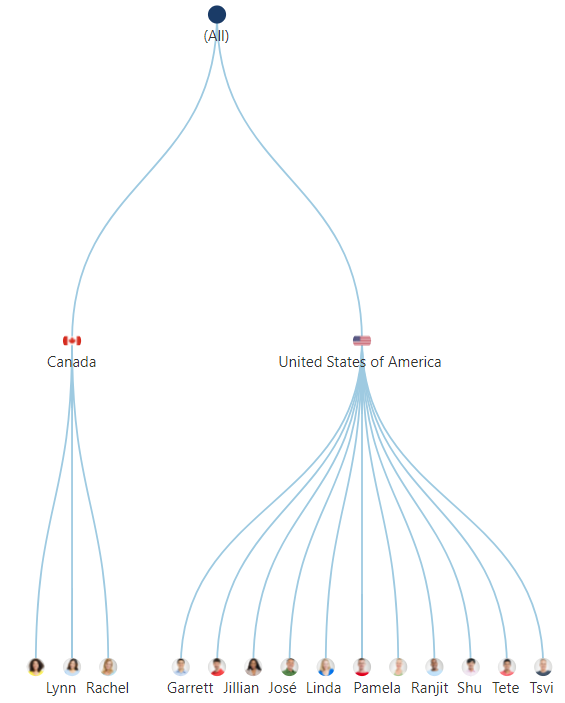
Binding images to data points in a Tree Diagram in Dundas BI
As mentioned earlier, the Tree Diagram isn’t the only new addition to Dundas BI’s visualization assemblage. The Chord Diagram is another new explicit visualization that displays the inter-relationships between categorical items. Unlike Dundas BI’s other relationship visualizations that often show hierarchical relationships between data, the Chord Diagram visualizes the relationships within the same level. That is to say, this type of visualization is most powerful when visualizing the relationships between 1-level hierarchy members.
With a Chord Diagram, the data is displayed radially around a circle with each node (or slice) corresponding to each category. The relationships between nodes are drawn together with sweeping arcs, their widths proportionate to the magnitude of the flow. What we’re left with, is a remarkably aesthetically appealing visualization that is much easier to digest than say a pivot table, when attempting to measure movement between categories.
A use case for this diagram might be when monitoring churn rates of subscribers moving from one telecom network to another.
Chord Diagram in Dundas BI visualizing the stream of data from one source to another
As you can see, with the Chord Diagram we are immediately able to see the bi-directional paths of customers moving between networks, which would have been more tedious and tremendously difficult to conclude from other table-type visualizations. Using this visualization is even easier with the built-in brushing interaction that allows the user to easily isolate the arc (flow) they are looking at, simply by hovering over it.
Interested in seeing what else Dundas BI 5 has to offer? Schedule a personal live demo with a Dundas Solution Architect and experience for yourself how we’ve made unlimited analytics possibilities even easier.
Follow Us
Support