The essential last step of any successful data-driven analytics strategy.
“By visualizing information, we turn it into a landscape that you can explore with your eyes. A sort of information map. And when you’re lost in information, an information map is kind of useful.”
– David McCandless
Believe it or not, we humans have always been a data-driven species. Right from the day we were born, each of us have been experiencing this world through our five senses, learning from various events, understanding the cause and effect of everything, and taking actions based the conclusions we arrive at the end of this process.
If you look at this from a data science perspective, our brain is like a powerful analytical machine that is constantly storing information that our senses capture from every little life experience. Next, it cleans this vast pool of information by identifying what is important, discards what is not. It then runs various algorithms and models to analyze this information to decipher some insights. Based on these insights from previous experiences, it creates a mental image of the future outcome.
Once we’ve mentally articulated and visualized the entire experience, we have an immediate urge to share the resultant knowledge with others. Why? Because collective knowledge helps us shorten the learning curve and progress faster. And since a picture is worth a thousand words, we find it easiest to convey our thoughts through visuals of various kinds.
While that should give you a high-level understanding of what data analysis and data visualization is, let me formally define them for you. Data Analysis can be defined as a systematic process of collecting, modeling, and analyzing data to extract insights to support decision-making. While Data Visualization can be defined as the graphical representation of data and information to understand behaviors, trends, patterns, and outliers. To help you get a complete grasp of the subject, in this blog, we will cover the following points:
- How data visualization works?
- Advantages of good data visualization
- Key features of good data visualization
- Different types of data visualization
If you have ever seen a bar chart or a pie chart (and I am very sure you have), you have witnessed data visualization at work. These visuals serve as metaphors that create an emotional response within us which help us digest the information quickly. Once we have digested the information, we are motivated to take some form of action and that is in fact the end goal of data analysis.
Think about the last time you were watching a prime-time news anchor talking about the housing prices in your city. It is likely that you saw a chart next to them showing two trend lines comparing the prices from last year to this year, and probably future projections as well. If this year’s trendline was rising above last year’s, depending on which side of the market you belonged to, buyer or seller, you were either motivated to sell or concerned about having to rework your finances. Either way, those trendlines made you take some action.
Advantages of good data visualization
When implemented correctly, visualized data nurtures a habit that creates an assured recipe for success. Here’s how:
- It promotes information consumption
A well-designed visual representation of data through charts, graphs and maps enables information consumers to join the dots and identify valuable connections between multi-dimensional data sets. It creates a story in the minds of the viewers which becomes the basis for further exploration within the topic of interest. As information consumers become habitual to the process, it becomes increasingly easier for them to interpret the visuals which enhances their ability to consume more information at a faster pace. - It facilitates pattern recognition and outlier detection
Once an information consumer becomes comfortable with data visualizations, principles of visual perceptions such as proximity, similarity, enclosure, closure, continuity, and connection kick in. These principles help them identify patterns and outlier or elements that are signals versus those that are noise. Sufficient context and clearly communicated goals and objectives are needed to distinguish outliers from noise. - It fosters a culture of data driven decision making
As data consumers recognize more patterns and outliers, they are better equipped to create sounder strategies that directly impact the end results. The success that follows further increases confidence in data-driven decision making and the practice eventually becomes a part of the thought process. While experience builds better intuition, a data-driven mindset looks for hard evidence to back that intuition, further increasing confidence in the decision; also making it easier to explain the findings and derived insights to others.
Key features of good data visualization
We humans are good at recognizing smart designs. All we need is to think like a designer to tell visually appealing stories with data. The following are some fundamental principles author Cole Nussbaumer Knaflic suggests in her book Storytelling with Data that every data visualizer needs to remember:
- Good data visualization has a clear visual hierarchy of information
Specific design choices can be made that naturally guide the human eye across the graph without us consciously realizing it. For instance, bolding of specific keywords in the title of the graph is the first to attract attention, followed by the labels of the axes, and intensity of colors creating a distinction between important stuff in the foreground and supporting information in the background. - It is not overly complicated
If your data visualization looks complex, the audience is less likely to spend time understanding it. In order to keep your visuals and communications from appearing overly complicated, use a consistent and easy-to-read font, maintain sufficient white space for it to appear clean, choose fewer words and simple language, and favor simpler charts. This doesn’t mean you should oversimplify things, rather, not make them more complicated than necessary. - It is aesthetically pleasing
Studies show that more aesthetically pleasing designs are not only perceived as easier to use but also readily accepted and used more frequently. When designs are more aesthetically pleasing, the audience develops more patience with our visuals which increases our chances of getting our information across. Being smart with colors, paying attention to alignment and thoughtful use of white space are a great way to maintain aesthetics.
Different types of data visualization
Bar graphs and pie charts are probably the first images that pop in your head when you think of data visualization. Which is understandable because they’re the most commonly used ones. However, they’re just the tip of the iceberg. Charts, Tables, Graphs, Maps, Infographics, and Dashboards are the common general types of data visualization. Within them are more specific examples like Area Chart, Bar Chart, Box-and-whisker Plots, Scatter Plot, Cartogram, Heat Map, Histogram, Treemap, etc.
Each of these chart types have different use cases. Often, the most difficult part of creating a data visualization can be figuring out which chart type is best suited to the task at hand. To help you with this, we wrote a blog on 25 unique and smart data visualizations that we folks here at Dundas Data Visualization are fans of along with their use cases.
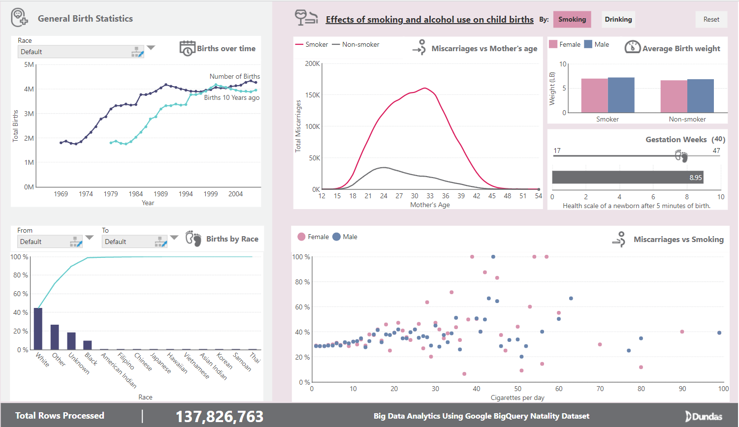
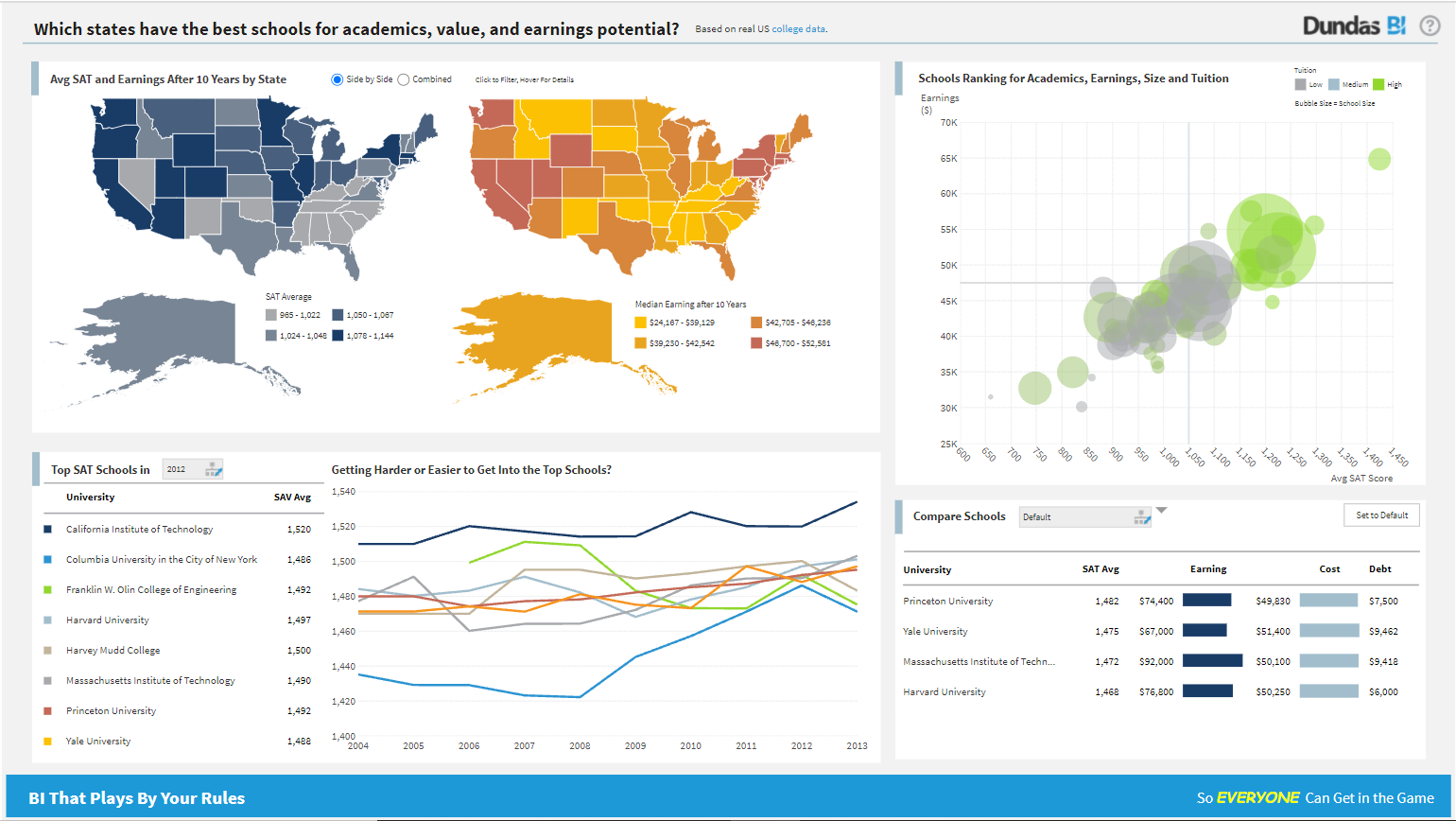
The best way to understand data visualizations is to see it. To experience various examples of data visualization in action, check out Dundas BI sample dashboards page. If you’re interested in the origin story as well, I encourage you to read a brief history of data visualization.
That’s everything you need to know to get off the ground with data visualization. Now that you’re equipped with sufficient knowledge about the essential last step of any successful data-driven analytics strategy, it will be a good idea to learn about the first step: business intelligence requirements gathering - what to do before building dashboards.

About the Author
Tejas Shah is a Computer Science graduate with a major in Data Science and a marketer by trade who is passionate about data-driven storytelling. He authors content that educates and offers a fresh perspective in the world of business intelligence and analytics.

Follow Us
Support