What Exactly Is Reporting?
Reporting… businesses live and die by it, employees live and die by it. So why is there such confusion over reports and dashboards? The term reporting has often been used to describe both reports and dashboards, with users commonly referring to simple tables placed within dashboards, as reports. Traditionally, most IT led business intelligence (BI) tools have been focused on reports that provide users with very little interactivity and visuals. However, modern data discovery tools revolutionized this and introduced tools that allow for exceptional interactive visualization, often delivered to greater audiences by means of dashboards. Today, the majority of BI tools administer either reports or dashboards (or have tendencies to focus primarily on one and egress limited capabilities to the other).
The issue that arises when deciding between using reports or dashboards, is that both terms are often construed as being synonymous with each other. The differences between both deliverables are often difficult to interpret. Oftentimes, there’s disconnect in regards to reporting and dashboards.
What Are The Differences Between Reports And Dashboards?
The best way to distinguish the difference between the two concepts, is to highlight each terms’ disparities. It’s important to understand that each medium is generalizable, as there are always exceptions to each respective case.
Enterprise Reporting
Enterprise reporting, or production reporting, is a method by which reports are distributed within an organization to provide users with support for their work. Generally, in traditional BI tools, reports are primarily text and table based, and periodically include visual components. More often than not, these reports are scheduled for automatic distribution, as they tend to be used on a more regular basis. These reports can be arranged via pagination, which is the exact placement of elements on a page. This technique is capable of complex display logic for creating printed reports or online operational reports. Even though losing popularity, paginated reports will continue to be a standard reporting method when it comes to displaying raw level data or pixel perfect data views designed for printing. It’s important to note that reports can be lengthy and span multiple pages. As a result, the creation of reports can be a bit more complex requiring a more technical user. Reports are, in summation, commonly comprised of background data and other decision informing information.
Dashboards
Conversely, dashboards present the most important information required to achieve specific business objectives, at a glance. They are designed for at-a-glance monitoring and decision making. Generally, a dashboards’ objective is to present all necessary content on one screen, and drive decision making without overwhelming the eye. A dashboard will focus on visual, interactive features and will allow users to physically ‘drill’ into information. Dashboards predominantly focus on decision driving, rather than informing, and are targeted at Key Performance Indicators, or other decision driving information.
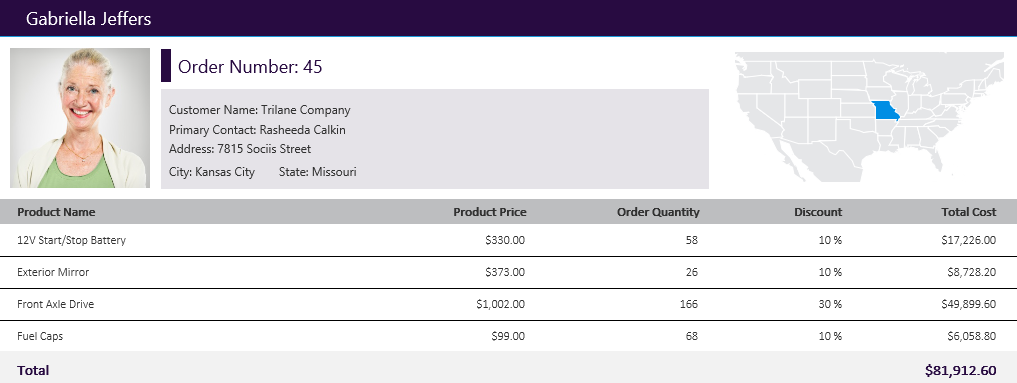
Now, these are all generalizations. Every dashboard does not need to be interactive and every report does not need to be static. A good example of a non-tabular report is a multi-page, pixel perfect report, which incorporates maps, data images, data labels, and other report elements that can be manipulated to a very precise degree:
Ad-Hoc Reporting
Ad-hoc reporting is definitely a part of the reporting world but is different than enterprise reports and dashboards as it is usually designed for very particular purposes, often without much planning in advance. Ad-hoc reporting is self-service, which allows for reports to be easily built with the exact information users require without consuming developer resources. Users are able to create those reports in order to analyze explicit business questions that are not answered within the organization existing set of enterprise reports and dashboards. Typically, with ad-hoc reports, the BI solution is connected to the desired modeled data sources, parameters are established, and frameworks for what the end-user will see are specified. Ad-hoc reporting is designed to capacitate end users and allow them to create their own solutions usually via drag and drop. Therefore, this method is more desirable when there is an excess number of end users, who yearn to act on data and information independently, while still having access to similar data sets.
In traditional BI tools, Ad-hoc reporting is often referred to as Ad-hoc querying as it allows users to generate a dataset (usually in the form of a table with different columns of data) simply by selecting the data fields required (the table columns) without having to write SQL or other queries code.
In modern BI tools, that includes data discovery capabilities, as well as allowing for Ad-hoc queries to be created via drag and drop, but the outcome is usually much more visual based. Using different types of visualizations rather than tables allows the user to reveal trends, patterns and data relationships. Often the visuals created using those tools serves as the starting point for a dashboard. As mentioned above, this is often a source of confusion, since those can also be simple tables included within dashboards.
So Which Should I Use?
What’s important to take away, is that there is room for all types of reporting. Putting Ad-hoc reporting aside, both enterprise reporting and dashboards are used to communicate data and information to executives and information workers who need to be able to monitor data and quickly make decisions that allow them to get back to do their job. It’s integral that objectives can be delivered on the pair and the user is able to integrate the two easily. The ideal situation involves starting with a dashboard, and drilling down into a more detailed report that is already filtered on previously identified issues located on the dashboard. On the other hand, Ad-hoc reporting will serve business analysts and executives that are trying to further analyze a new business situation and find new insights.
As different users have different skills and needs, it is important to have a BI environment that enables all users to interact with their data as needed - ideally in a single front-end solution that allows for all those types of reporting in one place, rather than having multiple tools that typically increase your data inconsistency and silos concerns.
About the Author

Jordan Zenko is the Community & Content Manager at Dundas Data Visualization. As Dundas’ resident (and self-proclaimed) story-teller, he authors in-depth content that educates developers, analysts, and business users on the benefits of business intelligence.
Follow on Linkedin
Follow Us
Support