Every chart, graph, and map holds a different purpose from the next; like every dashboard, there are different types of visualizations for different purposes. When making a dashboard, choosing the visualizations comes down to two very important factors:
- Visuals - is the data easy to understand?
- Space - is the information provided by the data worth the space it takes up?
Not every visualization can balance the two requirements for every set of metrics on every type of dashboard. That's why so many types of visualizations exist; they each have a distinct purpose.
Here are some of the more popular visualizations you might find on a dashboard, and some information about how to use them:
Sparklines:
These graphs are compact line charts. They’re used for displaying trends or data over time. They are useful when you are trying to conserve space, as they take up the smallest amount of space possible.
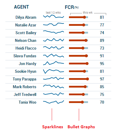
TIP Because space is valuable on a dashboard (especially for mobile dashboards), a compact visualization can be extremely useful for conveying information.
Bullet Graphs:
A variation of the linear gauge, bullet graphs feature a single measure compared with a target, in the context of performance quality. For example, a sales team might display current month-to-date revenue with target sales, and outline three sections of the graph with green, yellow, and red colours to signify whether sales are good, average, or poor.
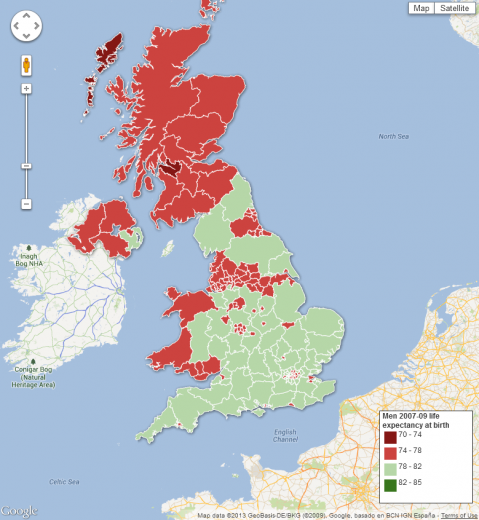
Maps:
These visualizations are best used to display geospatial data (data tied to a specific geographical location). Maps used in dashboards are essentially like any other map, but, instead of displaying multiple streams of information, maps tend to focus on only one. They can use visualization tactics such as different colours to display data information. Because the size and shape of the visualization depends on the geographical location it's representing, the size will vary from project to project.
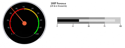
Gauges:
There are two types of gauges: radial and linear. Both are generally used for displaying performance targets versus actuals. Since radial gauges tend to take up a lot of space, and the same information could easily be displayed in a linear gauge or chart using up only a fraction of the space, they are not recommended for wide usage. The benefit of the radial gauge (and the reason they're not obsolete) is that they can be easier to understand. They are still often used in a variety of machinery and cooking products.
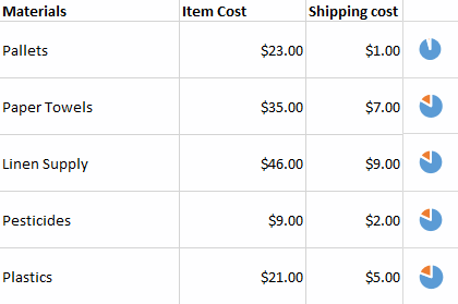
Pie Charts:
Pie charts are very widely used, but they should only be used to show the relationship of a part to a whole. While they get a bad rap in the data viz industry (much like their cousin, the circular gauge) because they don't allow for any deep or precise exploration into the data, they are definitely not useless. They are excellent if you have very little horizontal screen space, or if used in supplement with another visualization (such as a data grid).
Scorecards & Data Grids:
These charts combine several visualizations in one space in order to align with one specific goal. Scorecards and data grids are different than dashboards. While both can feature various visualizations, and both can stand alone, dashboards can track several metrics while scorecards only track one.
Follow Us
Support