
1. Overview
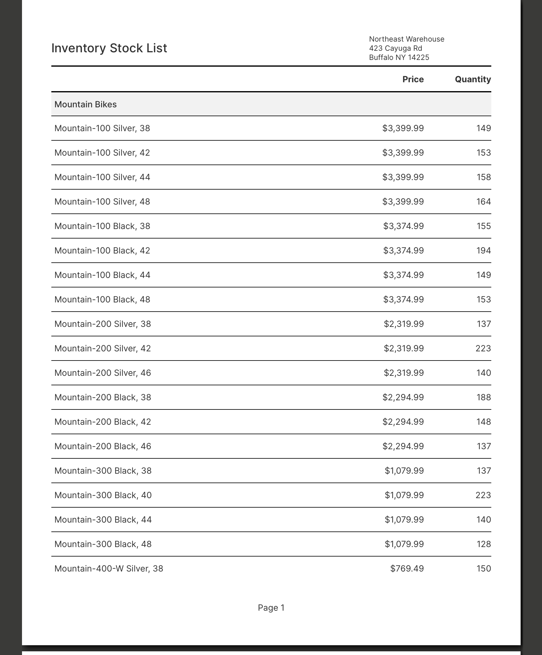
This walkthrough shows you how to design a pixel-perfect multi-page report, similar to the example inventory report shown in Report basics and concepts.
It displays two levels of grouping: one for product subcategories, and another for products. For this walkthrough, data is displayed as text using data labels, but you can use any of the same visualizations as are available in dashboards for your data in any report region.
Related videos: Scorecards and Reports
2. Designing the report
In the main menu, click Views, switch to Report at the top, then click Create to open a new report in edit mode.
2.1. Report wizard
In newer versions, the Report Wizard opens automatically, which is also available later from the toolbar to add a new sibling group to existing reports. You can close this wizard to start from a blank report and add data yourself directly as described in this article, or you can use it as a starting point for creating a similar report as follows:
- Data Source – You could use the same sample data described below if following this article's example.
- Fields – Expand the [Production].[Product] table and select Name and ListPrice, and expand [Production].[ProductInventory] to select Quantity.
- Grouping – Expand the [Production.ProductSubcategory] table and select Name.
The remaining wizard steps are not required for this example. If you used the wizard, you can follow the rest of this article to better understand what was created for you automatically and how to customize it.
2.2. Report properties
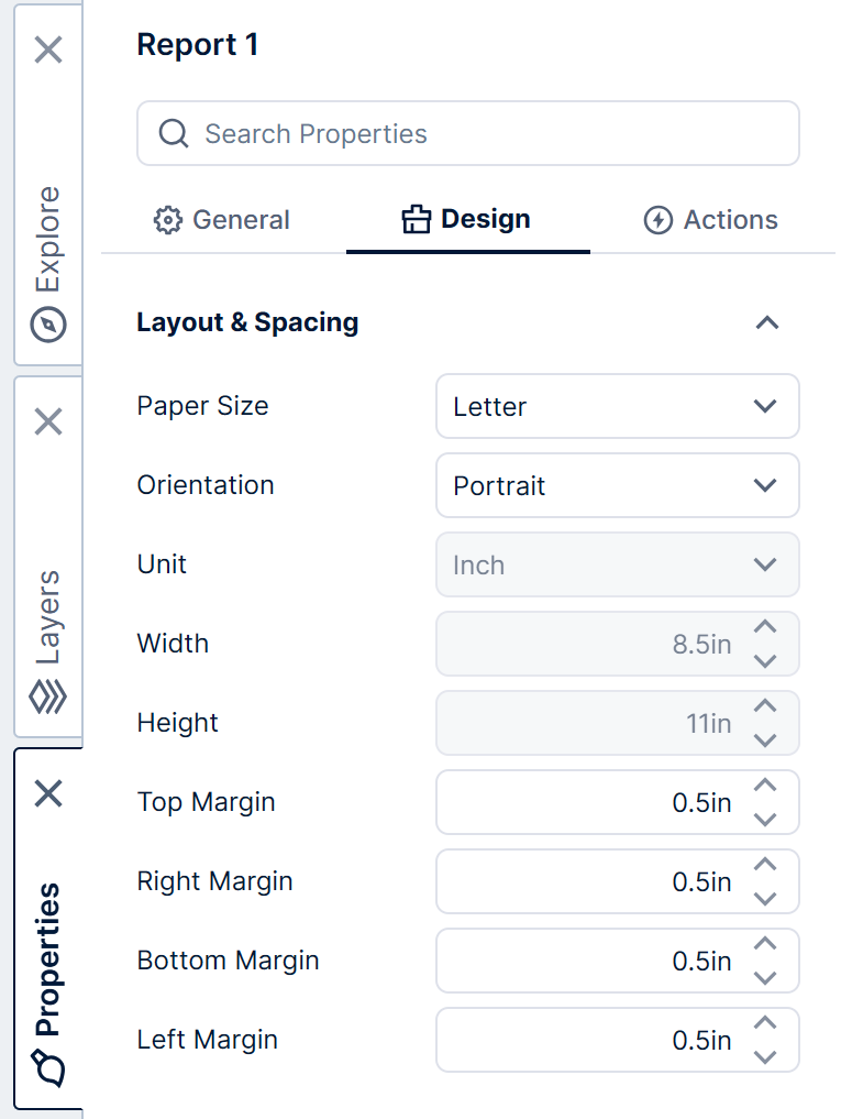
The default paper size for the report is set according to your locale - for example, letter-sized pages (8.5 × 11 inches) are used by default for cultures including en-US and en-CA.
To set the paper size, open the Properties window on the right, and expand Layout & Spacing. (If any elements are selected, de-select them first by clicking an empty area of the canvas.)
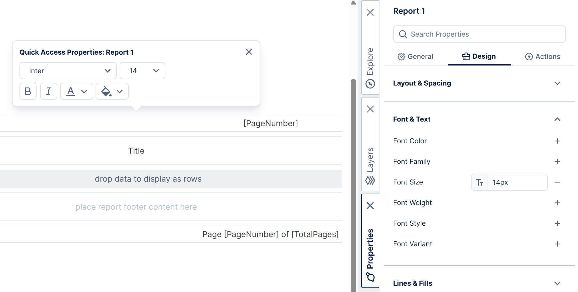
You can set up font properties to take effect for most of the content of the report at once under Font & Text, or by right-clicking an empty area of the report to bring up Quick Access Properties.
For this example, set the Font Size to 14px.
2.3. Title
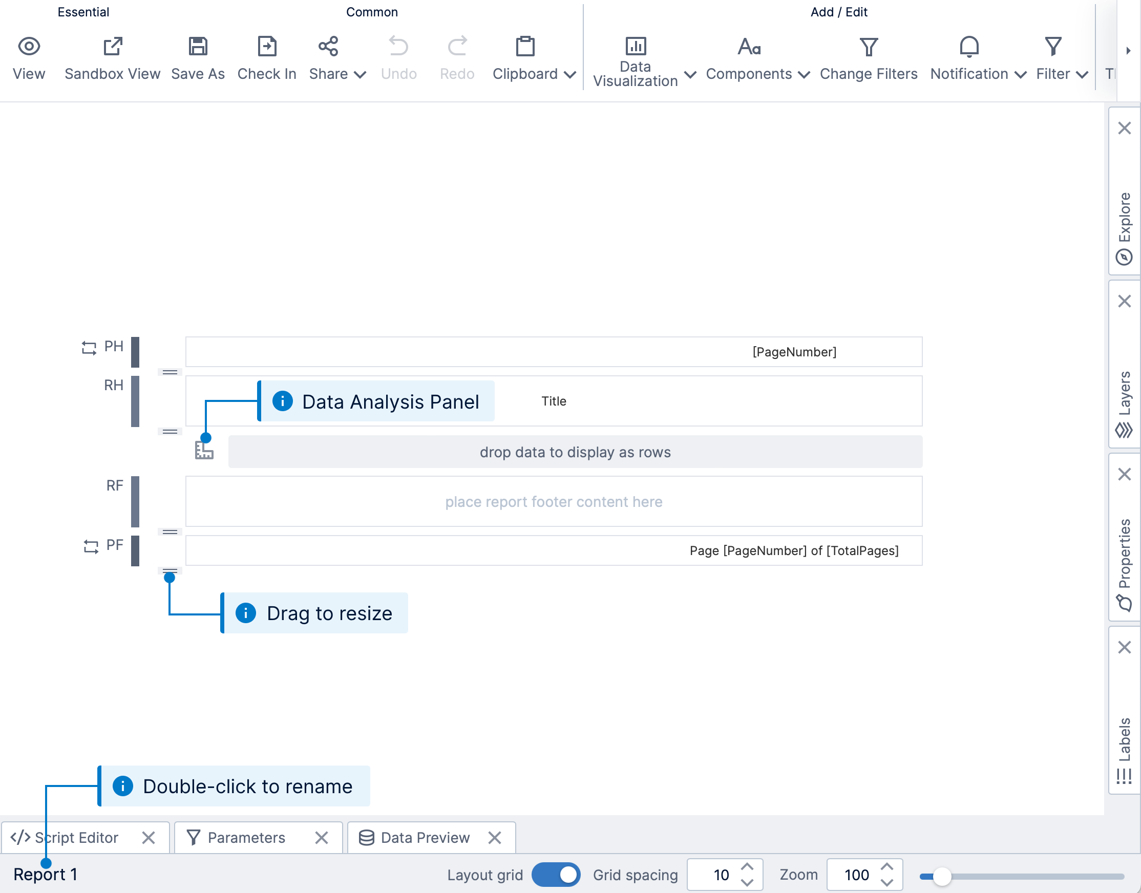
A label component was added automatically to the Report Header region as a title when you created the report.
Select the label and go to the Properties window under Font & Text, where you can set the following properties:
- Set Label Text to Inventory Stock List (or double-click the label to set its text).
- Set Text Alignment to Left.
- Set Font Size to 20px.
- Set Font Weight to 500 (or Bold).
Click the area labeled RH on the left to select the Report Header region to add new items to it directly, otherwise you can drag items into it from outside. Click Components in the toolbar to add a Label to display an address, for example.
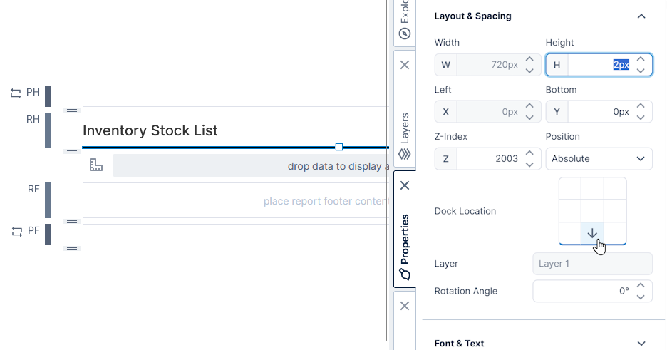
Click Components and then Line to add a line as a separator below the title. Go to the Properties window, and under Layout & Spacing and Lines & Fills:
- Set Stroke Color to Black.
- Under Dock Location, click the bottom-center square to dock to the bottom.
- Set Bottom to 0, and set Height to 2 to match the width of the line.
You can switch to View mode in the toolbar to see how your report looks so far, then return to Edit.
2.4. Add subcategory rows
Go to the Explore window and drag the data that will make up the rows of the report onto the grouping hierarchy region, labeled drop data to display as rows.
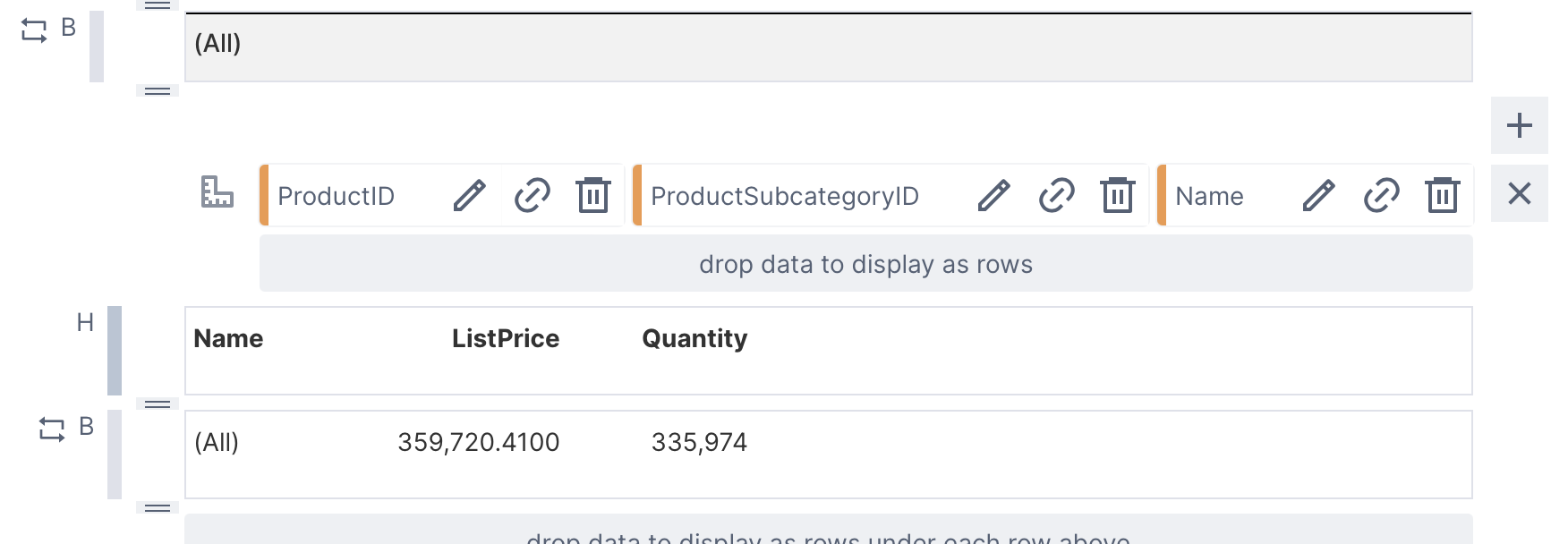
In this example that uses the Adventure Works sample database, we find and expand the table [Production.ProductSubcategory], then drag the ProductSubcategoryID column in order to uniquely identify each product subcategory and display a row for it.
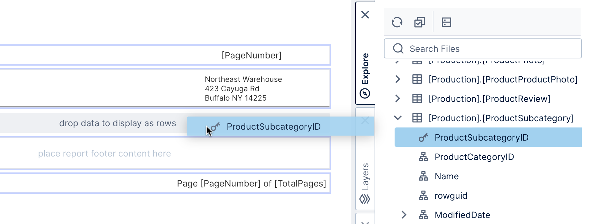
This will insert Group Header, Group Body, and Group Footer regions for the subcategories, and automatically add a header and corresponding data label to display the subcategory IDs.
For this example, select the header and data label and click Delete in the toolbar, because the design of this particular report does not display these IDs directly.
2.5. Add subcategory names
For our example, we started with IDs but we want to display the name of the subcategory in each of the repeated rows.
In the Explore window, drag the Name column from the same [Production.ProductSubcategory] table to the Group Body region (labeled place content to repeat here).
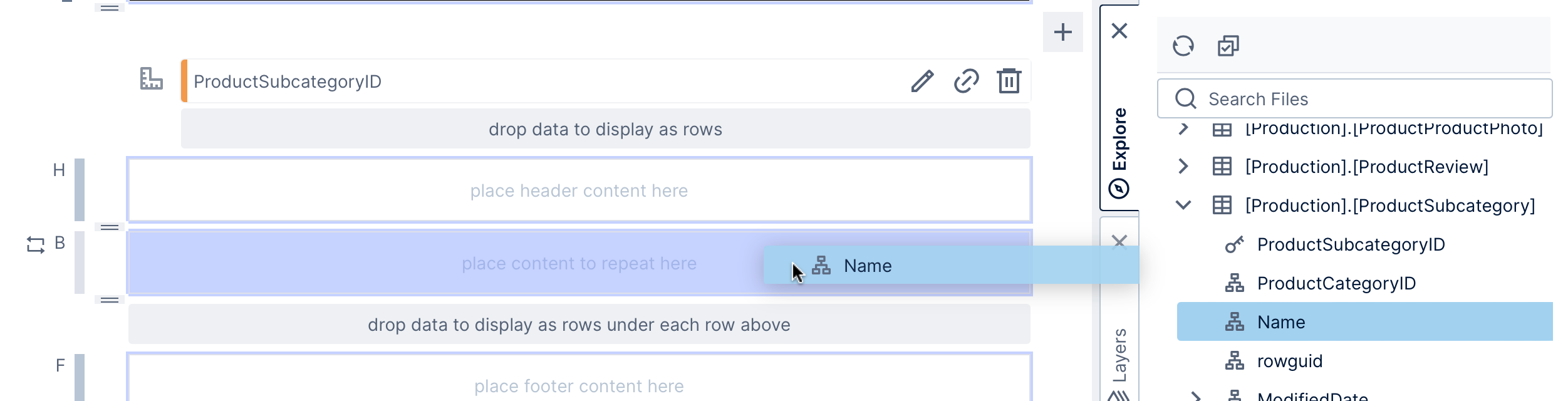
This automatically adds a header and corresponding data label for the names. For this example, select and Delete the unneeded header, and resize the width of the data label to fit longer names. (In Edit mode, the data label displays (All), but it will display the subcategory name when you switch to view mode.)
Set the Font Weight property for the data label to 500 (or Bold).
Click an empty part of the group body region to select it. Under Lines & Fills, set its Background property to #F2F2F2, and under Layout & Spacing set its Height to 40 pixels for this example. (You can also drag the resizer on the left of the group body to change its height).
Next, click Components and add another Line, this time in this group body region to separate each subcategory.
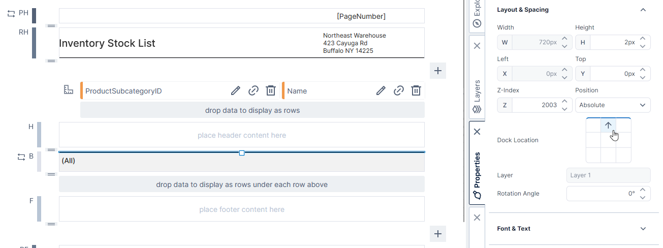
Set it up like the previous line, except dock it to the top, with the Top property set to 0.
2.6. Add product rows
We want to show a list of products within each subcategory along with the quantity and list price information. We can do this by adding a child (or nested) group inside our existing subcategory grouping.
In the Explore window, find and expand the [Production].[Product] table, and drag the ProductID column onto the child grouping hierarchy region (drop data here to repeat content for each value within every value above).
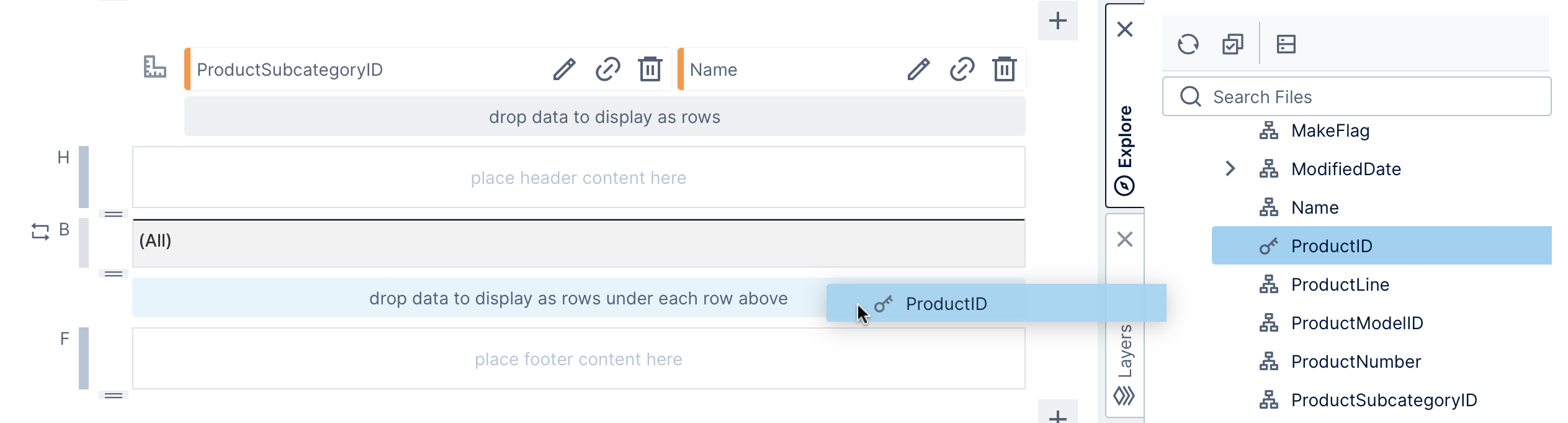
This will automatically insert a Group Header, Group Body, and Group Footer region for the products.
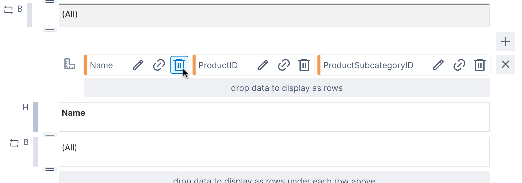
The subcategory ID and name hierarchies are automatically added from the parent group, along with headers and data labels to display the data. Since we don't want to display subcategories or product IDs in the product rows, we can delete these headers and data labels from the child group header and body.
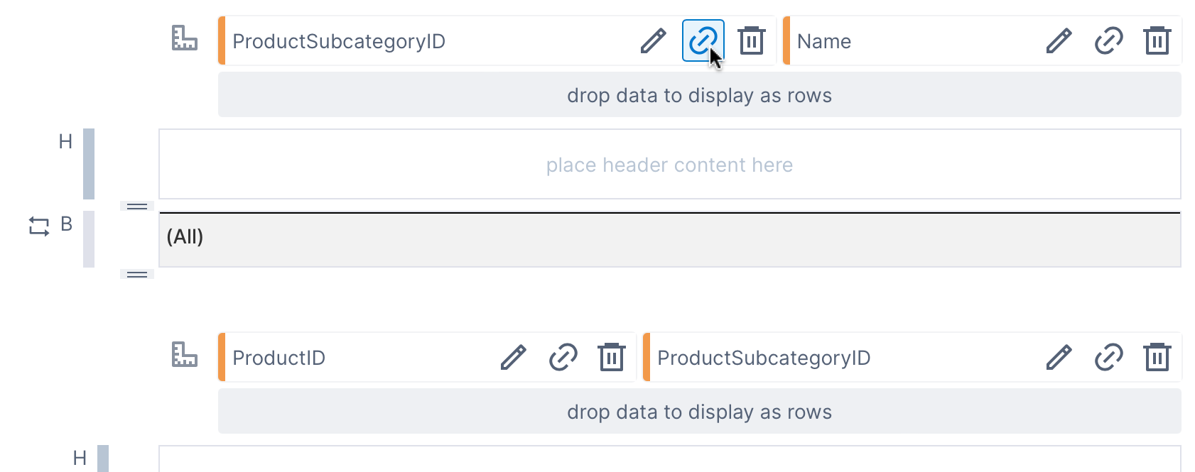
2.7. Link the parent group and child group
The parent group and child group each have their own data: the parent has the product subcategory data and the other has products, and they are related in this case by common ProductSubcategoryID values.
In our example, the product rows don't need the subcategory's Name column and we can remove this from the child group we just added in the previous section.
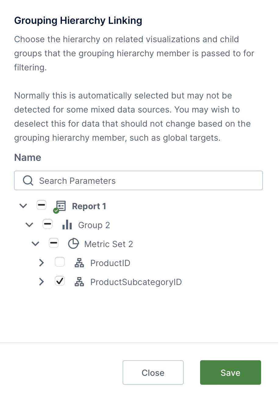
In many cases the child group will be linked correctly automatically, but you can confirm or change this by clicking the link icon next to each hierarchy in the parent group. For our example, click the link button for ProductSubcategoryID.
In the Grouping Hierarchy Linking dialog, select the matching ProductSubcategoryID data in the child group.
2.8. Add product data
Now we can drag the data we want to see in the child group body region: from the [Production].[Product] table, drag Name and ListPrice, and from [Production].[ProductInventory], drag Quantity.
Headers for this data are added automatically to the child group header, which will display them above the product data within each subcategory group, repeating them for each subcategory.
This would be helpful for many report designs, but to produce the design in our example report, we can Delete the header for product Name and drag the ListPrice header to the right edge of the parent group header instead, followed by Quantity. Reposition the corresponding data labels if needed to the right so they line up with their headers.
To complete the rest of the design for the product rows and headers:
- You can double-click the ListPrice header or select it and choose the toolbar option to change its text to Price. In the Properties window, uncheck Show Sort & Filter Menu.
- The product name data label should be resized to be as wide as possible to fit longer names.
- Click to select the group body region for products (you can click the area labeled B to the left). In the properties window under Layout & Spacing, set Height to 40 like the subcategory rows.
- Choose Components and then Line in the toolbar to add another separator line, this time between products. Set it up similar to the previous ones: Black except with only a 1px width, with height set to 1 to match, and docked to the top.
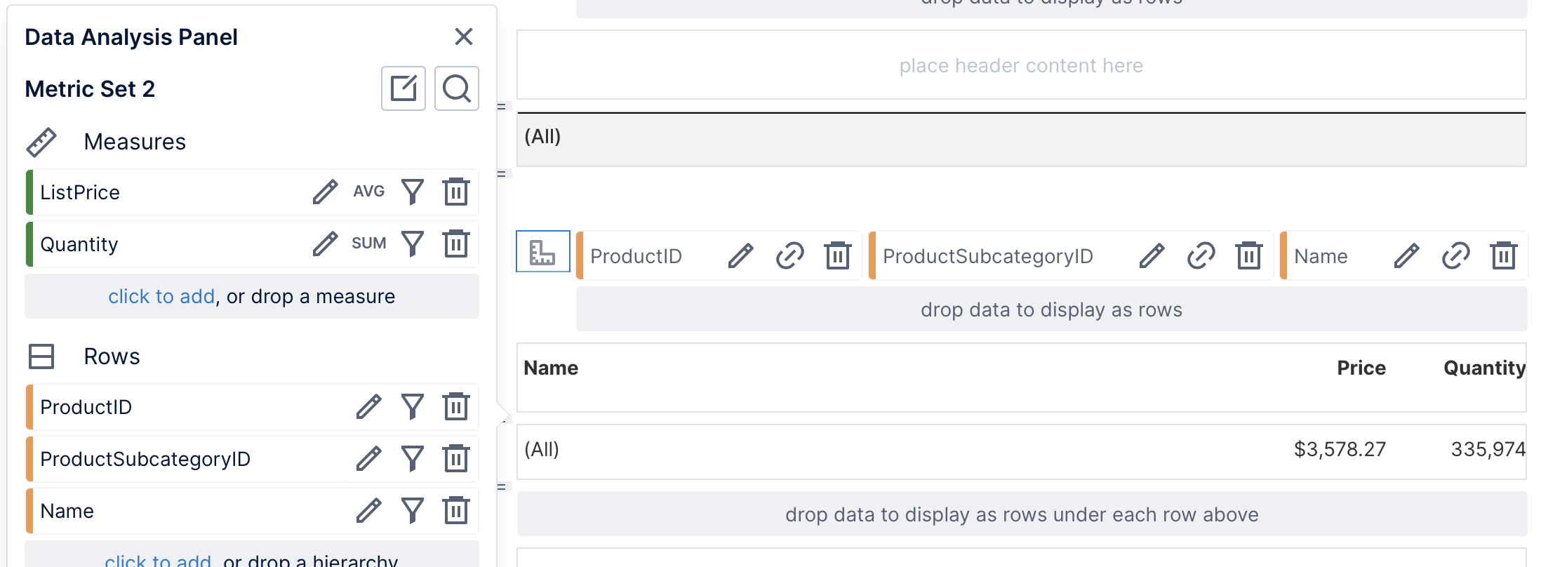
These data labels display data from the group metric set by default, so to make changes to it, click the metric set icon to the left of ProductID to open its Data Analysis Panel.
For example, you can change the aggregator for ListPrice to Average. Click to edit ListPrice and then click Define text formatting to set up currency formatting.
2.9. Placeholder label in the page footer
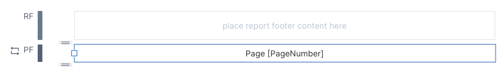
Reports are automatically given labels in the page header and footer displaying the page numbers, but you can optionally customize these. You can also drag predefined placeholder labels like these from the Labels window, normally docked to the right side of the screen.
To recreate the example report design, Delete the label from the page header.
Double-click the label in the page footer or select it and choose the toolbar option to change its text, and set it to Page [PageNumber]. Resize the label's width so that the text is centered on the page.
2.10. View the report
Switch to View mode in the toolbar to see the report produced by this design, and scroll down through subcategories to find the products listed for each.
To view the report as a PDF that you can save, share, or print, click Share in the toolbar and choose PDF. You can also set up a Notification to schedule a one-time or recurring e-mail to the recipients of your choice with the PDF attached.
While you can obtain a similar result with a single table visualization on a dashboard, reports provide complete flexibility with the layout, as well as a paginated, printable result.
This particular example only used data labels, but you can add or re-visualize to any type of visualization and use the same set of properties and metric set options to customize them as on dashboards. For example, the report shown in Report basics and concepts added bar charts to the report footer, or you could re-visualize the Quantity or Price data labels. For more report options such as page breaks and displaying headers on each page, see Design tips for reports and scorecards.
3. See also
- Report basics and concepts
- Design tips for reports and scorecards
- Adding a data label
- Adding a table of contents
- Building a scorecard
- Sorting and filtering a report or scorecard
- Using a data cube to join tables
- Data cube storage types
- Video: Scorecards and Reports
- Video: Scorecards and Reports part 2