
1. Overview
This article demonstrates how to use automatic joining and hierarchies to combine related data together while working with a metric set.
In keeping with the self-serve paradigm, some things are done automatically to save you time as you drag-and-drop items from the Explore window to the canvas, such as joining two tables of data together when you drag a column from each into one metric set.
You can also drag a hierarchy that was set up ahead of time onto a regular column of matching data, to augment it with additional capabilities such as multiple hierarchy levels and additional details made available as attributes.
The Adventure Works 2014 database is used as an example.
Related video: Creating Custom Categorical Hierarchies
2. Automatic joins
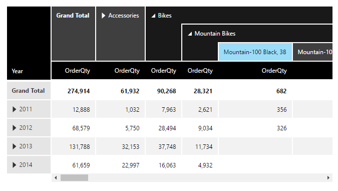
This example begins with a table visualization like the one in the View data with a chart and drill down article, which displays OrderQty as a measure, and a date-time hierarchy on the Rows axis.
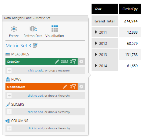
2.1. Display ProductID on Columns
In the Explore window, expand the data connector to find the table [Sales].[SalesOrderDetail], and expand it as well.
Drag the ProductID column onto Columns in the Data Analysis Panel.
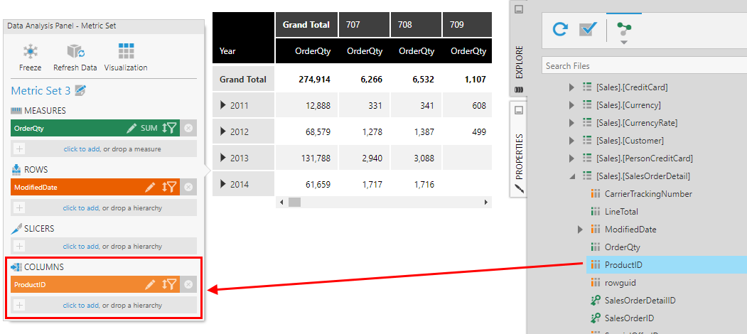
The table visualization is reconfigured to additionally display Product IDs along the columns axis.
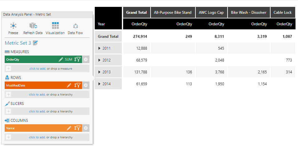
2.2. Replace ProductID with Name
Since showing product ID values is not very meaningful, find the [Production].[Product] table in the Explore window and expand it. Drag the Name column onto Columns in the Data Analysis Panel, replacing the ProductID column.
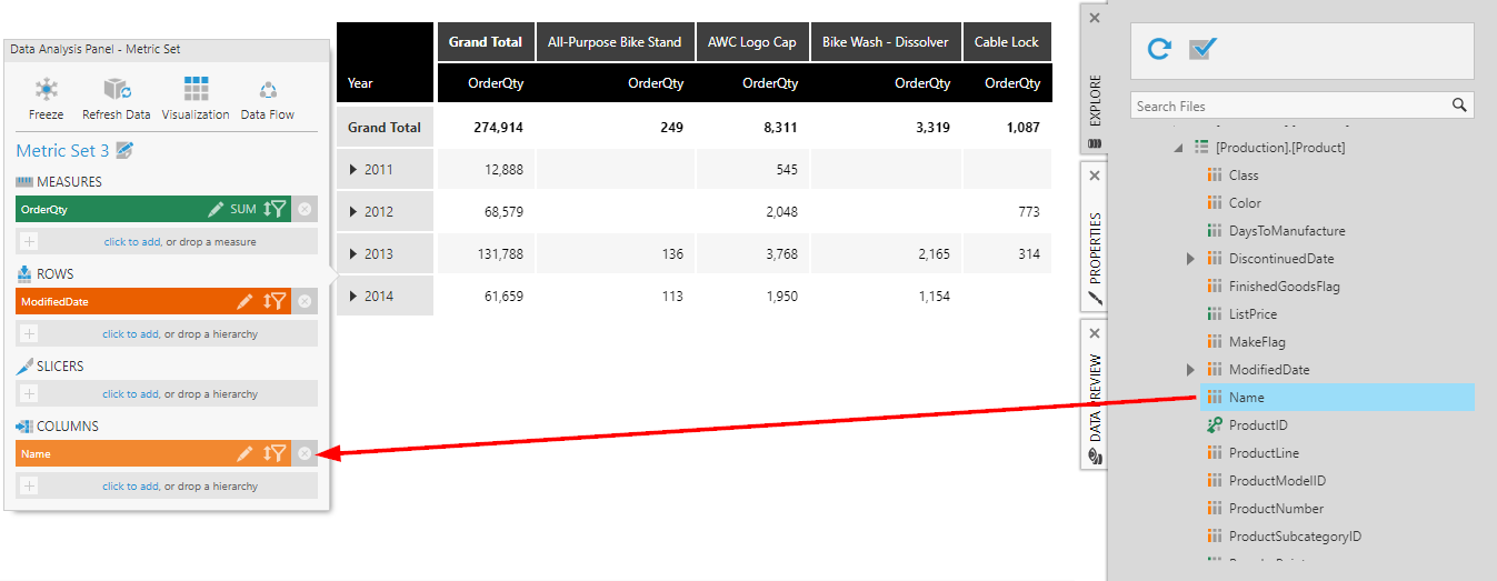
The table visualization is reconfigured to show product names on the columns axis instead of product IDs (in alphabetical order, by default).
Behind the scenes, this automatically performed a join between the SalesOrderDetail and Product tables based on their common column, ProductID, using the native relationships defined in the database. You can also create your own relationships for joining between any two data sources as described in the article Add a relationship between tables, or matching columns will be identified for you automatically if no relationship exists.
You could choose to drag additional data from this table to take advantage of auto-joining, for example by dragging Color to Slicers in the Data Analysis Panel.
2.3. Edit automatic joins
After adding data from multiple tables or data sources, you can see and change how the data is automatically joined. While editing the metric set full screen, click the Data Flow button that now appears in the Data Analysis Panel.
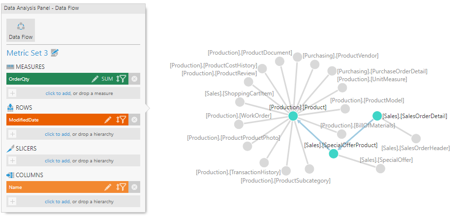
The green and blue nodes in the diagram represent tables that have been joined, and gray nodes represent additional related data that is not used but available to add.
The arrows indicate the order in which the tables were joined. View the join relationship details for any node that an arrow points to by clicking it, or by right-clicking it and selecting Relationship Details.
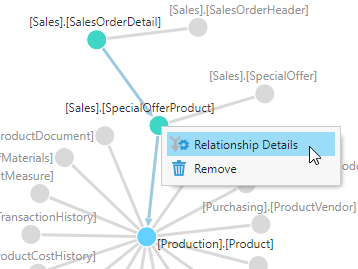
The relationship popup lists the columns of the two input tables and includes settings to determine how they are joined.
The existing key elements are indicated by key icons shown next to the column in each table that matches with the other.
To define a key binding, drag a column from one input table and drop it onto the column containing matching values in the other table. You can click the Delete icon to remove a key binding when you have multiple.
Change the join type if you want to change which records should be included:
- Inner Join - Only records with matching key values in both input tables.
- Left Join - Only records with a key value in Left Input.
- Right Join - Only records with a key value in Right Input.
- Full Join - All original records will be included.
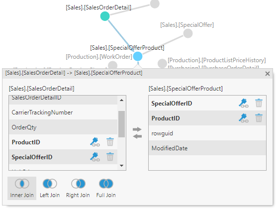
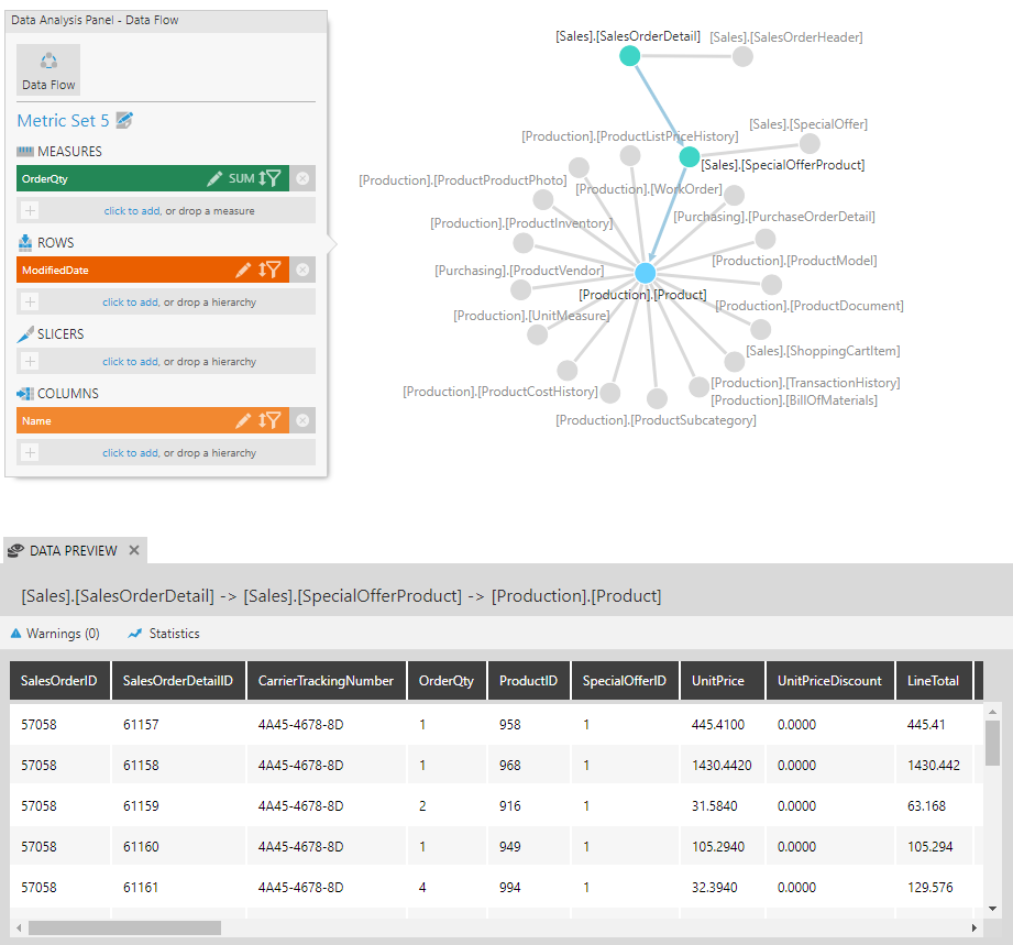
When a node is selected (shown as blue), you can open Data Preview to see the data that has been joined up to that point and verify that it looks correct.
When relationships have been created to your current data by other users or in your database, the related tables are displayed as gray nodes. You can right-click one and select Expand to view all the other data related to that table in the diagram to explore.
To join with a table represented by a gray node and add it to the visualization, right-click it and select Add to Visualization.
To join with other data not in the diagram, drag a table from the Explore window. This will add a new node in the diagram and a new join relationship that you can configure.
Click the Data Flow button again to return to your own visualization and the regular metric set options on the Data Analysis Panel.
3. Hierarchies
Now we will create a hierarchy to allow us to do more with this column of products. Hierarchies that are set up ahead of time like these are sometimes called 'user' hierarchies.
3.1. Create a Product hierarchy
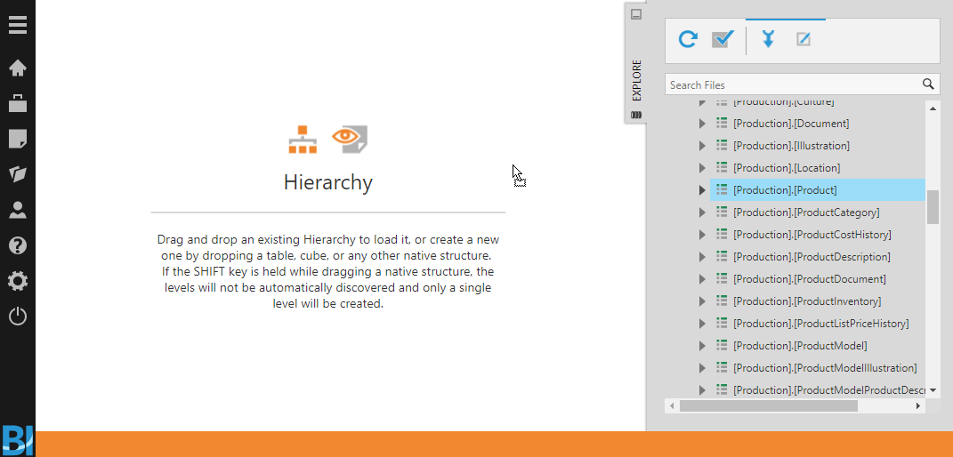
Choose Business in the main menu, click to choose the Hierarchy file type, then click Create and choose a Standard hierarchy.
This opens the Hierarchy editor, which lets you define a hierarchy by dragging items from the Explore window or a data file from your desktop.
As an example, expand your data connector in the Explore window and find the [Production].[Product] table. Drag the table (or one of its columns) to the canvas.
An automatically defined hierarchy Structure is displayed with a Preview to the right, allowing you to explore the resulting hierarchy as a set of members arranged in a tree view.
The name of your new hierarchy is displayed in the status bar at the bottom, where you can double-click to rename it.
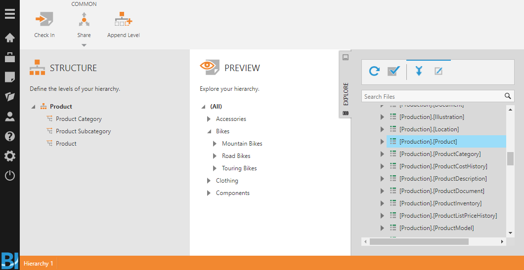
In this example, three levels of a Product hierarchy have been automatically generated based on existing relationships between the Product table and other tables.
Under Structure, you can select a level if you want to customize its options in the Configure Hierarchy Level popup, including its keys and display captions and default sorting. After selecting a level, you can click to add a new one from the toolbar either above or below it.
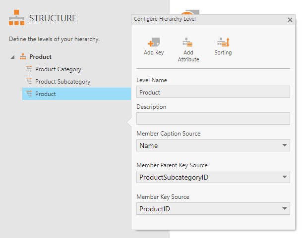
In this example, ProductID was automatically set as the Member Key Source of the Product level, which is used to uniquely identify each product member. These key values match our original ProductID column's values, so we will be able to use these together.
3.2. Replace ProductID with Product hierarchy
Next, go back to the metric set from Section 2.
Instead of replacing the product IDs with a simple Name column, we will replace it with our new hierarchy: remove Name from under Columns and re-add ProductID in the Data Analysis Panel.
From the Explore window, drag the hierarchy you created onto ProductID to replace it.
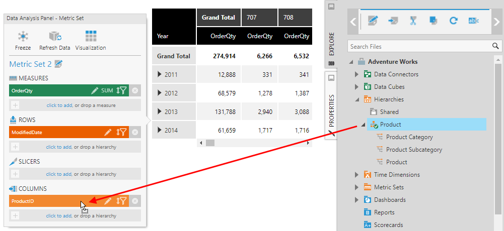
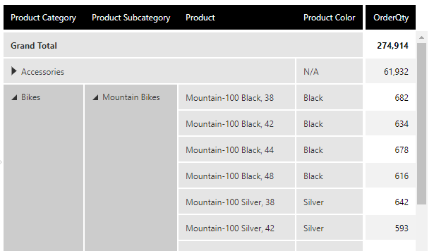
The Columns axis of the table visualization now shows product categories, which you can expand to see product subcategories and expand again to see products. Since the Name column was indicated as the Member Caption Source for the hierarchy, the captions are taken from the Name column of each hierarchy level.
In this case the hierarchy's lowest level Product was set up with keys that matched our ProductID column. If you are working with a column of values that matches the keys from a different level of the hierarchy than the bottom one, expand the hierarchy in the Explore window and drag that specific level instead on top of your existing column to replace it with the hierarchy from that level up (e.g., drag the Product Subcategory level in our example above on top of a column containing subcategory IDs).
4. Attributes
Attributes are optional additional details from your hierarchy level's data source that automatically become available to add to the metric set once the hierarchy is used. Attributes can describe the members of a hierarchy level, like the color or size of each product in the Product level of the hierarchy.
4.1. Add attributes
To add attributes to our Product hierarchy, re-open it from the main menu. For this example, click to select the Product level to open its details.
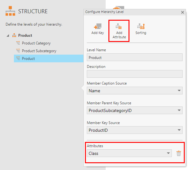
Click Add Attribute in the Configure Hierarchy Level popup for each attribute that you want to add, and under Attributes, choose one of the columns from this level's data source. From our example data source, you can choose Color, Class, Size, Style, and others.
4.2. Use attributes
Navigate back to the metric set to use the attributes in a visualization.
To have a better look at our products, we can click the x button next to ModifiedDate in the Data Analysis Panel to remove it, then drag ProductID from Columns to Rows in the Data Analysis Panel.
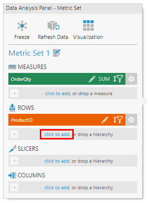
Next, we can click to add an attribute of the Product hierarchy.
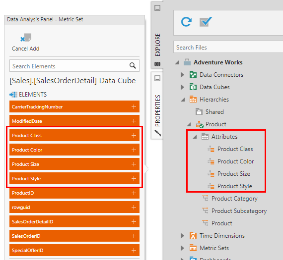
Select an attribute from the list. Alternatively, you can find these attributes in the Attributes folder under the hierarchy in the Explore window, which you can then drag to add.
Since we added attributes to the Product level in our example, click to expand or right-click to change the level down to Product to see these product details we added as attributes.
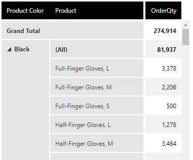
These attributes are known to describe the values of the hierarchy, e.g., each Product can have only one Color. Additional totals and expander buttons are unnecessary and will be left out automatically for the attribute when selected after your hierarchy.
If you choose to, you can also place an attribute before its hierarchy, or on its own. In this case, totals and expanding/collapsing work as they normally do for other hierarchies. The figure below shows the result of dragging to re-order Product Color first and displaying the Product level of the hierarchy afterward.
5. See also
- Video: Creating Custom Categorical Hierarchies
- Metric set analysis tools
- View data with a chart and drill down
- Add a relationship between tables
- Create a ragged hierarchy
- How to create a custom user hierarchy
- Transform: Process Result