1. Overview
This walkthrough shows you how to use scorecards to create a customized table with complete control over layout and support for any visualization in its rows. This example displays a row for each product with a different visualization used for each measure.
A scorecard is another type of view and is similar to a report, but while reports are laid out into pages including page headers and footers and are ideal for PDFs or printing, scorecards are focused on the design of a custom table displayed on screen. You can also add it to a dashboard just like you would display a table visualization.
Related video: Scorecards and Reports
2. Designing the scorecard
This example uses a data connector pointing to the Adventure Works sample database for Microsoft SQL Server Analysis Services (SSAS), but you can follow similar steps with any data source.
2.1. Create a new scorecard
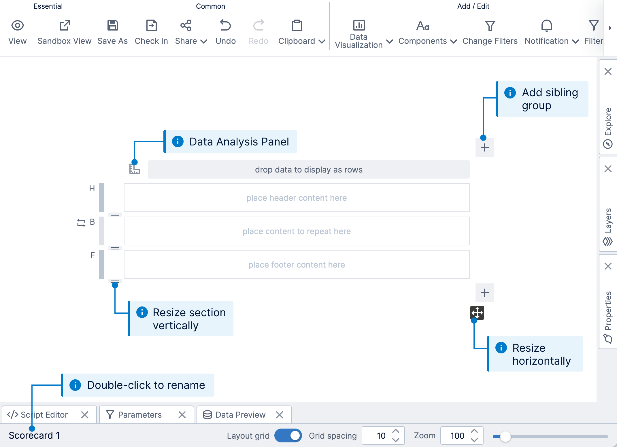
In the main menu, click Views, choose Scorecard along the top, then click Create.
This opens a new scorecard in edit mode.
To change the width of the scorecard, click and drag the diagonal arrow icon to the bottom-right of the editor.
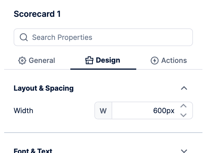
You can also set a precise width by opening the Properties window, and finding the Width property in the Design tab under Layout & Spacing. (If some element on the canvas is selected, click a blank area to de-select it first to access the overall scorecard properties.)
2.2. Add a row grouping
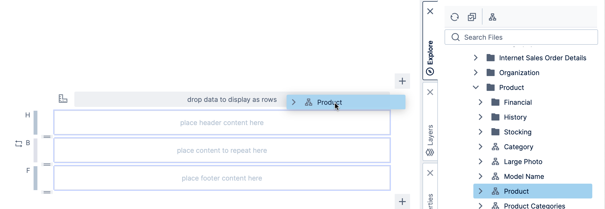
From the Explore window, drag data that contains a value for each row you want the scorecard to display.
In our example, we expanded the Adventure Works cube, dragged the Product dimension and dropped it onto the row grouping area (drop data to display as rows). This will cause the body region we are designing (labeled B along the left) to be repeated for each product.
For convenience, a pair of items are automatically added to the scorecard: a data label in the body region, which will display the product name, and a header in the header region.
You can click View in the toolbar to see the scorecard with product names displayed in each row, then switch back to Edit.
2.3. Display sales by date
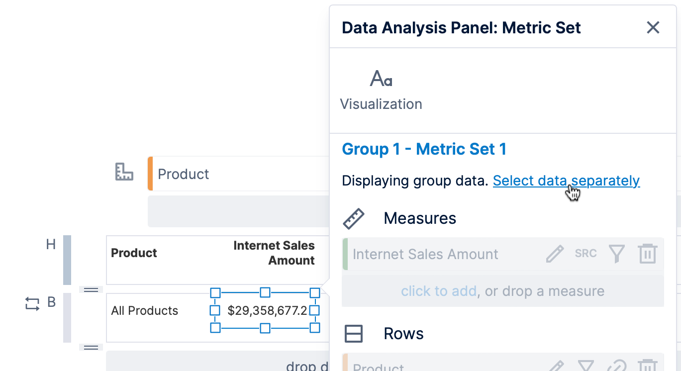
To display more data, we drag the Internet Sales Amount measure from the Explore window onto the body region. The corresponding data label and header are created automatically next to the product names.
The Data Analysis Panel for this data label opened automatically, showing that it currently displays the data from the scorecard group itself, e.g., data grouped only by each product. Click Select data separately if you want to create a separate metric set for this visualization that can display data grouped by additional hierarchies, such as a sparkline displaying multiple points at different dates in every scorecard row.
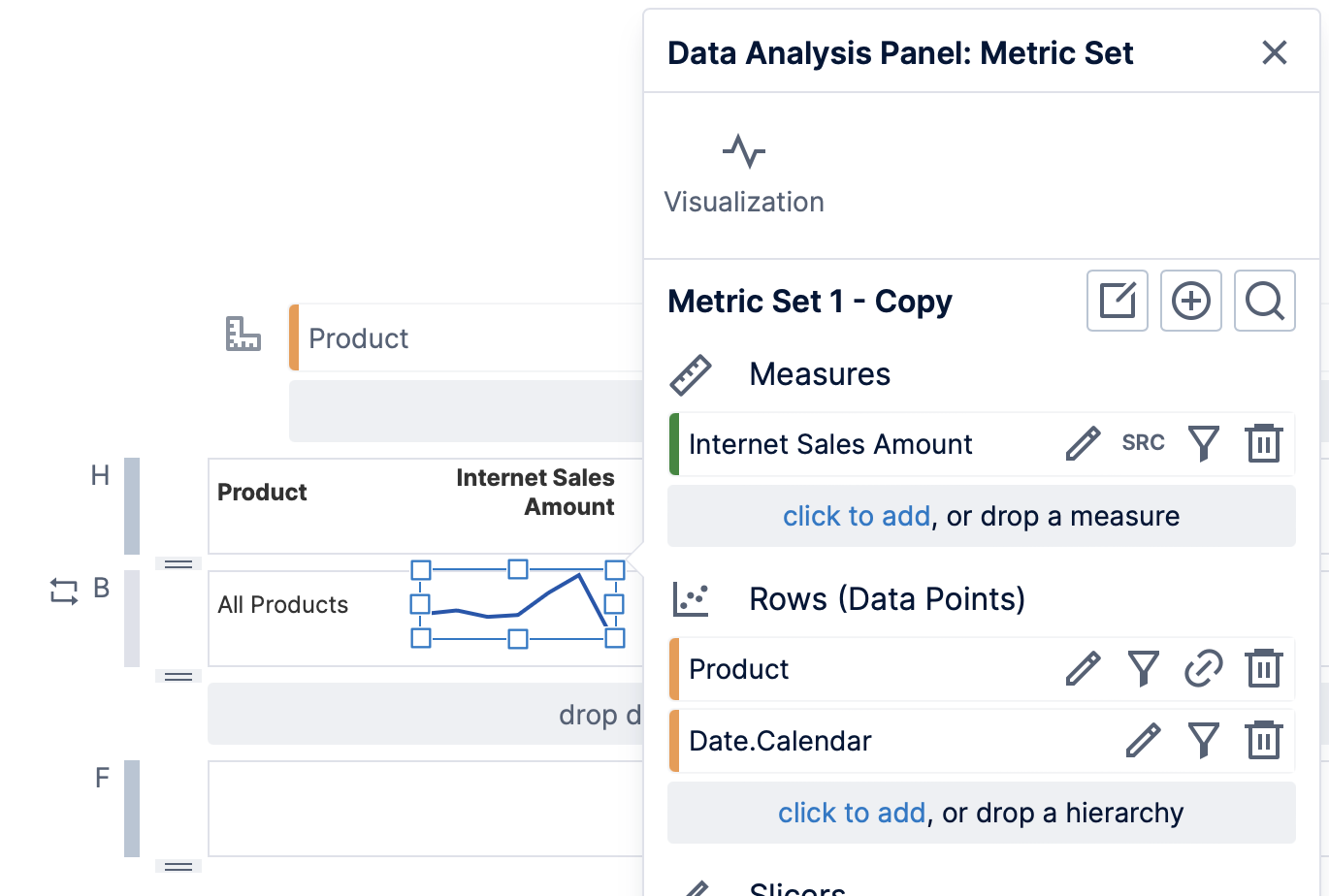
We have done so, and then dragged the Date.Calendar hierarchy from the Explore window to Rows in the Data Analysis Panel.
The data label may now automatically re-visualize to a sparkline, or you can choose Re-Visualize in the toolbar and then Sparkline.
2.4. Display the order count
From the Explore window, drag the Order Count measure to the body region.
The corresponding data label and header label are created automatically.
2.5. Display the sales by territory
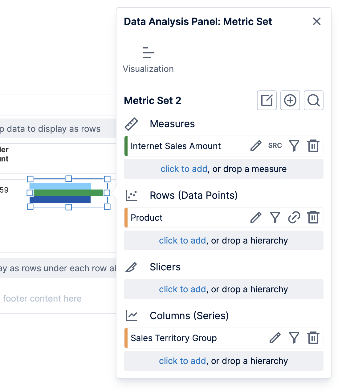
In the toolbar, click Data Visualization and select Data Bar as an example of how to start with a blank visualization instead of dragging data directly to the canvas.
We dragged the Internet Sales Amount measure onto the empty visualization. Notice in the Data Analysis Panel that the Product grouping hierarchy was added automatically, but that the metric set is already separate from the group in this case.
Drag the Sales Territory Group hierarchy from the Adventure Works cube to Columns.
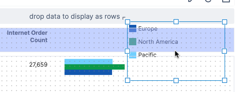
You can connect a legend to this data bar just like adding a legend to a chart on a dashboard: with your visualization selected, click Data Visualization in the toolbar, and then Legend.
To display the legend just once at the top, we can drag to move it to the header region above.
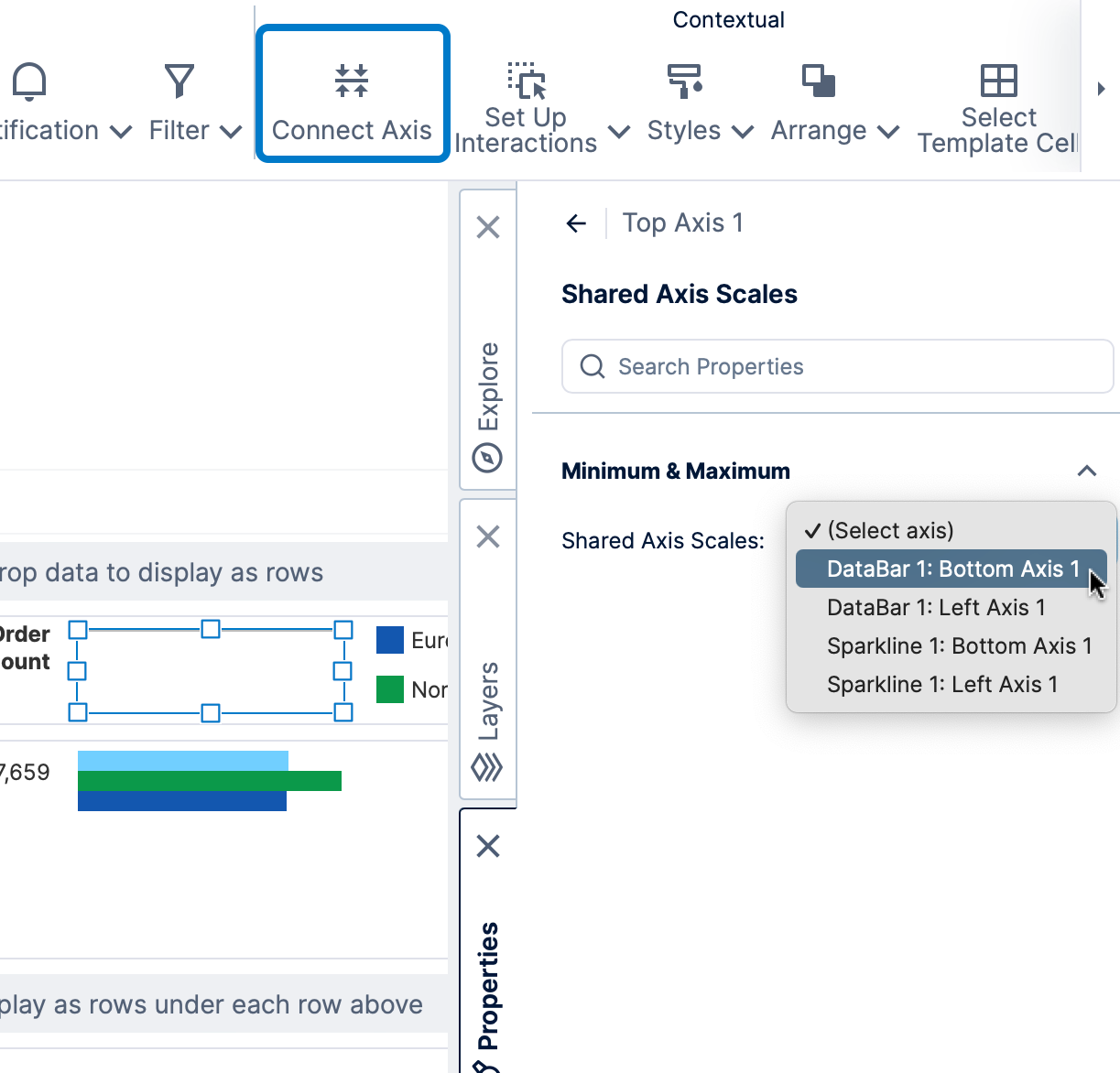
2.6. Add an axis
An axis can be added to the header or footer of a scorecard to use as a reference for visualizations such as data bars in the rows, like how an axis in used in a regular bar chart.
- In the toolbar, click Data Visualization and select Axis.
- Drag the axis visualization to the header area, above the data bar, and resize it to match the visualization.
- With the axis selected, click Connect Axis in the toolbar, and for this example select DataBar 1: Bottom Axis 1 from the dropdown that appears in the Properties window.
2.7. Adjust the group header area
The group header area appears only once for the list of products. As examples of how you can set its appearance:
- Set the background color of this area by clicking an empty spot inside it, opening the Properties window, and expanding Lines & Fills (previously the Look tab) to change the Background property.
- In the Properties window under Layout & Spacing (previously in the Main tab), select the Sticky option to keep the header 'frozen' at the top as you scroll the scorecard down.
- Add a line at the bottom of the header by following the same steps as shown for a report: clicking Components in the toolbar and choosing Line, then positioning it along the bottom.
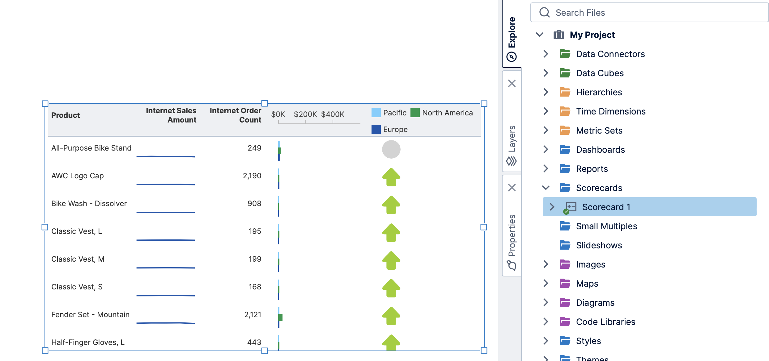
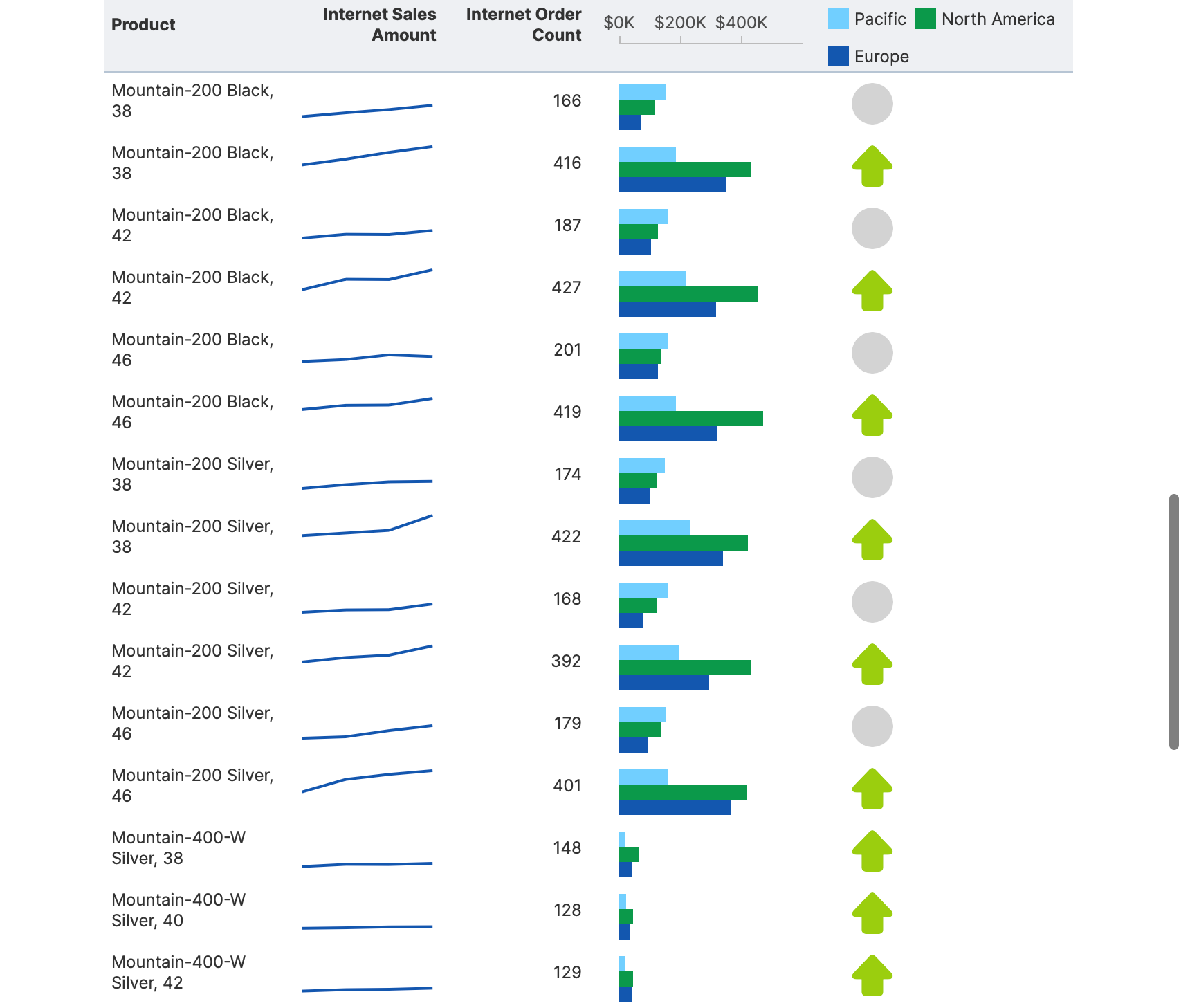
2.8. View the final scorecard
Click View in the toolbar to see the completed scorecard. (We added an additional state indicator to our example comparing recent sales figures against the previous period.)
You can hover a header such as Internet Order Count and click the icon that appears to open the sort and filter popup, and sort by Descending order, for example.
3. Using the scorecard in a dashboard
While editing a dashboard, drag the scorecard from the Explore window to your canvas. You can reposition and resize the scorecard as you would with any other visualization.