
1. Overview
A collection of design tips and brief how-tos for designing reports and scorecards, which can also help for small multiples.
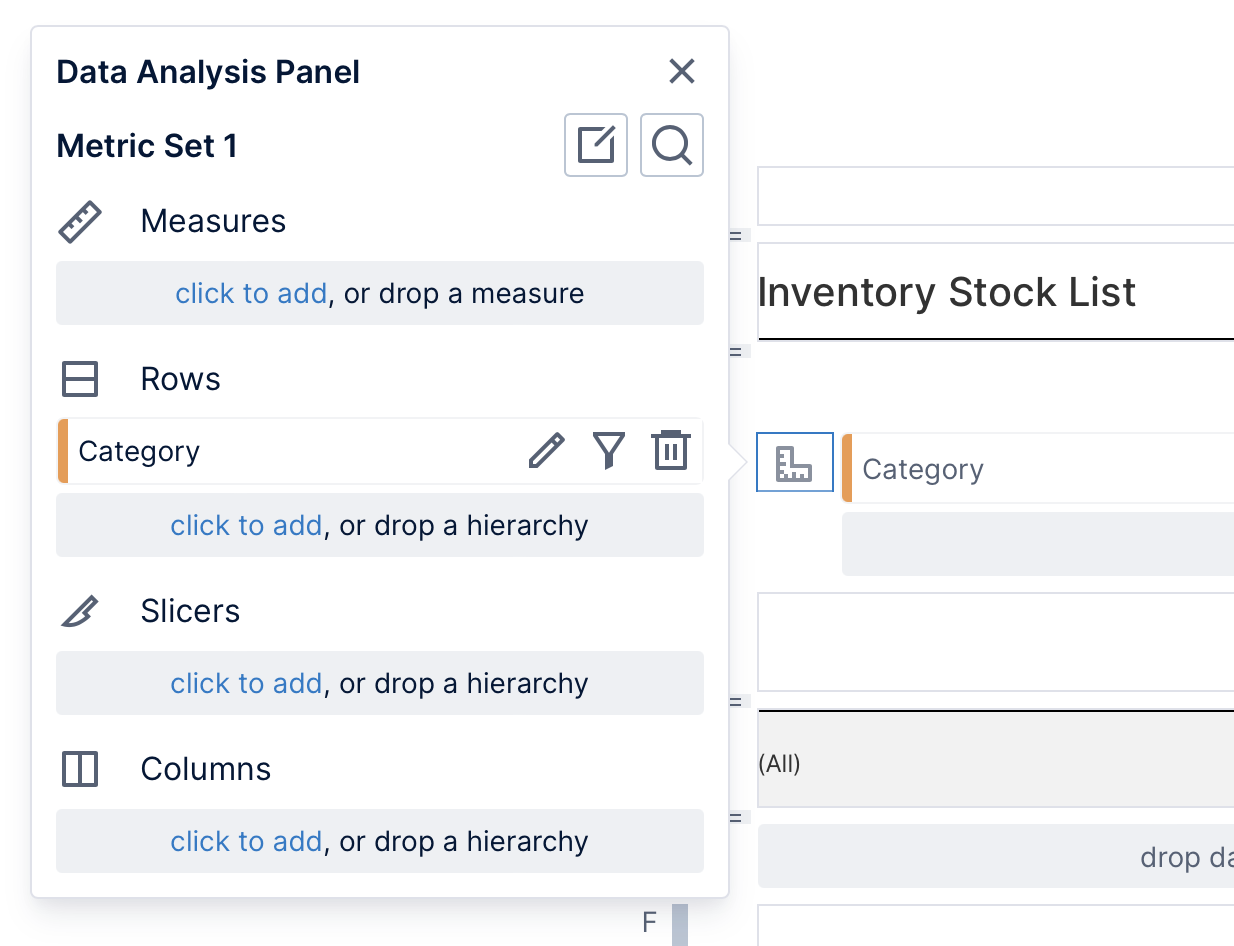
2. Auto create
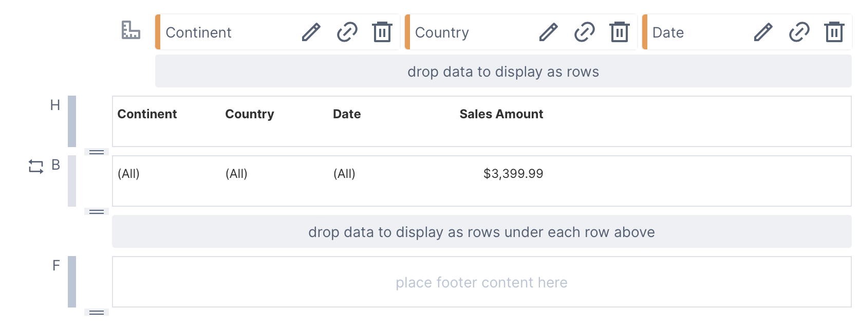
You can quickly create a report or scorecard for a whole table or sheet from a data connector, or an existing metric set, by dragging it from the Explore window onto the grouping drop area (labeled drop data to display as rows)
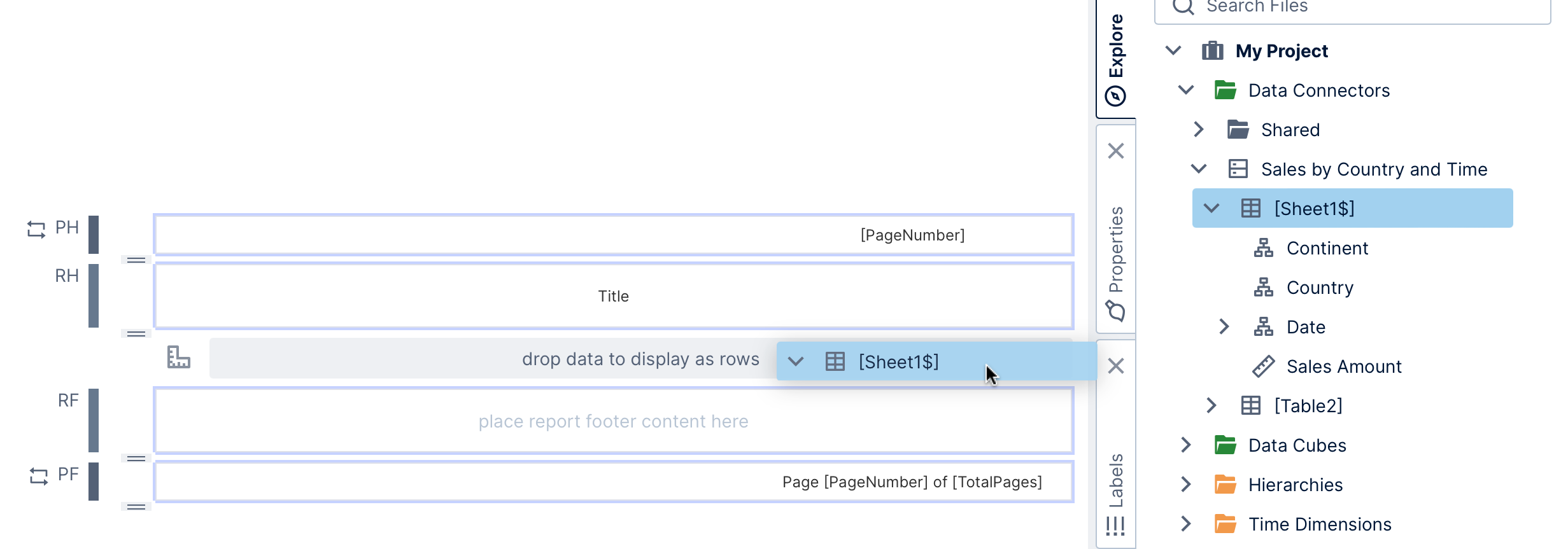
The grouping is automatically populated with header and data label pairs for each column in the table.
Alternatively, drag individual columns, measures, or hierarchies directly to the body region (labeled B to its left) to auto-create a table-like layout in a similar way one column at a time.
3. Positioning elements
3.1. Aligning
As you drag or resize an element, contextual guidelines (dotted lines) appear to help you align with other elements. When your element snaps into alignment with another, these lines and the boundaries of aligned elements appear.
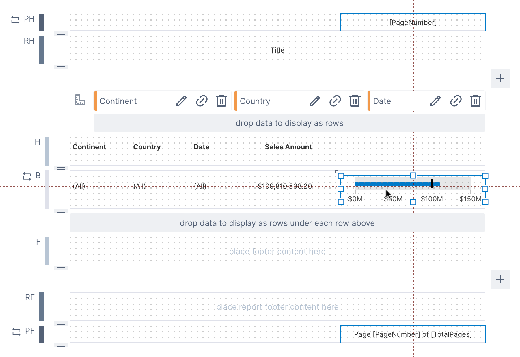
When an element in a body region snaps into alignment with an element in the header region, the contextual guidelines will include small icons and the elements become bound to one another. Afterward, moving the element in the header region will also move the element in the body region. Moving the element in the body region will break the bond.
If you want to temporarily disable these contextual guidelines, press and hold the Alt or option key on your keyboard while dragging or resizing your control.
If the snap grid is enabled, your element will also be snapped to the grid while dragging or resizing. If you want to turn off or customize the snap grid, go to the status bar and click the grid & magnet icon with the description Disable snap grid or customize its size. You can also disable this snapping temporarily by holding the Ctrl key on your keyboard.
3.2. Arrange multiple elements
When multiple elements are selected, you can adjust their alignment using the Arrange option on the toolbar.
To select multiple elements, click and drag to select an area containing them, or hold Shift on your keyboard while clicking to select them.
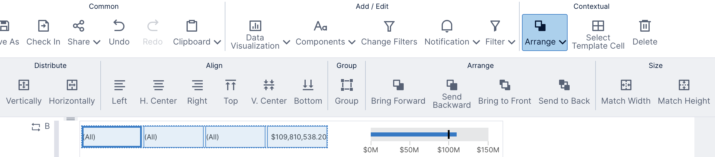
You can use these toolbar options to quickly distribute, align, or resize the positioning for multiple elements.
3.3. Resize to region edge
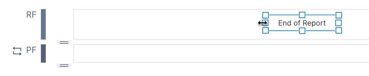
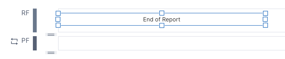
Double-click the resize handle of an element to expand/contract the corresponding side or corner of the element to the outer edge or corner of the template cell containing that element.
3.4. Resize region to fit contents
Double-click the bottom resize handle of a region's template cell to resize it to fit its contents.
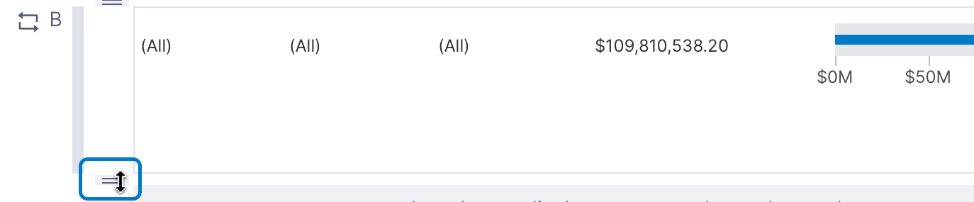
The cell will be resized up to eliminate any empty space below the contents of the cell.

3.5. Auto expand to fit
You have access to the same set of visualizations in reports, scorecards, and small multiples as you do in dashboards, but the table and data label visualizations have an additional option Auto Expand To Fit in the Properties window, found in recent versions in the Design tab under Layout & Spacing.
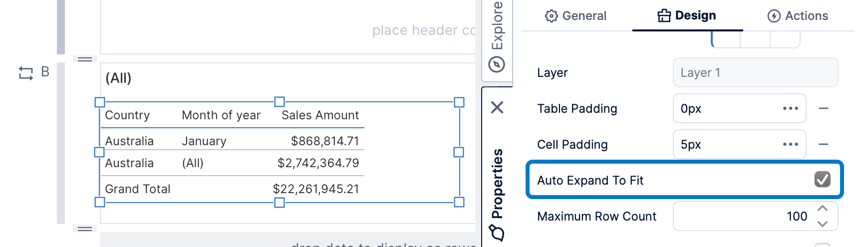
When enabled, if the rows of a table do not fit within the height that was set for it in edit mode, it will automatically expand as needed to fit the additional rows rather than show a scrollbar. A data label will similarly expand in height as needed to fit additional lines of text rather than cut it off if this option is enabled.
Content that was placed below this table or data label when editing will be pushed downward to fit the expanded content.
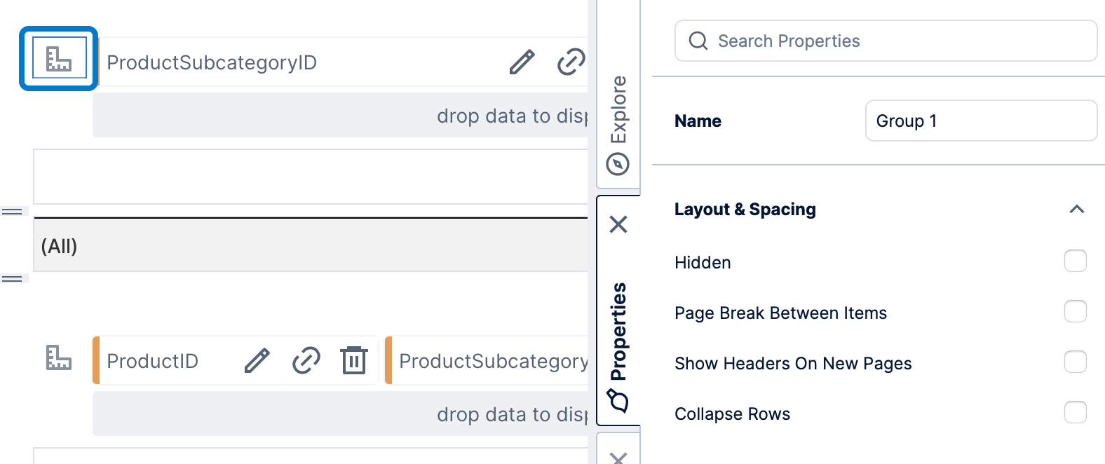
4. Customizing region cells
Template cells (or regions) in reports, scorecards, and small multiples have properties available related to appearance and sizing.
Click within a body cell, for example, and it will be highlighted with a dashed, red border. Then go to Properties to set any of the following:
- Background - The background brush for the cell.
- Background Palette - Backgrounds to apply in sequence to the repeating rows (or columns). Applies to body cells only.
- Row Separator Lines - Display a separator line between each row or every Nth row. For body cells only.
- Height - Set the precise height of the cell in pixels.
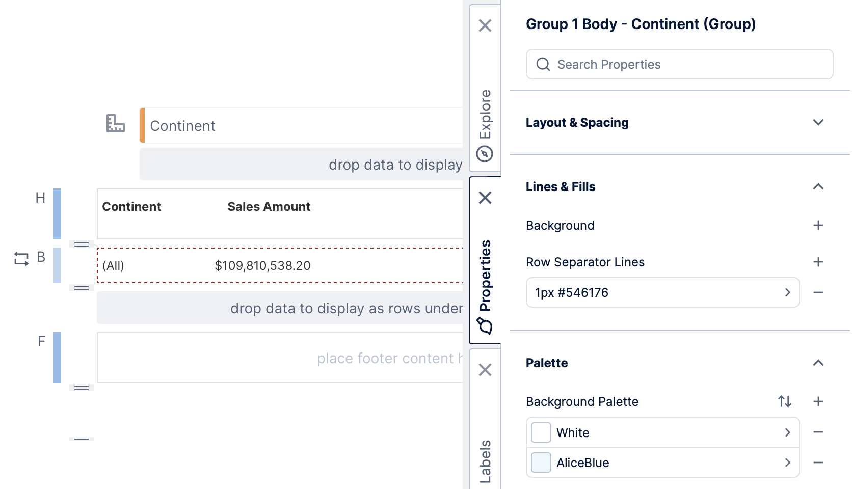
4.1. Alternating row colors
Use the Background Palette property to display alternating row colors.
With the body cell selected, go to Properties in the Design (or Look) tab. Under Palette, click the + icon for the palette twice, for example, if you want the rows to alternate between two colors.
4.2. Display separator lines
With the body cell selected, go to Properties in the Design (or Look) tab. Under Lines & Fills in recent versions, click the Row Separator Lines + icon and select the new item to edit it (e.g., 1px Black).
Increase the Interval to 3, for example, if you want to separate only every three rows. You can open the Stroke options to change its Color and Width.
5. Report options
5.1. Placeholder labels
New reports are automatically populated with placeholder labels for the page number and number of pages, but you can drag these and other metadata labels from the Labels window.
Each view parameter is also listed here so that you can display its value as a label on the report.
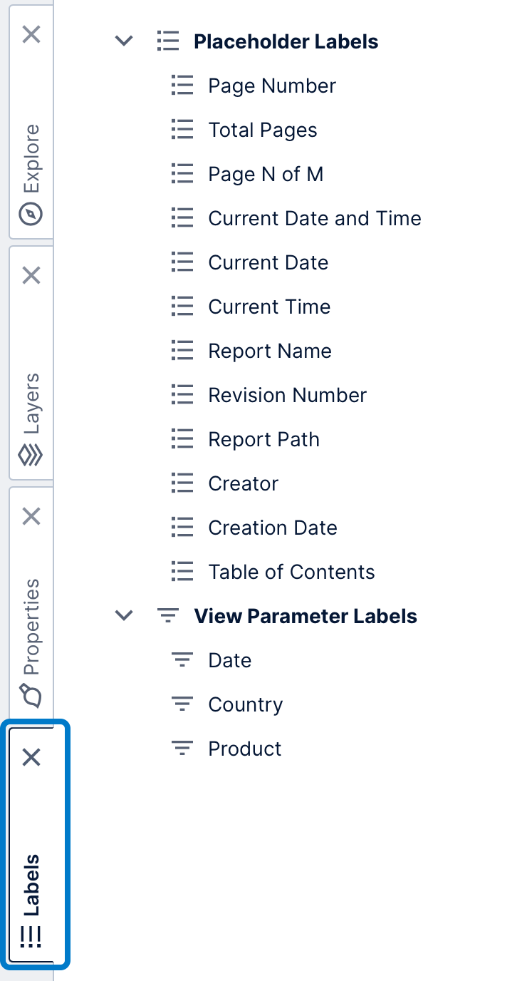
After you drag a label from the Labels window, you can customize its text and combine it with your own. Alternatively, you can add your own label from Components in the toolbar instead and set its text to include one of the placeholders:
| Label Name | Placeholder | Displayed Text |
|---|---|---|
| Page Number | [PageNumber] | The number of the current page. |
| Total Pages | [TotalPages] | The total number of pages in the report. |
| Page N of M | Page [PageNumber] of [TotalPages] | The number of the current page out of the total number of pages in the report. |
| Current Date | [CurrentDate] | The date when the report was generated. |
| Current Time | [CurrentTime] | The time when the report was generated. |
| Current Date and Time | [CurrentDate][CurrentTime] | The date and time when the report was generated. |
| Current User | [CurrentUser] | The name of the user viewing or exporting the report. |
| Report Name | [ReportName] | The name of the report. |
| Revision Number | [RevisionNumber] | The revision number of the report. This number will be changed every time the report is checked in, and will be set to -1 while the report is checked out. |
| Report Path | [ReportPath] | The full path of the report, including the project, folders, and name of the report. |
| Creator | [Creator] | The name of the user who created the report. |
| Creation Date | [CreationDate] | The date the report was created. |
| View Parameter Labels | [viewParameterScriptName] | The current value of one of report's view parameters. The placeholder contains the Script Name set in the Parameters window. |
| Table of Contents | [TableOfContents] | The table of contents entry number to display for an entry, determined at view-time. |
5.2. Page breaks
Report regions have options for displaying each of its rows on a new page or to display the content after it a new page, also called a 'page break'. For example, you may want the report to skip to a new page each time an outer or parent grouping is displayed, such as for each subcategory of products.
Select any region other than a page header or footer, and go to the Properties window under Layout & Spacing to find properties Display On New Page and Display Following Content On New Page.
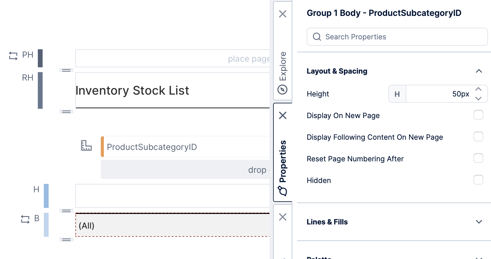
There is another setting available in the properties for a group, which inserts page breaks slightly differently.
After selecting a region, click Configure Group in the toolbar, or you can click the metric set icon to the left of your grouping hierarchies to select the group directly.
In the Properties window under Layout & Spacing, find the Page Break Between Items property.
This property is different because it only inserts page breaks between body rows within each grouping, and not before the first or after the last row.
5.3. Show headers on new pages
In large reports, the content of a group of rows may span more than a single page. You have the option of repeating the group headers on every page to help readers identify the columns.
Follow the same steps shown above to access the group properties, and set the Show Headers On New Pages.
5.4. Reset page numbering
Enabling the Reset Page Numbering After property option causes the effective page number to return to 1, and separates the pages that follow into a separate group with its own total page count. (If the next item directly after this region is a page footer, it will instead display the original page numbers, and then be reset.)
This property is available for any template cell other than page headers and footers, accessed the same way as the page break options.
5.5. Hide page headers & footers
You can hide page headers & footers just for the report header template cell, for example if you are using it as a title page.
Click to select the report header (labeled RH along the left), then find the option Hide Page Header & Footer in the Properties window under Layout & Spacing. You may want to combine this with the Reset Page Numbering After property described above.
6. Scorecard options
6.1. Sticky headers
If you want the header to always remain visible while scrolling through the rows, select the header cell, and in the Properties window under Layout & Spacing enable the Sticky option.
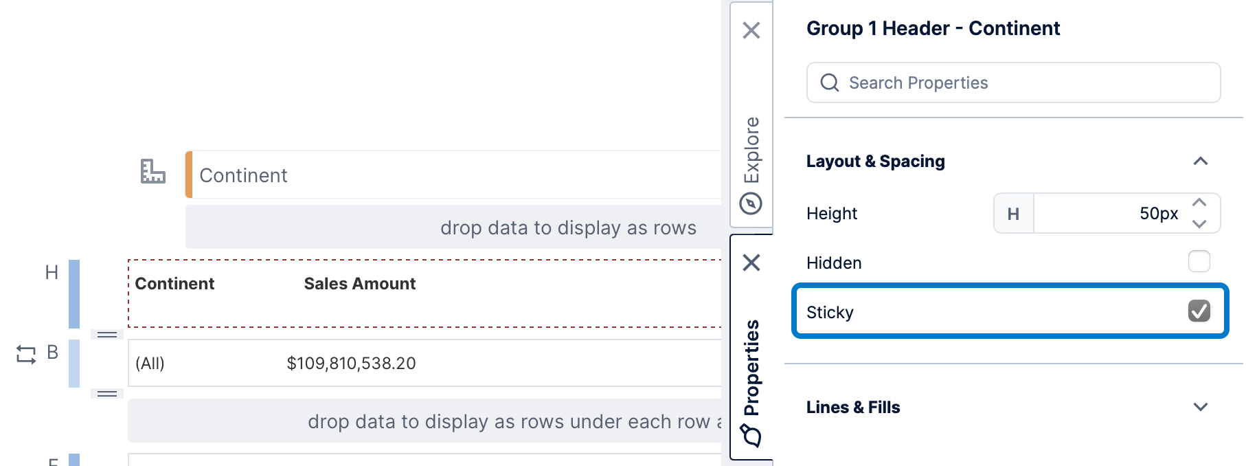
You will usually want to also set up a Background under Lines & Fills (previously the Look tab), or make other considerations for when other content has been scrolled below the header.
When viewing, the header always remains visible when any of its rows below are still visible. This is also called a 'frozen' header.
When using nested groups, you can make multiple headers sticky, and each header will remain visible when its rows are visible.
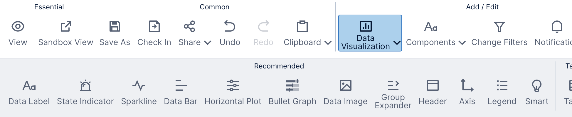
7. Recommended data visualizations
Click Data Visualization in the toolbar to see the Recommended data visualizations you can add, in addition to all of the data visualizations available in other views such as dashboards.
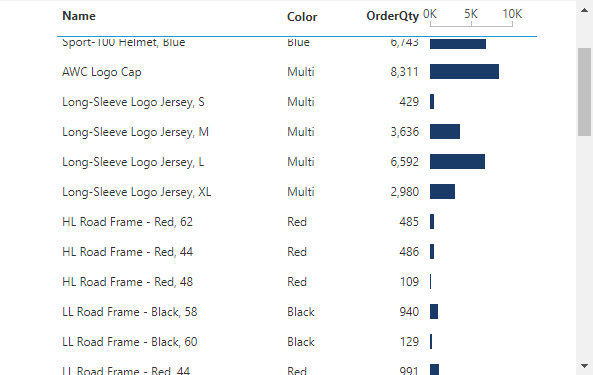
The options found under Recommended include special versions of charts and gauges with predefined options that can work well when repeated in small sizes:
- Sparkline is a line chart with both horizontal and vertical axes hidden to emphasize the historical trend of the data.
- Data Bar is a bar chart that normally displays one horizontal bar per row, with both horizontal and vertical axes hidden.
- Horizontal Plot is a version of a scatter plot along one axis, also called a strip plot, allowing you to see patterns in the distribution of points over time or by magnitude.
- Bullet Graph is a best practice version of a gauge designed for comparing metrics against their targets and other contextual values.
- Axis lets you display a single axis for charts or gauges separately in a header or footer.
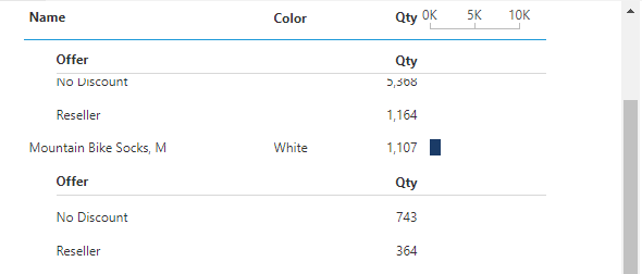
- Group Expander lets you interactively collapse or expand the rows in the group when viewing.
The options above that directly visualize data will also be available later in the Re-Visualize menu of an existing visualization.
8. Displaying group data
When dragging data directly onto a report, scorecard, or small multiple, a data label is normally created automatically to display that data, which you can then customize, remove, or re-visualize. This visualization initially displays data directly from the same group metric set used to produce the rows (or columns) of your view using the data you dragged onto the grouping hierarchy region. This can help with performance when viewing or exporting, especially when there are many data labels.
Data visualizations can also select data separately from the group, especially when they need to display multiple rows or data points within each individual visualization (e.g., a line chart that needs to connect multiple data points).
If a visualization currently displays the group metric set's data, the text Displaying group data is shown in their Data Analysis Panel and options are disabled unless you open the group's Data Analysis Panel directly. You can click Select data separately if you want to create a separate metric set for the visualization.
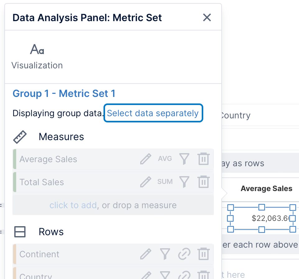
Afterward, you can select more data or make other changes just for this visualization. New visualizations added using Data Visualization in the toolbar already start out with their own separate metric set.
If you want to make changes to the group metric set when your visualizations are displaying group data, you can open the group metric set's Data Analysis Panel by clicking the metric set icon to the left of the grouping hierarchies.
In a visualization's Data Analysis Panel, you can also click the hyperlink to the group metric set (e.g., Group 1 - Metric Set 1) as a shortcut to switch to its Data Analysis Panel.
Here you can add more data, filter or sort it, or access other metric set options such as measure formatting.
8.1. No data templates
When the group metric set that determines your report's or scorecard's rows is empty, you can set up what should be displayed in its place.
With nothing selected on your report or scorecard, click No Data Templates in the toolbar. (To de-select an element, click on empty space outside of any template area.) This adds new ND (no data) template cells above each group body region for you to add content to, such as a label component.
9. Convert a scorecard to a report or vice versa
You can create a report from an existing scorecard or vice versa by using the Save As option in the toolbar.
In the Save dialog, select the new Type. You can also optionally edit the Name and Location.
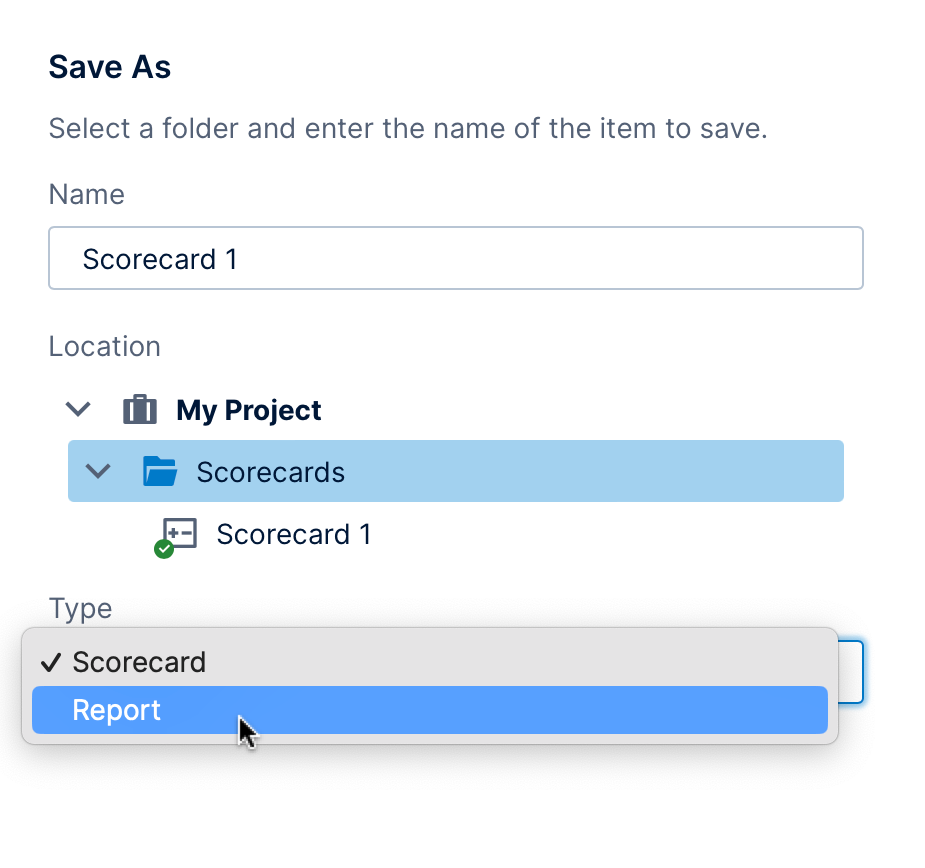
Reports and scorecards can produce similar results but you may decide that the other type is more appropriate. For example, only reports are designed to be formatted into pages according to a paper size with page headers and footers. Scorecards are usually viewed directly in the browser or added to a dashboard, and they can include optional sticky headers for scrolling.