1. Overview
A table visualization lets you display data from a metric set using a tabular view. A table is also known as a data grid or data table, and it is the default type of visualization that is used when first selecting data if you did not choose another type.
2. Elements of a table
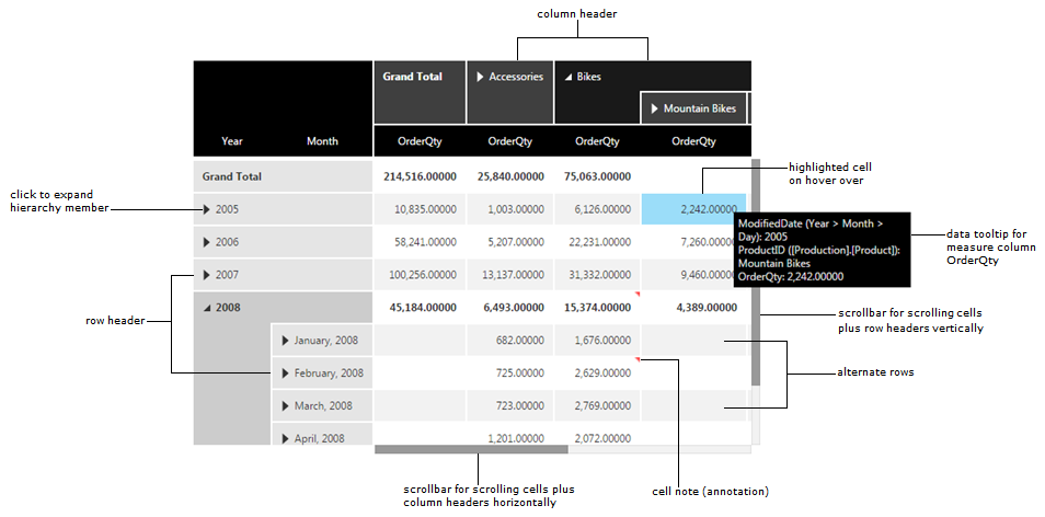
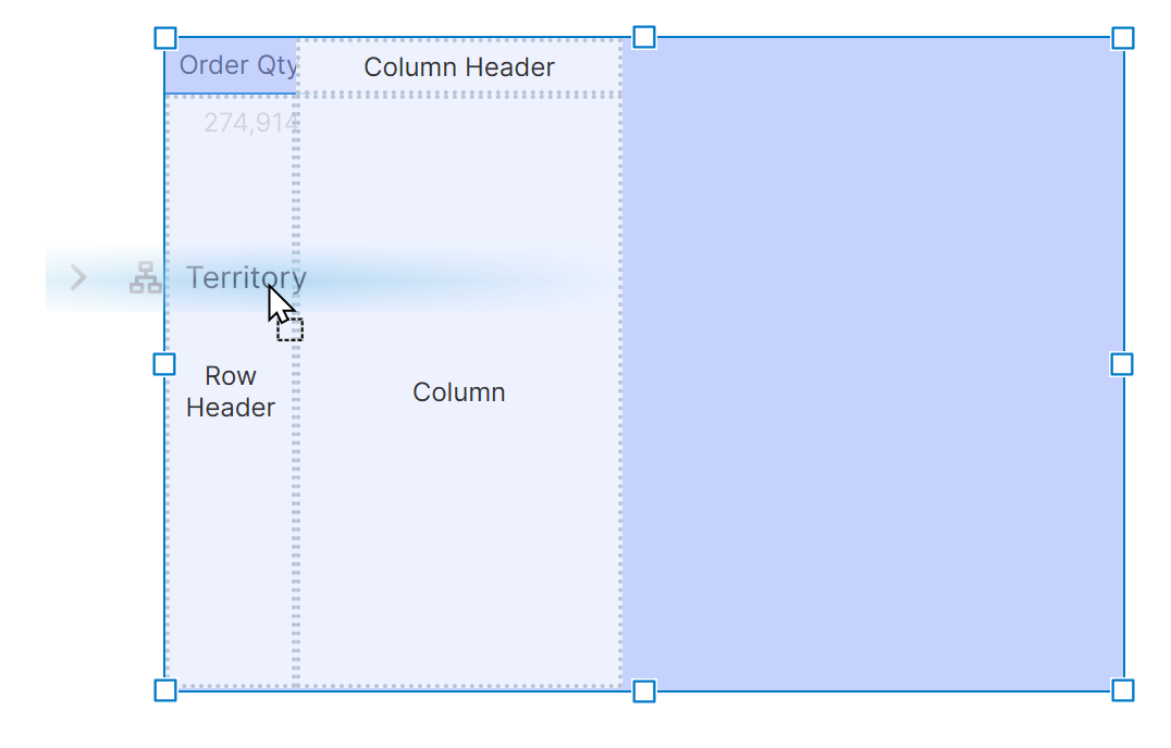
The figure below shows the main elements of a table visualization.
3. Adding a table
3.1. Drag a database table or spreadsheet
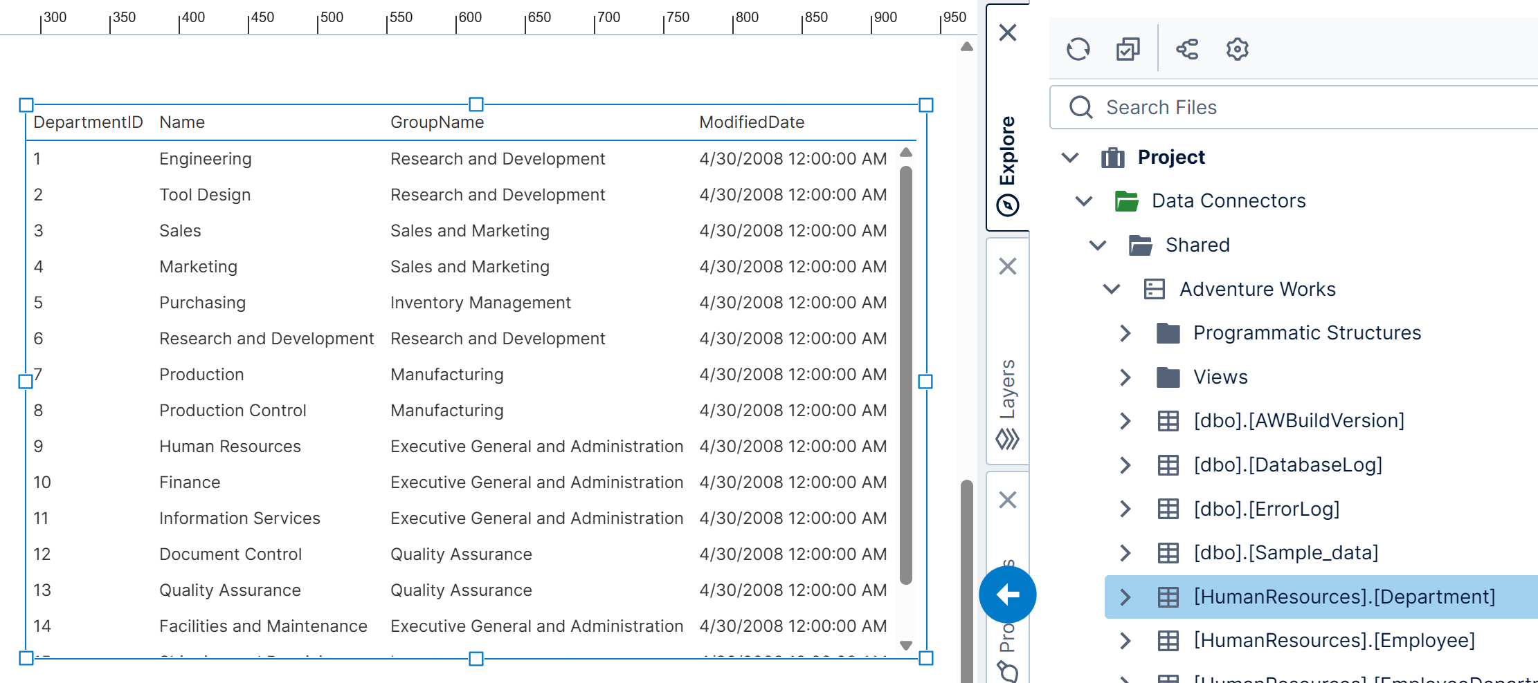
One way to create a table visualization is to drag an entire table or sheet from under a data connector in the Explore window to the canvas of a metric set or dashboard.
This method of adding a table is useful for previewing data because it displays all of the original rows of data unchanged using the raw data retrieval mode, which means it has some limitations.
3.2. Re-visualize
If you already have a visualization of a different type, you can Re-Visualize it from the toolbar to a Table. It will be listed near the beginning of the options.
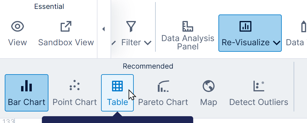
All of the existing data will then be displayed as a table using the default settings.
3.3. Add data
To create your own new table:
- If you are editing a view such as a dashboard, you can go to Data Visualization in the toolbar and choose Table if you know you want one, or in other types of views where data is visualized as a data label by default.
- Expand to find a data cube or data connector in the Explore window, and find a table column or a cube's measure or dimension/hierarchy listed below it.
- Drag it to the canvas of a new metric set, onto the canvas of a dashboard you're editing, or onto an empty table visualization if you already added one. You can also click to select it as your starting data in a new metric set.
It will initially appear as a table visualization. Numeric data will appear as a single cell showing an aggregated value such as the sum; otherwise, it will appear as a single column of hierarchy values.
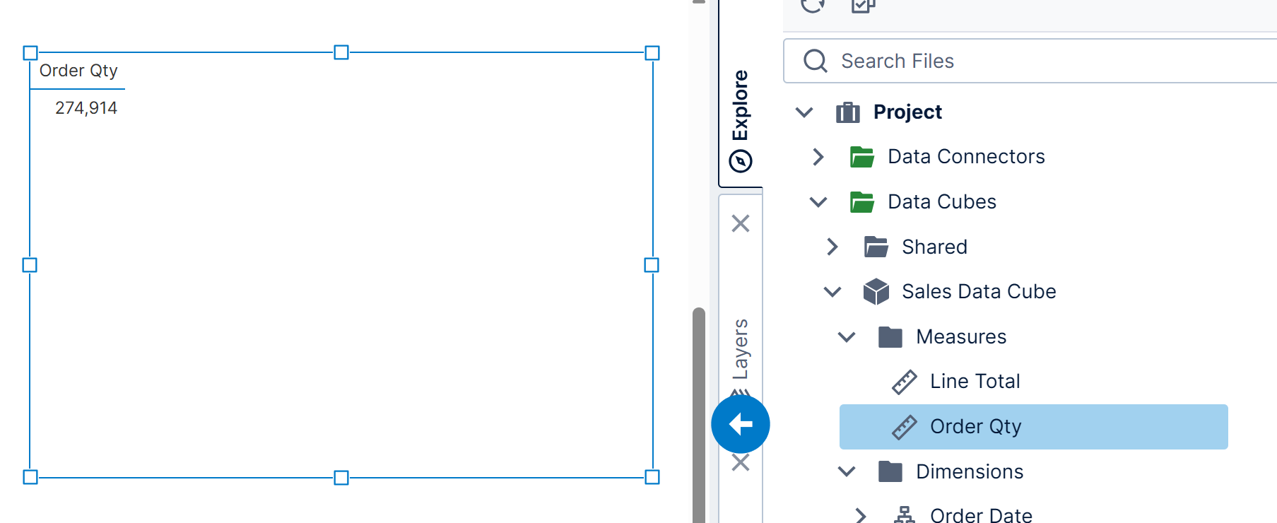
Now drag more data onto the table, or onto one of the options in the Data Analysis Panel that appears.
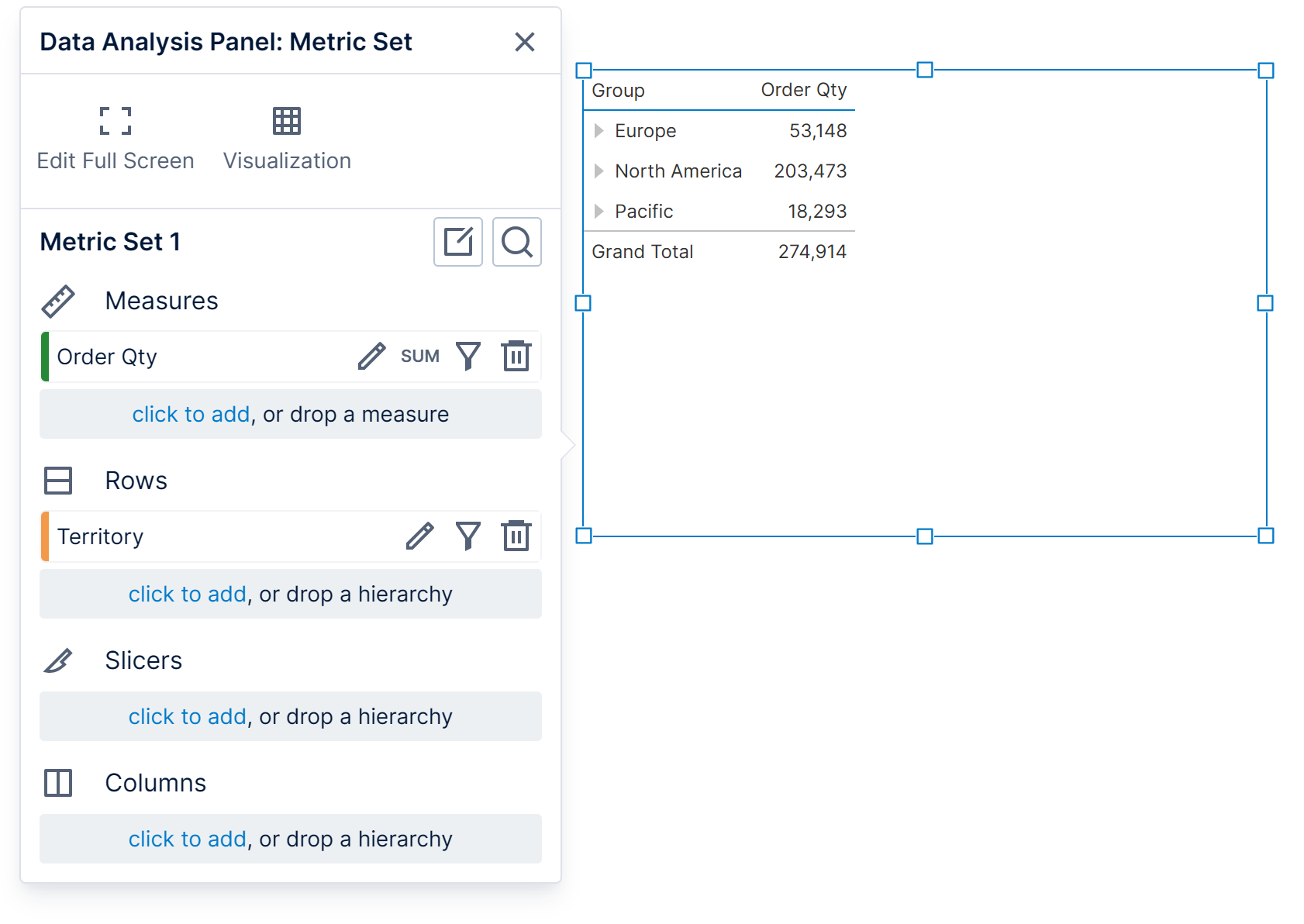
Your data may be re-visualized automatically according to the recommendation engine if you haven't chosen a specific visualization yet. You can keep using a table by dragging data onto one of the labeled areas such as Row Header for non-numeric data like the territory names in this example.
If needed, you can always click the highlighted Re-Visualize button in the toolbar and change it back to Table.
Like all visualizations, the table displays its data using a metric set, which determines the data to display and data-related settings.
4. Row headers versus flat columns
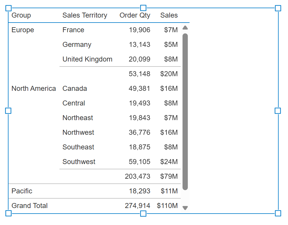
Non-numeric data is usually displayed as row headers, but can also be displayed as a 'flat' column of regular cells like numeric data. See the table elements diagram to compare them.
- Row headers are always displayed on the left, frozen there when scrolling horizontally, and they display how data is grouped using cells that span multiple rows instead of repeating the same value in consecutive rows. Viewers can drag and drop their column headers to re-order them and change the grouping, and expander buttons can expand or collapse values. The order of these columns is maintained when sorting unless you choose to change it.
- 'Flat' columns of regular cells have a wide variety of customization options. They can be placed in any order (to the right of any row headers), and dragging and dropping their column headers is unrelated to how the data is grouped. When sorting non-numeric data in a flat column, it is automatically grouped so that it takes priority for sorting.
4.1. Flat columns
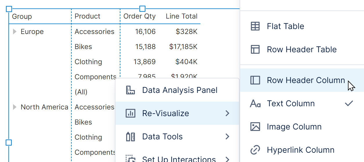
To change how non-numeric is displayed, you can right-click a row header column, select Re-Visualize, and then Flat Column.
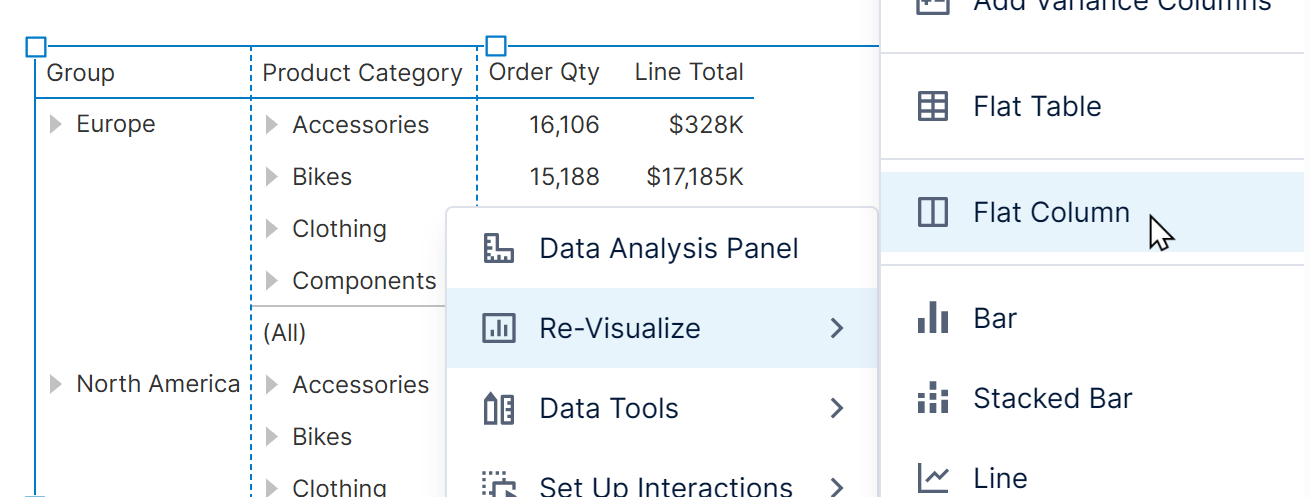
Similarly, you can select Row Header Column on a flat column.
Alternatively, open the Visualization tab of the Data Analysis Panel and move a hierarchy from Row Header to Column or vice versa.
4.2. Flat table
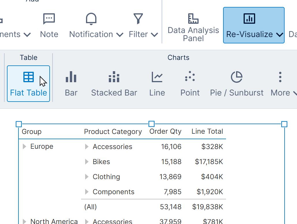
To quickly change the entire table to flat columns, select the table and find Flat Table in the toolbar under Re-Visualize.
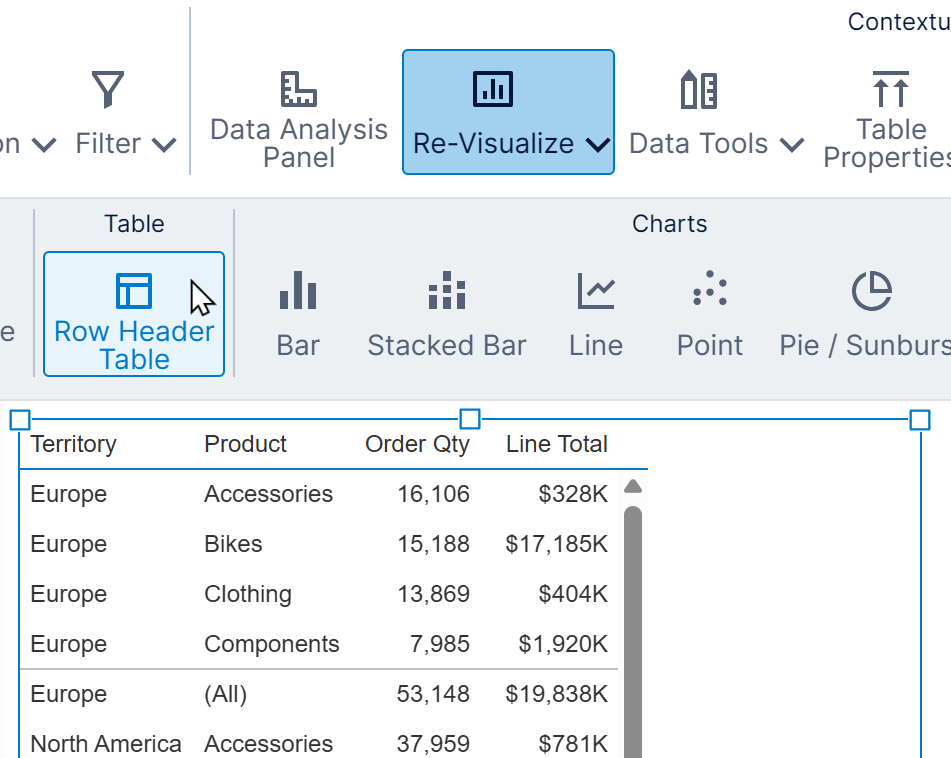
For a table with flat columns, you can choose Row Header Table.
5. Table properties
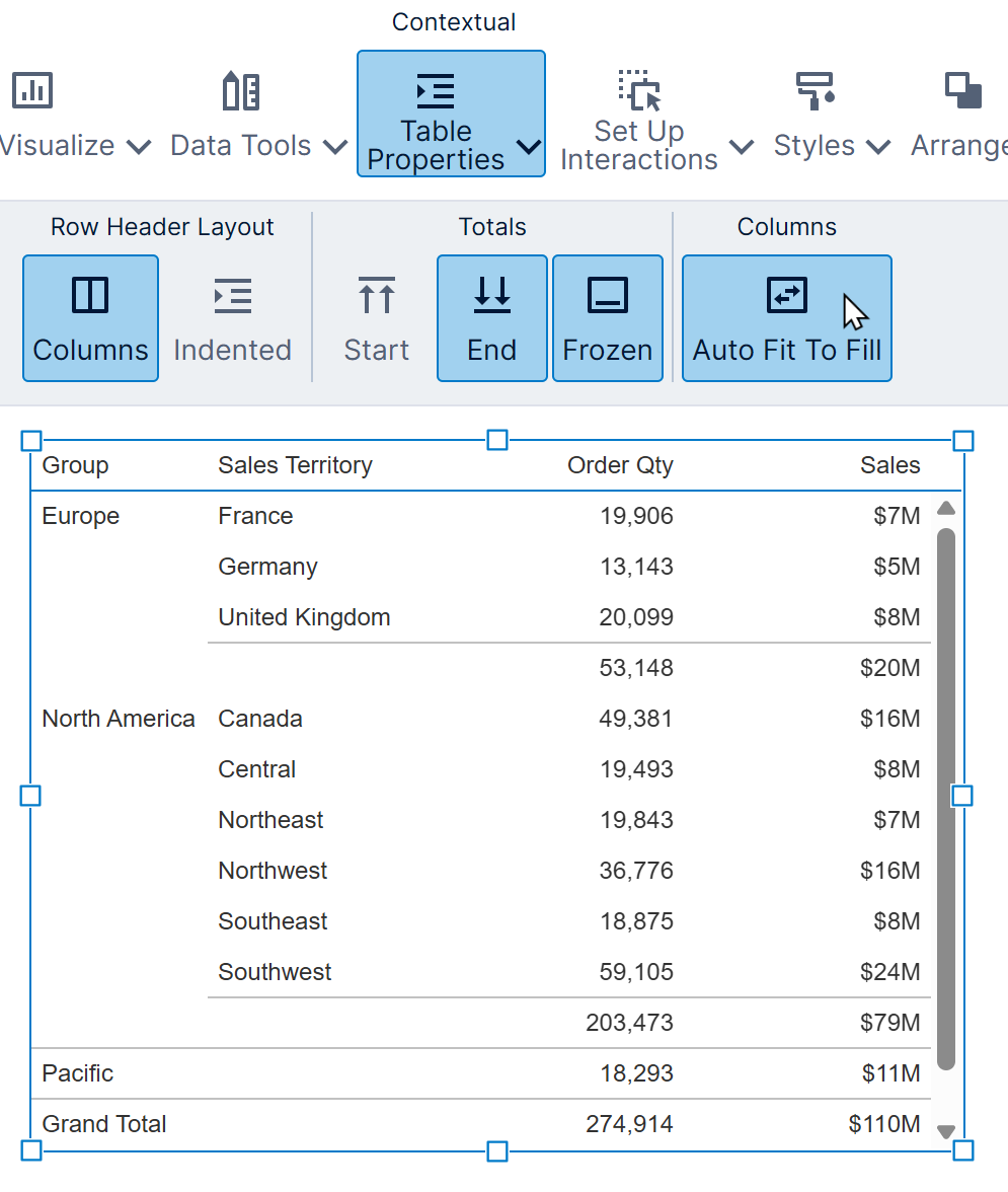
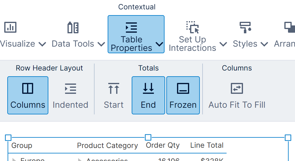
Some important properties for customizing your table can be accessed from the toolbar, such as row header layout, how to display totals, and auto-fitting of columns.
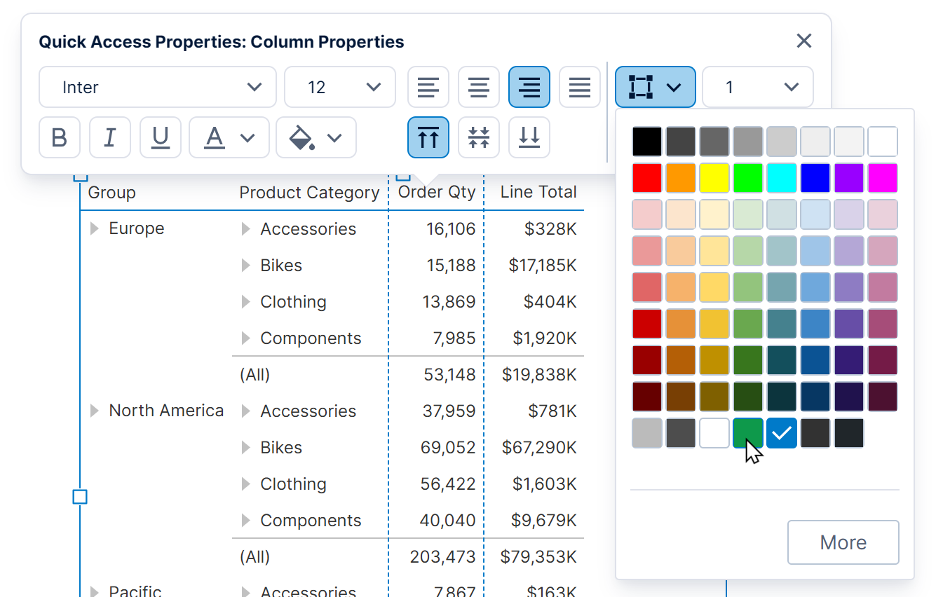
You can use the Quick Access Properties popup to customize properties such as colors and fonts by right-clicking where you want to make a change, such as on a row header or on an alternating row background. (In earlier versions, left-click the table when it is already selected.)
Users with access to the full Properties window can customize every aspect of the table's appearance and layout. Some important properties are described in the sections below.
5.1. Column properties
Cell columns ('flat' columns) have a wide variety of settings that can be used to customize them.
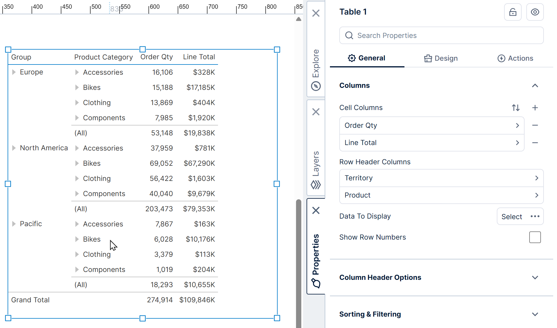
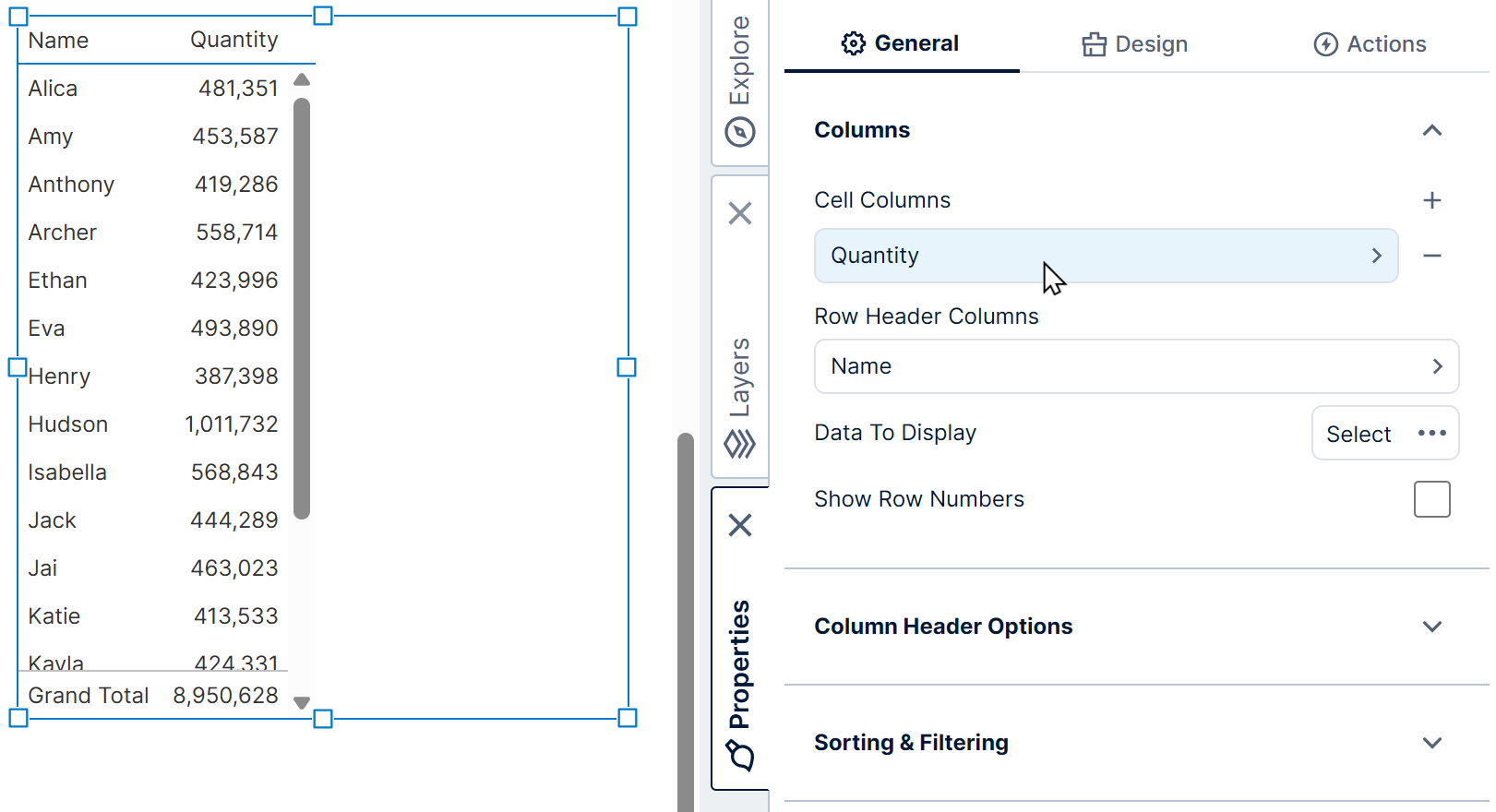
Under Columns, select a cell column to customize in the Properties window in the General (or Main) tab. You can also click directly on a column in the table itself, or right-click and choose Column Properties.
If you want to add new columns, you can use the Data Analysis Panel's Visualization tab. Alternatively, you can click the + button in the Properties window shown above to add a new column there and configure it entirely through its properties such as Custom Text.
5.1.1. Column type
By default, column cells display values as text, but you can change the column type to one of the other supported column types:
- Image – Displays images at URLs/addresses from or based on your data, similar to a data image, as set in the Image Path property.
- Hyperlink – Provides clickable links to navigate to URLs or addresses from your data.
- State Indicator – Uses a state indicator in each row to display symbols or other visuals based on each row's states.
- Bullet Graph – Displays a bullet graph type of gauge in each row.
- Data Bar – Displays a simple horizontal bar chart in each row.
- Checkbox – Visualizes data as a checkbox that is checked or unchecked based on values such as True or False, or zero or non-zero.
For example, change the Column Type property to Data Bar. The table now shows data bars in the LineTotal column instead of text values.
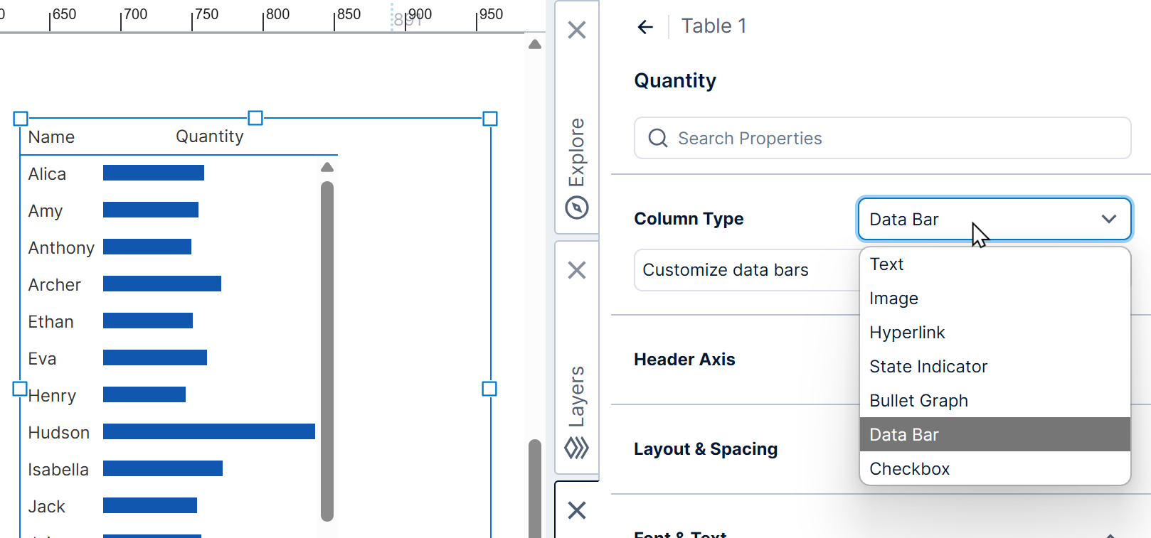
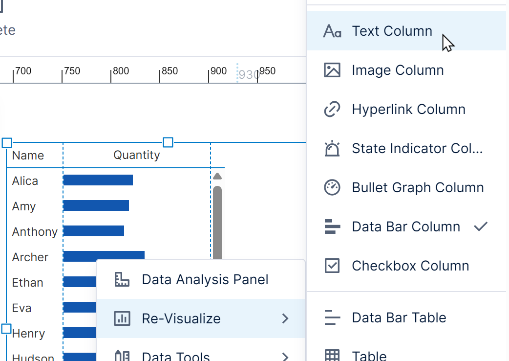
Instead of using the Properties window, you can also change the column type from the context menu.
Right-click the table column to open its context menu, click Re-Visualize, and then select the new column type (for example, Bullet Graph Column).
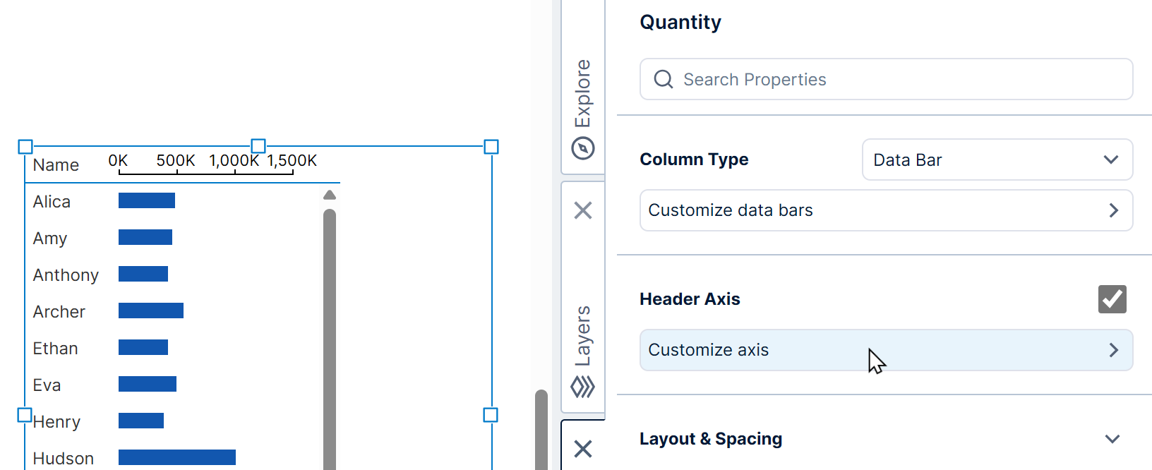
Some of the column's properties in the Properties window will be specific to the selected column type. For example, you can further customize State Indicator, Data Bar, and Bullet Graph columns by clicking their Customize option.
Data Bar and Bullet Graph columns also have the Header Axis option, which replaces the column header text with an axis like in a chart, and can be further customized by clicking Customize axis.
To customize how measures and other data are visualized by a data bar, bullet graph, or state indicator column, click the column to select it and open its Data Analysis Panel to the Visualization tab. The same visualization options are available as for an individual chart, bullet graph, or state indicator.
5.1.2. Frozen columns
The Frozen option can be found under Layout & Spacing (or in the Main tab in previous versions).
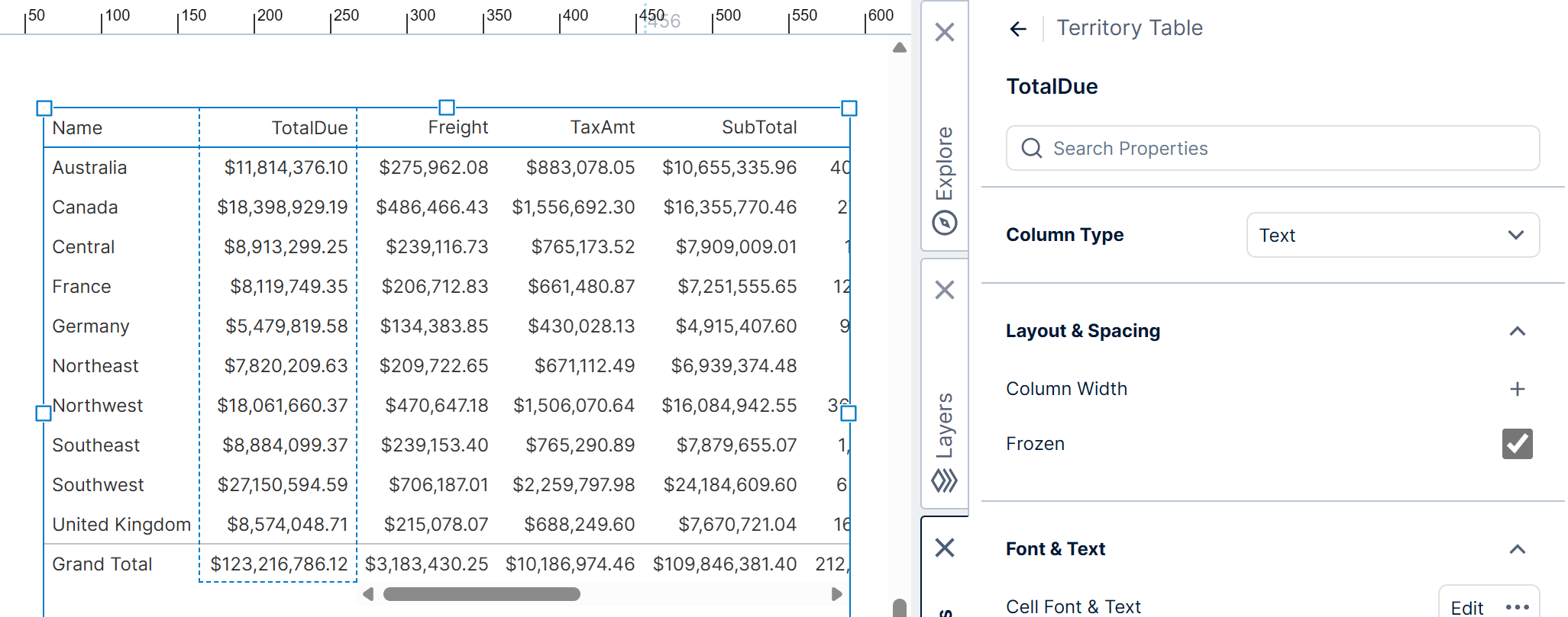
This puts the column to the left of non-frozen columns. Similar to row header columns, the position of frozen columns will not change when you scroll the columns to the right horizontally.
5.1.3. State styles
You can set up states on your metric set and use State Styles on table columns to change the appearance of different cells based on conditions. The article Set up states on a metric set demonstrates this with a table visualization.
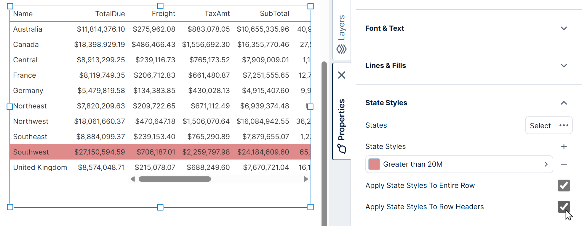
When using state styles, you can choose to apply them to the whole row instead of just the cells of that column by using the Apply State Styles To Entire Row property.
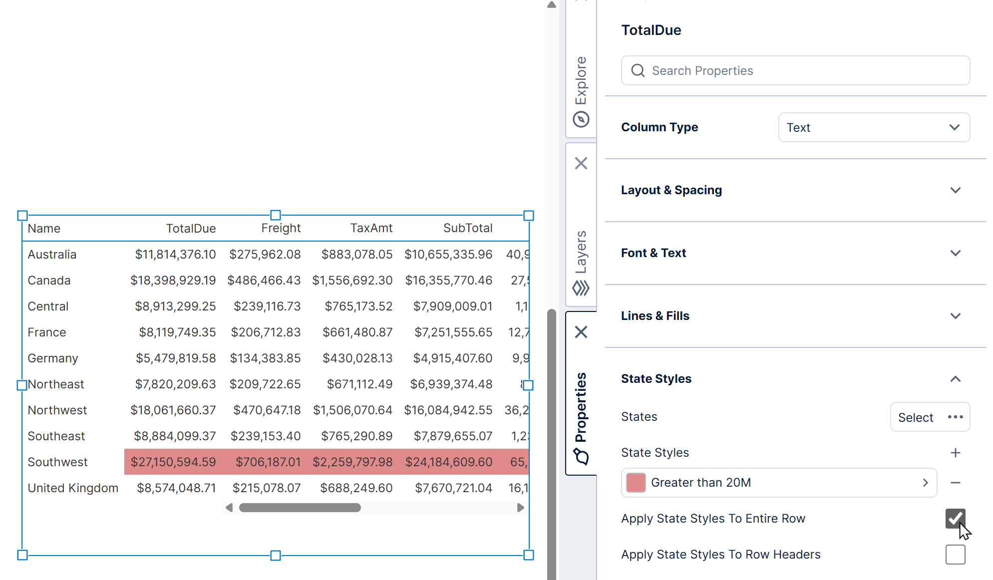
After selecting this option, you can also choose to apply the state styles to the row headers in each row by selecting the property Apply State Styles To Row Headers that appears.
This will apply to row headers that do not span multiple rows. For row headers that span multiple rows, consider setting up color rules on the column in the table's Row Header Columns property instead.
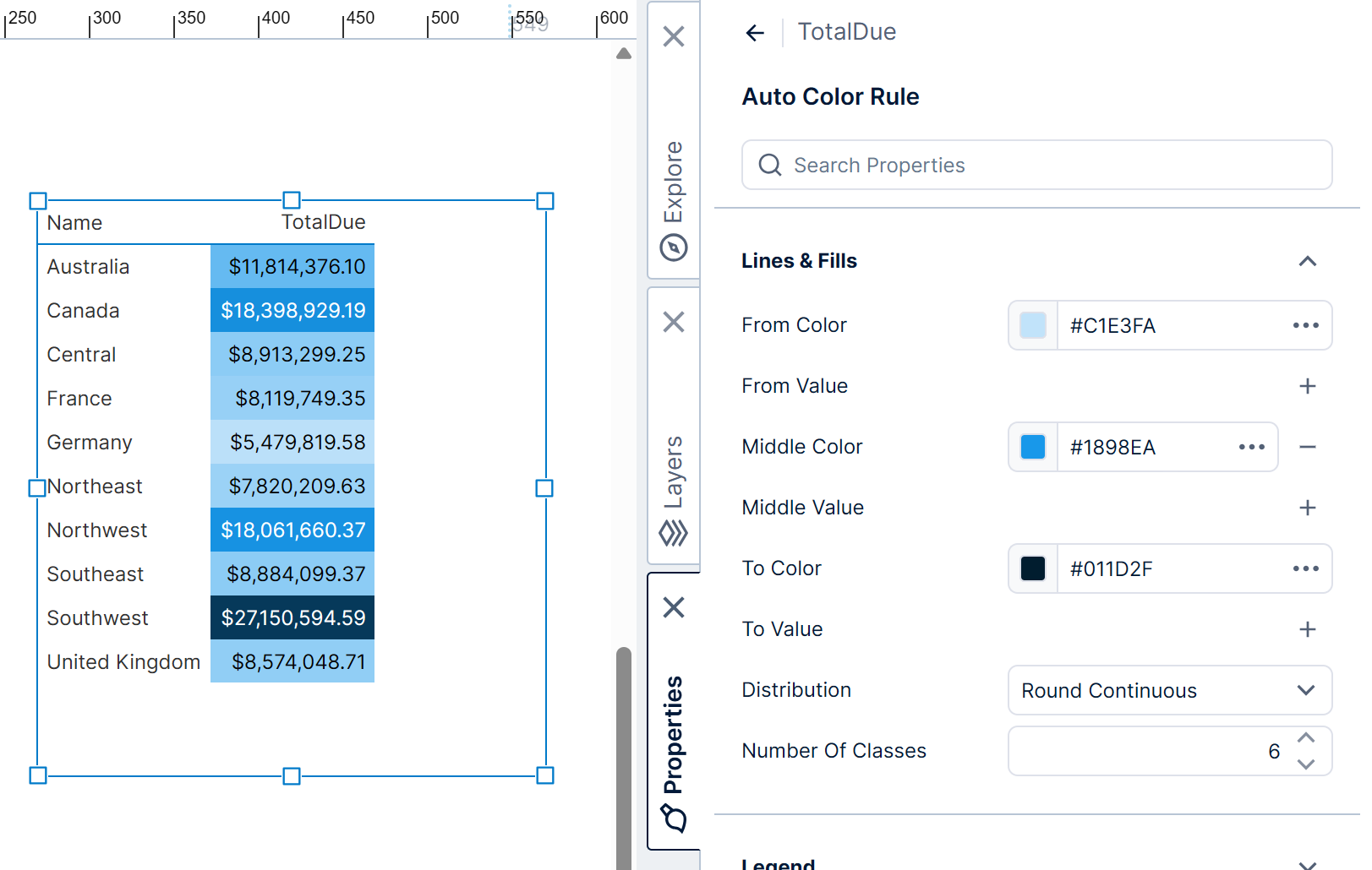
5.1.4. Color rules
You can change the color of each cell in a column according to its data using color rules. Expand the Color Rules category of a column's properties (in previous versions, go to the Look tab and look under Cell Style).
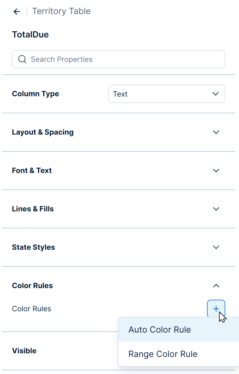
There are three types of color rules you can apply:
- Auto Color Rule - Automatically determines colors and corresponding ranges based on the values in the cells. Click the + button to add to a measure (numeric) column.
- Range Color Rule - Sets up each range of values and its corresponding color manually. Click the + button to add to a measure (numeric) column.
- Discrete Color Rule - Sets up the corresponding color for each hierarchy member. Click the + button to add a rule for each value in a non-numeric column.
Select the added color rule to further customize the value or range of values, color, and legend text. Color rule properties are the same in all visualizations - see Apply colors to data points or series using color rules for more details and examples.
5.1.5. Custom text
You can go to the text properties of a column to customize its cells' text.
There are separate options you can open for headers vs. cells/rows.
For cells, the Text property is read-only and indicates what data this column is connected to.
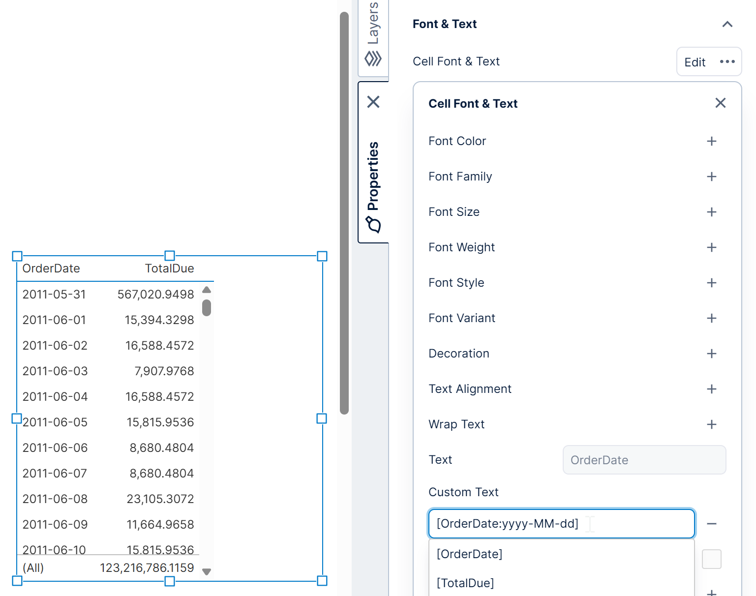
If you want to change the cell text, use the Custom Text property. When unset, it will display the data connected to this column. You can set it using one or more placeholder keywords for the data added to the Data Analysis Panel, and you can combine this with regular text. Keywords also support optional formatting if you don't want to use a time dimension's or measure's formatting options. See Display date only on column instead of date/time for an example, or for more information about keywords see the Formatting text article.
You can use the Header Text property to change the text displayed in the column header. This property supports regular text, as well as keywords such as [Product] to refer to a hierarchy placed on Columns in the metric set.
5.1.6. HTML formatting
If your data contains HTML tags that you want to apply for formatting rather than display as text, select to Allow HTML From Data.
This option is located below the Custom Text property described in the previous section, and it is only available when no custom text is set.
5.1.7. Custom groups
In the column's text properties, open the Group Header settings and set Group Text to display another header with your provided text above the regular column header.
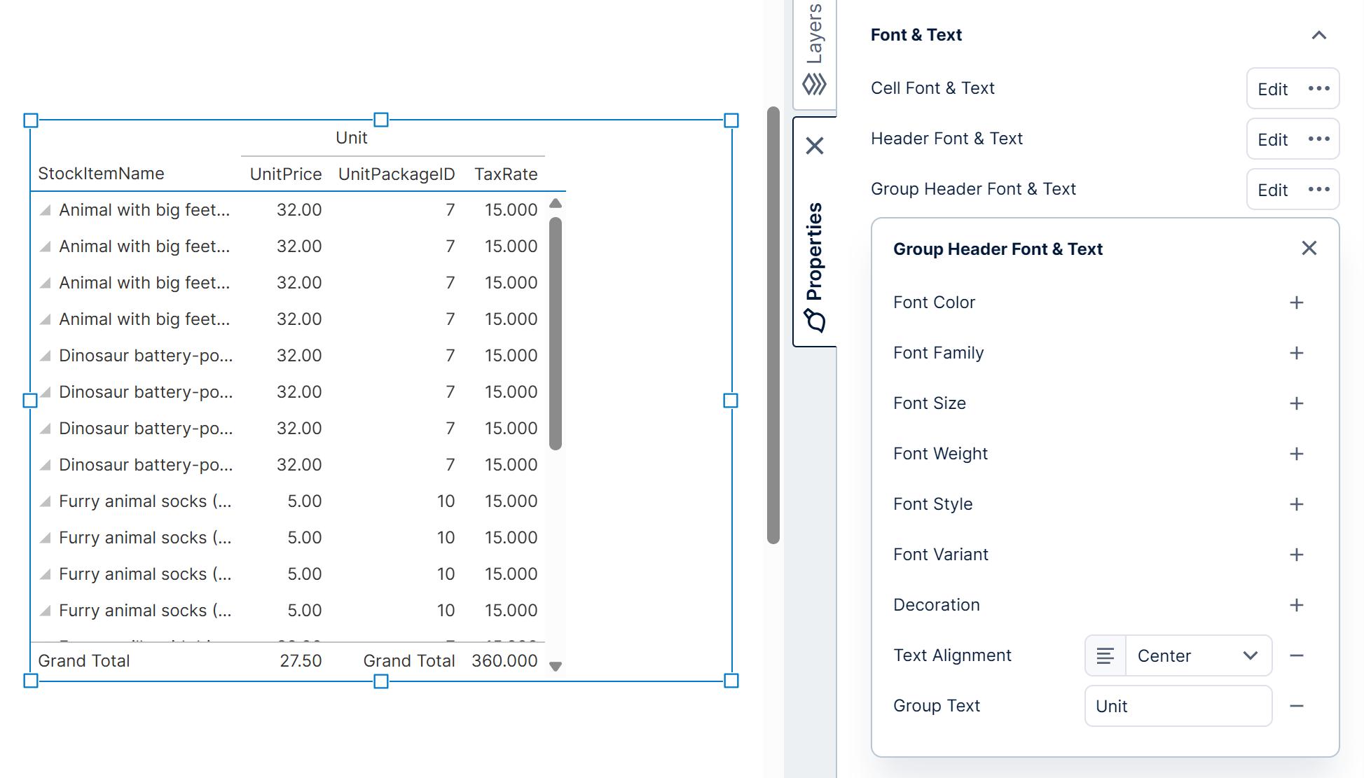
Add the same Group Text to neighboring columns to group them together.
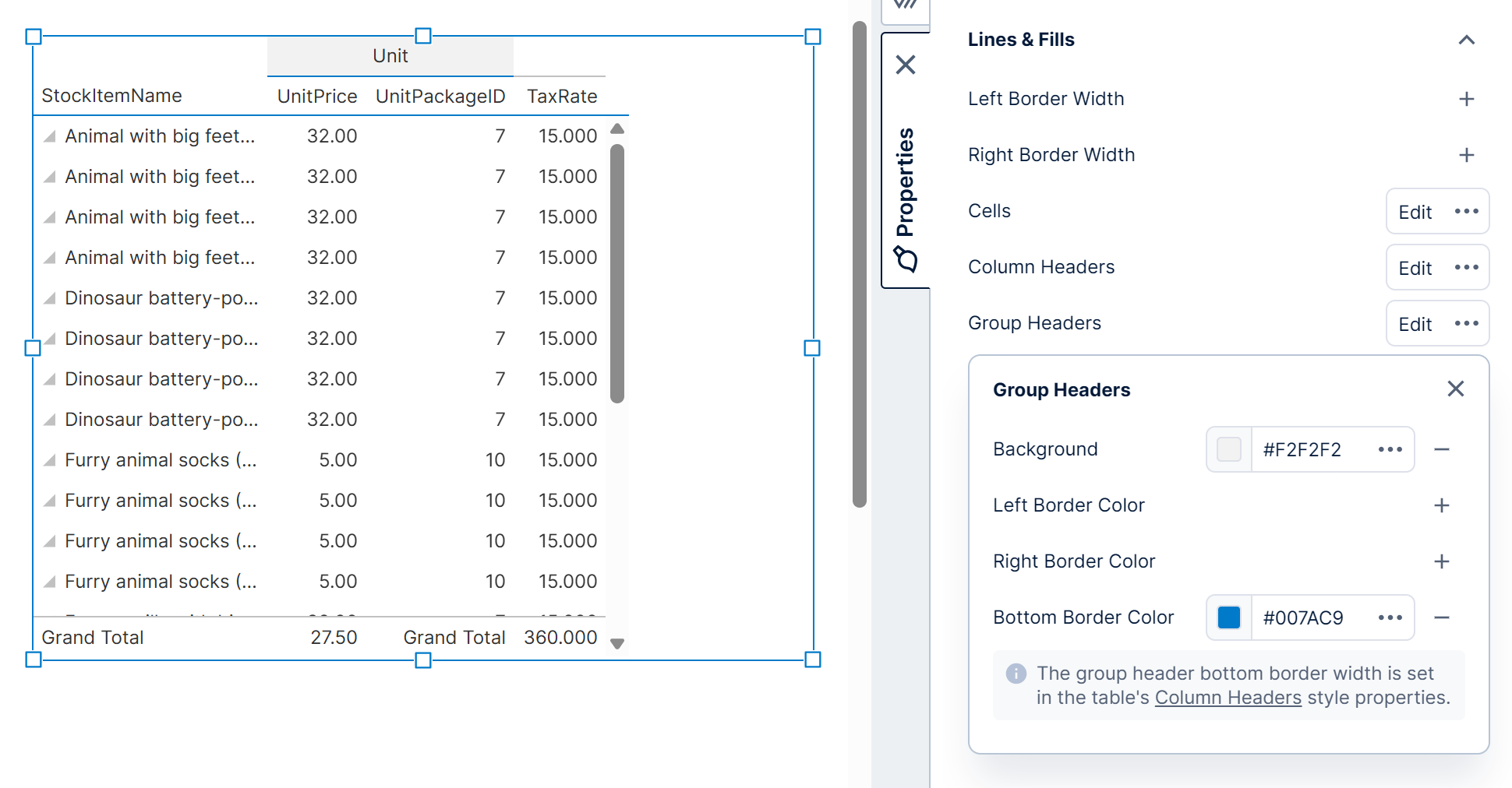
Go to the Lines & Fills category (previously the Look tab) to customize the other group header appearance.
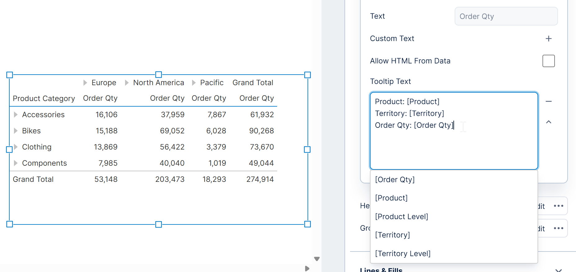
5.1.8. Tooltip
When you hover over or long-tap a table cell, a tooltip appears by default showing the data associated with that cell/data point. (Switch to view mode first if editing a view.)
You can customize which data is shown in this tooltip, including adding data not already displayed directly in a column's cells: in the Data Analysis Panel, click Visualization and expand Tooltips to find the data assigned for each column. This same interface is used for customizing various aspects of all visualizations, described in Setting up the visualization. Click the paintbrush icon next to the heading as a shortcut to the corresponding property described next.
The Properties window provides more options and control over the formatting of the tooltip text. In the column's text properties, open Cell Font & Text in recent versions to find the Tooltip property. Like the Custom Text property, this can be set using both regular text and placeholder keywords for inserting data. For more information on keywords including formatting options, see Formatting text.
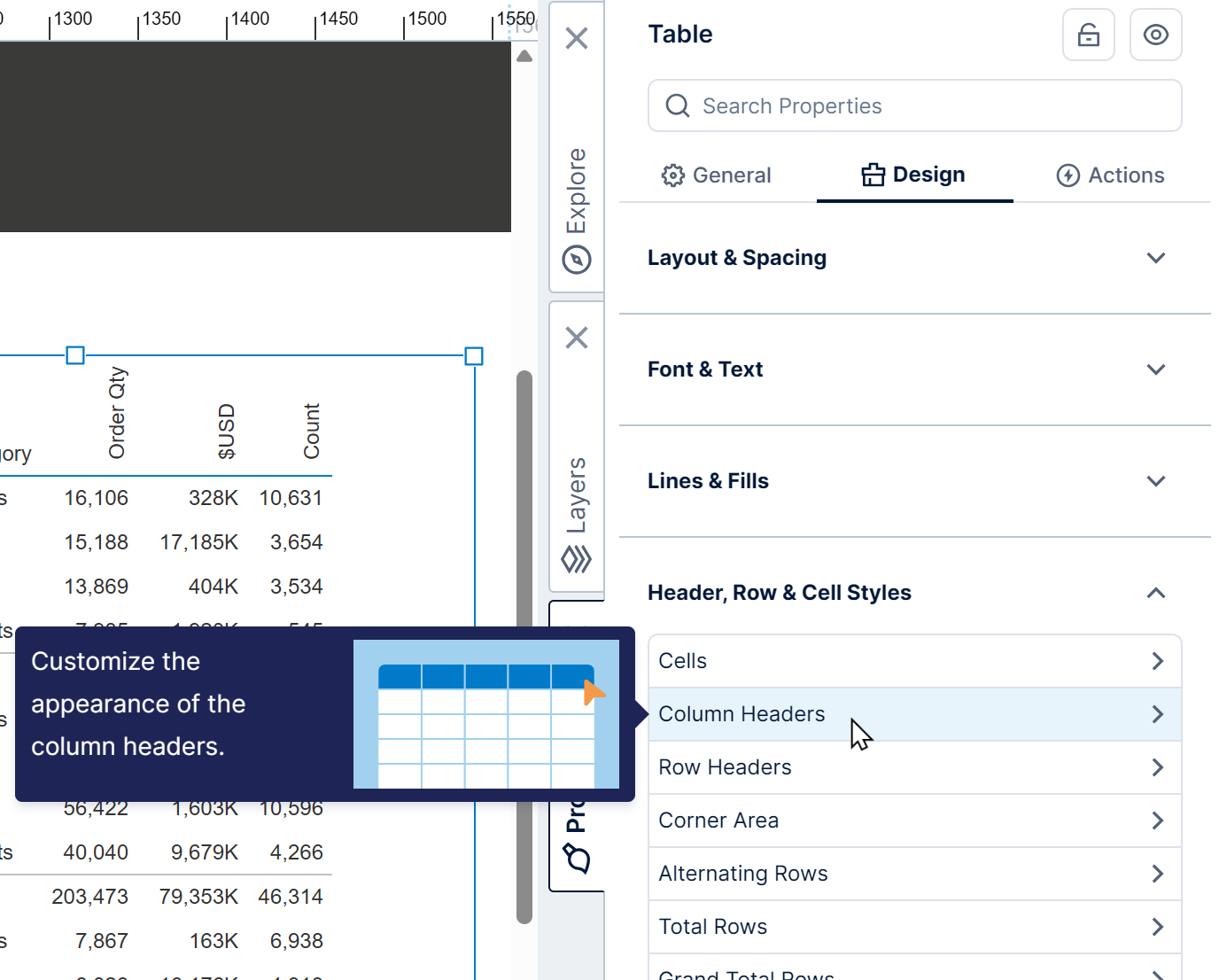
5.2. Column headers
The General (or Main) tab of the table's properties contains several options determining which column headers should be displayed.
Use the Design tab instead to customize their styling, including options like rotated column header text (use the Look tab in previous versions).
5.2.1. Redundant column headers
A table with a hierarchy placed on Columns in the metric set (e.g., Product) will repeat the column headers for each columns hierarchy value (e.g., repeat OrderQty for each Product value).
This is displayed for consistency even if there is only one column while you perform your analysis, and this single column header is repeated in this case.
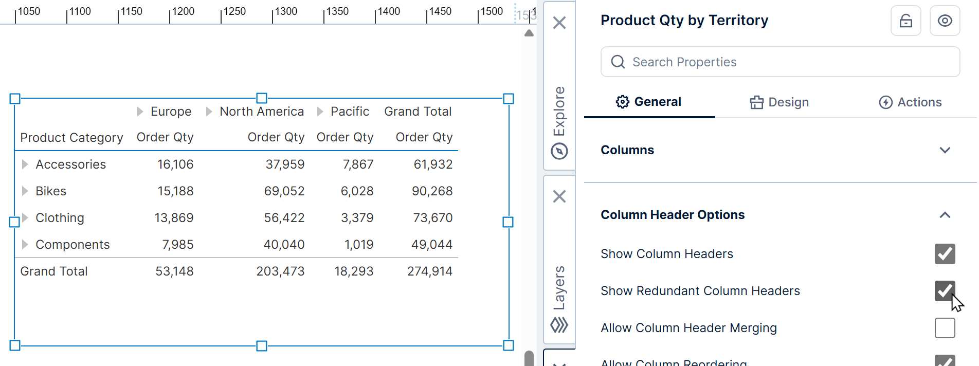
You can hide these column headers by unchecking the Show Redundant Column Headers property.
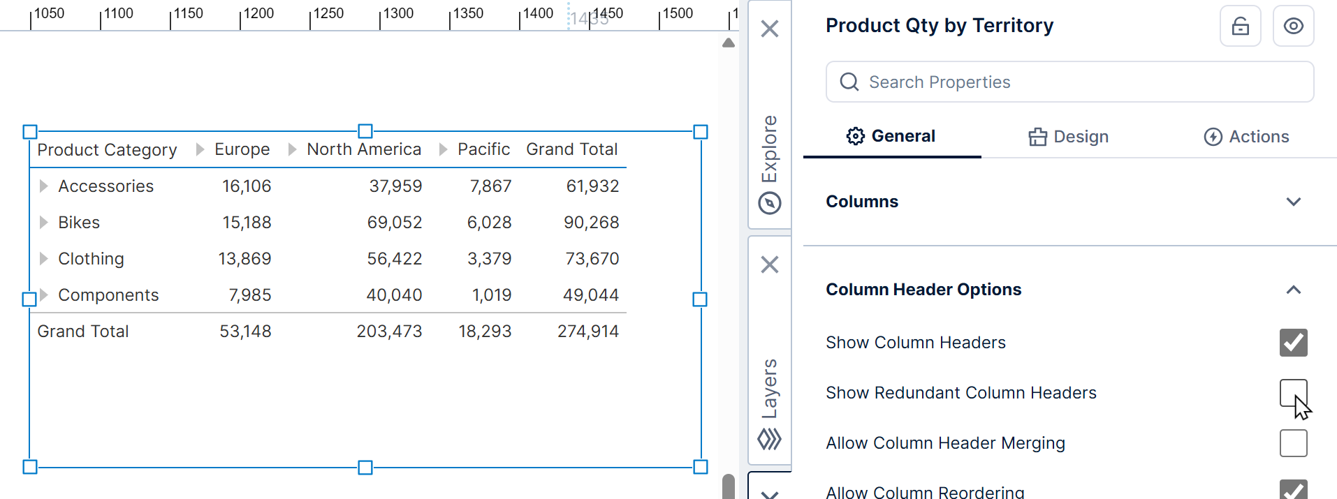
The above functionality will work even if two column headers have been previously merged into a single column header via the Allow Column Header Merging property.
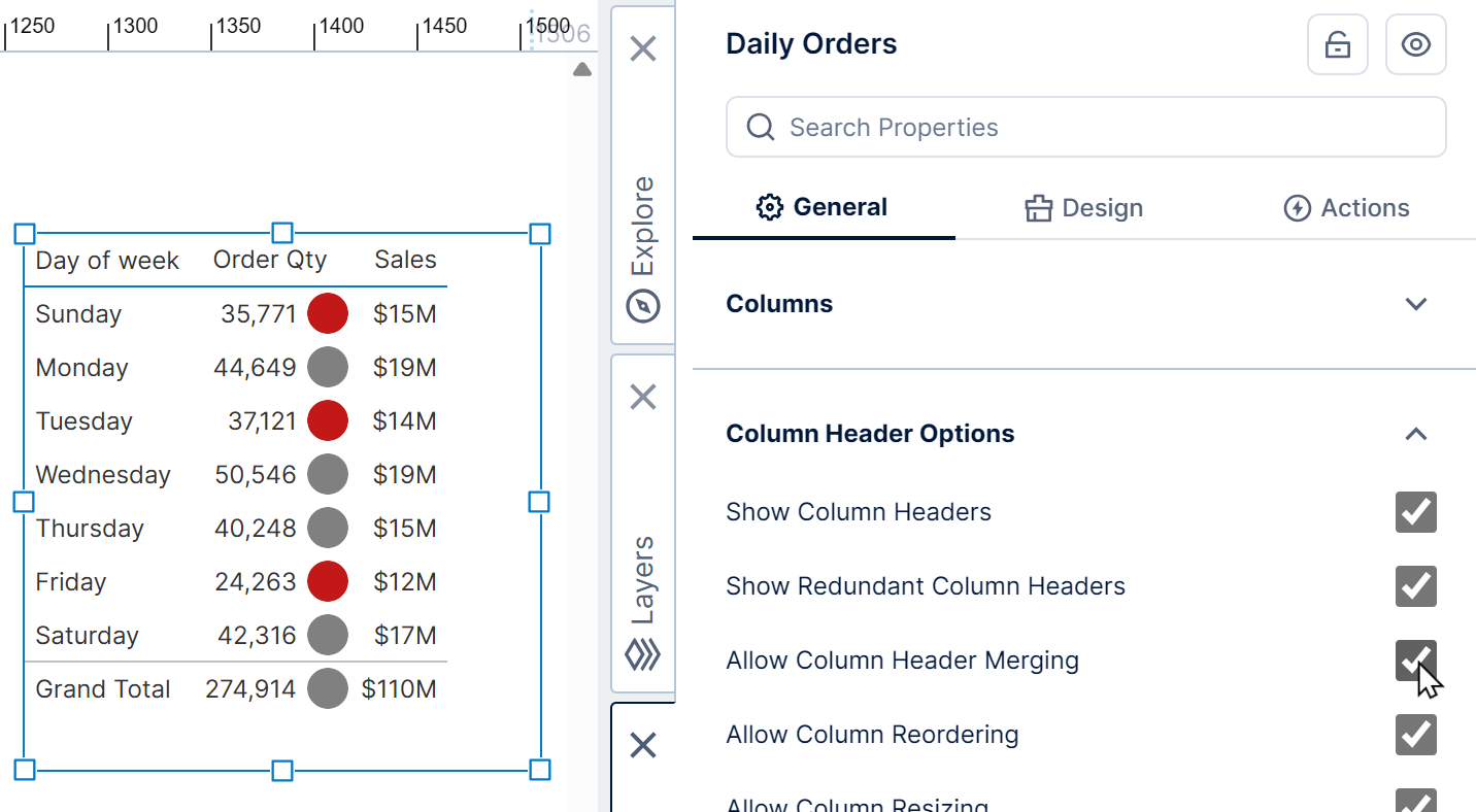
5.2.2. Merging
When your table has two adjacent columns with the same header text, you can merge the text into one header by selecting Allow Column Header Merging.
For example, in a table with two columns corresponding to the same data, where one displays the values directly as text and the other shows state indicators, you can merge their two column headers into a single one spanning the columns.
5.2.3. Column hierarchy headers
When working with data organized into columns, you may want to identify each row of headers displaying the values of a hierarchy placed on Columns in the metric set.
Select the Show Column Hierarchy Headers property to identify each of these rows to their left.
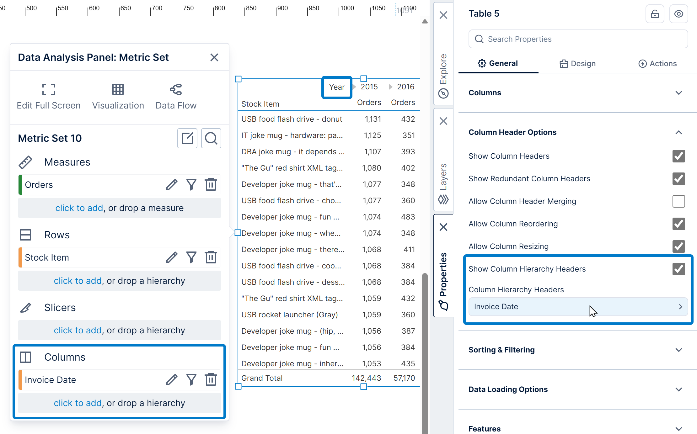
Under the Column Hierarchy Headers property that appears below, you can select a hierarchy to customize how its headers appear.
If the hierarchy has multiple levels, click to add a Level Customization for each level you want to customize.
5.3. Expanders
If you want to hide expanders from a table's row headers, click to edit the column from the table's Row Header Columns and select Hide Expander, located under Animation & Interaction in recent versions.
For other options, go to the overall table properties, switch to the Design tab, and expand Animation & Interaction. (In previous versions, go to the Main tab and expand Interactivity.)
- Uncheck Allow Collapsing Separate Hierarchies to show expander buttons only when displaying an upper level from a multi-level hierarchy.
- Select the Show Expanders Only On Hover option if you want to show expander buttons only when hovering over them or after tapping their cell.
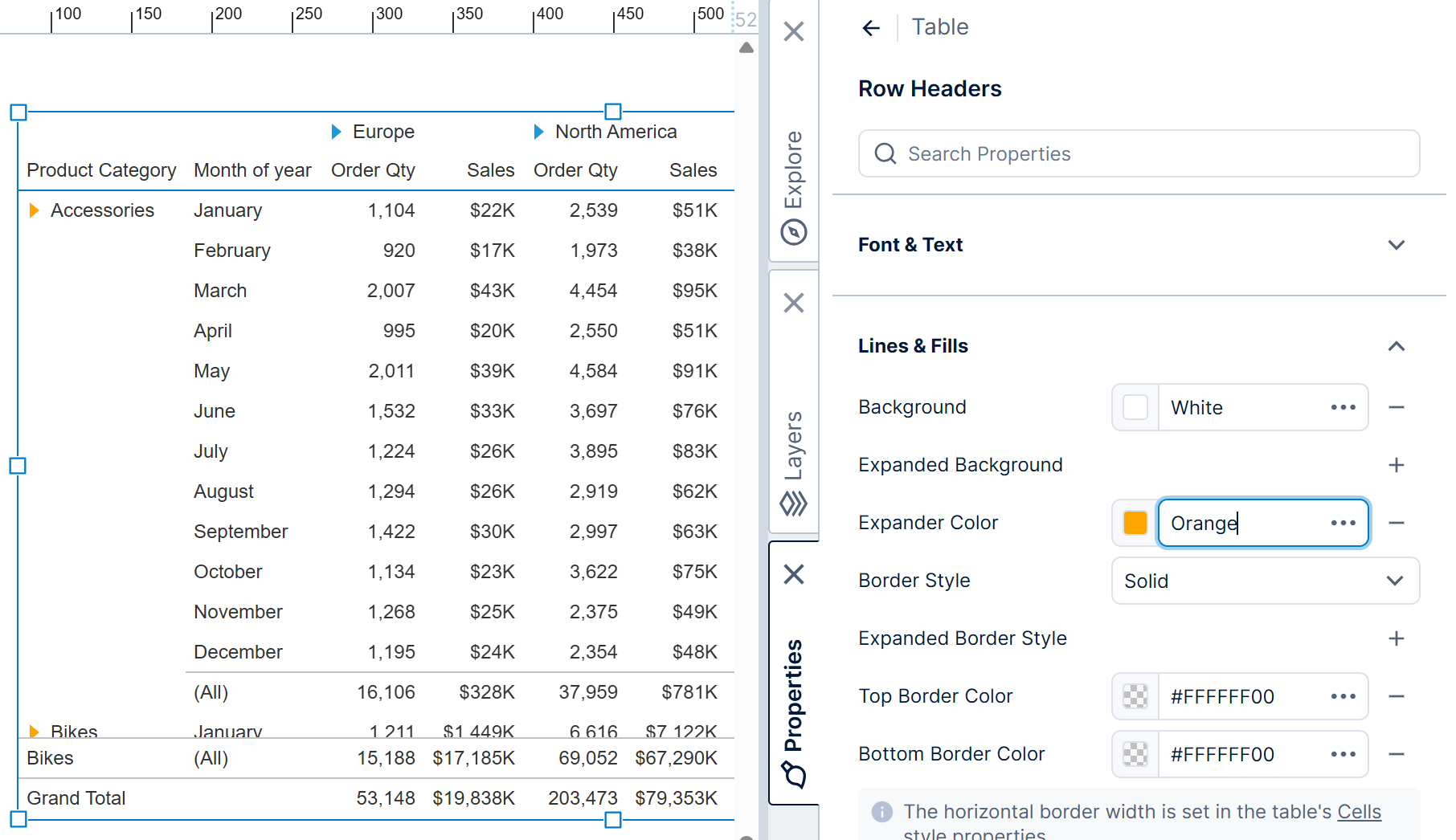
To change the color of the expander buttons in row or column headers:
- Go to the Design tab of the overall table properties (Look tab in previous versions).
- Under Header, Row, & Cell Styles, click to edit Row Headers or Column Headers (previously under Headers).
- Under Lines & Fills, set the Expander Color (previously under Appearance).
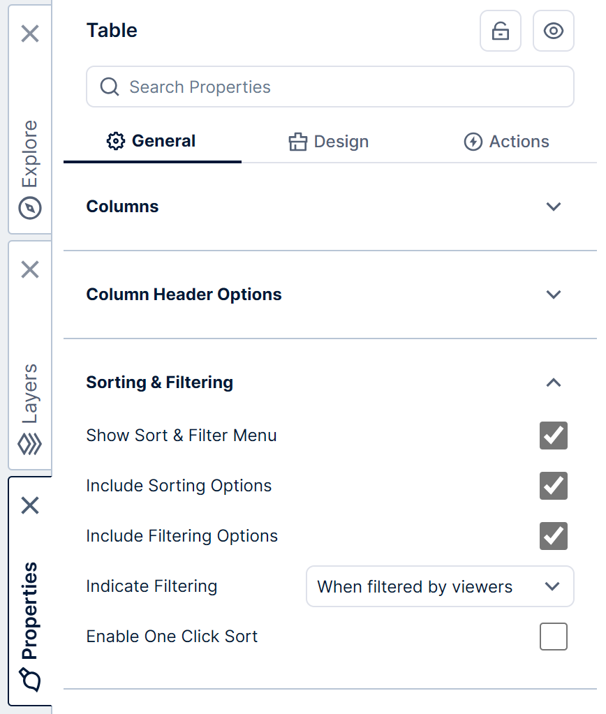
5.4. Sorting and filtering
You can hover over column headers in view mode to access sorting and filtering options.
Click the icon that appears to view the Sort and Filter menu.
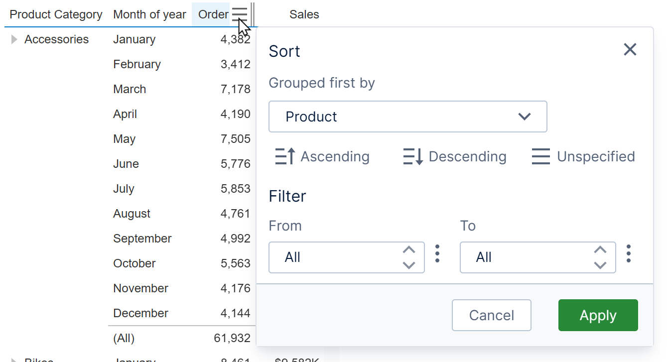
In edit mode, you can choose to show only the Sort options or only the Filter options in this popup: in the General (or Main) tab of the table's properties, expand Sorting & Filtering and uncheck Include Sorting Options or Include Filtering Options.
Hide the menu altogether by unchecking Show Sort & Filter Menu.
You can use an icon over column headers to indicate when filtering is applied.
Choose how this indicator appears for filtered columns using the Indicate Filtering property:
- On Hover – A filter indicator will appear when hovering the mouse cursor over a filtered column or after tapping it.
- When Filtered by Viewers (default) – A filter indicator will appear on its own, but only if the filtering was applied by viewers of a checked in metric set (not while checked out to you).
- Always – A filter indicator will always be present for a filtered column.
5.5. Totals
The settings that determine which totals are displayed are on the metric set, for example to show them only for some hierarchies, or only on rows or columns.
When totals are enabled, the table's properties described below can customize where they're displayed. To customize their appearance, see the total row and total column style properties in the Design tab (Look tab in previous versions).
5.5.1. Freeze total rows
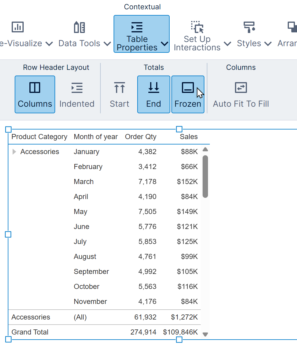
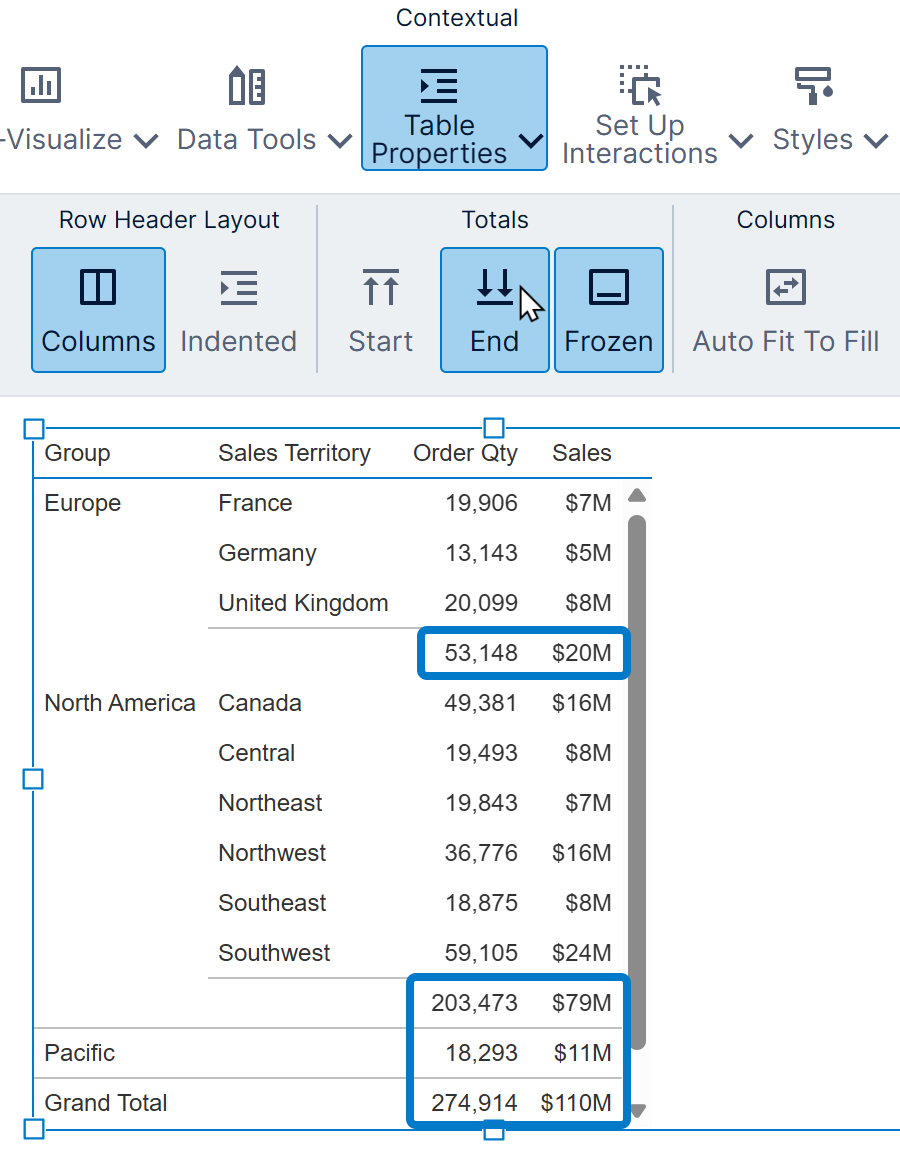
In the Design tab, expand Layout & Spacing to find the Freeze Total Rows property (previously found in the Main tab). You can also toggle this easily from the toolbar as shown below.
When enabled, the grand total and nearest subtotal are always displayed at the edge of the table, even when scrolled out of view.
5.5.2. Show totals at start or end
You can decide between showing total rows at the top or bottom, and total columns left or right.
Enable or disable the Show Totals At The End property, found in the Design tab under Layout & Spacing (previously Show Totals At Bottom in the Main tab), or use the toolbar as shown below.
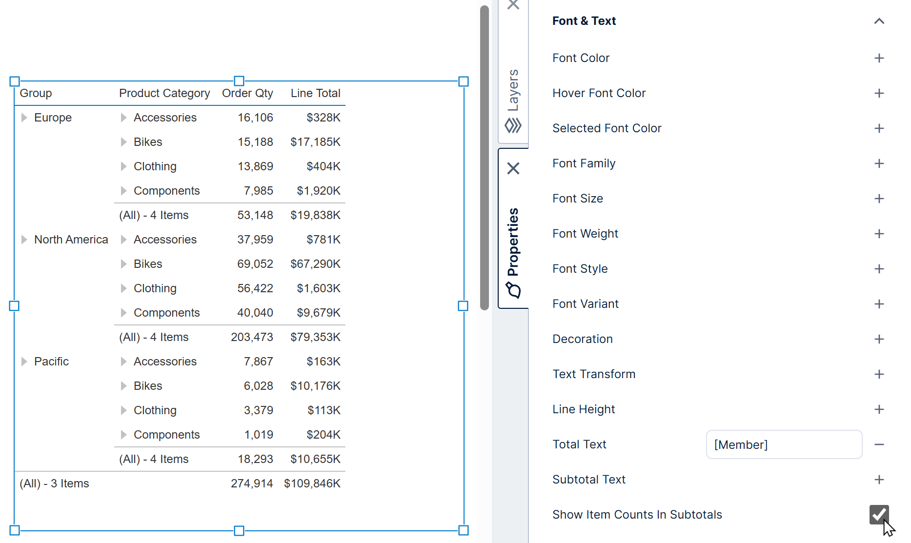
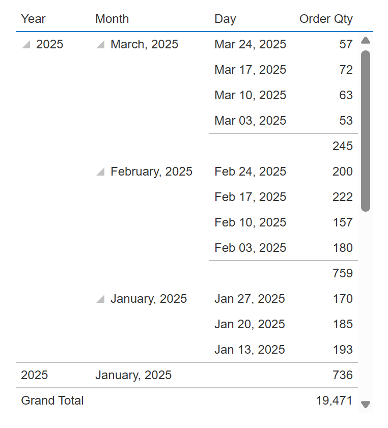
5.5.3. Item counts in subtotals
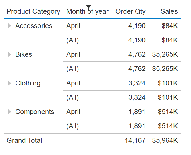
When working with any table that includes subtotals, you can hover over its cell to view the number of items that made up that subtotal amount. Subtotals are displayed if enabled in tables with multiple hierarchies or multiple levels, including when a member is expanded.
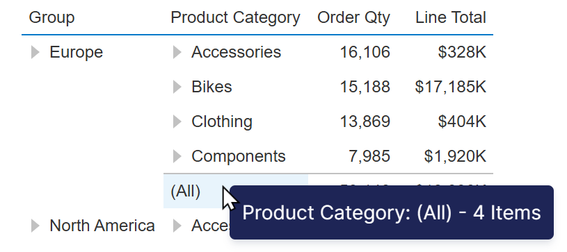
This can be helpful as context for the subtotal amounts when doing analysis.
If you would prefer to display this item count in the cell text of the table itself, enable the Show Item Counts In Subtotals property, found in the Design tab of the table's properties, under Font & Text (previously the Text tab).
5.6. Design
The Design tab of the table's properties is the main place for customizing the styling for each part of the overall table (use the Look tab in previous versions).
Expand Header, Row & Cell Styles in recent versions to find a list of different parts of the table that each have their own settings as described in the following sections. In version 25.2 or greater, these styles are also indicated by icons when moving the mouse over the table in edit mode, which you can click to jump to their settings in the Properties window.
Some appearance properties are also available on individual columns, which take priority when set.
5.6.1. Column header style
Use the Column Headers style to change the appearance for column headers displayed directly above data cells, as well as for any additional column headers displayed when a hierarchy is placed on Columns in the metric set.
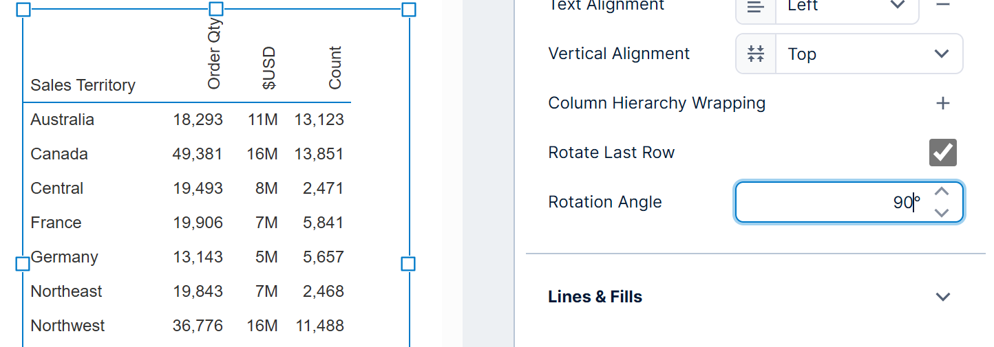
Use the categories to access all the options. For example, under Font & Text, you can enable Rotate Column Header Text and set a rotation angle.
5.6.2. Total styles
To change the appearance of rows or columns containing totals, use the total, grand total, and frozen style properties:
- Total Rows - Change the appearance of rows containing the grand total and subtotals, with separate settings for row headers vs. regular cells.
- Grand Total Rows - Change the appearance of the whole row containing the grand total. These properties take precedence over the Total Rows style when set.
- Frozen Rows - Change the appearance of total rows that are displayed as frozen at the edge of the table when scrolled out of view (if enabled), with separate settings for row headers vs. regular cells.
- Grand Total Columns - Change the appearance of the grand total column, with separate settings for column header vs. regular cells.
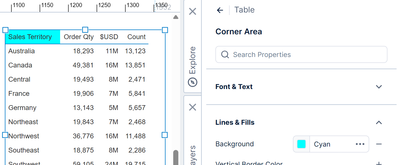
5.6.3. Corner area style
The 'corner area' of a table visualization is above the row headers and to the left of the column headers, used to display headers identifying each column of row headers (and column hierarchy headers if enabled).
The Corner Area style applies to this area.
5.6.4. Alternating row style
To add or customize alternating row styling in a table, use the Alternating Rows style properties.
You can change the background color of the alternating rows, for example.
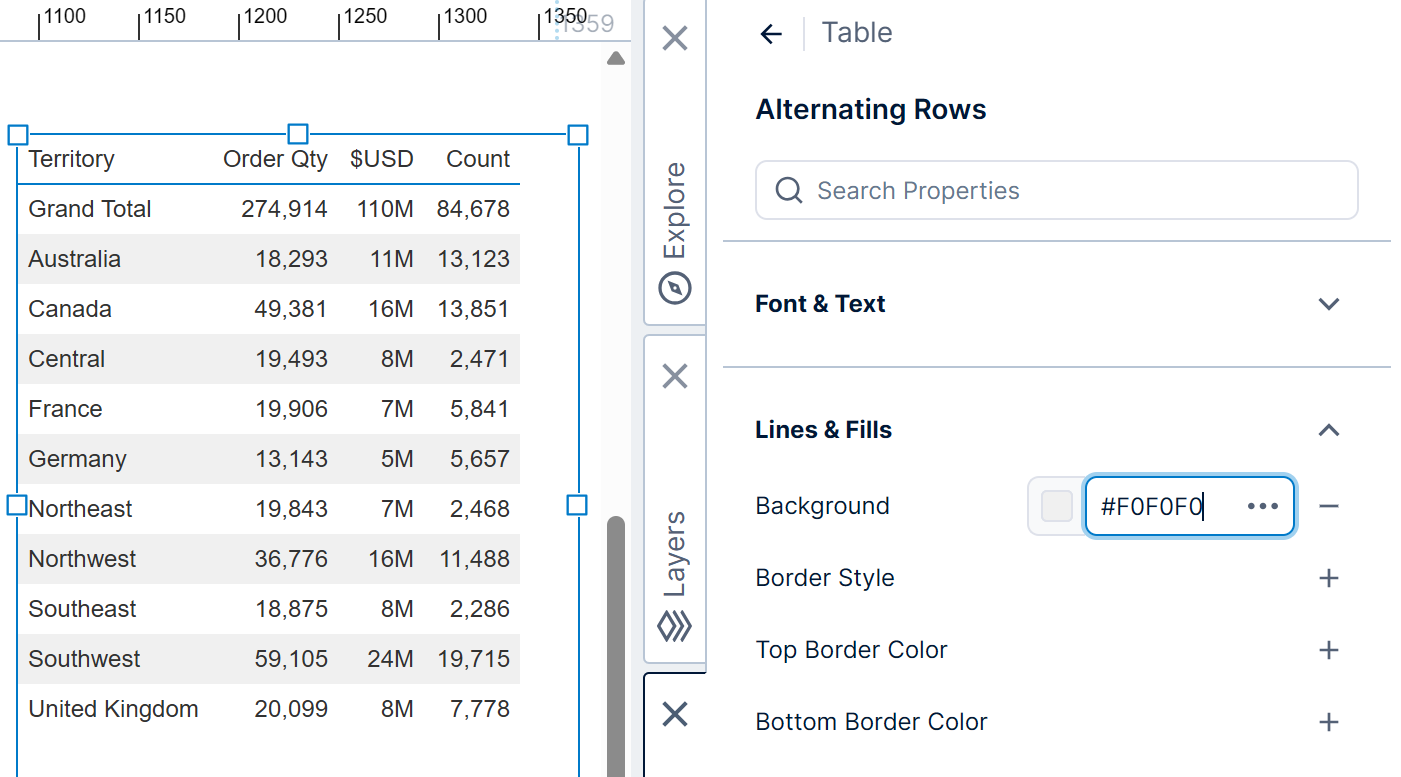
The alternating row style is applied to the cells displayed to the right of any row headers when the Row Header Layout is set to Columns.
General cell styling including the alternating row style do also apply to row headers when the row header layout is set as Indented instead.
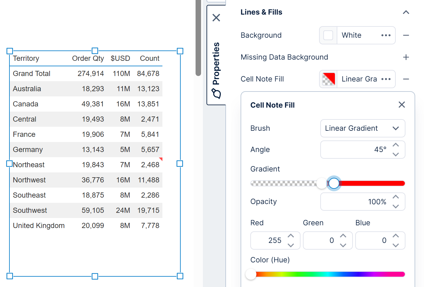
5.6.5. Cell note style
When you add a note (annotation) on a table cell, the note is indicated as a small, red triangle in the top right corner of the cell. Hover over this triangle indicator in view mode to see the details of the note.
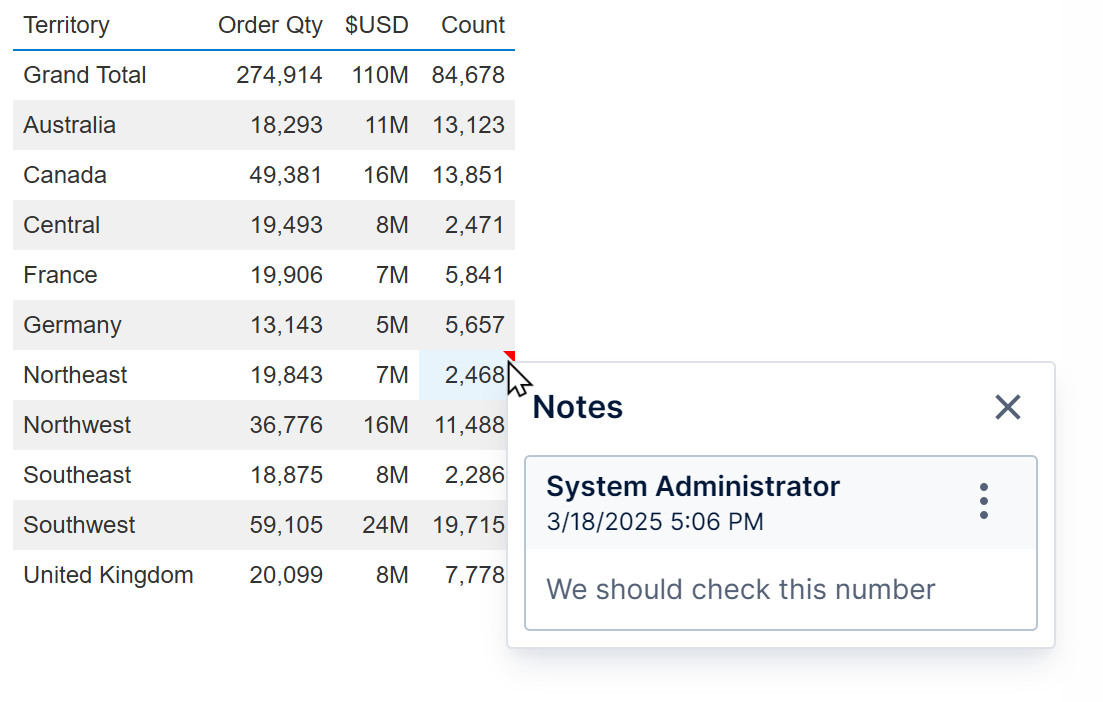
To customize the appearance of the cell note, go to the Cells style, and find cell note settings under Layout & Spacing and Lines & Fill. (Click Cell Note Style in previous versions.)
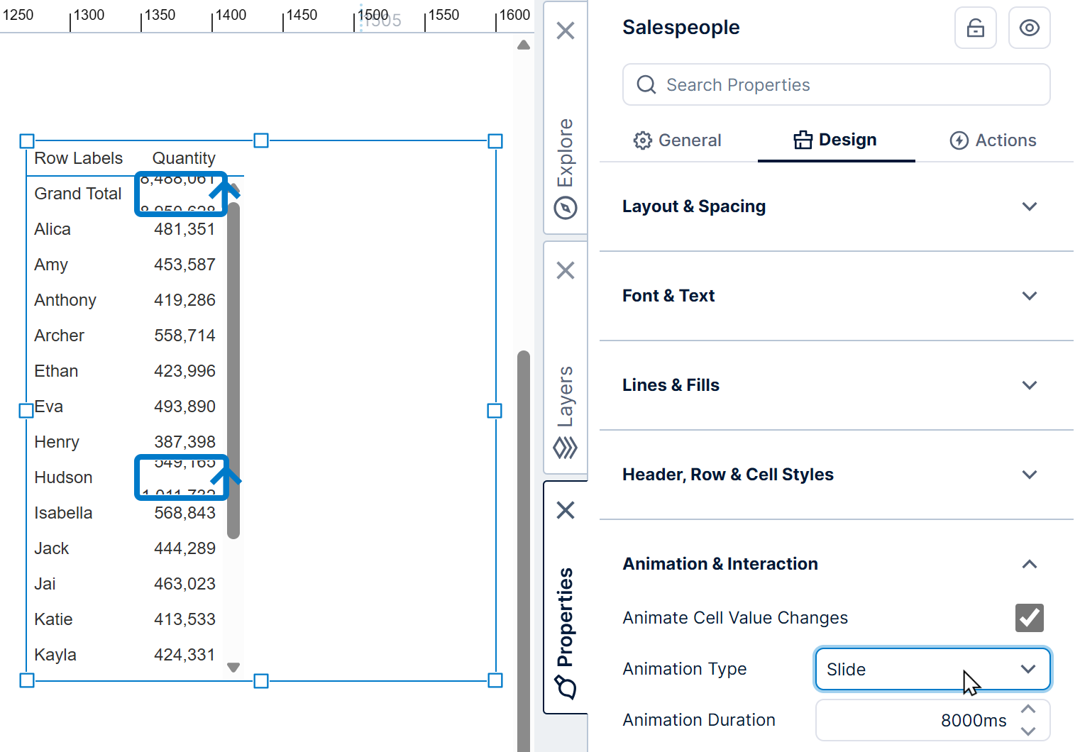
5.6.6. Animate cell value changes
When a measure value (number) changes, its cell can be animated to call attention to viewers. This can be useful when the table is set up to automatically refresh, or as a result of filtering or other interactions. Animations apply where the measure value corresponding with a particular hierarchy value changes (not when the hierarchy values change).
Go to the Design (or Look) tab of the table properties and under Animation & Interaction, enable Animate Cell Value Changes and select the Animation Type:
- Highlight temporarily changes the background color of the changed cell. This animation type comes with the option to select the highlight color.
- Slide moves the values in the direction of the change. Values that go up will slide up, and values that go down will slide down.
5.7. Layout
5.7.1. Row header layout
In the Design tab under Layout & Spacing (formerly the Layout tab), you will find the Row Header Layout property. You can also use the toolbar to change this property as shown below.
By default, this is set to Columns, which means each hierarchy or hierarchy level has a separate column with its own column header.
When the row header layout is set to Indented, row headers are displayed compactly in the same column, and each hierarchy or level is indented separately within it.
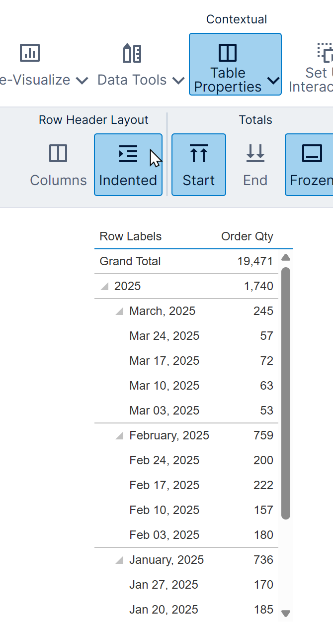
You can control the width of this column and the amount of indenting using the properties Indented Column Width and Indentation respectively.
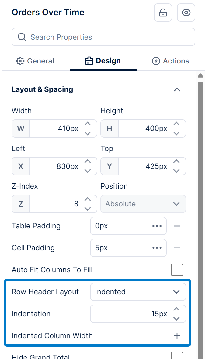
You can customize the Indented Header Text shown above this single column of row headers in the Font & Text category.
Note that the indented option requires the following:
- Totals must be enabled on the metric set. To find this setting, click the Edit button in the Data Analysis Panel and set Shown Totals. If you want to hide the grand total you can use the table's Hide Grand Total property instead.
- Totals should also not be disabled on the hierarchies displayed as row headers. Each hierarchy listed in the Data Analysis Panel has its own Shown Totals setting you can click to edit.
- The table must be set to show totals at the top, because each level is indented below.
5.7.2. Auto fit columns to fill
By default, columns are automatically sized to fit their contents. When you resize a table wider than is needed, you'll see an area of white space.
In the Properties window's Design tab under Layout & Spacing (previously Layout tab), select the Auto Fit Columns To Fill option for the columns to expand to fit the table's available width. You can also use the toolbar.