
1. Overview
You can set up actions or interactions on any visualization, filter, or component, or view such as a dashboard. For example, with a few clicks you can set up a visualization to filter other visualizations, drill down, expand/collapse data, and more.
Set up common interactions from the toolbar or context menu, or any number of other action combinations using the Properties window.
Related video: Interactions
2. Actions
You can set up actions to run when some event occurs for a dashboard or other view, or one of its elements, such as when a viewer clicks (or taps) an element. These are the actions available:
- Navigate – navigates to another dashboard or other view, or to a webpage
- Hover Over or Pop-up – displays a pop-up of another view such as a dashboard
- Drill Down – goes one level down in the hierarchy and filters to the selected data
- Filter – filters to the selected data
- Expand/Collapse – expands a hierarchy member to view its values from one level down, or collapses them up
- Show / Hide or Change Layer – shows or hides content
- Toggle Template Cell – expands or collapses a cell in a dashboard's template grid
- Data Input – appends data to a Data Input transform in a data cube (not available on data visualizations)
- Script – executes the provided JavaScript code (only available from the Properties window)
Any element can run actions for common events such as Click, while some elements have more events available such as Selection Changed on a Drop Down List or No Data on a data visualization. Views have events such as Ready, which occurs when initial loading has finished. Certain elements or events may not support all types of actions.
3. Creating an interaction
3.1. From the toolbar
To quickly create an interaction for the element that's selected, choose Set Up Interactions in the toolbar and choose an option. This will automatically set up an action for the most common event and open its dialog for you to configure or confirm its settings.
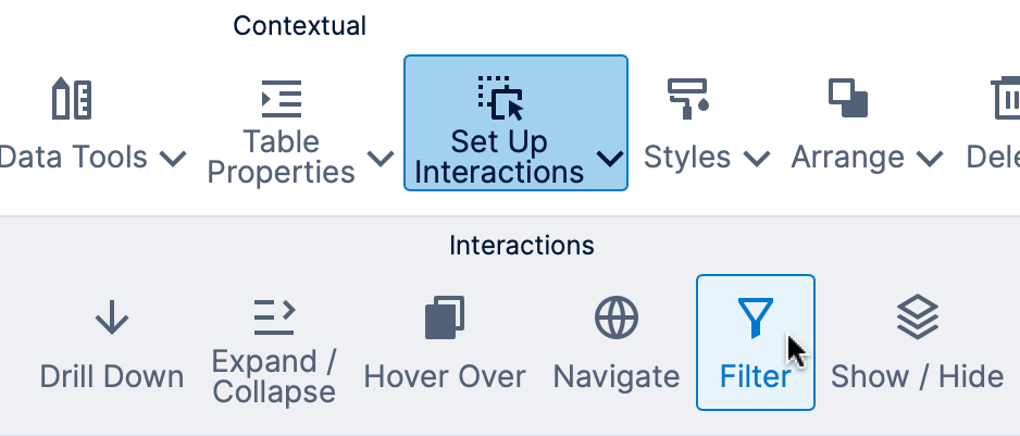
Choose the same option from the toolbar again to edit or delete the action, or you can find this action in the corresponding actions list in the Properties window as described in the next section.
For Hover Over, a Pop-up action is always added to the Hover actions of the element for when viewers hover over it with their mouse. Other interactions are set up depending on the element:
- Data visualizations – Click
- Filters – Value Changed
- Radio Button List – Selection Changed
- Drop Down List – Selection Changed
- Timer – Timer Interval Tick
- Slider component – Changed
- Other components – Click
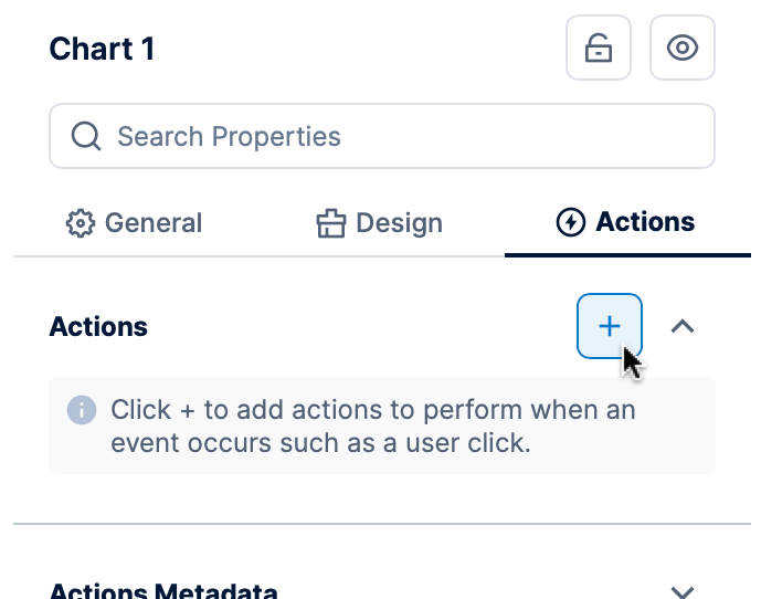
3.2. In the Properties window
You can use the Properties window to add a custom action for whichever event you prefer, or to add or reorder multiple actions. As an example, you can make a pop-up appear when a data point is clicked, rather than when the mouse hovers over it.
In the Actions tab, click the + button. (In previous versions, find Actions in the Main tab and click the + or menu button next to one of the lists of actions.)
In the popup that appears, choose the Trigger (event) and the type of Action to run: for example, Click and Pop-up (which will also apply when a viewer taps on a touchscreen).
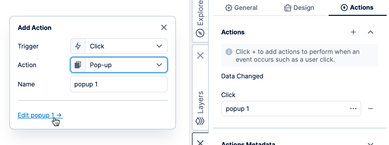
Optionally customize the Name, then click the Edit link as a shortcut to edit the remaining settings. Notice that the item is already listed now in the Properties window, where you can click to edit it later.
If there are multiple actions added to the same list, you can drag to reorder them (click the sort buttons in older versions). Actions will run sequentially in the order in which they are listed under each heading.
4. Configuring an interaction
When the configuration dialog appears, in many cases the interaction will set itself up automatically and you can immediately click the Save button at the bottom to close it.
Some actions have additional options to configure how the interaction is triggered. Common configuration options are described here, while others are included in walkthroughs linked to for each type of action in the list above.
All actions have a Name (sometimes called 'friendly name') you can optionally customize to help identify actions in the Properties or Layers windows.
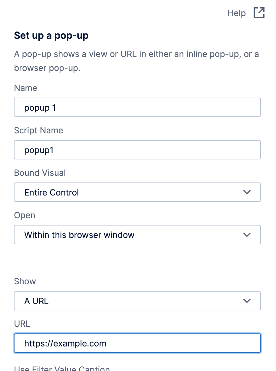
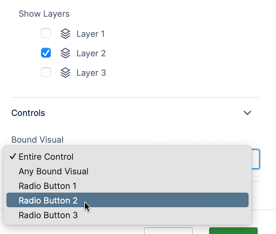
4.1. Bound visual
The Bound Visual option (if available) causes the action to occur only on the indicated part of that control or visualization. You can add multiple actions to the same event via the Properties window if you want different actions for different Bound Visuals.
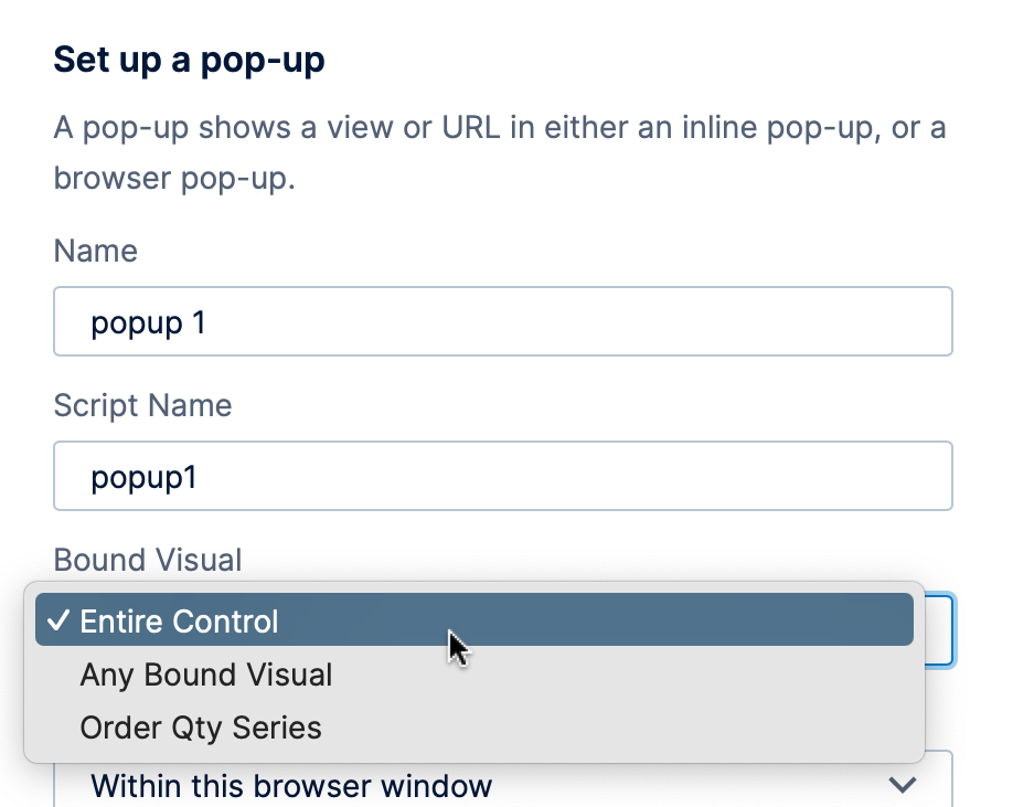
- Many visualizations allow you to limit an interaction to a specific area, such as a column in a table or one series of data points in a chart.
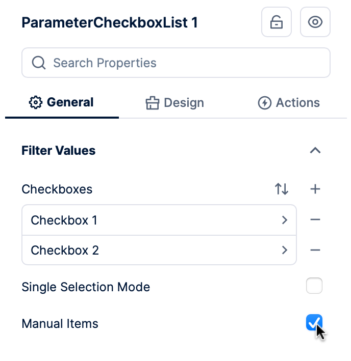
- Checkboxes can be in one of two states: Checked, and Unchecked, and you can bind an interaction to either state. For example, you can show a layer of content when a checkbox is Checked and hide it when Unchecked.
- Drop Down Lists and Radio Buttons allow you to set up their items or buttons yourself in the Properties window, and you can then use the Bound Visual option in interactions to bind separate interactions to each one. For example, a Show/Hide interaction can show a particular layer of content on a dashboard with other layers hidden when the second of three radio buttons is selected.
To use a filter in this way instead of as a regular filter, select its Manual Items property option. For example, you can add items to a Checkbox List filter and set up an action for each item.
4.2. Set up parameters
Many actions involve choosing what data should be passed to a parameter (e.g., what data to filter by).
When setting up a filter or drill down interaction, it will be configured for you automatically based on compatible data on the current dashboard or view, but you can confirm or change this setting. Navigate and hover over/pop-up interactions require setting up the parameters if you want the other dashboard or view to be filtered.
To set these up, click Set up parameters in the interaction dialog.
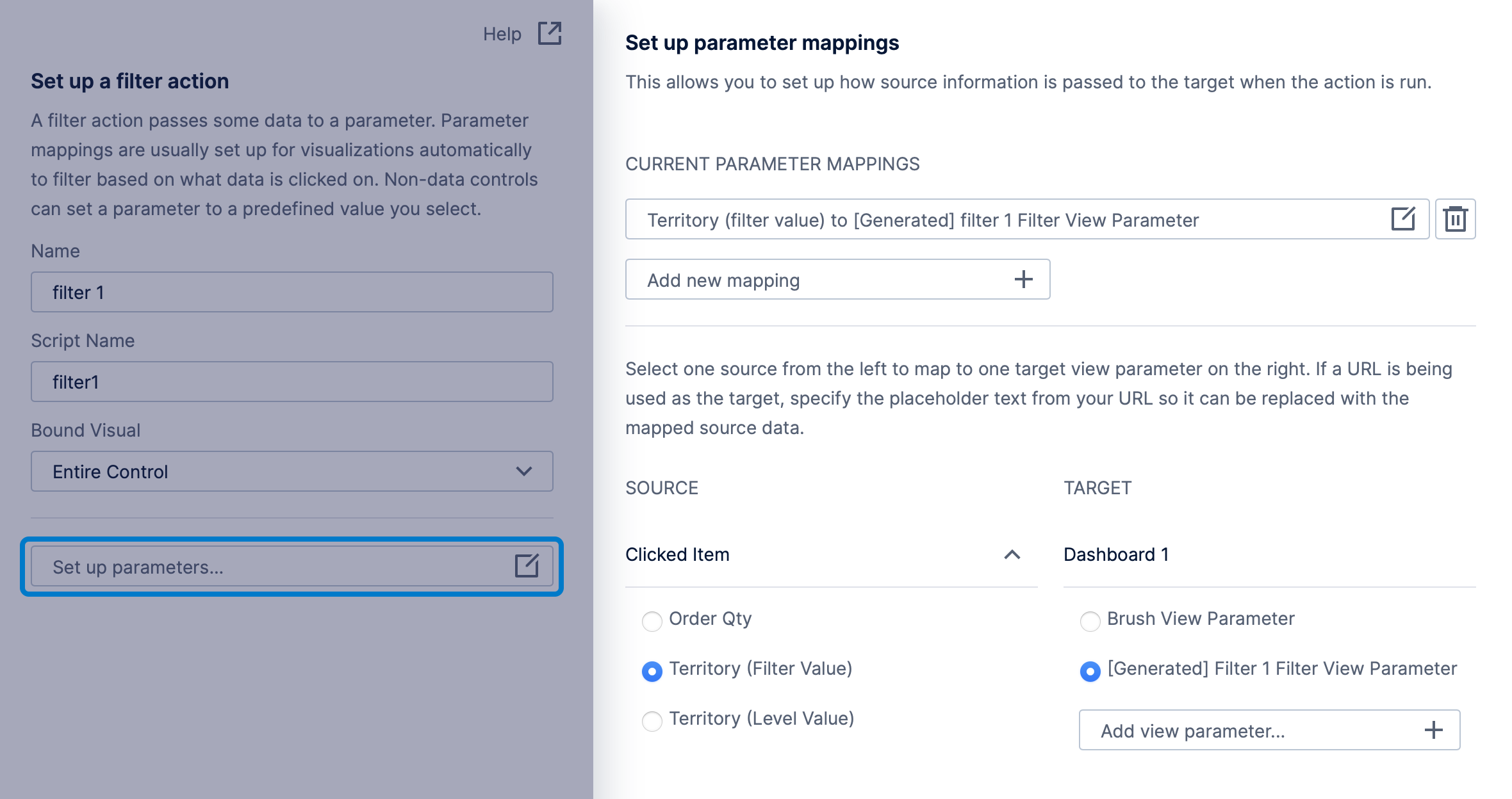
Under Source, choose what value should be passed to a parameter. To pass more than one clicked value at the same time, click the Add new mapping button to add multiple mappings: one for each value.
Under Target, choose a parameter to pass that value to. A parameter will automatically be generated for a filter or drill down interaction connected to compatible hierarchies on your dashboard or view, or you can choose your own parameter. You can create parameters or change what the parameter is connected to in the Parameters window.
For a walkthrough on setting up parameters, see the articles linked to above for each action.