
1. Overview
This article gives specific examples of how to configure the visualization tab of the Data Analysis Panel for various types of data visualizations. The visualization tab helps you assign data elements from the underlying metric set to parts of the data visualization. Using the Data Analysis Panel and simple drag-and-drop operations, you can display data in the form of labels, headers, tooltips, colors, etc.
See Setting up the visualization to learn more about the visualization tab.
Related video: Configuring Metric Sets
2. Chart visualizations
2.1. Grouping series in a bar chart
The Series Grouping option of a series allows you determine whether a data point series is grouped into multiple series based on a hierarchy's values.
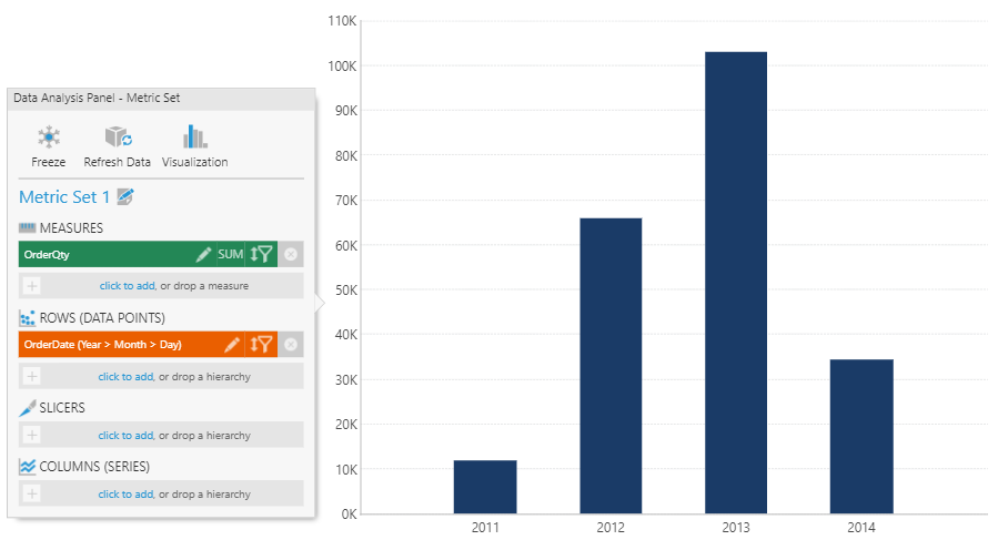
As an example, consider a metric set with the following data selected and visualized as a bar chart:
- Measures: OrderQty
- Rows: OrderDate hierarchy
Click the Visualization button in the top-right corner of the Data Analysis Panel to switch to the Visualization tab. Under the first series, click More to see additional options. Locate Data Point Label and Series Grouping. Drag the Product hierarchy from the Explore window and drop it under each. The resulting bar chart shows a cluster of bars over each year, each with a bar for each value in the top level of the Product hierarchy.
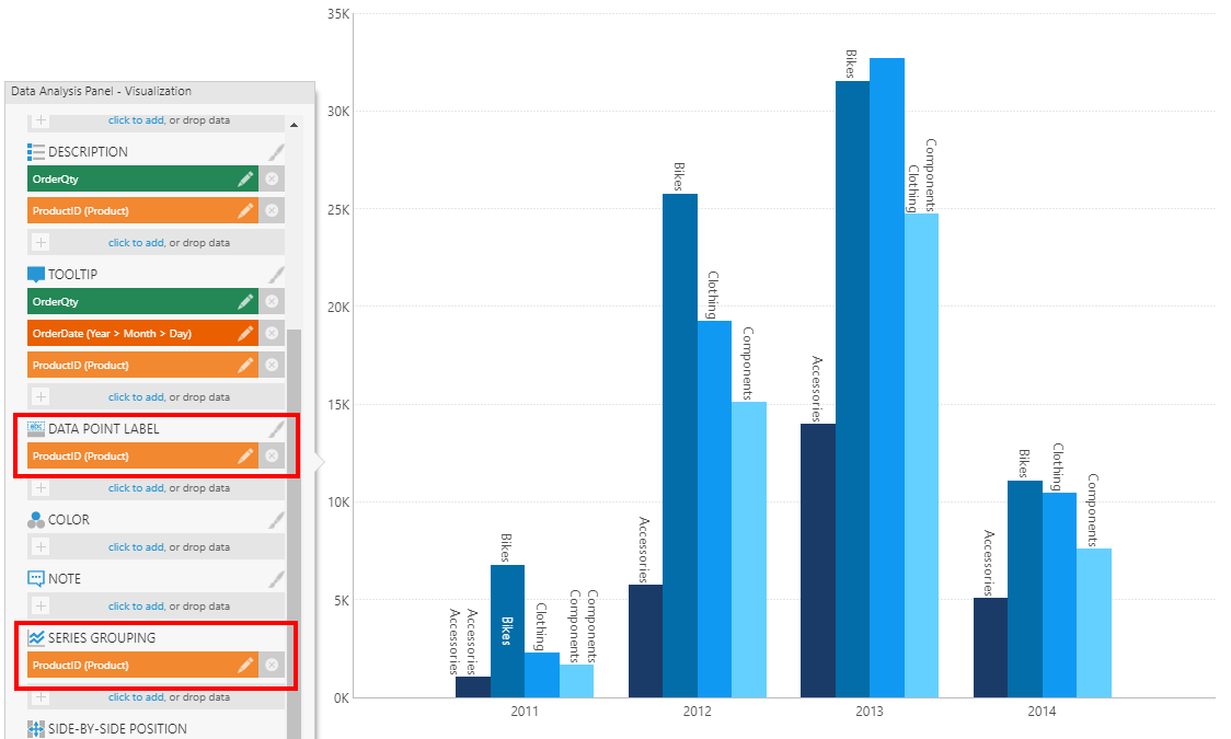
If there is a series in your chart that repeats the same values in each grouping, you can remove the hierarchy from Series Grouping to prevent it from being displayed multiple times.
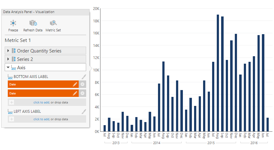
2.2. Axis labels
Axis labels can be used to display labels from upper levels of a hierarchy (e.g., Month grouping labels under Day labels) by dragging a hierarchy level from the Explore window, or to display measure values by dragging a measure.
For example, consider the chart below showing typical axis labels displayed for a time dimension hierarchy. They combine the month names with the year repeated in consecutive labels.
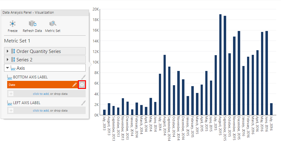
To replace this, switch to the Visualization tab in the Data Analysis Panel. Click to expand the Axis section, and remove the time dimension from under Bottom Axis Label.
Find and expand a time dimension hierarchy in the Explore window to list its levels, then click and drag each individual level you want labeled to Bottom Axis Label.
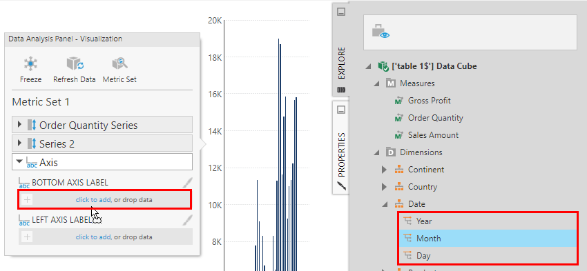
Each level will be displayed as a separate row, and instead of repeating values like the year, each value is displayed once with leader lines grouping the values below. The values are displayed using the short caption format settings in the time dimension.
2.3. Color
Add data under Color to apply different colors to data points or series based on their values. Colors are applied according to color rules, which you can configure from the Properties window. See Apply colors to data points or series using color rules for more details.
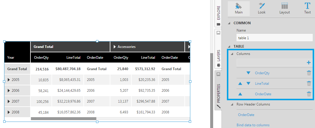
3. Table visualization
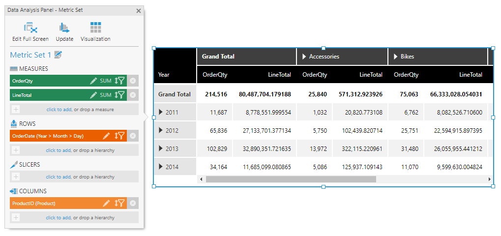
Consider the metric set with data selected as follows:
- Measures: OrderQty, LineTotal
- Rows: OrderDate hierarchy
- Columns: Product hierarchy
This metric set configuration is not specific to a table visualization, but rather it describes how data will be grouped into a tabular result (of rows and columns), which can then be visualized in a variety of ways including both charts and tables.
The figure below shows this set up in the Data Analysis Panel, and the corresponding table visualization displaying a row for each OrderDate (year) and a column for each different Product (or product category):
Click the Visualization button in the top-right corner of the Data Analysis Panel to see and change which data is displayed in different parts of the table visualization:
- Column Header - displayed as a row of column headers above the table's columns.
- Row Header - displayed as a column of row headers to the left of the table's columns. Row headers are a special kind of column designed to visually group data appearing on the right, where values are displayed once for consecutive rows instead of repeated. There may also be triangular expander buttons you can click to expand or collapse data to switch between summaries and details.
- Column - displayed as regular (or 'flat') table columns. These columns are repeated for each column hierarchy value (e.g., each Product hierarchy value).
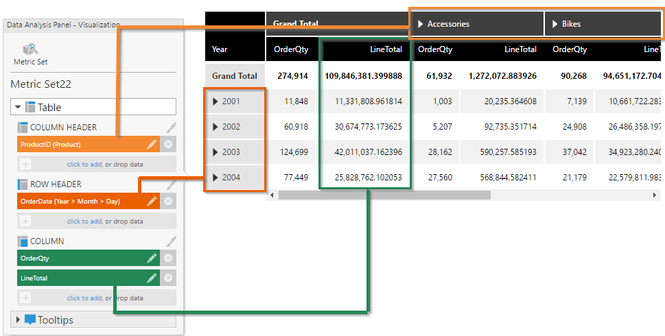
You can drag data or click to add data under one of these headings to add additional elements to the table, or click x to remove them.
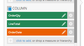
For example, only measures OrderQty and LineTotal are assigned under Column in the example above, but you can add any data there to display as regular columns, including hierarchies. You can also add the same data multiple times as multiple columns that you can customize differently.
Each table column has settings such as header text, tooltip, appearance, state styles, and different column types, all of which you can further customize in the Properties window.
When you're setting up interactivity, such as hover-over interactions, you also have the option of targeting a specific table column (e.g., using the Bound visual option).
The Visualization tab also allows you to remove an element of the metric set from the visualization, or to restrict it to only a certain use. For example, a measure can be removed from under Column so that it is not displayed directly in a column of the table, but added instead to the tooltip of some other column.