
1. Overview
The following walkthrough shows you how to:
- Choose data to display directly on a dashboard or other view as a table visualization.
- Apply a time dimension to date and time data.
- Re-visualize the table as a bar chart.
- Drill down and drill up on the data.
These steps create a metric set on the dashboard for analyzing the data from your data source. You can work with multiple metric sets at once when editing a view like the dashboard in this example, or you can follow similar steps when editing a single metric set full screen.
The Adventure Works SQL database is used as an example.
2. Walkthrough
2.1. Create a new dashboard
From the main menu, choose Views, and then click to Create a dashboard.
Choose the Blank option to drag and drop content anywhere, or a template with a grid-like layout instead if you prefer.
2.2. Add a measure
In the Explore window, locate the data you want to display from within a green folder such as Data Connectors or Data Cubes.
For this example, we will expand the data connector for a database, then expand its database table [Sales].[SalesOrderDetail], and drag the OrderQty column to the canvas.
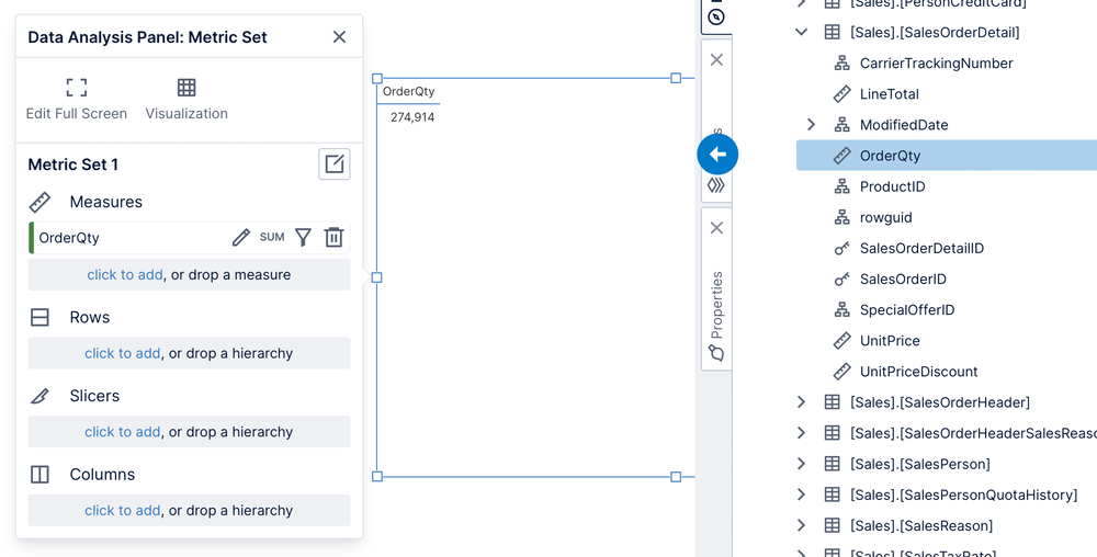
By default, data is displayed within a new table visualization. The Data Analysis Panel appears to the left with the new metric set it's based on, which you can use to determine how data is displayed.
OrderQty contains numeric data, which is normally used as a 'measure' and it was added under Measures in the Data Analysis Panel by default. Only a single, aggregated number (the sum or total) appears in the table because no hierarchies (e.g., non-numeric data) have been added yet.
When editing a view like this dashboard, you can drag and drop data from any data source to create new metric sets and visualizations, or drag existing metric sets created ahead of time, and display them all together.
2.3. Add a hierarchy
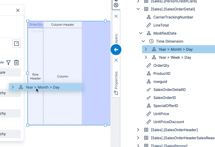
Under the [Sales].[SalesOrderDetail] table, locate the ModifiedDate column and expand it. You'll see a Time Dimension item for columns like this containing date/time data, and this contains date and time hierarchies you can use to group and explore through the individual dates.
Drag the Year > Month > Day hierarchy onto the area labeled Row Header over the table visualization. You can also expand the hierarchy first and drag one of its levels.
The hierarchy is added under Rows in the Data Analysis Panel, which groups the data so that the table visualization displays one row for each year. Note the OrderQty values are now broken down by year.
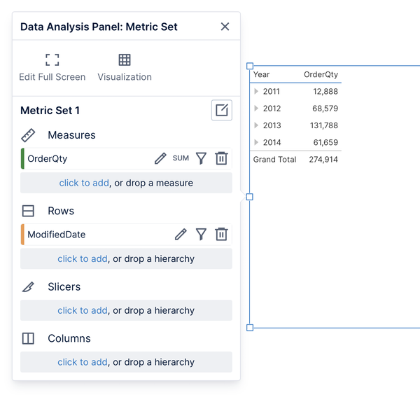
(Row headers in a table visualization have certain features compared to regular columns, such as the triangular buttons like those displayed here next to the years to expand them down to lower levels.)
2.4. Re-visualize as a chart
With the table visualization selected on your dashboard, click Re-Visualize in the toolbar and select Bar Chart.
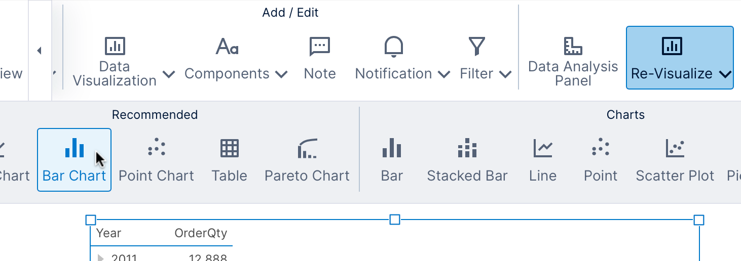
The table is re-visualized as a bar chart.
2.5. Drill down and drill up
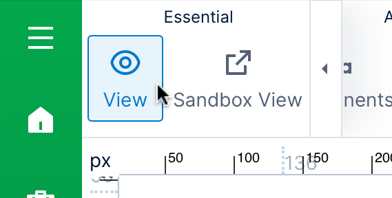
In order to interact directly with the data and drill down, click View in the toolbar to switch from the current Edit mode. In View mode, the rulers are hidden and the options available in the right-click menu for a visualization are different.
While in View mode, right-click (or long-tap) over any data, in this case one of the bars in the chart. From the context menu that appears, select Drill Down.
This option is available because of the time dimension we applied earlier, which allows us to explore the data through different levels like Year and Month.
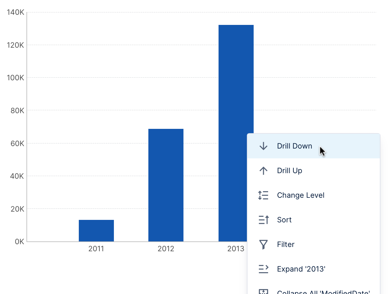
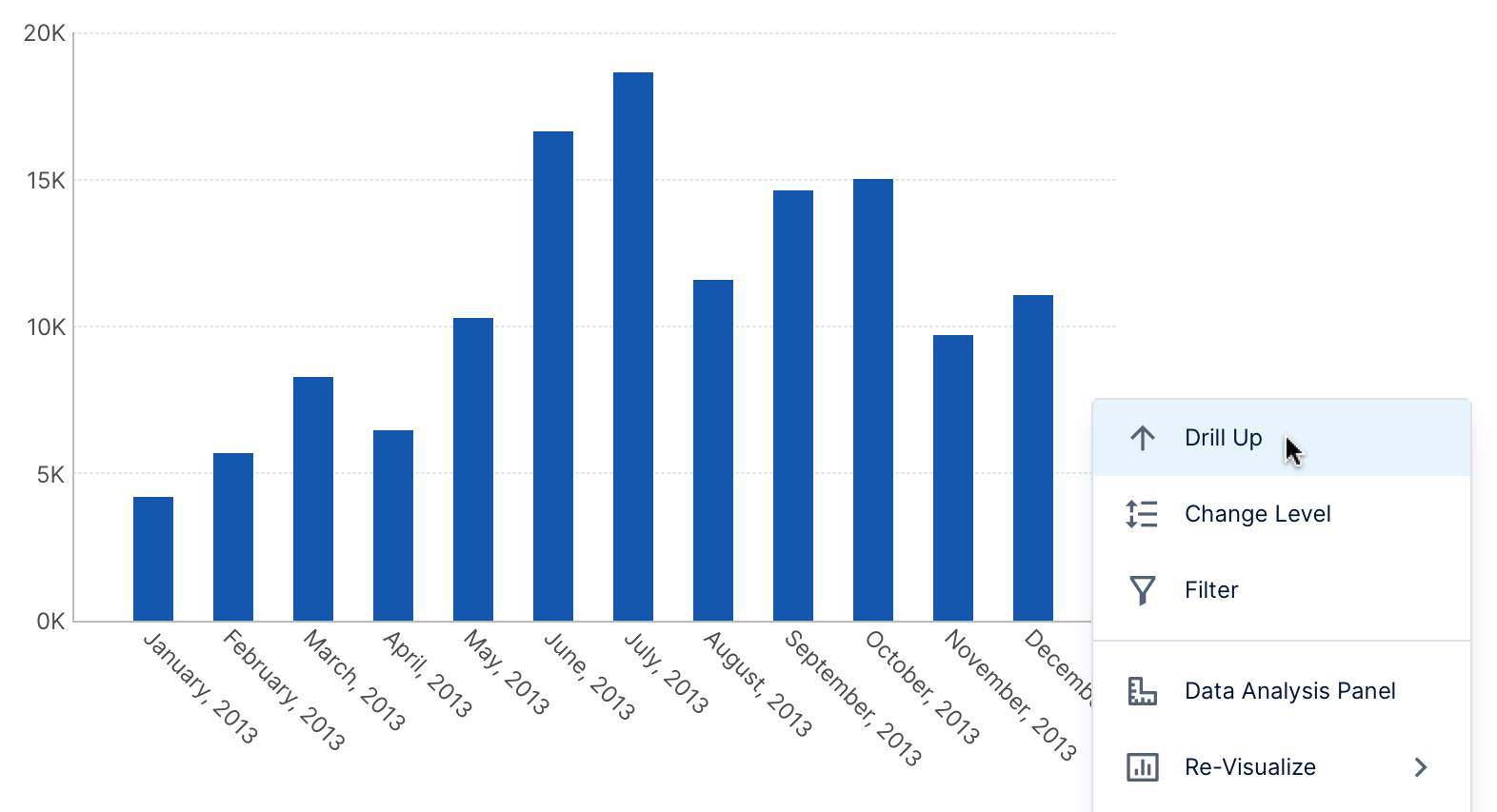
The chart now displays date members that are one hierarchy level down and which correspond to the bar that you just drilled down. For example: drilling down from the year 2014 to the individual months of that year.
You can continue drilling down further, or drill back up using the same context menu.
This is one of several options for exploring data that anyone can access from the context menu for any visualization when viewing a dashboard or other view, taking advantage of the metric set's analysis capabilities without necessarily needing to edit the metric set directly. For more details, see Metric set analysis tools.
To go back to Edit mode, go to the toolbar and click Edit.
Now you can also Check In your dashboard for others to see it, or you can share a link to it. Everyone who views this dashboard can access the same drill down options and other View mode interactivity (unless these are restricted by application privileges or in properties).