
1. Overview
This article outlines the overall data model and how the different types of files you can create work together.
2. The data model
The following diagram shows the main elements of the data model and how data flows in the system. Although the pathways are a bit different if you're working with relational data versus OLAP data, everything is ultimately modeled though cubes and visualized through metric sets.
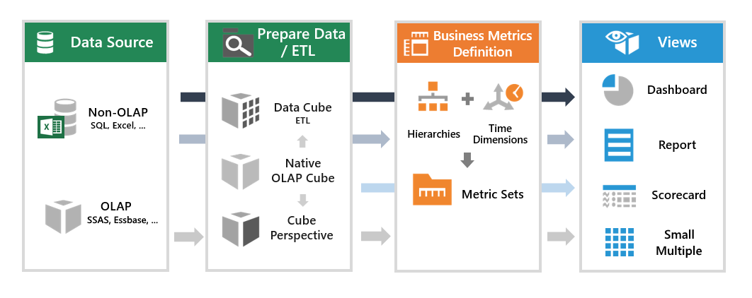
The data flow is flexible, as indicated by the background arrows in the figure above and described below. You don't need to create every element in the data flow, and can drag and drop a spreadsheet or database table directly onto a dashboard, for example. It is also modular, giving you the opportunity to reuse and collaborate on any part of the workflow.
Related video: Data Flow
2.1. Data connectors
- A data connector holds the information necessary to connect to a data source.
- The connection information required is different depending on the type of data provider that you select.
- For example, to connect to SQL Server, you generally need to choose an authentication method, specify a server instance, and indicate the database you want.
- Once you've created a data connector, you can go to the Explore window to access native data structures such as tables, views, stored procedures, functions, or OLAP cubes.
- For example, you can drag columns from native tables under your data connector and visualize it right away on your dashboard. Behind the scenes, items such as metric sets are auto-generated for you in order to have a complete data flow like the one in the diagram.
2.2. Data cubes (ETL)
- A data cube is a multidimensional model of your data that consists of measures, hierarchies, and metadata such as formatting.
- Works primarily with non-OLAP sources such as relational databases, letting you view your data as a cube without having to use an OLAP system like Analysis Services.
- You can set up an ETL process when editing a data cube by choosing from our wide range of transforms and connecting them together to perform tasks such as data cleansing and combining data.
- You can use your existing cubes from OLAP directly; otherwise, the OLAP Select transform lets you select a tabular set of data from it as input to a data cube to join with other data or perform other operations.
- Performance can be improved by using the optional storage types: warehouse to store the cube's output, or in-memory for faster analytics.
- There is always a cube behind a visualization and its metric set, so a data cube may be auto-generated for you if you drag data directly from a data connector so that you can start to work with it immediately.
2.3. Hierarchies and time dimensions
- Hierarchies (also called 'dimensions') are used for grouping data into rows and columns, and setting up drill downs.
- Hierarchies can have multiple levels, allowing you to easily drill up/down, expand upper-level items, or change levels.
- You can optionally define a hierarchy and its available settings ahead of time, or you can just use a plain column of data such as text or date values as a hierarchy directly.
- A time dimension is a container for one or more date and time hierarchies that are based on the same calendar system, which you can use with any column of date values to group and explore by levels such as Year and Month.
- Each project has a built-in time dimension ready to use, which you can modify if needed (e.g., to add levels such as Hour if your data includes times of day).
- New time dimensions can also be created, optionally based on other calendar types such as your company's fiscal calendar.
2.4. Metric sets
- A metric set selects a set of data from a data source or cube to display, and performs analytic tasks on it such as grouping, sorting, filtering, and formula calculations.
- To define a metric set, you add measures (numerical data), assign hierarchies to its Rows, Columns, and Slicers axes, and change their settings.
- In this way, a metric set is like selecting data in a 'pivot table', a query against an OLAP database, or other applications that use dimensions and measures.
- Metric sets also handle other things specific to the data you're selecting, including states, missing data rules, and formatting. These settings will apply regardless of which visualization you choose to use to display the metric set, and a single metric set can be reused multiple times and visualized in different ways.
- A metric set may be auto-generated for you. For example, you can drag and drop data directly onto a dashboard without first creating a metric set from the main menu.
2.5. Views
- Dashboards, reports, scorecards, and small multiples are all different types of 'views', which display data by combining multiple visualizations connected to metric sets.
- Dashboards are the easiest type of view to create, allowing you to simply place content where you want it, usually for display on a screen.
- Reports lay out content into multiple pages with scrolling, ideal for saving to PDF and for printing. (Reports meant for displaying on your screen without much scrolling can usually be created using a dashboard.)
- Reports, scorecards and small multiples have a lot in common: they give you an easy but structured way to create complex views involving repeated visualizations, just by using drag-and-drop operations.
- You can also add one view inside another: for example, a scorecard view can be dragged onto a dashboard and combined with other content, or you can create a dashboard combining several smaller dashboards together into a personalized view of data.
- Slideshows can display the views you select in sequence as a presentation, on automatic rotation, or combined into a single exported file such as PDF or PowerPoint.
3. OLAP sources
In the case of OLAP data sources, there is no need for another data cube because OLAP cubes are already multidimensional data sources that can be used directly. For example, if you have a data connector hooked up to a Microsoft SQL Server Analysis Services (SSAS) database, you can go to the Explore window and see the database's cubes under the data connector, and the measures and dimensions under each cube. Drag any measure or dimension onto a metric set or dashboard canvas, and the metric set will be based directly on the OLAP cube as shown in this walkthrough.
3.1. Cube perspective
A cube perspective lets you define a subset of a native OLAP cube. This is an optional item you can create in order to limit the measures and dimensions available to users when creating corresponding metric sets, dashboards, reports, etc.
4. See also
- Video: Data Flow
- Seat types
- Metric set analysis tools
- Automatic joins and hierarchies
- Promoting an auto-generated metric set
- Re-wire the data flow
- Connect to OLAP data and apply a formula