1. Overview
This walkthrough shows you how to connect to OLAP data such as an Analysis Services database, view the data on a dashboard, and apply formulas to data. The dashboard editor is used here, but you can follow similar steps using the metric set editor.
You can work with data from an OLAP database the same way as with data from other data sources, except that cubes have already been completely prepared in the database. These existing cubes are often used directly instead of Dundas BI data cubes, and they contain measures and dimensions or hierarchies rather than tables.
Related video: Formulas
2. Connecting to OLAP data
2.1. Create a new data connector
Create a data connector from the main menu or one of the other ways mentioned in the article Connect to data and view it on a dashboard.
Click in the Name box to type in a file name for your data connector, and set the Data Provider to the type of data source. We chose Microsoft SQL Server Analysis Services in the image below as an example, which is also used for connecting to Azure Analysis Services.
Fill in the fields that appear below, such as Server Name and Database Name, and change any of the other options as needed to successfully access your data source. The example used in this article is the Adventure Works sample database for Analysis Services.
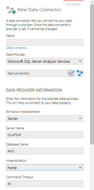
Optionally, click Test connection to verify the settings you entered.
Click the submit (checkmark) button at the bottom to check in the data connector and discover the available cubes in the background.
2.2. Create a new dashboard and add a measure
You can now use this data connector in metric sets or in views such as dashboards.
For example, create a new a dashboard from the main menu, selecting the Blank template option.
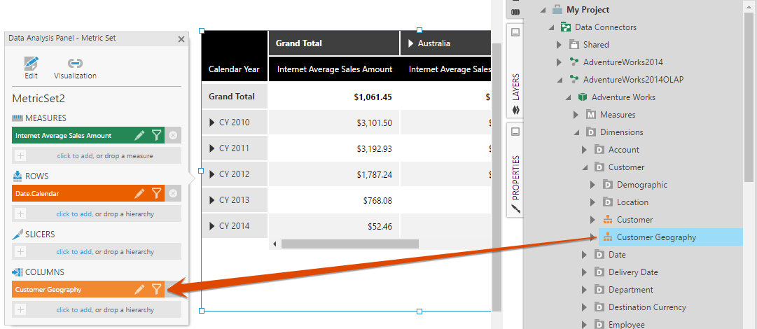
Go to the Explore window, locate the data connector you just created, and expand it to see a list of its available cubes. Expand a cube to see a list of available measures and dimensions.
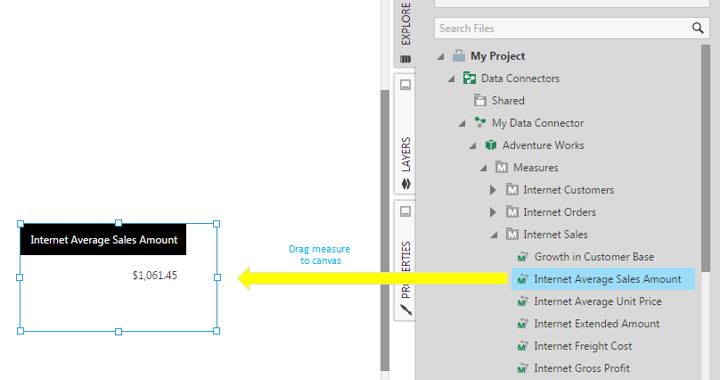
Find the Internet Average Sales Amount measure and drag it onto the dashboard canvas. A table visualization is automatically created, displaying a single measure value because no hierarchies have been added yet.
2.3. Add hierarchies
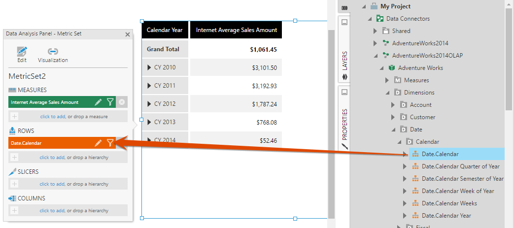
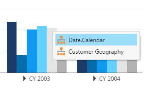
Next, go to the Explore window, expand the Dimensions folder under your cube, and find the Date.Calendar hierarchy.
Drag the Date.Calendar hierarchy and drop it onto the label drop a hierarchy under Rows in the Data Analysis Panel that appeared to the left of the table visualization.
The table visualization automatically updates to show expandable date members along its rows axis.
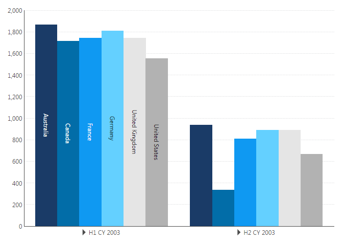
Similarly, drag the Customer Geography hierarchy to Columns in the Data Analysis Panel.
The table visualization updates to additionally show expandable country members along its columns axis.
2.4. Switch to View mode
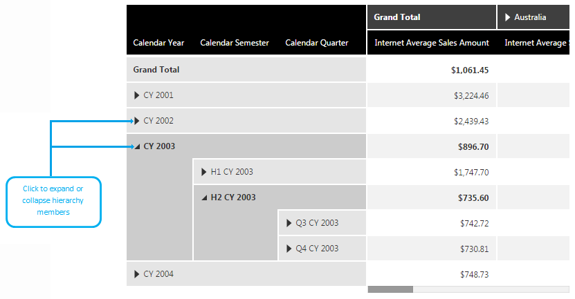
Resize the table visualization a bit larger and then click View in the toolbar so you can start interacting with the dashboard.
For example, click the triangle in the CY 2003 cell to see calendar half year members. Click the triangle in the H2 CY 2003 cell to see calendar quarter members.
2.5. Re-visualize as a bar chart
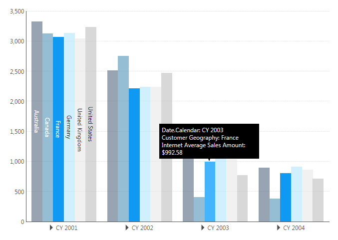
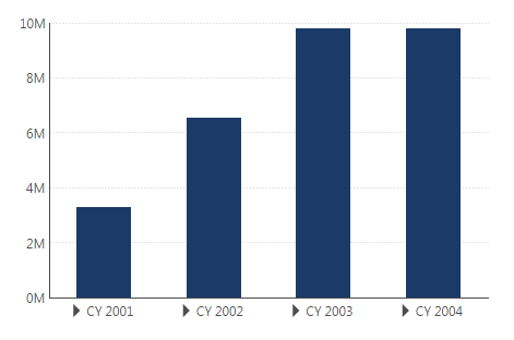
While in View mode, right-click (or long-tap) over the table visualization, click Re-Visualize, and then click Bar.
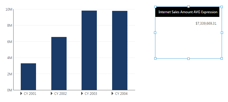
The table changes to a bar chart that displays calendar year (date) members along the X axis, and Internet Average Sales Amount measure values on the Y axis. The chart also shows multiple series, where each series (bars of the same color) corresponds to a specific Customer Geography member (e.g., country). You can see this if you hover over a bar to see its corresponding information in a tooltip.
2.6. Drill down on the date hierarchy
Right-click (or long-tap) a CY 2003 bar on the chart.
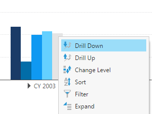
From the context menu that appears, choose Drill Down, and then select Date.Calendar as the hierarchy to drill down on.
The chart now displays date members along the X axis that are one hierarchy level down and which correspond to the CY 2003 member. You can Drill Up the same way, or switch back to Edit mode. If you switch back to Edit mode, you'll see that the chart remains in the same state it was in before you exited View mode (e.g., in the drilled down state).
3. Using formulas
In Dundas BI, you apply formulas by writing small expressions, much like you would in a spreadsheet application. A formula expression can be as simple as a constant number value, or it can use math and formula functions.
3.1. Create another dashboard
For this part of the walkthrough, create a second dashboard.
Go to the Explore window and drag the Internet Sales Amount measure to the dashboard canvas as before. A table visualization is added to the dashboard, showing a single measure value. The Data Analysis Panel appears to the side.
Drag the Date.Calendar hierarchy to Rows in the Data Analysis panel. The table visualization is updated with calendar year members along its rows axis.
Select the table visualization, go to the toolbar, click Re-Visualize, and then click Bar from the dropdown menu. The table visualization changes to a bar chart.
3.2. Add a formula to the bar chart
To begin applying a formula to the bar chart, choose Data Tools in the toolbar, or right-click (long-tap) the chart and choose it from the context menu.
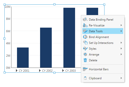
Then choose Add Formula.
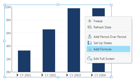
Below the toolbar, you'll see a formula bar appear. This lets you type in a formula expression such as a call to a formula function.
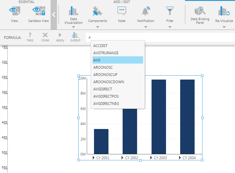
For example, to apply a formula that performs an average operation on the bar chart, go to the formula bar and type the letter A.
From the auto-complete menu, select the AVG function.
Type an opening parenthesis after AVG like the following:
AVG(
Once the above has been entered into the formula bar, a tooltip popup appears describing the function and its required arguments.
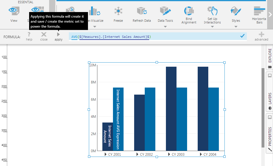
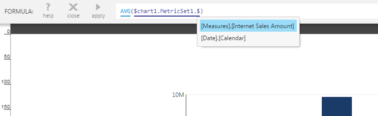
Specifically, the AVG function requires one argument, which is a set of data values. To indicate that you want to compute the average of the measure values displayed on the existing bar chart, click any data point on the chart, or type the dollar sign character ($) in the formula bar. This opens a menu that lets you choose an applicable argument for the function. For example, select [Measures].[Internet Sales Amount].
![Select [Measures].[Internet Sales Amount]](/support/images/dbi/docs/design/olap-formula-dollarsign-v2.png)
Make sure there is a closing dollar sign ($) followed by a closing bracket. The entire formula entry now reads:
AVG($[Measures].[Internet Sales Amount]$)
Click the apply button. If the formula syntax is correct, a checkmark is displayed in the formula bar, and the bar chart is updated to show the corresponding formula series.
For more information on the kinds of formulas you can apply, see the article Adding formulas.
3.3. Re-visualize the formula series
Next, right-click over one of the formula bars on the chart.
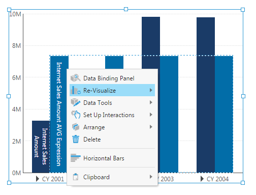
From the context menu that appears, click Re-Visualize, and then click Line. The formula series is now displayed as a horizontal line on the bar chart.
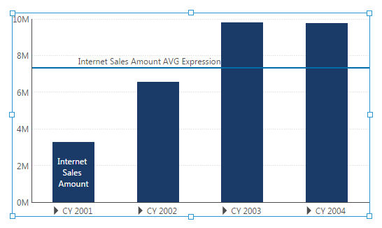
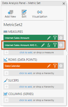
If you right-click over the chart and click Data Analysis Panel, you'll see that the formula result has been added as a second measure which is now part of this metric set. You can remove the formula result if desired by clicking its x icon on the right.
3.4. Adding a formula from the Data Analysis Panel
You saw earlier how to add a formula from the toolbar or context menu. If you have the Data Analysis Panel open, you can also add a formula by clicking the click to add link in the Measures section.
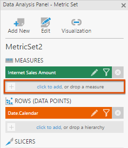
You'll see a list of available measures to add to this metric set.
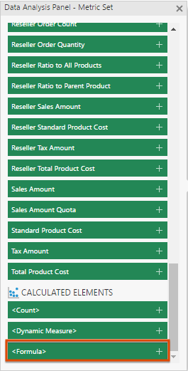
Scroll all the way down to the Calculated Elements section and click <Formula>. The formula bar will appear below the main toolbar as before.
3.5. Adding a formula as a new visualization
The previous example showed how to add a formula as a second measure/series on an existing chart (metric set).
But you can also apply a formula on an existing visualization and have the result displayed in a new metric set and visualization added to the dashboard. This option will leave your original visualization and metric set unchanged.
As an example, first create a new dashboard as before. It should have a bar chart (e.g., chart1) that displays an Internet Sales Amount measure against a Date.Calendar hierarchy. Go to the toolbar, click Data Visualization, and then scroll until you find the Formula Visualization item.
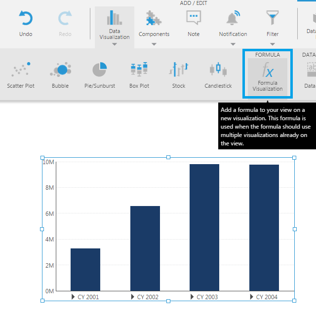
Click Formula Visualization to open the formula bar.
Type the letter A. From the auto-complete menu, select the AVG math function.
Now can refer to any or multiple visualizations on the dashboard as inputs to the formula, so the placeholders referring to measures include the visualization and metric set names. The easiest way to enter this is to click on a data point on the chart, or you can type it yourself as follows:
Type a dollar sign character ($). From the menu, select chart1.
Type a period character (.) and then from the menu, select MetricSet1.
Type a period character (.) and then from the menu, select [Measures].[Internet Sales Amount].
The formula entry looks like this so far:
AVG($chart1.MetricSet1.[Measures].[Internet Sales Amount]$)
Click apply. The formula result is displayed as a new table visualization (and metric set) which is added to your dashboard. This new metric set is called a formula metric set.