
1. Overview
This article shows how you can add automatically configured absolute and relative variance charts to your table or chart, or easily set up a waterfall chart as a variance waterfall.
2. Variance table
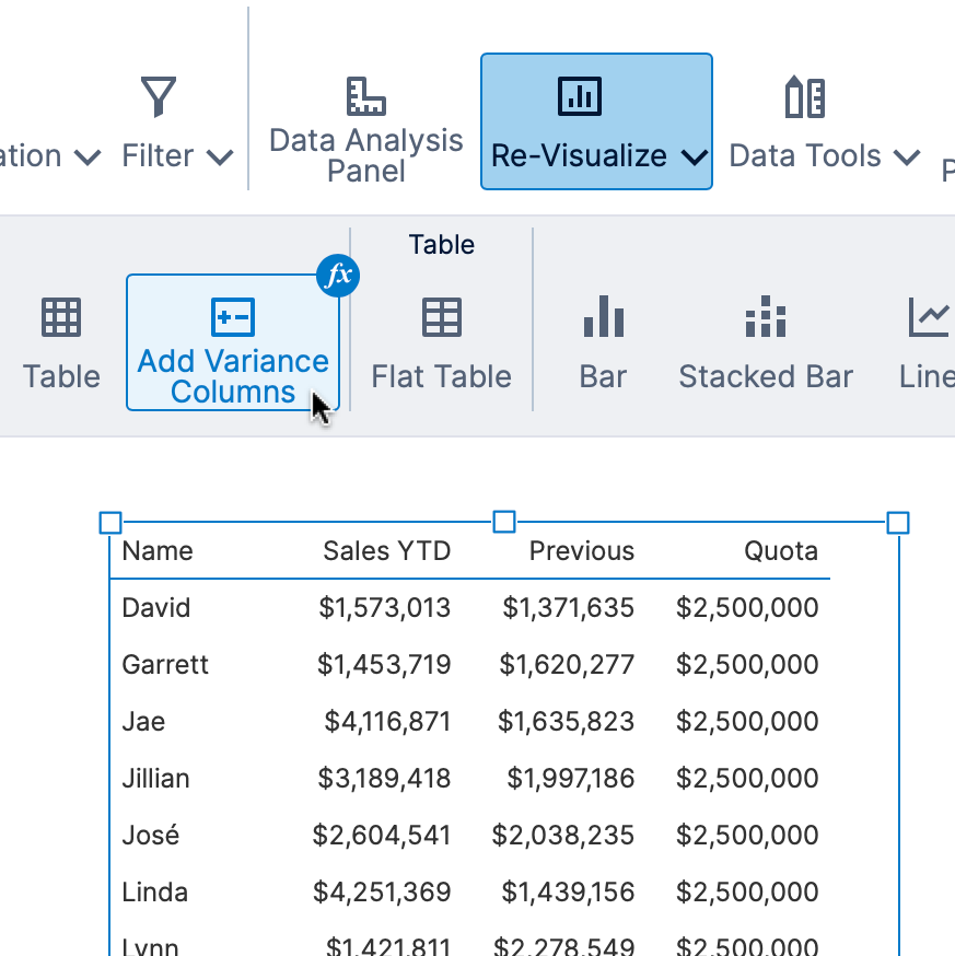
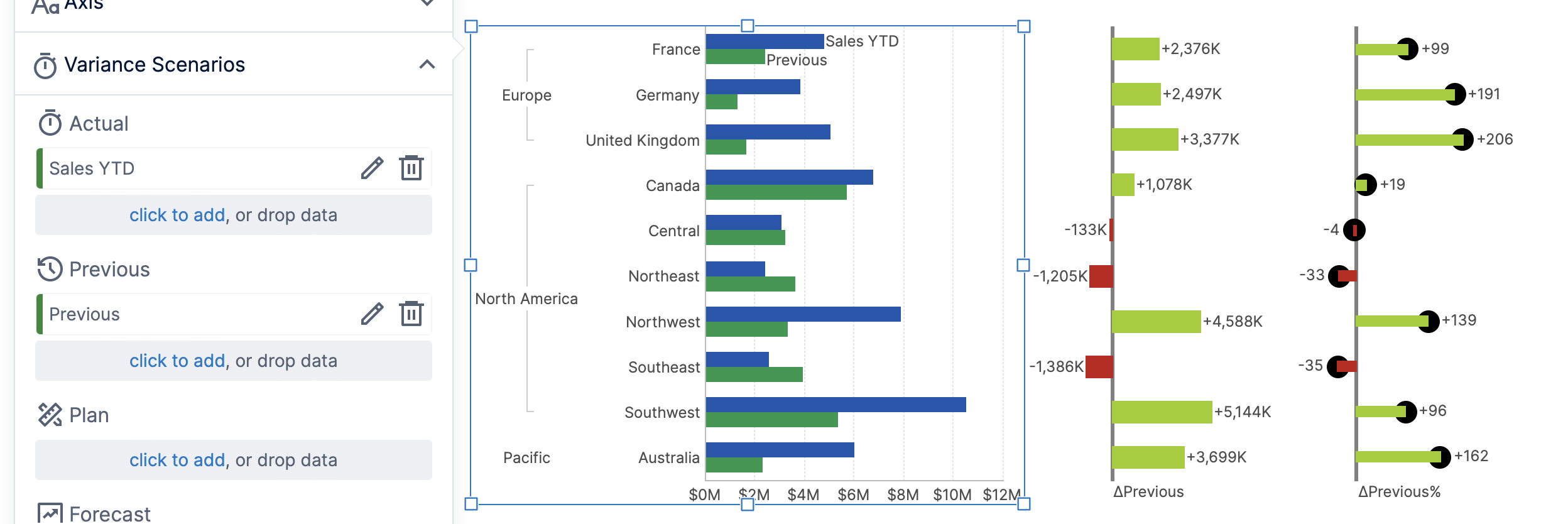
You can set up a variance table including absolute and relative variance chart columns by assigning the data to be compared.
For a table like in the example below displaying two measures, clicking Re-Visualize will offer the option to Add Variance Columns under Recommended if not already applied to this table.
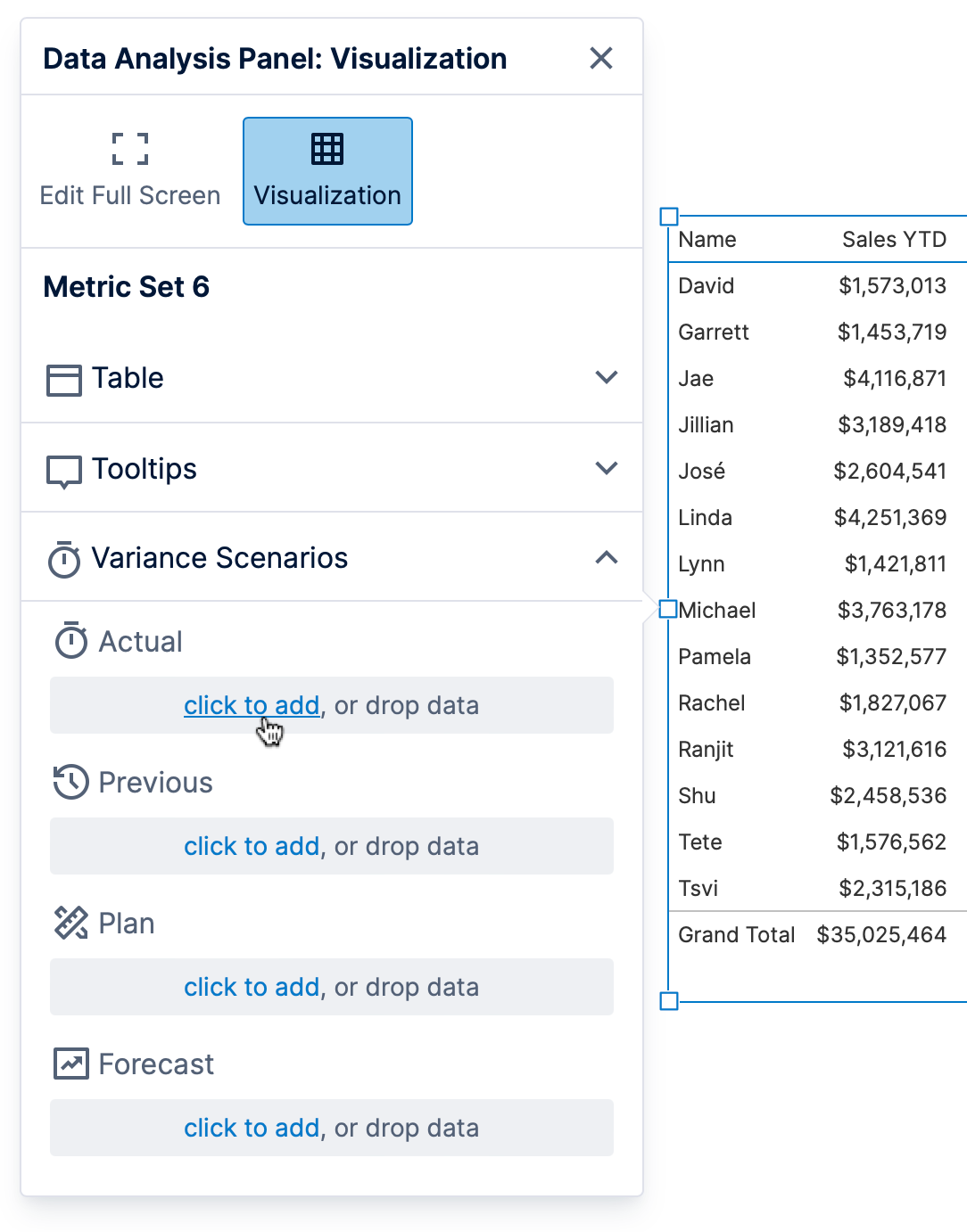
This opens the Data Analysis Panel to the Visualization tab and expands the Variance Scenarios section. You can also open the Data Analysis Panel to this section yourself at any time.
Assign your data to two or three of the listed scenarios:
- Actual – Measured data that occurred in a recent time period.
- Previous – Measured data that occurred in a previous time period. You can easily add a period over period comparison measure to use here such as the previous year's values.
- Plan – Budgeted or target values. You can add a contextual measure if you want to enter your own target values.
- Forecast – Expected data, e.g. sales figures forecasted based on current orders (cannot be compared against Actual).
This automatically calculates the variances (differences) between the assigned values, and configures two data bar columns to display them as charts. You can customize or remove any of the resulting changes, as they are made only once at the moment you assigned the data above.
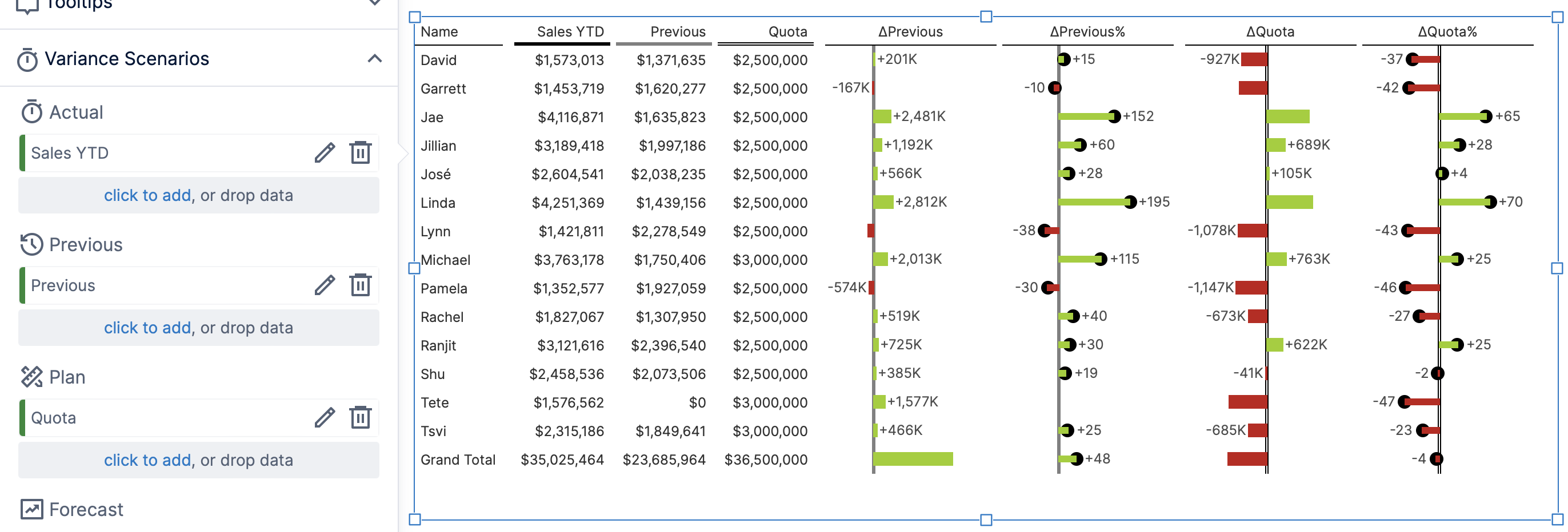
The first new column visualizes the absolute differences between the values, while the second visualizes them as a percentage relative to the size of each comparison value (e.g., relative to Previous). You can see and change the formulas used for these by clicking their fx button in the Data Analysis Panel. A number of property customizations are made for you in the charts including states highlighting negative variance values.
By default, the column headers displaying your original values are set up with an appearance matching where they are represented in the charts. In the image above, each chart axis matches the corresponding column header for either Previous or Quota (planned data).
3. Adding variance charts
As with a table, clicking to Re-Visualize a chart displaying two measures may show you the option to Add Variance Charts under Recommended.
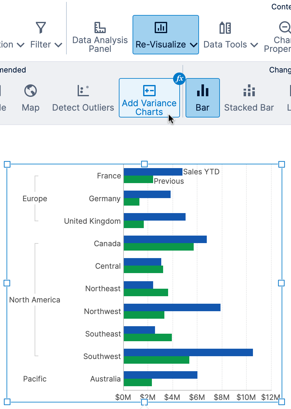
Otherwise, you can open the Data Analysis Panel, click Visualization, and click to expand Variance Scenarios.
Assign data to two or three of the scenarios the same way as described above for a table.
This will add separate charts positioned to the right or above your chart. They are pre-configured to use the Align Axes option in the toolbar and to share their axis scale with your original chart so that the data points line up.
4. Variance waterfall
After adding or re-visualizing to a Waterfall chart and adding some data, click Re-Visualize and find Variance Waterfall under Recommended.
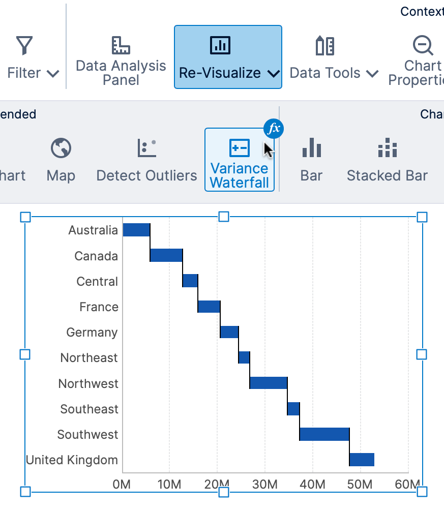
Or you can open the Data Analysis Panel yourself to the Visualization tab and expand Variance Scenarios for a waterfall chart at any time.
Assign data to either Actual or Forecast, and then either Previous or Plan. See the section for tables for more details about scenarios. (Only two scenarios are supported at one time in a single variance waterfall chart.)
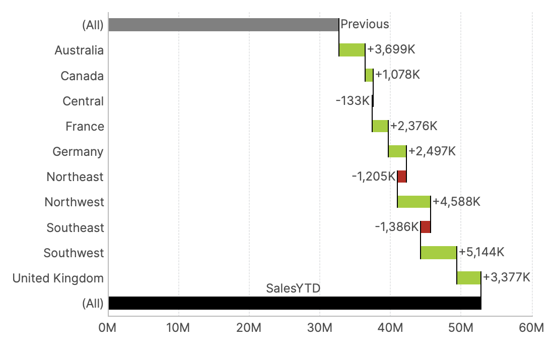
The resulting chart is set up for you with three data point series:
- The first series displays only a single total value for your previous or plan data, as a base bar at the beginning of the waterfall.
- The second series displays each of the contribution values in the middle, calculated as the variance (difference) between the scenario values for each value of the data added to Rows (Data Points) in the Data Analysis Panel for the metric set.
- The third series displays only a single total value for your actual or forecast data at the end of the waterfall.
If the total values are not displayed, or if you want to disable them, you can change the metric set's totals settings.
5. See also
- Using Dundas BI recommendations
- Using a table visualization
- Using chart properties
- Using a waterfall chart
- Adding formulas
- Set up states on a metric set