
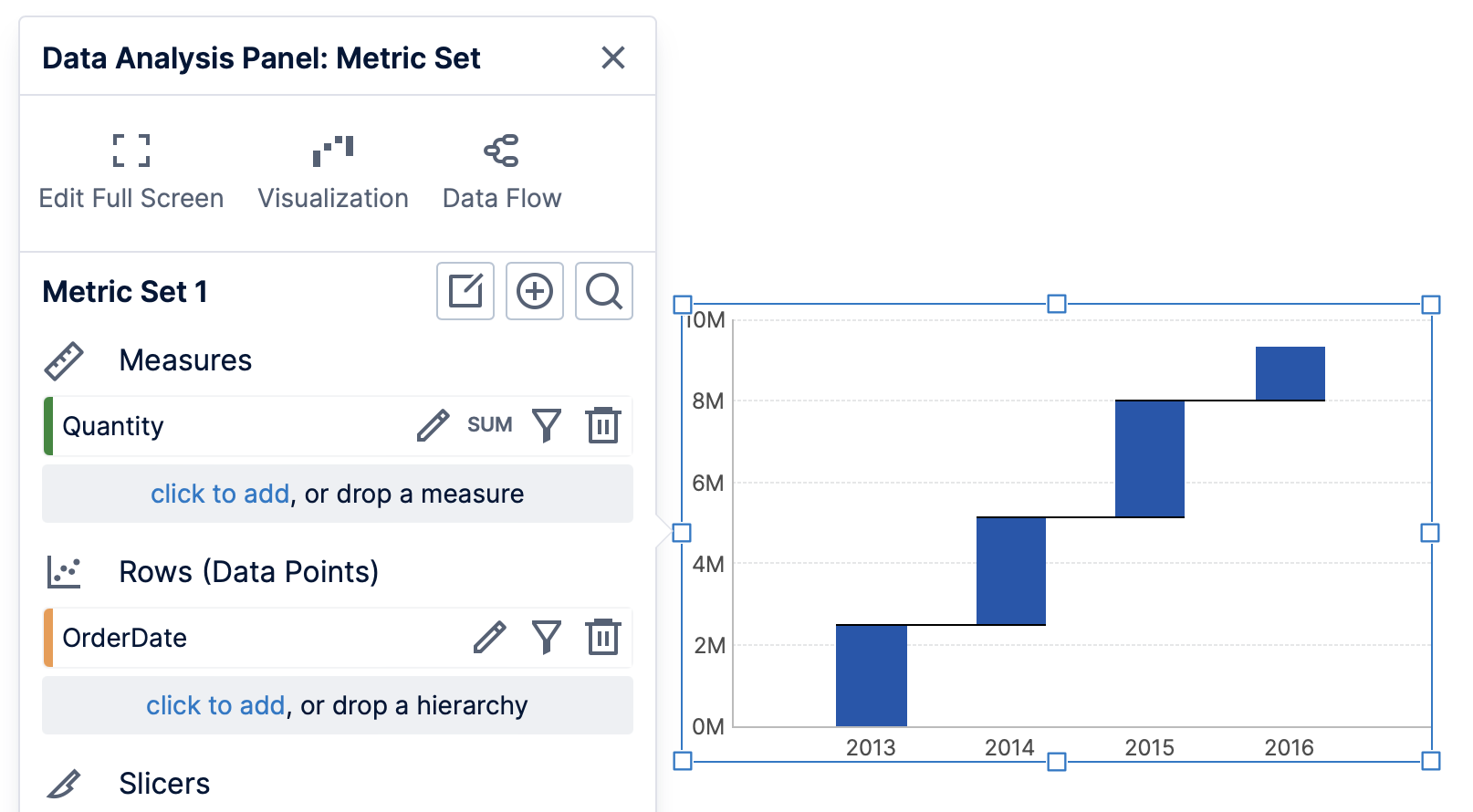
1. Overview
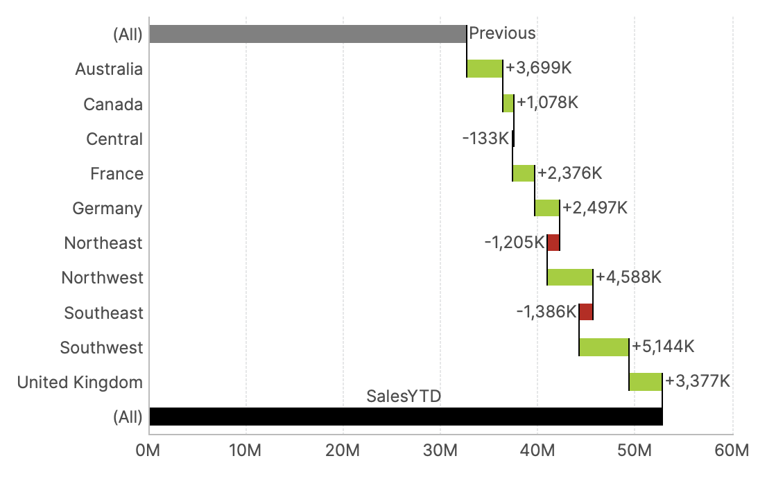
A waterfall chart displays the cumulative sum of a series of values as a specialized type of bar chart. It visualizes a measure's changes over a particular sequence, and well as its totals.
2. Selecting data
A basic waterfall chart can have a single measure and a single hierarchy.
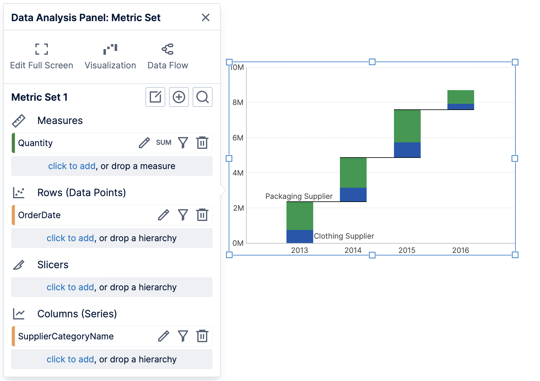
More complex displays are possible using multiple measures, or multiple hierarchies added to Columns (Series) in the Data Analysis Panel. Doing this will stack each set of values on each bar, showing how several component values affect the total.
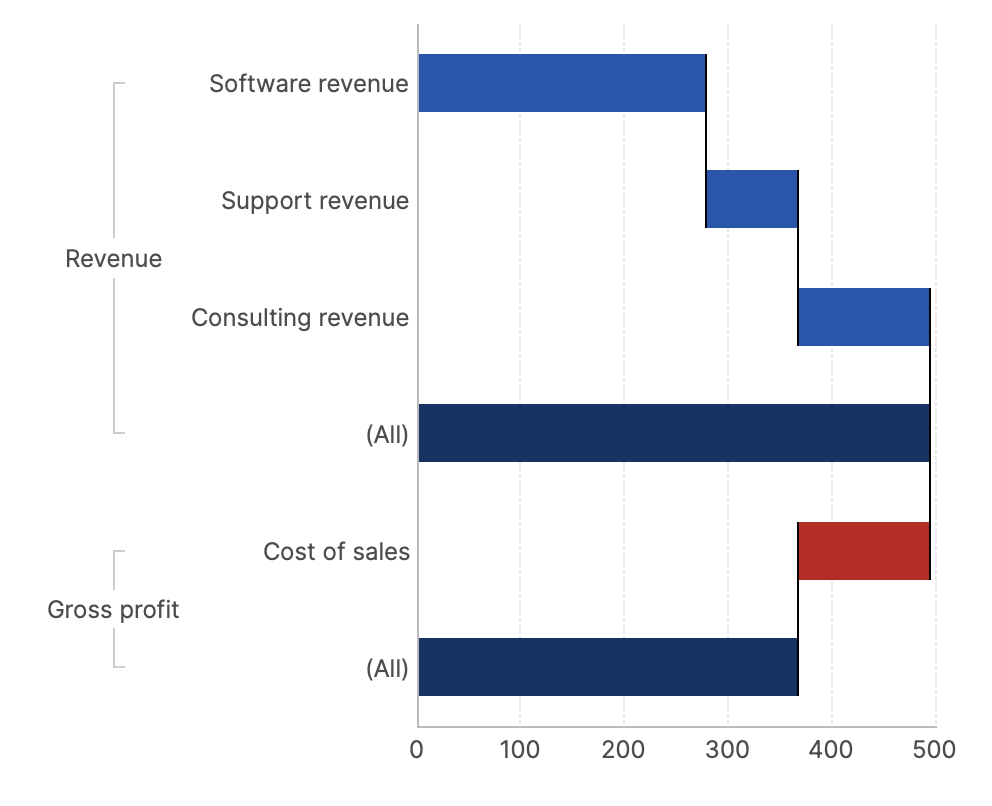
2.1. Totals and aggregators
Total values are often displayed on Waterfall charts. To change which total values are included:
- Check your metric set's Shown Totals setting and set it to Rows to display total bars, or else None. (The other options can result in adding a total series when data is added to Columns (Series) in the Data Analysis Panel, which is usually not used in waterfall charts.)
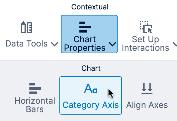
- When displaying date/time data, the bottom axis scale type may have been set to Date/Time by default, which does not support displaying separate total bars. You can find Chart Properties in the toolbar and choose Category Axis to change the scale type in this case.
Switching to a categorical axis - As the chart shows cumulative totals, the measure's aggregator should be set to Sum in the Data Analysis Panel. Using other aggregations may not display the desired result on the chart.
- Subtotal bars will be displayed if there are multiple hierarchies or multiple levels selected on Rows in the Data Analysis Panel. To select multiple levels when using a multi-level hierarchy, set the Top Level, or you can drag the levels onto the chart from the Explore window.
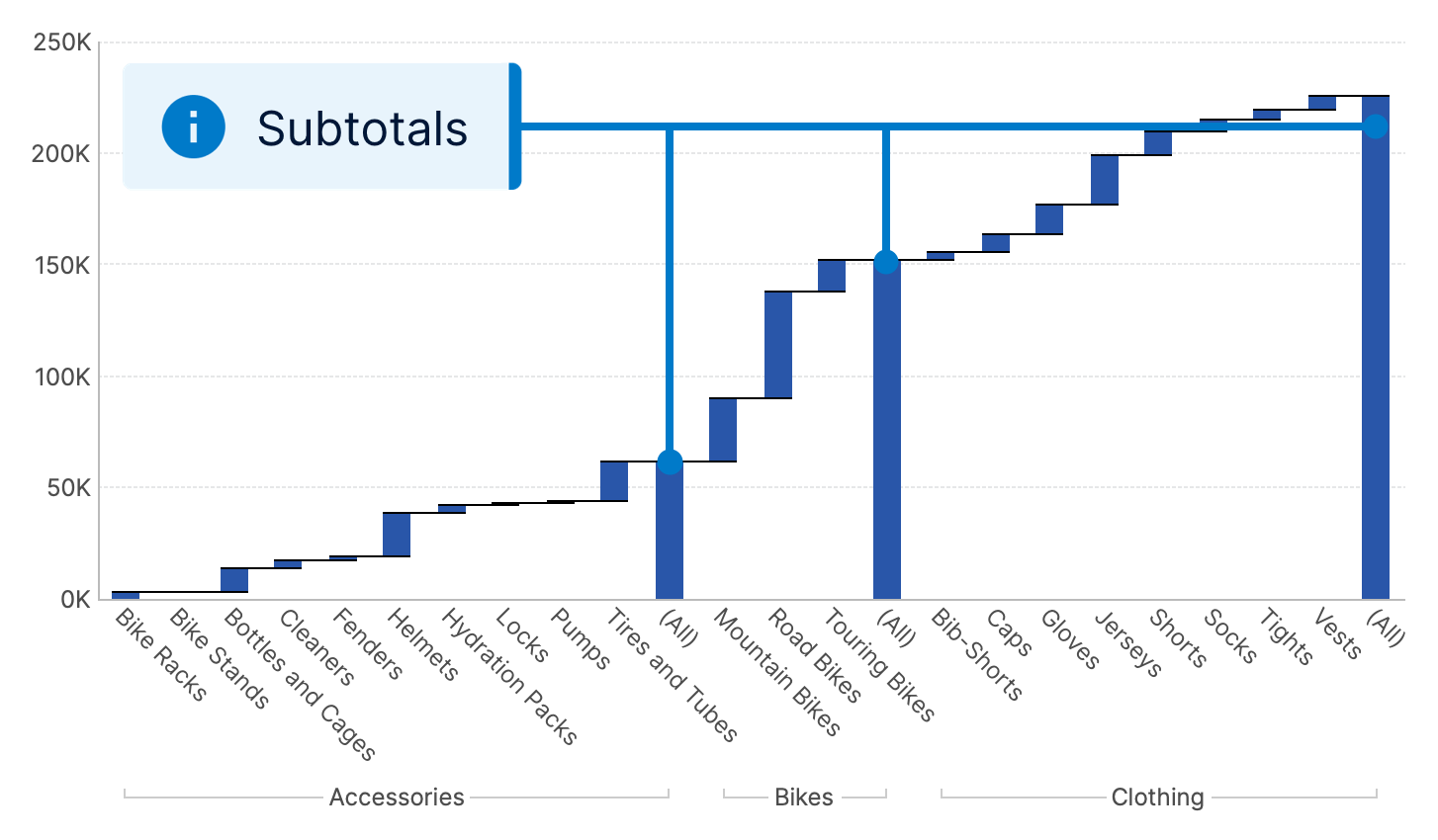
Waterfall chart with subtotals - To show or hide the grand total, see the Hide Grand Total property described next.
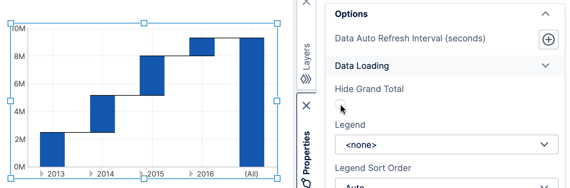
3. Properties
The grand total bar is hidden by default. To show it, un-check Hide Grand Total in the Properties window's General (or Main) tab for the chart. Find it under Data Points in recent versions.
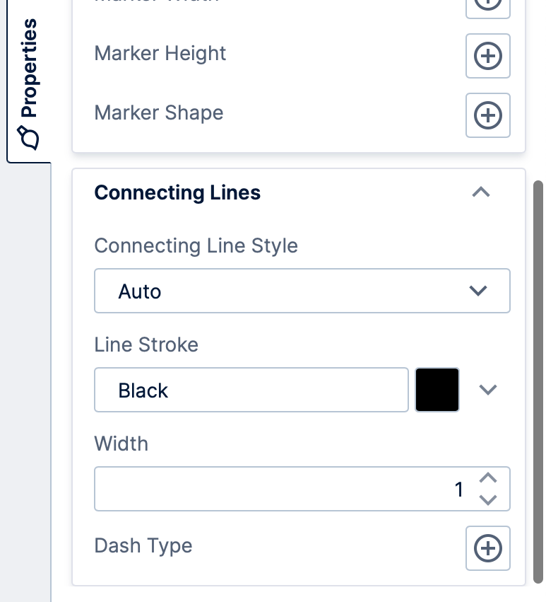
A waterfall chart (sometimes called a 'bridge' chart) typically displays connecting lines bridging the end of one bar with the start of the next. They can be customized using the connecting line settings found in the series properties, under Lines & Fills (previously Look tab).
4. States
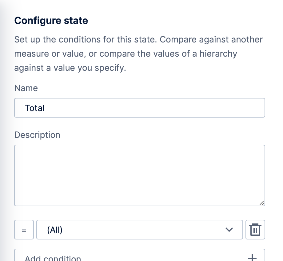
A common choice for waterfall charts is to visually distinguish between bars with positive versus negative values. This can be achieved by using states as shown in Set up states on a metric set.
Positive and/or negative states can compare against the constant value zero, while states identifying totals can compare against a hierarchy value of All.
5. Variance waterfall
You can have a variance waterfall set up for you automatically in version 23.4 and higher. For details, see Add variances.
6. See also
- Video: States
- Set up states on a metric set
- Using chart properties
- Metric set analysis tools
- Show or hide total values on a chart
- Add variances