1. Overview
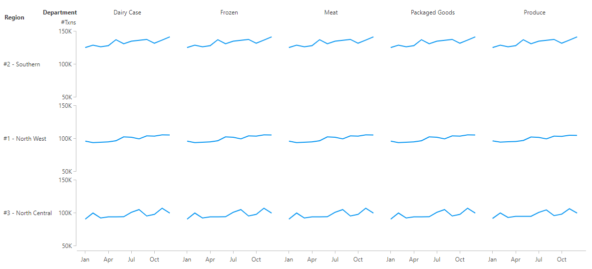
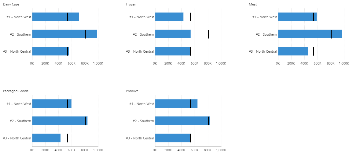
Small multiples (also called trellis charts) produce a series of some visualization displaying the same data but with one variable changed each time. They can arrange the series horizontally, vertically, or in a matrix, and allow you to easily compare multiple sets of data that wouldn't fit well in a single visualization.
A small multiple is another type of 'view' like dashboards and reports. You can view small multiples on their own or drag one onto another view to combine it with other content.
2. Choose a hierarchy to repeat by
Every small multiple repeats content for each value of some hierarchy, similar to reports and scorecards.
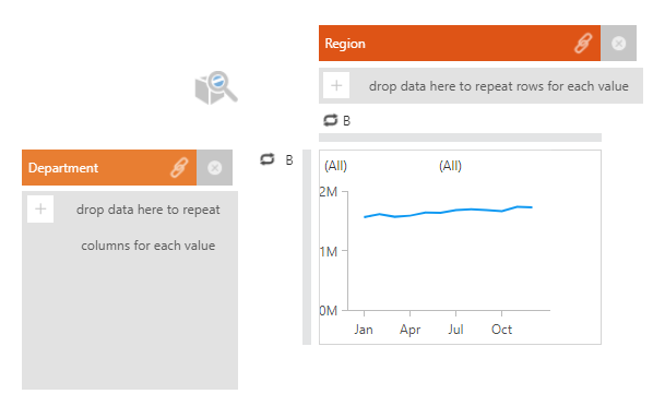
After creating a new small multiple from the main menu, you can drop a hierarchy or a column of categorical data (e.g., Department) from the Explore window onto either of the two drop zones that appear.
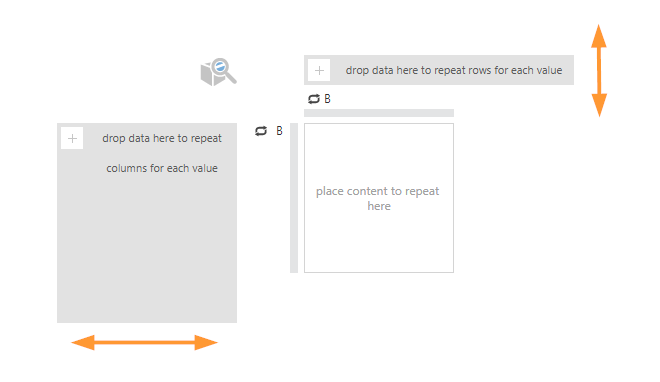
Drop data to repeat columns on the left to arrange visualizations horizontally, or rows on the top to arrange them vertically.
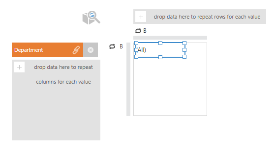
A data label is added automatically that will identify the hierarchy value in each cell. You can change or re-position this label.
3. Add a visualization
Add your main visualization to repeat as a series by choosing one from Data Visualization in the toolbar. To allow the visualization to change automatically as you add data based on recommendations, choose Smart.
This visualization can contain as much data and details as you need it to, and it will be reproduced in a series for each value of the hierarchy you chose to repeat by. You can also add any other components or visualizations that you like, and re-arrange the contents of the cell.
Click View in the toolbar at any time to see the rows or columns produced by your data, and the visualization you set up repeated in series.
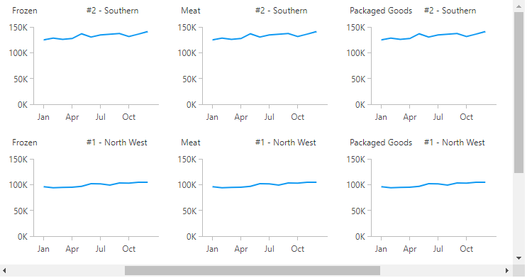
When data is added only along rows or only along columns, the series of visualizations will wrap onto additional columns or rows once the available space is filled to avoid the need to scroll to see the entire series.
4. Displaying a crosstab
You can also drop data onto both drop zones, to produce a matrix with a row for each value of one hierarchy and a column for each value of another.
When grouping the small multiples into both rows and columns, the rows and columns will not wrap and will instead extend to fit however many values are currently selected from your data. One or both scrollbars may appear if all of the columns or rows do not fit.
You can use headers to label each row and column only once along the outside of the small multiple series. See the section below about headers for details.
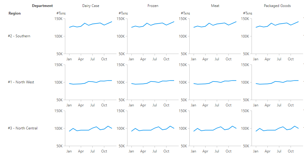
If your crosstab consists vertically of a row for each value of a hierarchy, and horizontally a series of visualizations for different measures (or vice versa), you only need to repeat your small multiples by the hierarchy. When editing, you can set up a row or column of visualizations for each measure, and then repeat it vertically or horizontally.
5. Sorting and filtering
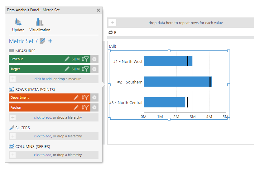
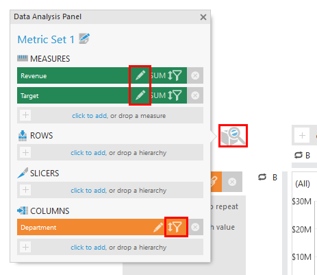
To sort and filter the rows and/or columns of your small multiple series when editing, access its Data Analysis Panel by clicking the cube and magnifying glass icon on the editor.
You can click the sort & filter icon for a hierarchy, or you can click to edit a measure or hierarchy's settings and set up custom measure or custom hierarchy sorting.
For example, small multiples are often more readable when sorted by a measure.
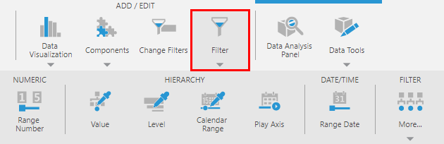
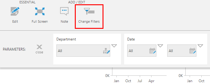
When viewing, you you can filter by adding filters to the parameter bar that is accessible from the toolbar, similar to reports and scorecards. To add a filter to the parameter bar, choose Filter in the toolbar when editing, and choose a filter type.
The Parameters window will open to show the new filter's connections, with some connections already selected. Review or change these selections, then click View and then Change Filters in the toolbar to try the filter.
You can also sort and filter when viewing by adding a Header control to a header or corner area. See the next section below for details.
Finally, simple visualizations such as data labels that are displaying data from the group metric set can also be right-clicked (or long-tapped) when viewing to sort and filter the small multiple's rows and columns using the same context menu options as other metric sets.
6. Headers and footers
You can add content displayed along the outer edges of the series of visualizations, in areas called headers, footers, and corners.
To set up headers and footers, click an empty area of the editor if necessary to de-select an element, then switch to Advanced Mode in the toolbar.
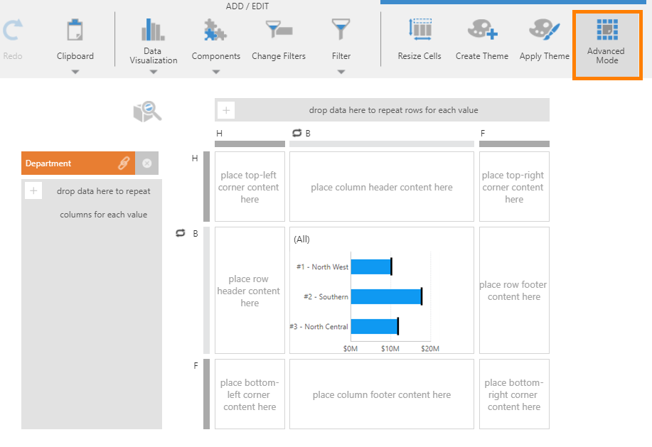
A header, footer, or corner can be a good place to add a legend to be used as a reference for your small multiple series. Row headers and row footers are displayed once per row, and column headers and column footers once per column.
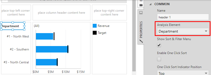
You may want to add a Header control, found in the Data Visualization toolbar, which can allow you to sort and filter the rows or columns when viewing. Set its Analysis Element property to your hierarchy in the Properties window to connect it.
When displaying a 'crosstab' with your small multiple series grouped into both rows and columns, you can label each row along the left by dragging or adding the corresponding data label into the row header cell, and each column along the top by doing the same into the column header cell.
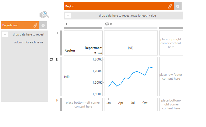
Each 'corner' area is displayed only once, above or below the row headers and before or after the column headers. These areas make the most sense, for example, to add a Header for each series grouping hierarchy when displaying a crosstab.
Another use for headers and footers is explained below, for displaying axes with labels only along the outer edges.
7. Resizing and customizing cells
A cell will automatically expand in size to fit your content when you resize or re-position it.
For more control over the size of the canvas used to produce a small multiple series or any of its headers, footers, or corners, choose Resize Cells in the toolbar when there is nothing selected in the editor. If something is selected, first click an empty area of the editor.
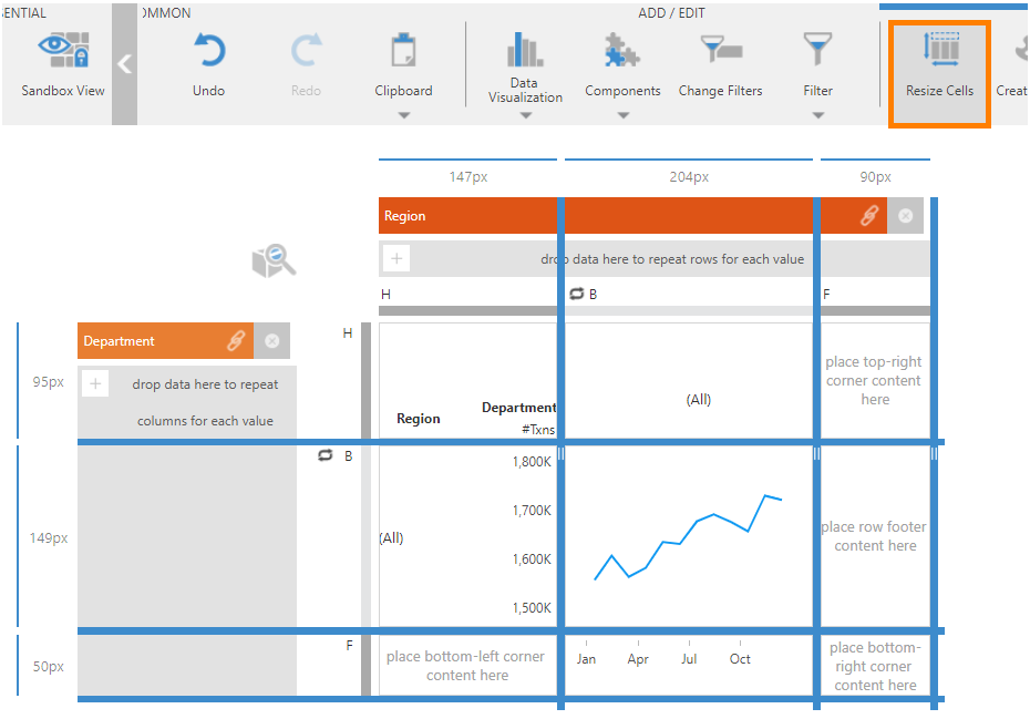
This toggles blue draggable resize borders with each size labeled in pixels along the edges. If you are in advanced mode, you can resize each of the widths and heights between the various regions at once.
When finished, click Resize Cells in the toolbar again to return to normal editing.
You can also open the Properties window when there is no cell or element selected to set up a background or font that takes effect for the entire view, including all headers, footers, and corner areas.
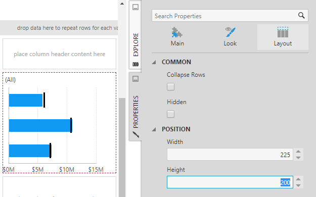
If you click to select a cell, in the Properties window you can also set its width and height in pixels under Layout & Spacing, or set up a background for that cell under Lines & Fills, previously the Look tab. (If the cell is difficult to click on, select something in the cell and choose Select Template Cell in the toolbar.)
For the main (or 'body') cell that contains your visualization, you can also set up a background palette for alternating colors, or separator lines between each visualization, similar to reports and scorecards.
8. Chart and gauge axes
8.1. Sharing axis scales
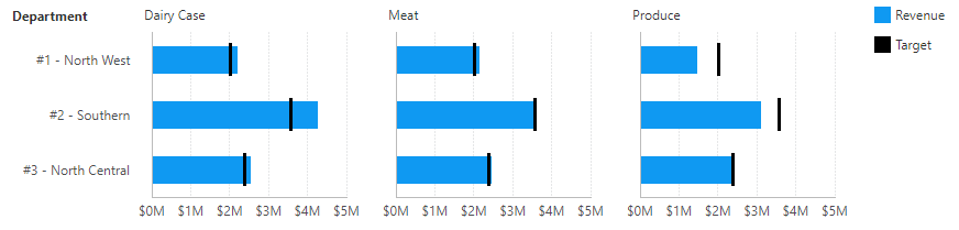
Charts are a common visualization to use in small multiples, and they support reproducing the same range of values along each chart axis to ensure meaningful comparisons between each chart in the series.
In small multiples, all chart axes share their ranges of values by default. You can enable or disable this behavior for chart axes or gauge scales using their Share Scale With Copies property. You can find more details in the article Share axis scales in a scorecard.
8.2. Labeling only along the edges
When all the axes or scales label the same values, showing the labels in every chart or gauge can be redundant. If you prefer, you can label a scale only along the outer edges of the series to reduce the amount of text and the potential distractions when viewing.
To do this, first switch to Advanced Mode in the toolbar to make headers and footers available.
Click to select a header or footer, such as the row header cell, then choose Data Visualization in the toolbar and under Recommended select Axis to insert it. Resize the control if more vertical space is needed.
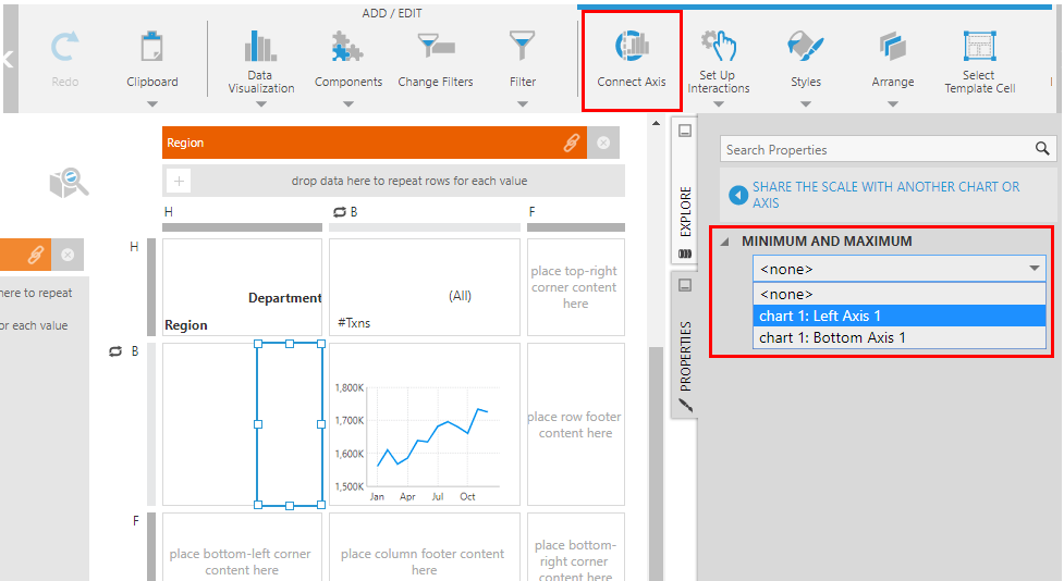
In the toolbar, click Connect Axis. In the Properties window that opens to the shared scale properties, choose the axis or scale from the dropdown that should be replaced by this axis in the header.
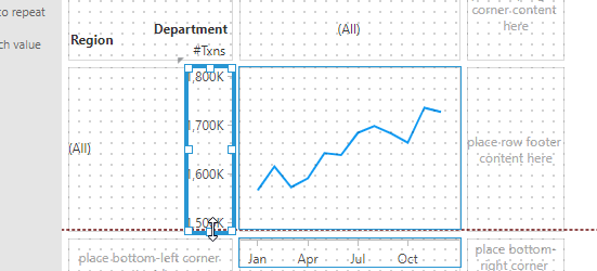
The outer axis will update to display the values of the chart or gauge. Ensure their positions and sizes line up, and the axis will align itself with the data points so that the labels and tick marks correspond correctly. You can use the red, dashed guidelines that appear when dragging or resizing.
If the axis is displaying categorical data, the hierarchy member keys will initially be displayed. The axis will need a copy of this data in order to display its captions, which you can drag to add after opening the Data Analysis Panel for the axis from the toolbar.