
1. Overview
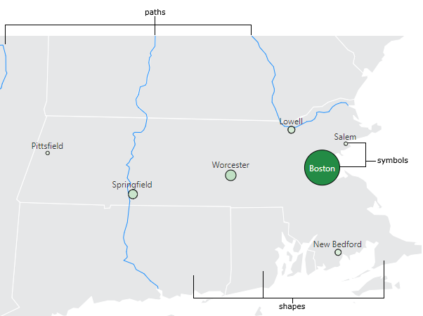
Maps display geographic information in the form of shape, path, and symbol elements. Then you connect these elements to data so that their appearance will change based on data values.
- Shapes – Areas defined by boundaries on all sides, such as continents, countries, states/provinces, or lakes.
- Paths – Linear features such as roads or rivers, or straight lines drawn by the map to connect pairs of symbols. These can come from a map resource, or from a data source referring to pairs of symbols.
- Symbols – Location points on a map such as a city, office, or vehicle. These can either come from a map resource or from coordinates in your data source.
2. Map resources
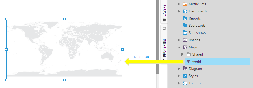
Map elements (shapes, paths and symbols) are saved as map resources, which are one of the file types you can find in the Explore window. Map visualizations can automatically find and load a map resource that matches your data, or you can choose one yourself by dragging it onto your map.
When symbols are displayed at coordinates that come directly from your data source, map resources are still displayed in the background as context, by default.
2.1. Built-in maps
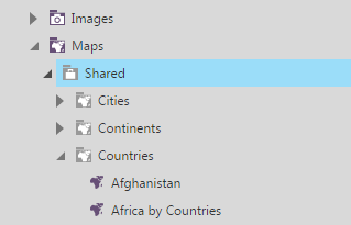
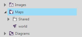
The Global project includes a set of built-in map resources that you can browse or search for in the Explore window. You can find these in the Shared sub-folder under the Maps folder.
The built-in maps are categorized into different folders such as Cities, Continents, Countries, and States and Provinces. If your data matches map elements within this set of maps, a matching one will be loaded automatically. You can also drag map resources onto your map that you prefer to use with your data or as additional details to display.
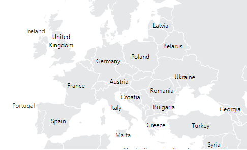
In addition to individual map resources, map visualizations have built-in layers displayed in the background as context, which change automatically as you zoom in. Other map resources are displayed on top. You can view a dashboard containing a blank map visualization with no data to see these layers: you are initially presented with the Continents layer, which changes to the Countries layer as you zoom in, and then to States/Provinces.
Your data might match directly with these layers, for example if your data contains country names. You can use the zooming behavior described above with your data if it contains a multi-level hierarchy that matches two or more of these layers, and the Top Level is set to select multiple levels at once: for example, you can zoom in when viewing to drill down from continent data to country data, then to states & provinces. (See Metric set analysis tools for more information about selecting multiple levels.)
2.2. ESRI shapefiles
You can also import shapefiles containing map elements besides the ones already included. Once imported, they can be loaded automatically if they match with your data, or you can drag them onto your map.
The ESRI (Environmental Systems Research Institute) shapefile format is a popular file format for storing map data. Shapefiles can be found from a wide variety of online sources, including many government agencies around the world.
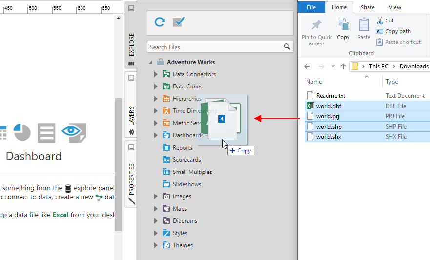
An ESRI shapefile is actually composed of several separate files: a main SHP file, an SHX index file, a DBF database file, and optionally more that can help ensure shapefiles from different sources are read correctly. For example, a map of the United States might be represented by the following files:
- usa.shp – Main shapefile which contains definitions for one layer of geometry elements (either polygons, polylines, or points).
- usa.shx – Index file containing information about how to read the shape data from the SHP file.
- usa.dbf – DBF (dBASE) file which defines a database table of attribute values. Contains one record (or row) per geometry element.
- usa.prj – (Optional) A Well-known Text (WKT) description of the projection being used to allow for conversion to standard WGS-84 coordinates.
- usa.cpg – (Optional) Supported in version 23.3 and higher, specifies the text encoding used in the DBF file as a code page name or identifier. For example: UTF-8.
If you downloaded shapefile data in the form of a ZIP file, you'll need to extract the contents to an actual folder first.
Drag the set of 3-5 files like the ones mentioned above from Windows Explorer or Finder, and drop it over the Explore window.
To start using it in a map right away, drop it directly onto your dashboard or other view while editing instead of onto the Explore window.
Either way, the shapefile is imported, so you and others can now find it under the Maps folder of your project in the Explore window.
You can also right-click or long-tap the Maps folder, choose Upload File, then select the files to upload rather than dragging them.
3. Connecting a map to data
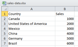
As a simple example, consider an Excel file that contains two columns of data:
- A column of text values that match the names of some known map features (for example, country names).
- A column of numeric values that can be used as a measure (for example, sales figures for each country).
To import this Excel file, drag it from your desktop onto the Explore window, or onto the canvas of a metric set or dashboard.
3.1. Add data to the map
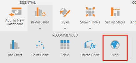
After selecting your data, you can re-visualize it to a map from the toolbar. If map resources were found to match your data, it will be located under Recommended.
Or add a new map to a dashboard or other view, then drag your data (e.g., Sheet1 from the example Excel data connector) and and drop it onto the map.
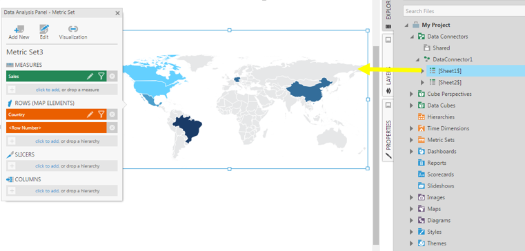
The data that best matches with the element names in the map resource will be connected automatically in the map visualization. You can then modify these automatically-assigned connections in the Visualization tab of the Data Analysis Panel.
3.2. Matching with map elements
To determine how your data is matched with map elements, go to the Data Analysis Panel for the map, and click Visualization. (Expand Paths or Symbols as needed depending on what type of element corresponds to your data.)
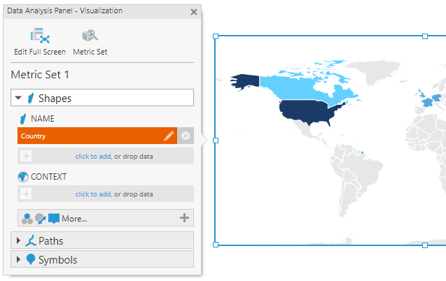
The Name data specifies how the matching is done between map elements and the data from the metric set. In the example above, the Country hierarchy from the Excel data contains names that match the shape names.
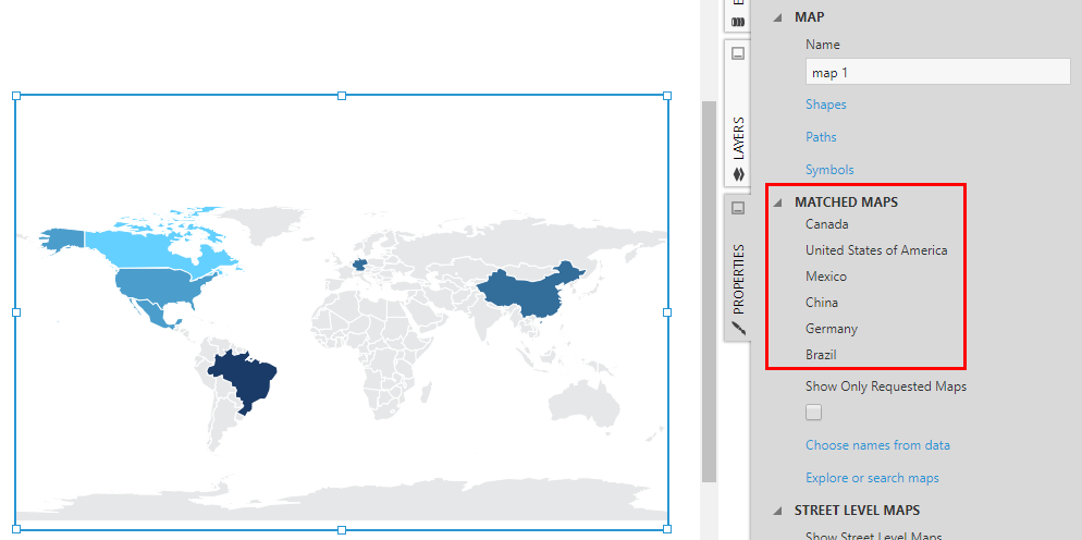
To see the map resources that were loaded automatically, go to the Properties window and find the Matched Maps section. This section will also indicate if there are any Missing Names that were present in your data without a matching map element.
In case there is more than one potential match for any names in your data, assign another column or hierarchy as Context. For example, the data for Montana in the map below matches both with a US state and with a province in Bulgaria.
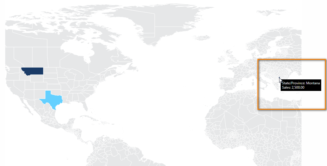
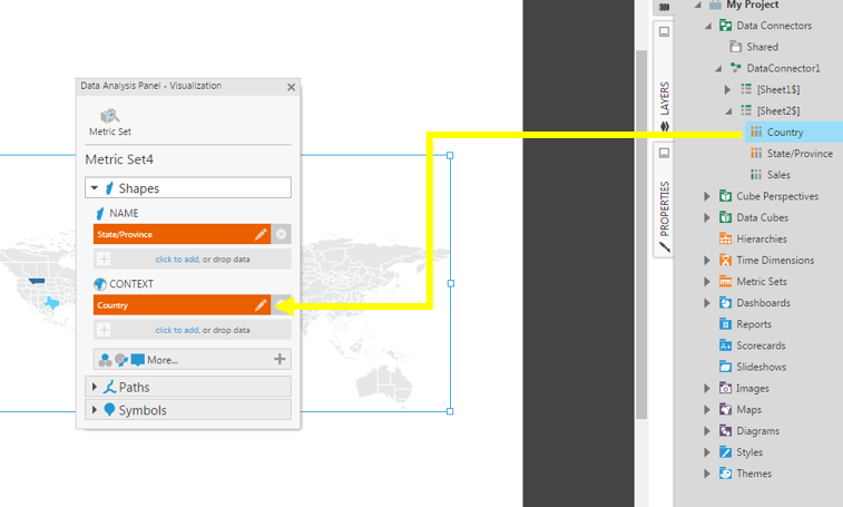
In this example, a Country column is needed as context in addition to the State/Province names.
When using a multi-level hierarchy with a lower level currently selected, the upper level can act as context instead, without assigning data separately as context. In this case, set the Top Level of the hierarchy to include the upper level, or drag the upper level from the Explore window onto the map.
3.2.1. Compatible names
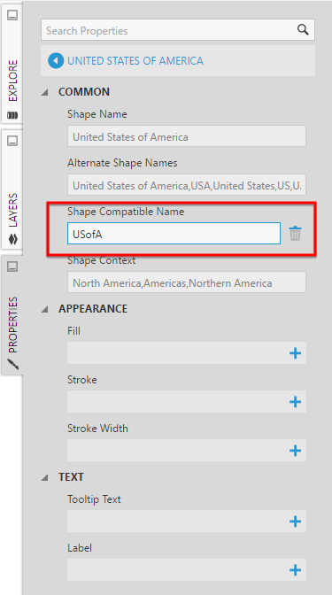
When matching data with map elements, both the names and alternate names included in the map resource will be used if they uniquely identify the elements.
If there is any data without a matching map element, besides changing your data or modifying the shapefile, you can also set the Compatible Name property for an element that you know matches a particular name value in your data.
Find the shape, path, or symbol from the General (or Main) tab of the Properties window, or click or right-click the element directly on the map to select it and open its properties.
3.3. Populating symbols or path connections from data
Rather than matching with map resources, you can also populate symbols and/or paths connecting symbols directly from your data source by assigning their longitude & latitude coordinates or their names in the Data Analysis Panel's Visualization tab.
For details, see the article Displaying symbols on a map.
3.4. Colors and sizes
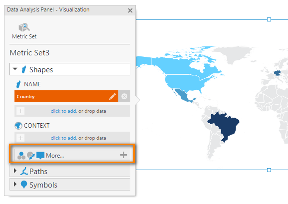
For the optional visualization choices, click the More button (if not clicked already) in the Data Analysis Panel's Visualization tab.
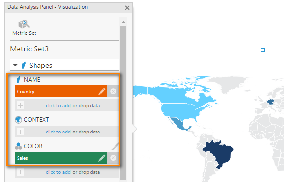
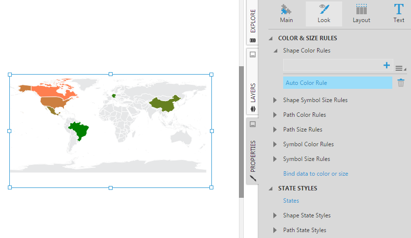
The data added under Shape Color in the image below means the shape colors change according to their Sales measure values. You can customize the actual colors and how they are assigned using the color rules in the Properties window.
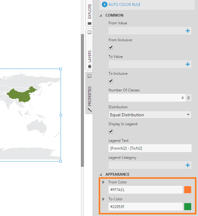
In the Properties window's Design (or Look) tab, find the color rules for each type of map element. You can modify the default Auto Color Rule, or add your own custom color ranges.
For example, change the auto color rule's From Color and To Color properties, or change the Distribution to determine how values are assigned a color.
When data is used to change map element sizes, such as when a measure is assigned to the shape Symbol Size, or the path or symbol Size, the size rules in the Properties window work the same way as color rules to determine the map element sizes. Symbol data can also be used to produce a heat map. See Displaying symbols on a map for more details and a walkthrough that customizes symbols as an example.
3.5. Labels
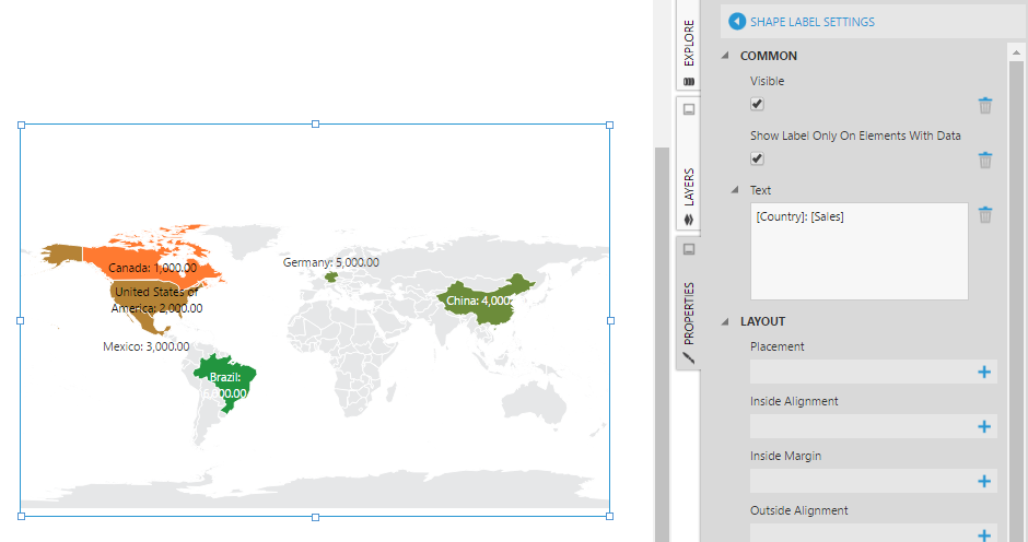
The Visualization tab in the Data Analysis Panel allows you to assign data you want displayed as a label for each map element.
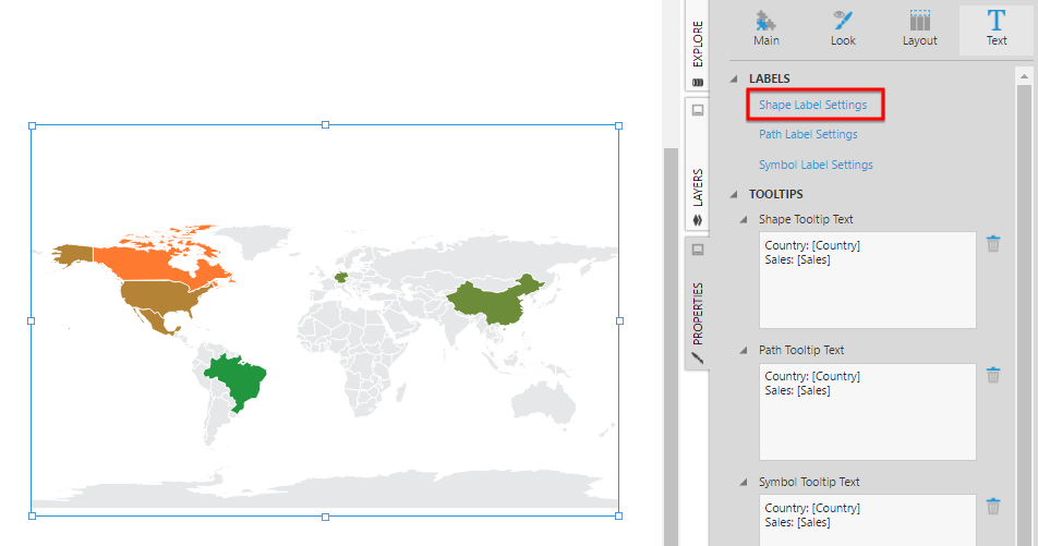
To make labels visible on the map or to further customize them, go to Properties, go to the Design tab and expand Font & Text (formerly the Text tab), and then click Shape Label Settings or on the settings for paths or symbols.
Select the Visible property option to show the labels of all the shapes in the map.
To hide labels not connected to data, do the same for Only Elements With Data.
4. Using a map
When you want to interact with the map directly, go to the toolbar and click View.
In View mode, you can:
- Zoom in or zoom out on the map by using the mouse wheel, or a gesture on a trackpad or touch screen.
- Pan the map by dragging it in any direction.
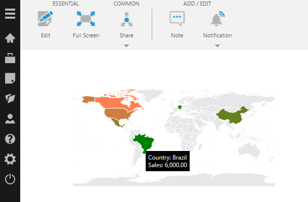
- Hover over a shape on the map (long-press on a touch device) to view its corresponding tooltip popup with connected data values.
- Set up optional additional interactions.
Note that the zooming and panning you do in View mode on a dashboard will be saved if you switch back to Edit mode, unless you checked in your dashboard before viewing.
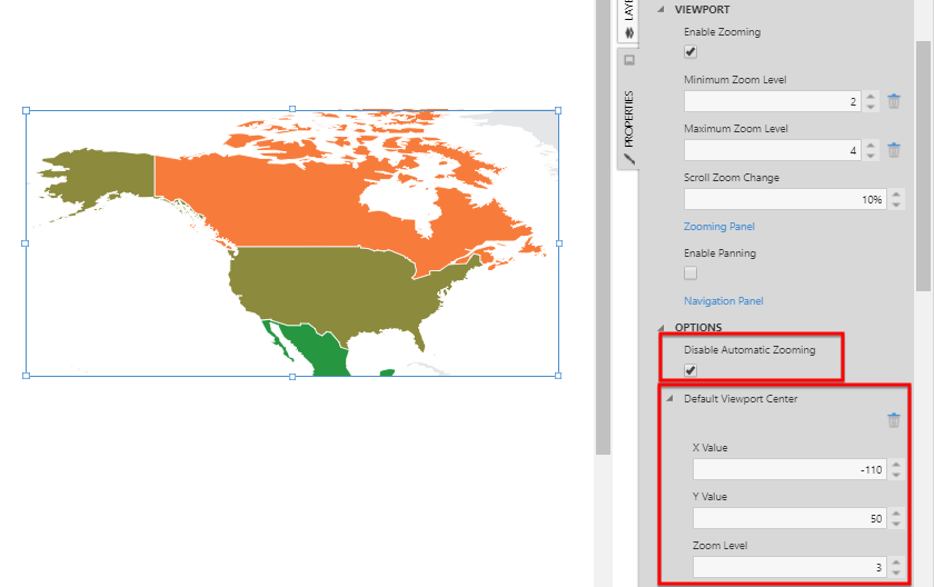
By default, Automatic Zooming is enabled, which means the viewport will automatically zoom and center over map resources displaying data whenever data loads. You can disable this behavior by disabling the Automatic Zooming option in the Properties window for the map, in the General (or Main) tab under Zooming & Panning in recent versions.
The Default Viewport Center property allows you to indicate the initial position and zoom level of the viewport when Automatic Zooming is disabled from the Properties window rather than interactively. To activate this option, click the + for this property in the Properties window.
5. Choosing map resources
You can also choose map resources yourself to display, rather than allowing them to be matched and loaded automatically based on your data.
In the Explore window, you can find or search for a map in the Maps folder.
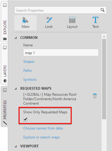
Go to the Properties window with the map selected. Each requested map will be listed (including its project name and folder location).
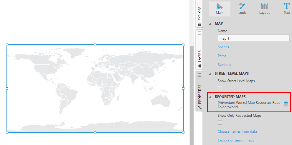
Selecting the Show Only Requested Maps property displays only the map resources that you selected this way. The built-in world map layers will no longer be displayed and your data will no longer be used to automatically search for and load map resources.
6. Show street level maps
You can connect to a third-party map provider to display as context for your map content. This is often useful when zooming more closely into maps displaying symbols, where street or city details are needed to understand the symbol locations. Map providers may also display other types of geographic information not easily displayed using shapefiles/map resources.
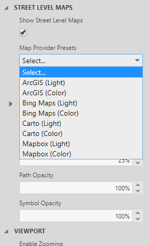
To start, enable the Show Street Level Maps property.
You can then choose from several predefined options using Map Provider Presets, or enter your own Map Provider URL.
Some map providers require authentication. If required, set the key or access token provider options to the values given to you by the provider.
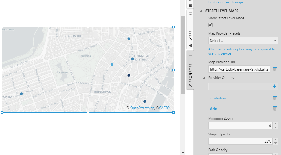
The geographical data from the map provider is displayed. In case you also have shapes from map resources displayed, the Shape Opacity map property is set to 25% by default, which means you will be able to see the relevant geographical data underneath.
For the predefined map providers, there may be other provider options listed that you can customize. For example, tilesetId for Azure maps can be set to a variety of image types including microsoft.imagery for satellite/aerial imagery.
You can use any map provider supporting the 'XYZ' tile server standard, and any of their basemap styles, by setting the Map Provider URL property. Replace the x, y, and z (or zoom) portions of the URL the map service tells you to use with placeholders {x}, {y}, and {z} respectively so that the map visualization can pass these parameter values to the service automatically. If available, also include the optional {s} placeholder to take advantage of subdomains for performance.
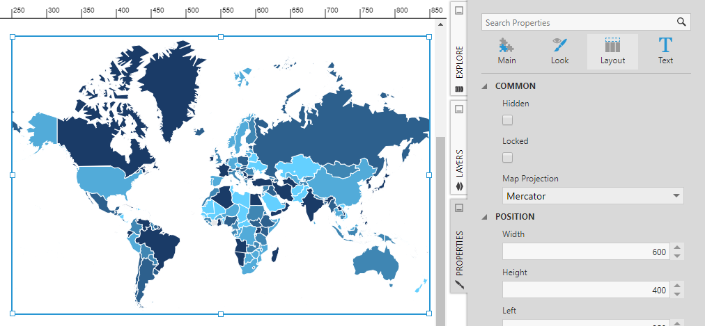
7. Map projection
The map visualization supports two main map projections, which determine how locations and shapes that actually exist on a spherical globe are represented on your screen:
- Equirectangular (default) – Common for map visualizations and GIS. Areas near the poles are distorted as shorter.
- Mercator – Most common for web mapping and navigation. Areas near the poles are easier to see, but the areas nearest to the poles are more distorted than with equirectangular and distorted as larger.
Another version of Mercator called Web Mercator is available and used with street-level maps.
You can change the projection in the Design tab of the map's properties under Layout & Spacing (formerly the Layout tab).
8. Customization options
Besides the options described above, there are more options for customizing your map available in the Properties window.
- The Design (or Look) tab of the map's properties contains a variety of styling options. Use the Font & Text category (formerly Text tab) to set up labels and tooltips that apply to all shapes, paths, or symbols at once.
- Like with other visualizations, you can use states to customize shapes, paths, or symbols on your map when their data matches certain conditions. In the Properties window for the map, go to the Design (or Look) tab to find the State Styles section where you can change a variety of settings based on your state conditions, including appearance, labels, and tooltips.
- Each shape, path, or symbol on your map that comes from a map resource also has its own dedicated properties you can optionally set, which would then take priority over the other properties listed above. If you want to customize settings such as appearance, labels, or tooltips for an individual map element, right-click it while in edit mode and choose the Properties option to go directly to its settings in the Properties window. You can also click Shapes, Paths, or Symbols in the map's properties for a list of those elements to customize. These are not available, however, for symbols or paths loaded dynamically from your data (via longitude/latitude coordinates for symbols or pairs of symbol names for paths).
- You can set up interactions for Selected Data Changed and customize whether to select map elements on hover or click in version 24.2 and higher, similar to treemaps.
9. Notes
- Simplification is applied automatically when displaying map resources, but extremely large and detailed shapefiles can still take longer to upload, process and display. You can simplify a shapefile before uploading it using a tool such as mapshaper to remove unnecessary details.
- Map visualizations load only a certain number of rows by default: if necessary, change the Maximum Row Count property setting. Consider also using the Show Only Requested Maps option and disabling automatic zooming when working with large datasets.
- If you have a shapefile that does not import correctly even when including its PRJ File, check the coordinate reference system (CRS) of the shapefile using a third-party application such as QGIS. This tool lets you check the CRS of a shapefile and also save/export it as a new shapefile with a different CRS (for example, WGS-84). You can use QGIS to prepare a shapefile with the appropriate CRS before importing it.