
1. Overview
Funnel charts have been used to represent a sales process by depicting the number of leads remaining at each stage. This article describes how you can create a funnel chart in Dundas BI.
2. Setup
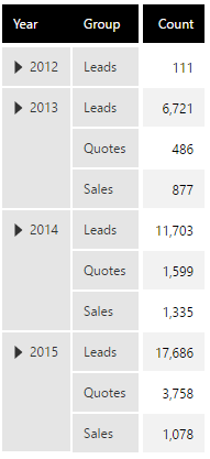
In this example, we are using the data shown in the following figure, but where the time dimension is moved to Slicers in the metric set.
From the main menu, select Business, and click to Create a metric set.
Start by creating a simple bar chart with the number of leads as the measure and a data point for each process stage.
By default, your data is typically sorted alphabetically. If this does not match your process where each bar likely should be shorter than the previous, try clicking the sort & filter icon on your measure and sorting Descending. You can also use custom hierarchy sorting.

Click on Horizontal Bars in the toolbar or Properties window to arrange the data points from top-to-bottom.

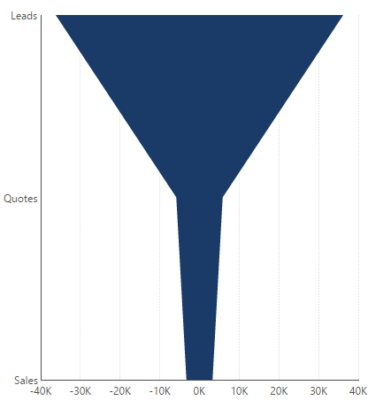
Re-visualize the bar chart to a Range chart. This chart type can display your measure as a filled area taking the diagonal shape of a funnel instead of displaying bars.

Click on Add Formula from the toolbar. In the formula bar, enter the expression $Measure Name$ * -1 substituting in your own measure name. Apply and close the formula bar to create a negative version of your measure.

In the Data Analysis Panel, click on Visualization.
Ensure your original measure is placed under Range Start, and your new formula measure under Range End (or vice versa).

This can now display a funnel chart like the following:
3. Styling the funnel chart
You can further style your chart using the following options:
- You can hide the Bottom Axis and the Left Axis by right-clicking them to open their properties and unchecking their Visible checkbox.
- You can use color rules to color the chart based on the different groups. For example, leads, quotes, and sales can each be given different colors.
- If you want the coloring to be more dynamic based on the values, you can set up states using both your measure and your hierarchy values as conditions.
- You can add data point labels to the stages and right-click them to open their properties to configure how they're placed.
A formatted funnel chart could look like this. Now you can use this chart on any dashboard.
