
1. Overview
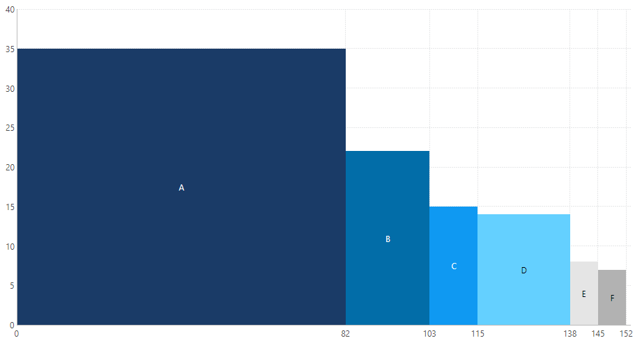
A variable width column chart, also known as a bar Mekko chart, is a bar chart where column widths are scaled such that the total width matches the desired chart width and there are no gaps between columns. This chart can be used for tracking the values of two different variables for each category in the data.
This article shows you how to create a variable width column chart using a range chart.
2. Steps
2.1. Prepare stacked data values
A variable width column chart requires measure values that are stacked along the bottom axis. A range chart by itself will not accomplish this so if you have un-stacked values, you will need to use the Cumulative Total formula function to help you calculate measures that will plot a running total of the bottom axis values.
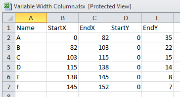
The required stacked values should look like the values in the following sample Excel spreadsheet.
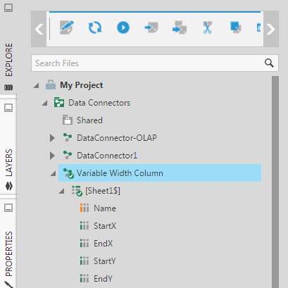
Once you have prepared the data, create a data connector in Dundas BI to connect to that data. For example, drag the Excel file to Explore.
2.2. Add a range chart
Create a new dashboard based on the Blank dashboard template.
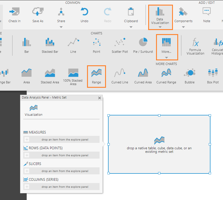
Click Data Visualization on the toolbar, then click More and select Range.
2.3. Set up the visualization
On the Data Analysis Panel for the range chart, click Visualization.
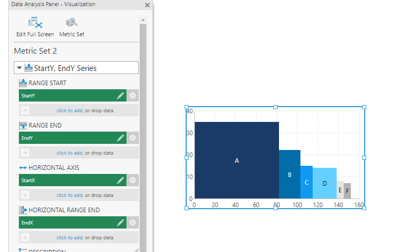
Drag-and-drop data columns from Explore onto the Data Analysis Panel as shown in the table below.
| Visualization Option | Data Column |
|---|---|
| Range Start | StartY |
| Range End | EndY |
| Horizontal Axis | StartX |
| Horizontal Range End | EndX |
| Series Grouping | Name |
The goal here is to set up a single range chart series where four measures are used to position each of the four sides of each bar/column.
If the axes were previously plotting non-numeric values, ensure both the left axis and bottom axis have their Scale Type property set to Numeric.
The easiest way to give each data point its own color from the palette is to make each one its own series using a series hierarchy: add a hierarchy to Columns (Series) on the metric set or move one there from Rows (Data Points).
2.4. Optional customizations
You can display tick marks by editing the properties of a chart axis: in the tick mark settings located under Lines & Fills in recent versions, select the checkbox to display the major (or minor) tick marks.
You can add a label for each data point on the bottom axis: in its properties, select Show Data Point Values as the Interval Method.
You can add a hierarchy under Color in the Data Analysis Panel to apply different colors to data points or series based on their values. Colors are applied according to color rules, which you can configure from the Properties window. See the article Apply colors to data points or series using color rules for more details.
3. See also
- Using chart properties
- Formula: Cumulative Total