
1. Overview
This article shows you how to use the Play Axis and Hierarchy Slider filters to select a value or range along a slider, and progress automatically when you press 'play'.
These filters can be used with any data added to Rows, Columns, or Slicers in your metric set, but normally make sense with a time dimension hierarchy, or a column of dates or date & time values. They can make connected visualizations change and animate through time as the play axis progresses, or allow you to select a range of dates to filter by.
2. Example preparation
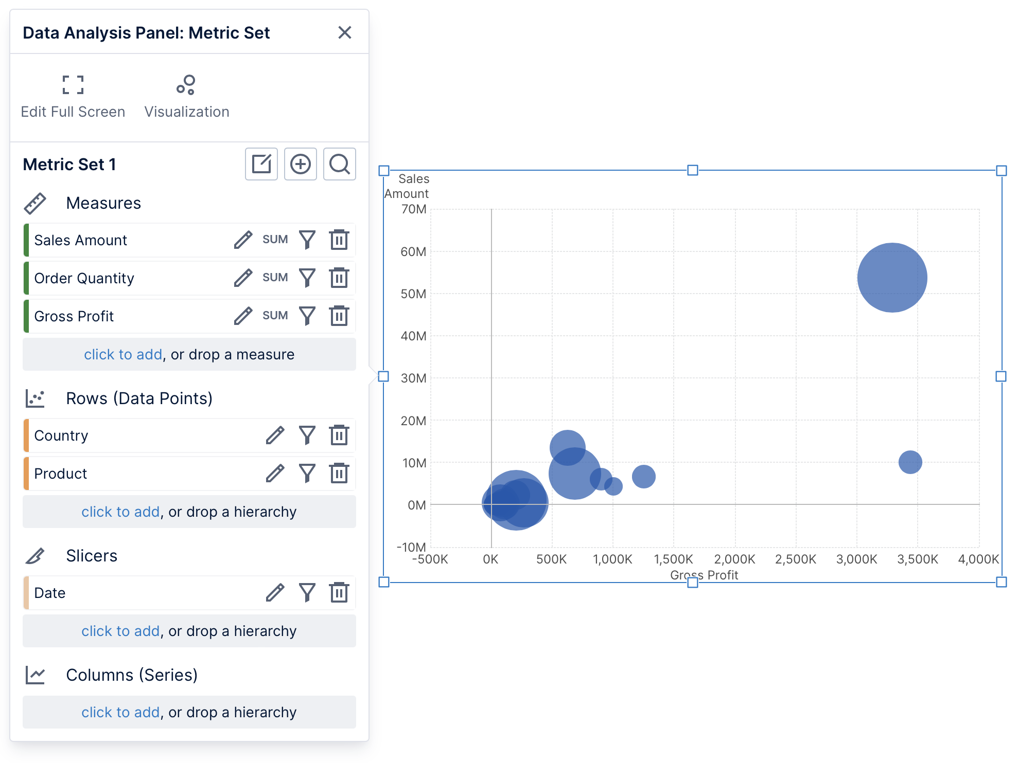
The example shown here uses the Product Sales data cube from the Getting Started Tutorial sample project.
We've created a new dashboard and dragged the following data to the canvas and the data analysis panel that appears:
- Measures: Sales Amount, Order Quantity, Gross Profit
- Rows: Country, Product Category
- Slicers: Date
The data should automatically re-visualize into a bubble chart, or you can choose one from Re-Visualize in the toolbar.
For the effect of data changing over time, you will usually want to place date/time data under Slicers and connect it to the play axis.
3. Creating a play axis
From the toolbar, click Filter and select Play Axis.
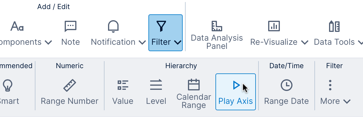
In the filter connections panel that appears, some data is normally selected automatically (Date in this example). You can change this if you want to filter something else.
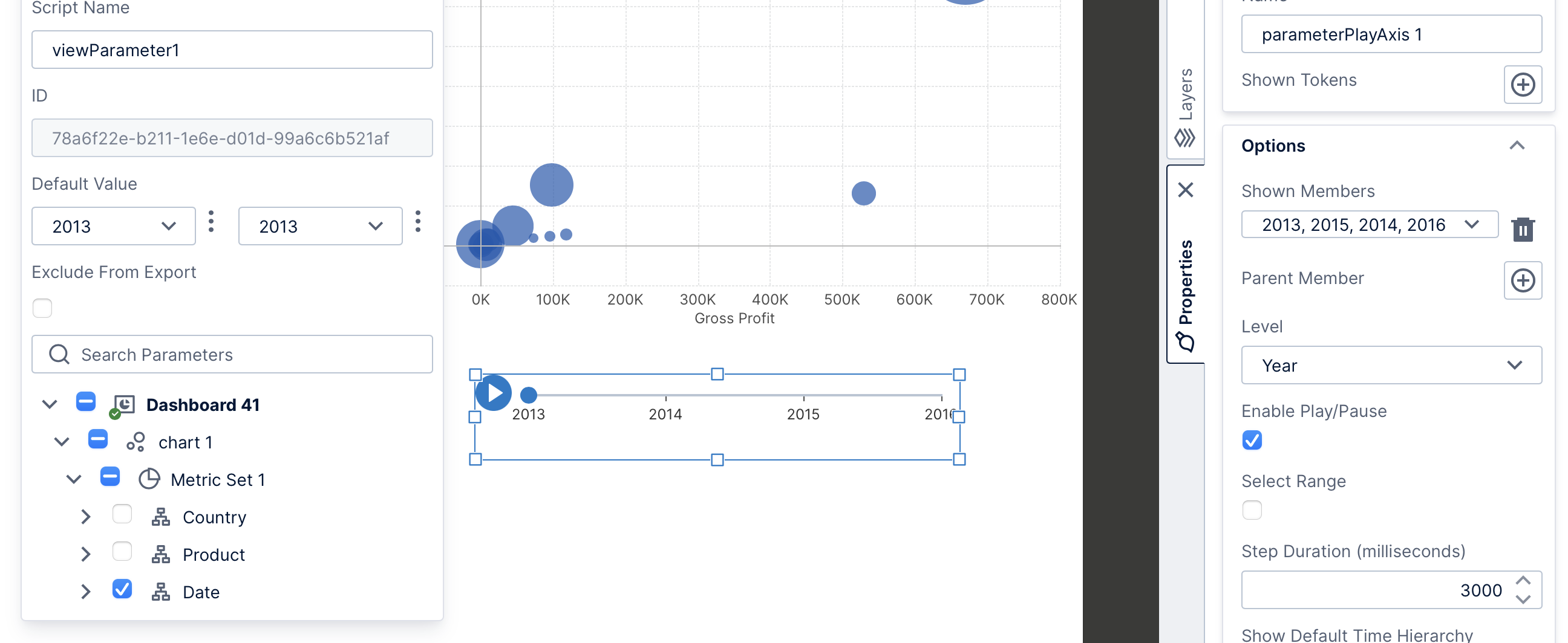
When connected to date/time data, the play axis automatically displays a selection of values relative to the current date. In our particular example shown here, our data set is older so that the default values don't have any corresponding data.
To adjust what values are included along the play axis, open the Properties window for the play axis and change the values selected for Shown Members.
4. Creating a hierarchy slider
When you click Filter in the toolbar and then More, you can find a Slider option under Hierarchy.
This is actually the same as a play axis filter but with different default settings selected in the Properties window. You can also choose these yourself after choosing a Play Axis from the toolbar, or customize them after choosing a Hierarchy Slider:
- The play/pause button is disabled (Enable Play/Pause is de-selected).
- Range selection is enabled (Select Range is selected).
- The token menu is enabled (Hide Token Menu is de-selected).
5. Viewing
Switch to View mode in the toolbar. Press the play/pause button if enabled, or click on values along the slider. When range selection is enabled, click and drag a 'handle' (e.g., blue circle) along the slider to change the start or end of the selected range, or click along the slider to move the nearest handle to that location.
You and other viewers of this dashboard (or other view) can right-click or long-tap:
- A specific value to drill down, filter out, or filter to that value along the slider.
- Anywhere on the filter to clear filtering, change the level or drill up.
- Anywhere on the filter to access range selection options if the connected view parameter value supports a range.
- When range selection and the play/pause button are enabled, you can choose the Pin Range Start option if you want pressing 'play' to automatically progress the end value of the range while keeping the same start value.
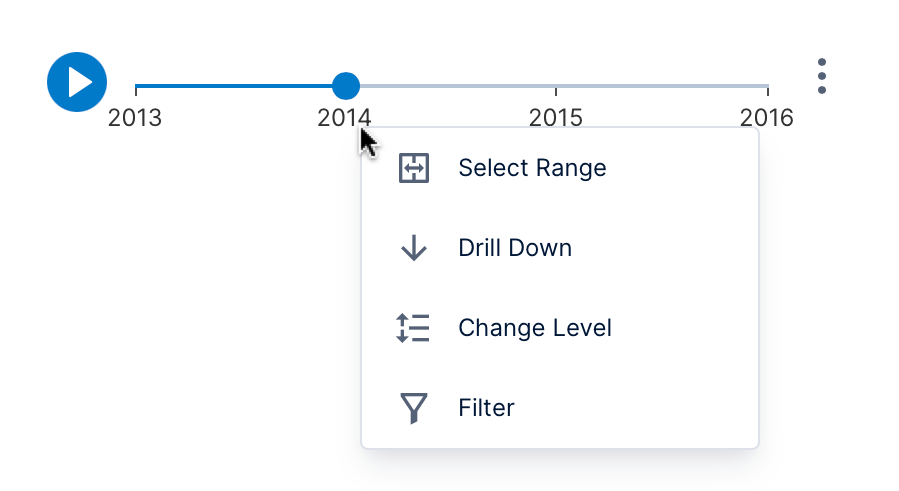
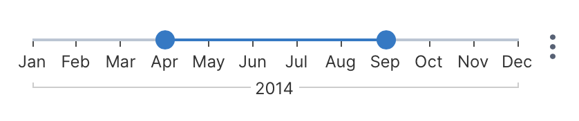
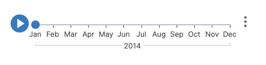
For example, right-clicking 2014 and choosing Drill Down will list along the slider the values for 2014 from one level below, such as months:
If you want to prevent viewers from accessing some or all context menu options, you can disable application privileges the same way as for visualizations. Privileges can be disabled in the Properties window for the play axis or for the dashboard (or other view), or for certain users.
6. Properties
When editing, you can optionally change settings in the Properties window for this filter that will take effect when the dashboard or other view is initially opened for viewing. For example:
- Shown Members – Select certain values if only those values should be initially displayed along the axis, or leave un-set to display them all. This is equivalent to the Filter context menu option in view mode.
- Parent Member – Set this property to display all the values from the level below that make up the selected value (this will override the Shown Members property). This is equivalent to the Drill Down context menu option for that value in view mode.
- Level – Select the current level of the hierarchy to display along the play axis, if it offers multiple levels. Viewers can also change the level from the context menu. (The displayed members will be filtered by the Shown Members, even if set to a higher level, e.g., setting Shown Members to 2017, 2018 and Level to Month will display only the months between 2017-2018).
- Enable Play/Pause – Shows the play/pause button for viewers to click to automatically progress the slider and stop the progression. If this option is de-selected, the filter will function mostly as a slider that works for time dimensions and other hierarchies.
- Select Range – Allows setting both a start value and end value along the slider to select the range of values between them, available only if the connected view parameter value supports a range. Viewers can also access this option from the context menu.
- Pin Range Start – When the play/pause button and range selection are both enabled, pressing 'play' automatically progresses only the selected range end value while keeping the same start value. Viewers can also access this option from the context menu.
- Step Duration – determines how fast the play axis progresses when playing. (You may also need to adjust the animation properties for some visualizations to match as described below).
- Hide Token Menu – this option can be unchecked to allow viewers to choose tokens such as relative time options Today or Previous month. The corresponding values will be indicated automatically along the slider if available and enabled in the connected time dimension hierarchy.
- Show Value Tooltips – this option in the Design tab under Font & Text (or Text tab) is enabled by default to automatically pop up a tooltip with the current value when it changes. You can disable it, or use the property Value Tooltip Duration to indicate how long this tooltip will be visible.
6.1. Visualization properties
Connected visualizations, and charts in particular, have their own animation settings that you may want to adjust when using a play axis filter:
- In the Properties window for a chart, find animation settings in the Design (or Look) tab: consider de-selecting the Animate In Stages setting, and setting Data Change Staggering to 0%.
- Be sure the visualization's Transition Duration or other animation duration property settings are far enough below the set Step Duration for the play axis for your particular data source, or consider improving its performance if needed.
7. Notes
- Range selection is only available if the connected view parameter value supports a range of values. For example, if you first created a Calendar filter (which supports choosing only a single value), then clicked the Parameters button in the filter connections panel for a Play Axis filter, you could connect the filter to the same view parameter as the Calendar filter and it would not support range selection.