
1. Overview
This article describes the purpose of slicers, columns, rows, and measures in the Data Analysis Panel.
The Data Analysis Panel appears when you drag and drop data onto a metric set, or the canvas of a dashboard or other view. If closed, you can re-open it from the toolbar or context menu for a data visualization.
2. Data Analysis Panel
The Data Analysis Panel lets you build a view of your data simply by dragging data from the Explore window.
| Type | Purpose | Visible |
|---|---|---|
| Measures | Display numeric/fact values | Yes |
| Rows | Group by values into rows/data points | Yes |
| Slicers | Filtering only | Limited |
| Columns | Group by values into columns/series | Yes |
The figure below shows the Data Analysis Panel for a table visualization.
3. Measures
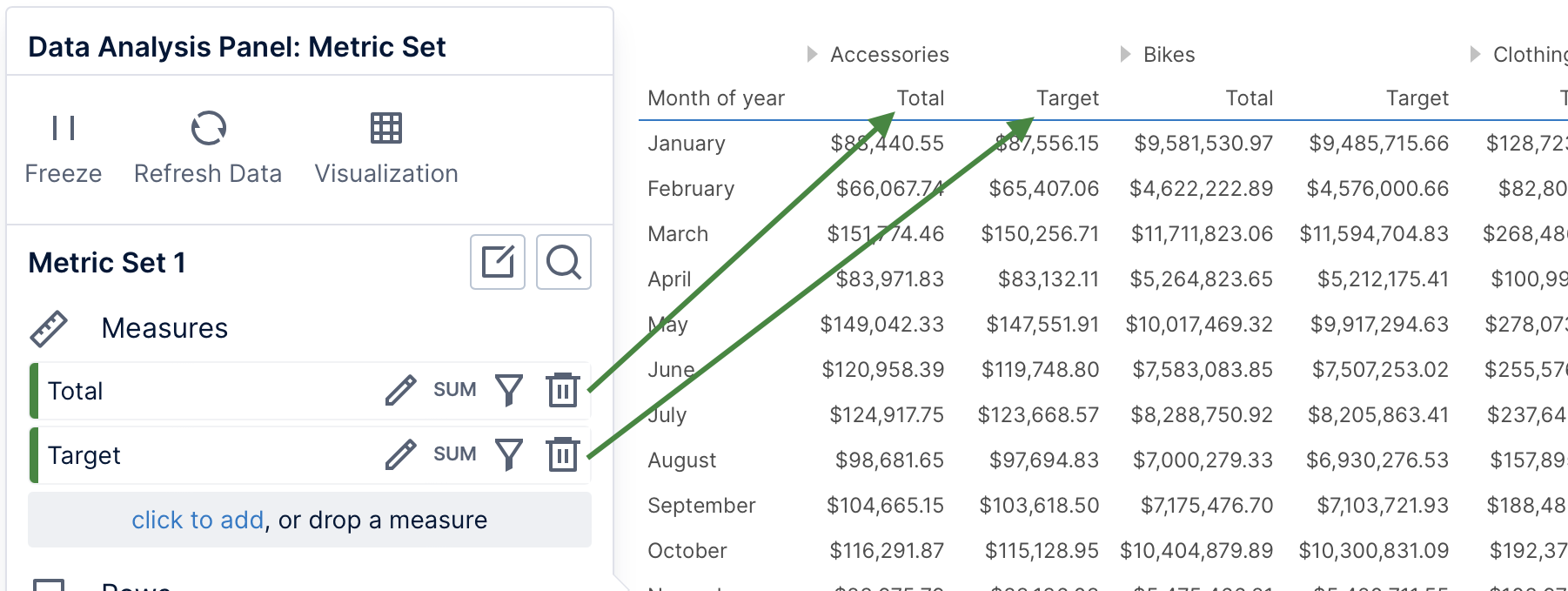
Add data under Measures in the Data Analysis Panel to display the numeric values you are interested in viewing (such as sales or stock levels). Measure values will be grouped into the Rows and Columns data that have been added, and filtered by Slicers, if any.
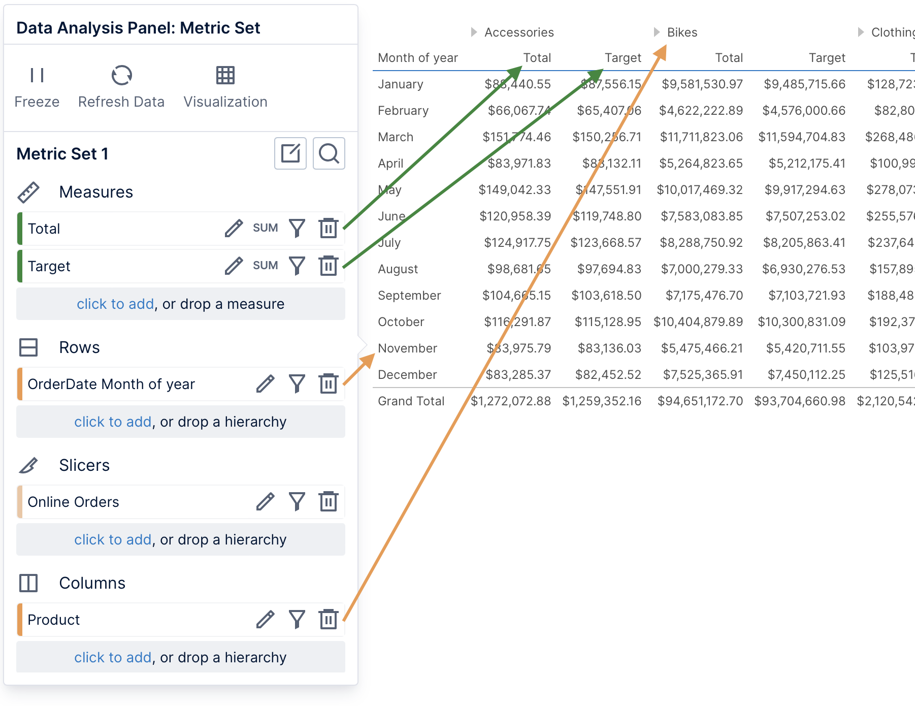
In a table visualization, each measure appears as a column. When selecting measures together with data under Columns, the measure columns will reoccur for each column hierarchy value (as seen under Accessories and Bikes below).
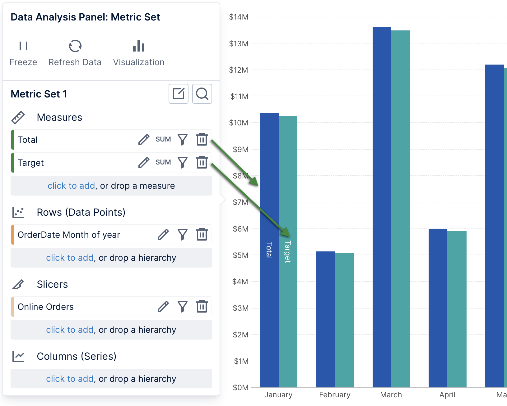
In a chart, each measure is displayed as a series of data points, each with a different color by default.
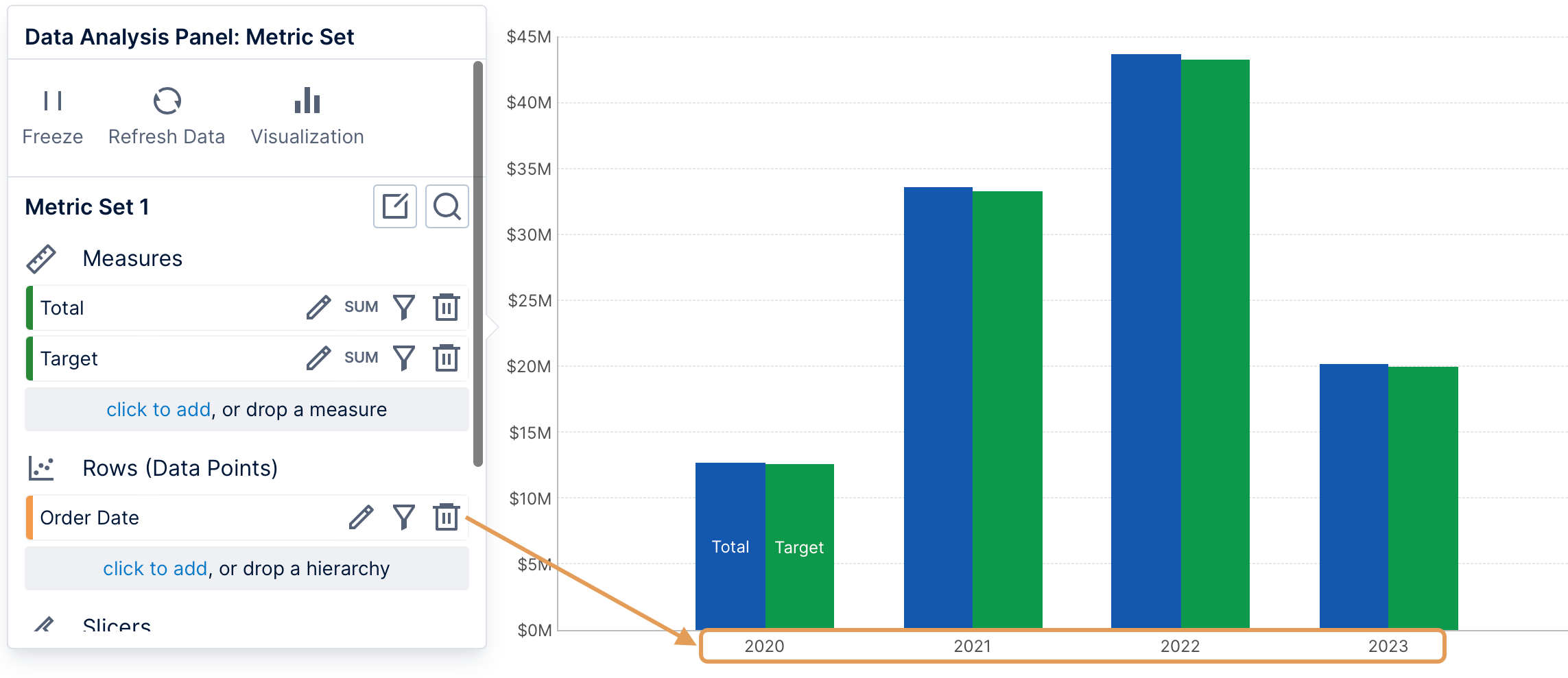
4. Rows
Data can be added under Rows in the Data Analysis Panel to group the measures by these values into rows, such as sales broken down by year instead of just a single total sales value.
This data often consists of text or date/time values, and is called a hierarchy (or dimension).
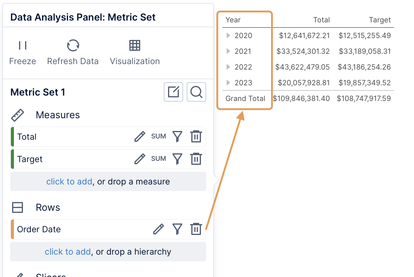
If you add multiple hierarchies, a row will be displayed for each combination of their values in the data, for example for each year and for each country.
In a bar chart, rows of data are displayed as data points (bars). These will often be displayed along a chart axis with a label corresponding with each data point.
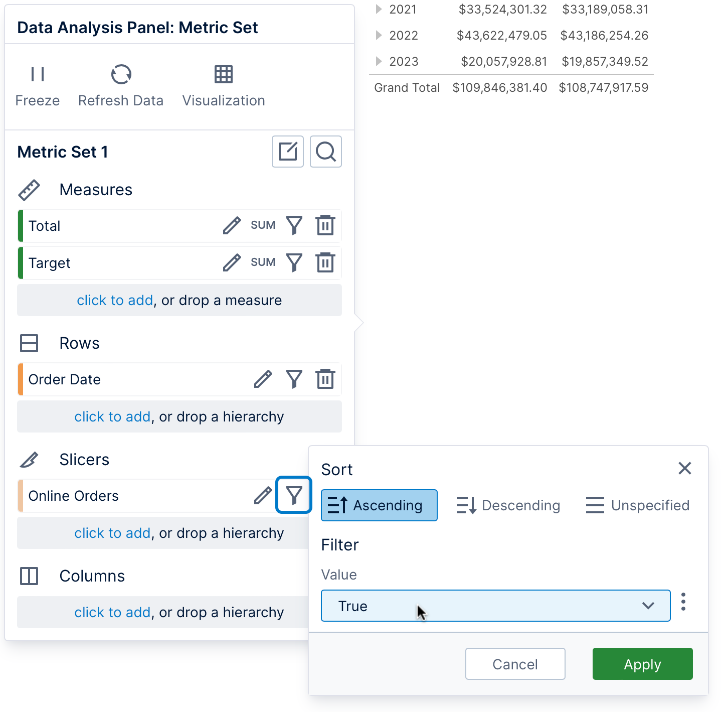
5. Slicers
Data can be added under Slicers in the Data Analysis Panel when you only want to filter by those values. In our example shown below, all the data displayed in the table is filtered to only online orders by filtering a column of true/false values named Online Orders to the value True.
The slicer values selected for filtering can be displayed in tooltips and labels (a limited number of filter values can be displayed at a time if many are selected at once). Slicer values apply to the entire visualization: if you want to display different values in each row, column, or data point, you can add this data elsewhere on the metric set instead of Slicers.
After adding data under Slicers, click its filter icon and choose the values to filter by.
In a dashboard or another view, you can also add a filter and connect it to this slicer.
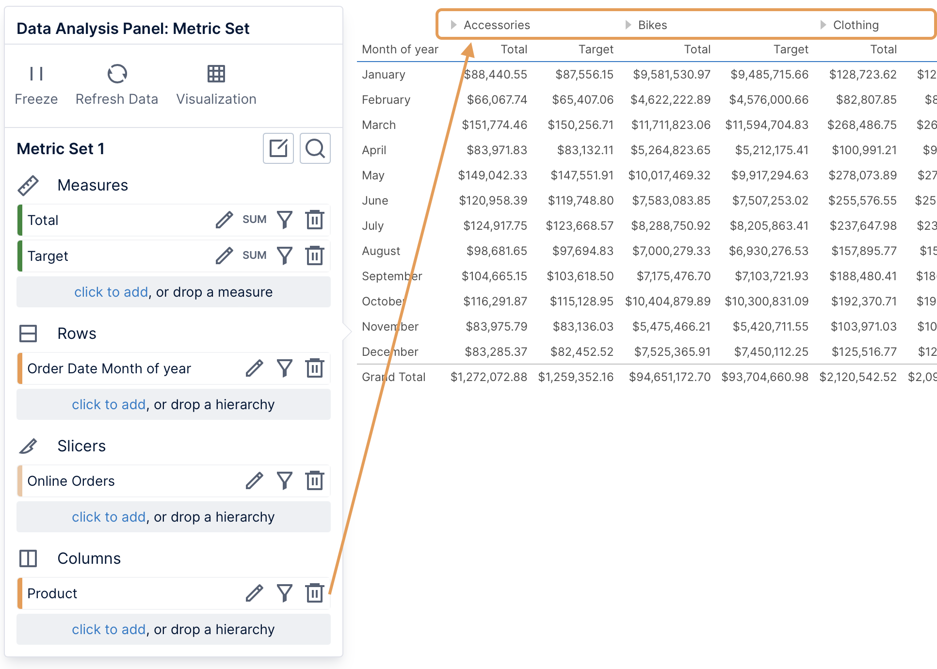
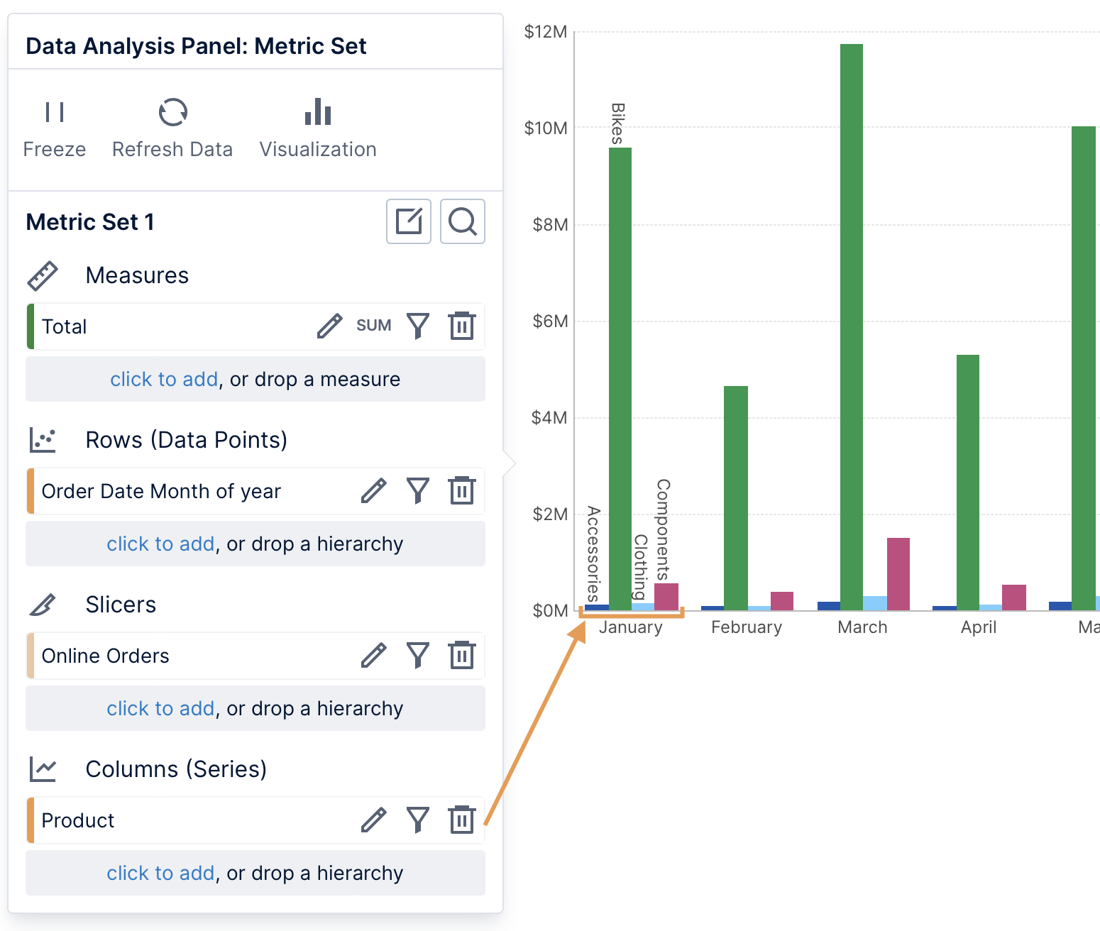
6. Columns
Data can be added under Columns in the Data Analysis Panel to group the measures by the selected values into columns. Since measures are each displayed as a column, a column hierarchy will repeat the measures for each of its values.
Column hierarchy values appear as another row of column headers in a table visualization.
In a bar chart, each series of bars is split into separate series for each column hierarchy value, where each series has a different color by default.
7. See also
- Video: Using The Data Analysis Panel
- Video: Filters
- Metric set analysis tools
- Create a metric set and add a filter
- Understanding the Dundas BI Data Model
- Setting up the visualization