1. Overview
This article shows you how to exclude select data points from the visualization without introducing filters or parameters, and optionally how to select multiple data points to keep or filter out at once. One common use case for this functionality is when you may want to omit some outlying points.
2. Example preparation
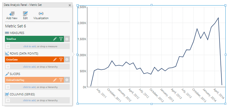
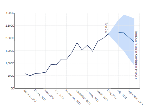
Any data displayed by any visualization can be filtered the same way as shown in this article, but for the example shown, a line chart was added to a dashboard by choosing Data Visualization from the toolbar and then Line (under Charts).
From the [Sales].[SalesOrderHeader] table of the Adventure Works database, TotalDue and OrderDate (expanded to a time dimension's Month level) were dragged onto the chart, and OnlineOrderFlag to Slicers in the Data Analysis Panel. The slicer was then filtered to show only True values (online only).
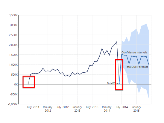
(The Selected Point Style property on the TotalDue series has also been customized in the screenshots below to a distinct DimGray fill.)
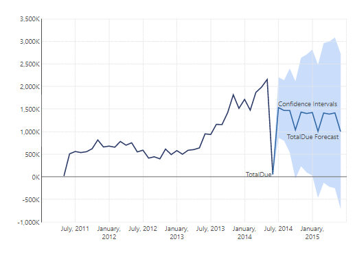
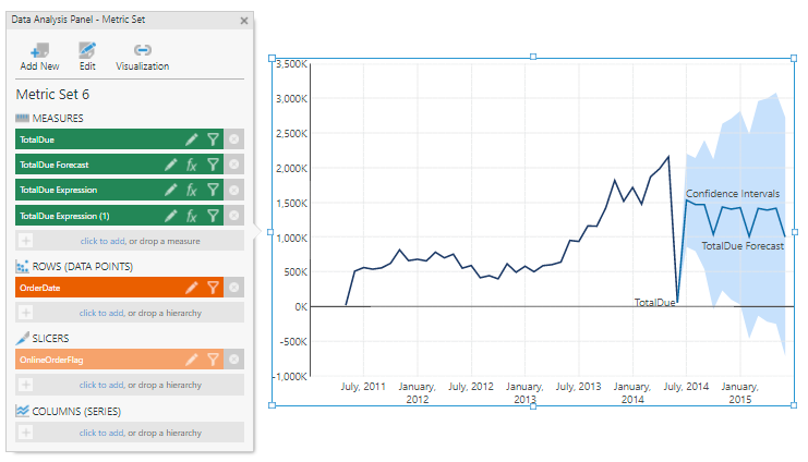
A forecast was added by choosing Re-Visualize in the toolbar and then the recommended Forecast Analysis option.
3. Exclude selected data points
Switch to View mode if you are currently editing a view such as a dashboard, so that you can interact with the data directly.
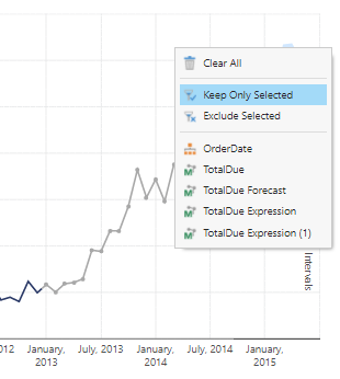
In this example using a chart, we can optionally select multiple TotalDue points at once by dragging a selection box around them, for example outlying points that are likely misrepresenting the trend.
Right-click (or long-tap) the visualization and select Filter. If you have just selected data as described above, this will present filtering options based on the selected data. Otherwise, the filter options will be based on the data you just right-clicked.
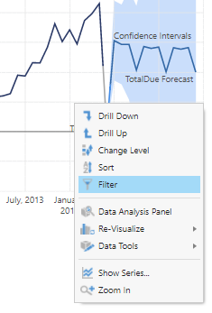
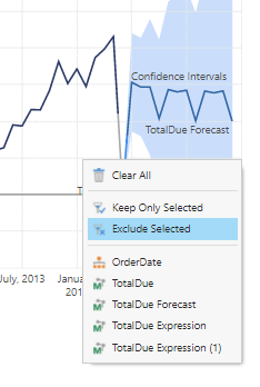
Select Exclude Selected.
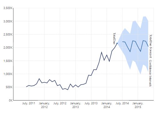
The selected points are excluded from the data visualization and the forecasting is recalculated.
4. Keep only selected data points
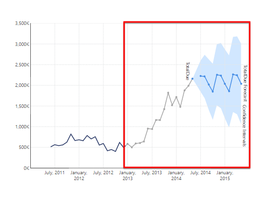
You can optionally select a group of multiple data points if you want to focus on them, for example dragging a selection box all the way from January 2013 to the top right corner of the chart in this example.
Right-click (or long-tap) the data visualization, select Filter, and select Keep Only Selected.
Everything other than the selected points (or else the one you right-clicked) is excluded from the data visualization and the forecasting is recalculated.
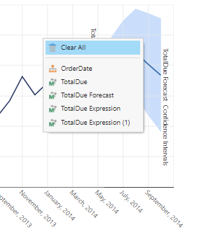
5. Clear all filters
Right-click the data visualization, select Filter, and select Clear All.
All of the filtering has reverted back to the originally prepared data.