1. Overview
This walkthrough shows you how to create metric sets, add them to a dashboard, and connect filters.
Specifically, you will learn how to:
- Create metric sets to analyze data.
- Change the visualization.
- Combine the metric sets on a dashboard.
- Connect a filter to both visualizations.
This walkthrough uses a data cube like the one from Using a data cube to join tables, but can be followed with any data source with similar data.
Related video: Introduction to Metric Set Designer
2. Create a new metric set
From the main menu, click Business, and then click Create.
The full-screen metric set editor is displayed.
2.1. Set up the metric set based on a data cube
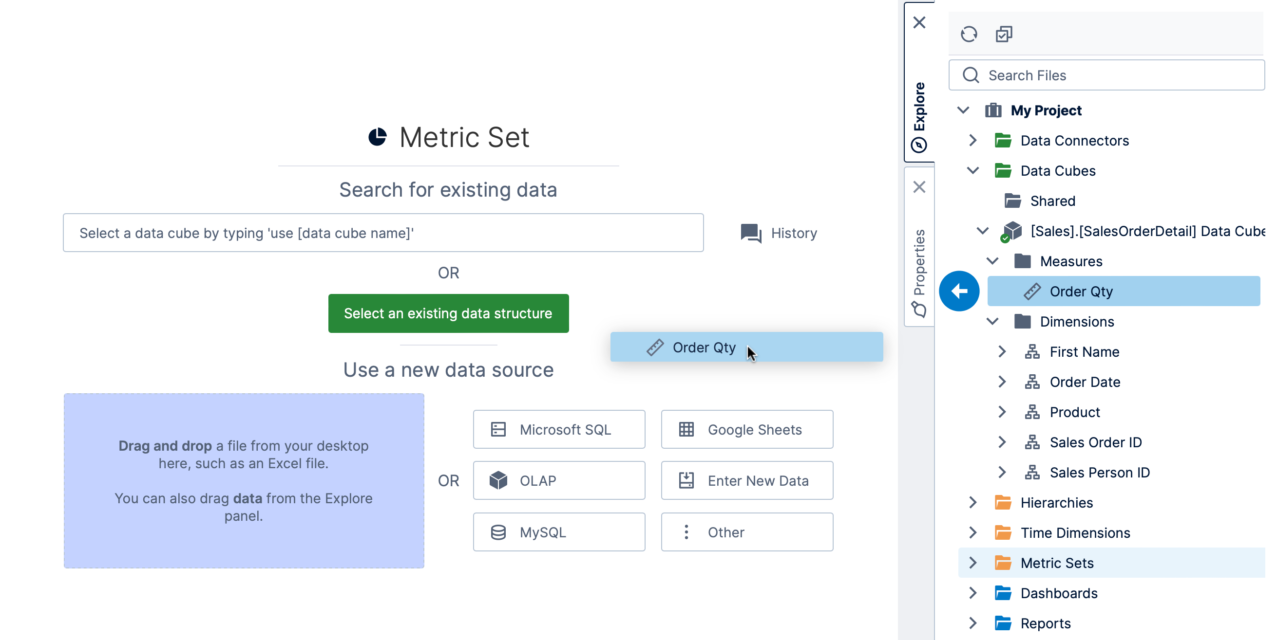
There are multiple options available from this screen for choosing your data source such as a data cube or data connector.
In this example, we located a data cube in the Explore window and clicked to expand it and its Measures subfolder, then dragged the Order Qty measure to the canvas.
You can also click to Select an existing data structure, then find and select the same measure in the dialog that opens.
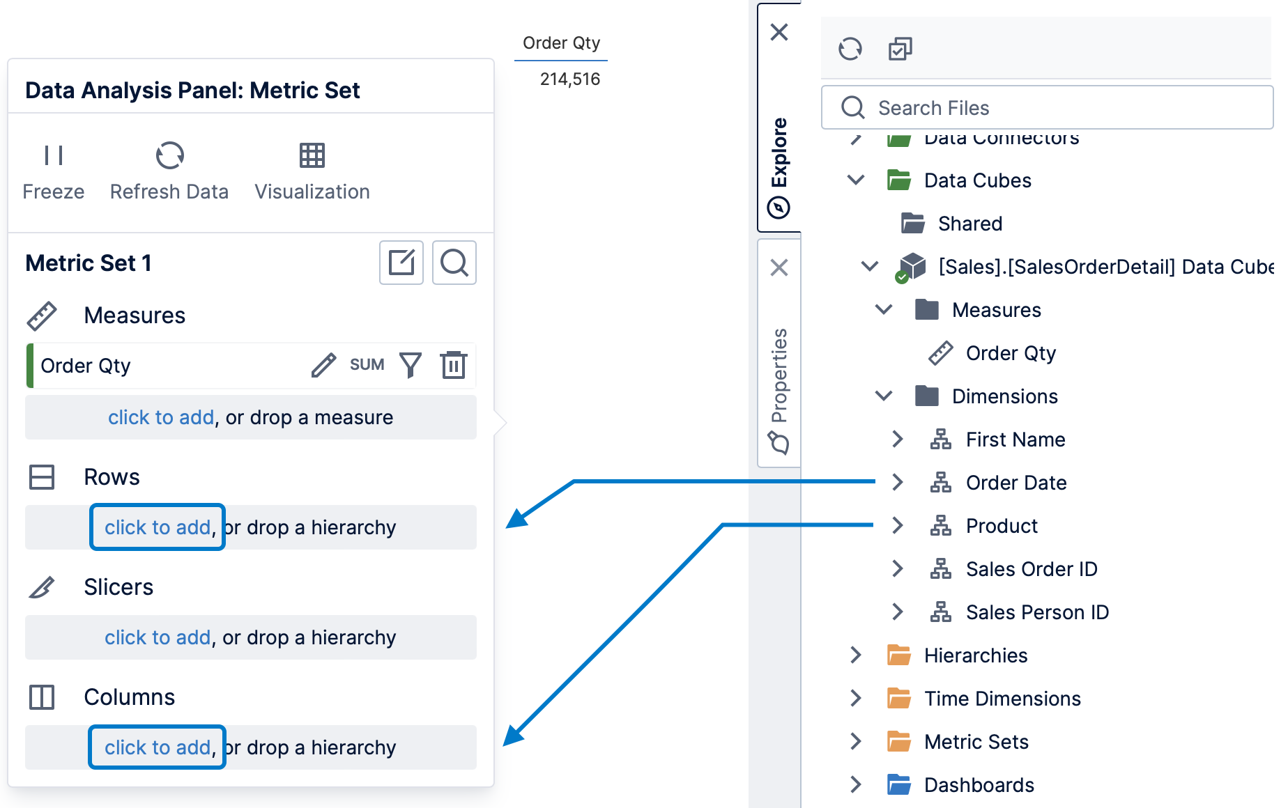
By default, the first data you choose is displayed in a table visualization beside a Data Analysis Panel. There is a single aggregated total value because no hierarchies have been added to group it.
In the Explore window, expand the data cube's Dimensions folder, then drag Order Date to Rows and Product to Columns in the Data Analysis Panel. Alternatively, you can click to add them in the Data Analysis Panel, choosing them from a list of data from your existing data source.
If you haven't chosen or customized a visualization yet, the table visualization is automatically re-visualized to a line chart because this is usually the best choice for visualizing changes to measure values over time.
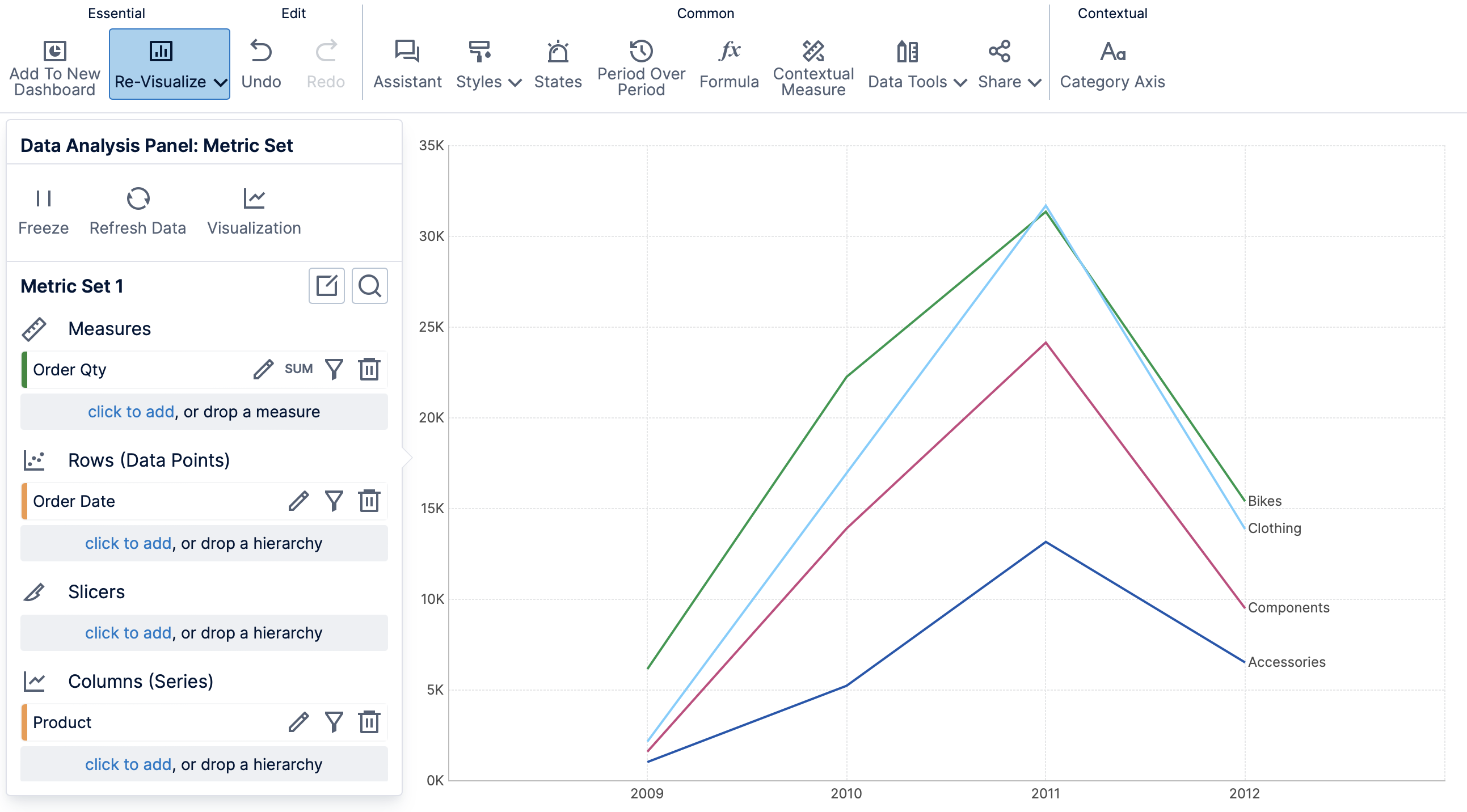
At any time, you can click Re-Visualize in the toolbar and make your own selection: it will not be re-visualized automatically after you have chosen or customized a visualization yourself.
3. Complete the metric set
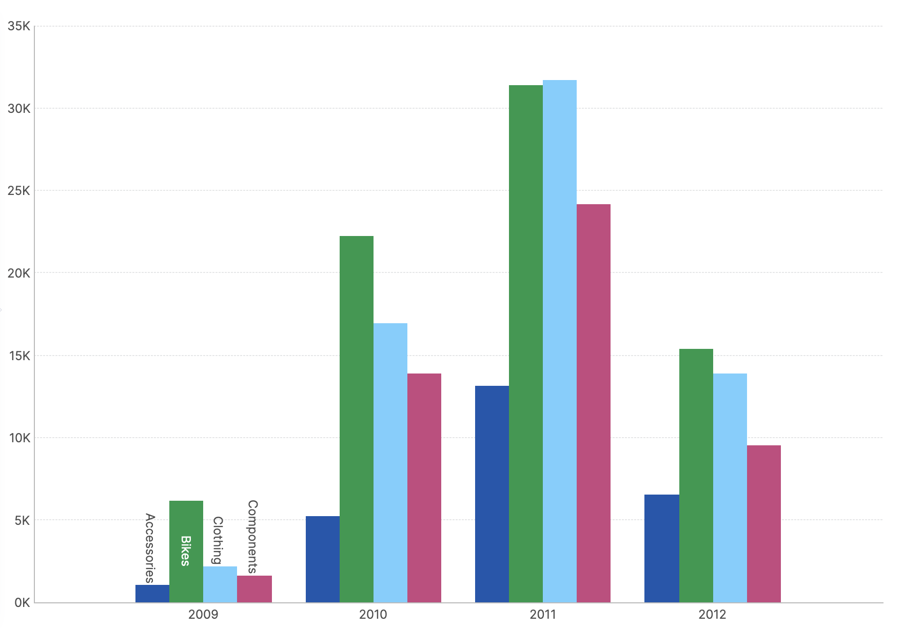
To complete the setup of this metric set, click Re-Visualize in the toolbar, and then click Bar Chart (or Bar under Change Chart Type).
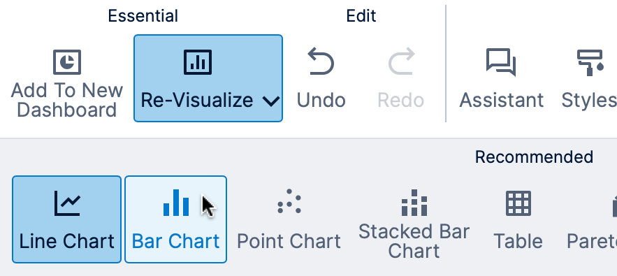
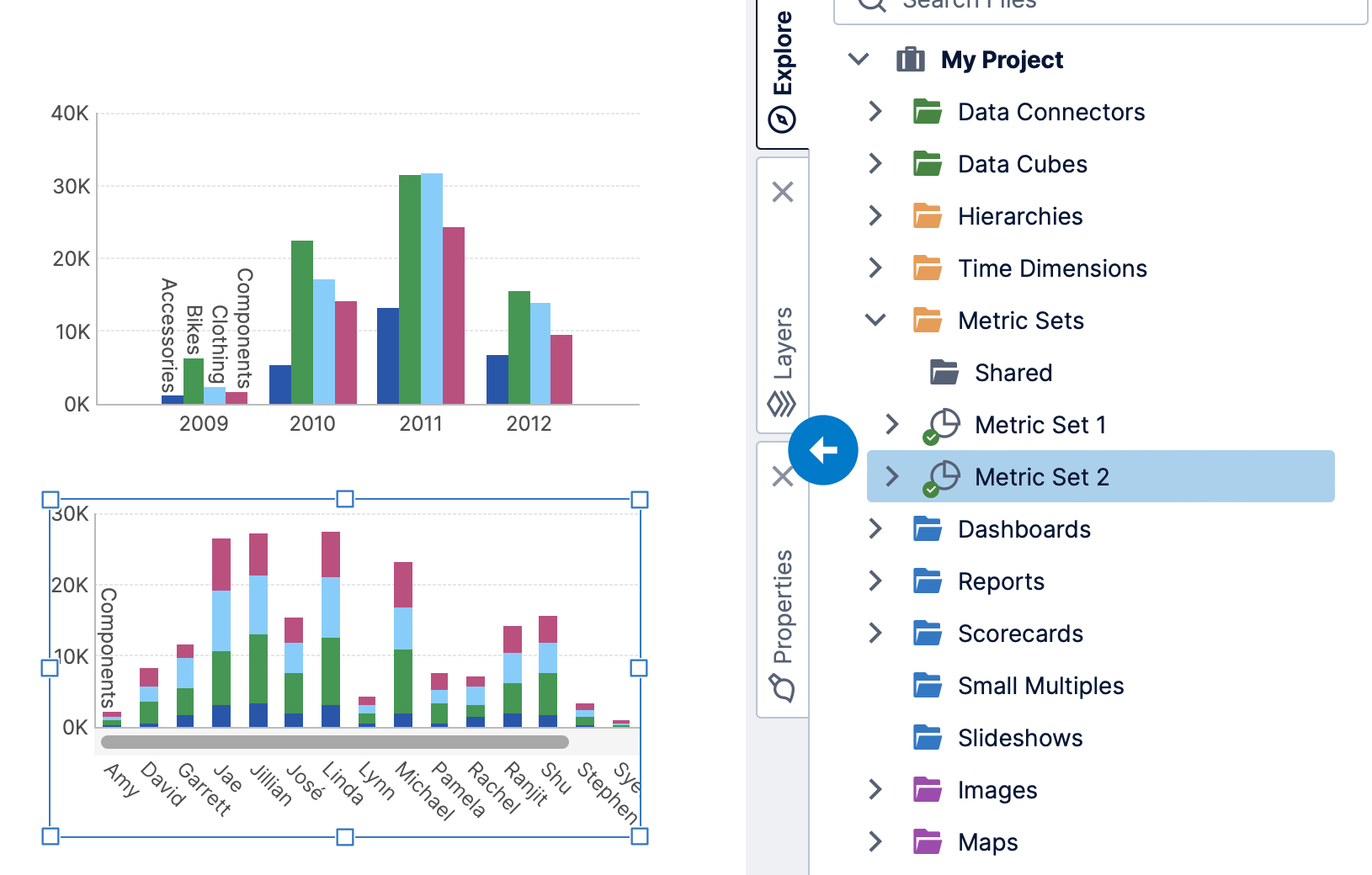
The visualization is now changed to a bar chart where each series (i.e., bars of the same color) corresponds to a specific product category.
If you want to allow others to use this metric set, click Share in the toolbar and check it in.
4. Add a second metric set
Using similar steps as before, create a second metric set as follows:
- Expand the data cube's Measures folder and drag the Order Qty measure to the canvas.
- Expand the data cube's Dimensions folder and drag the First Name hierarchy to Rows in the Data Analysis Panel.
- Drag the Product hierarchy to Columns in the Data Analysis Panel.
A data bar table may be chosen as the visualization automatically, showing person names along the rows axis, and expandable product categories along the columns axis.
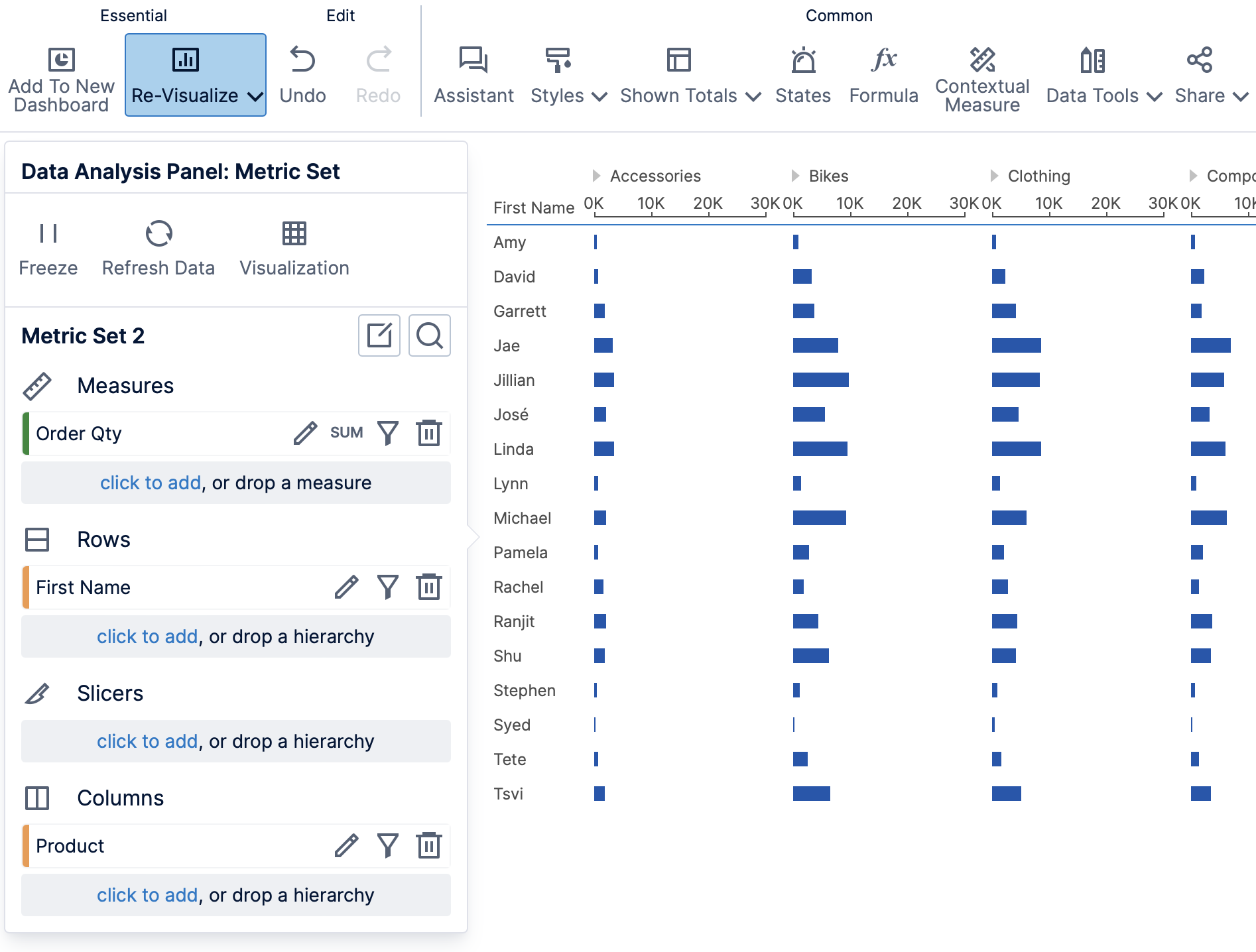
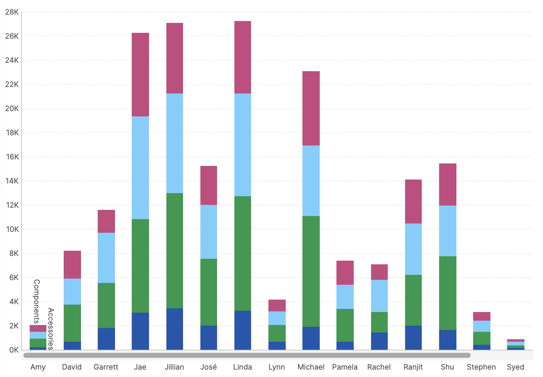
Click Re-Visualize in the toolbar, and then click Stacked Bar under Charts.
The table visualization is changed to a stacked bar chart showing person names along the bottom axis and measure values on the left axis. Each color in the stacked bars corresponds to a specific product category.
Click Share in the toolbar and check in this metric set too if you want to.
5. Display the metric sets on a dashboard
To automatically create a new dashboard and put the current metric set on it, click Add To New Dashboard in the toolbar of a metric set. Otherwise, click Views in the main menu and then click Create to create a dashboard.
Go to the Explore window, expand the Metric Sets folder, and drag the metric sets from earlier or the remaining one onto the dashboard canvas. Observe that they are visualized using the same options you chose.
6. Using filters on a dashboard
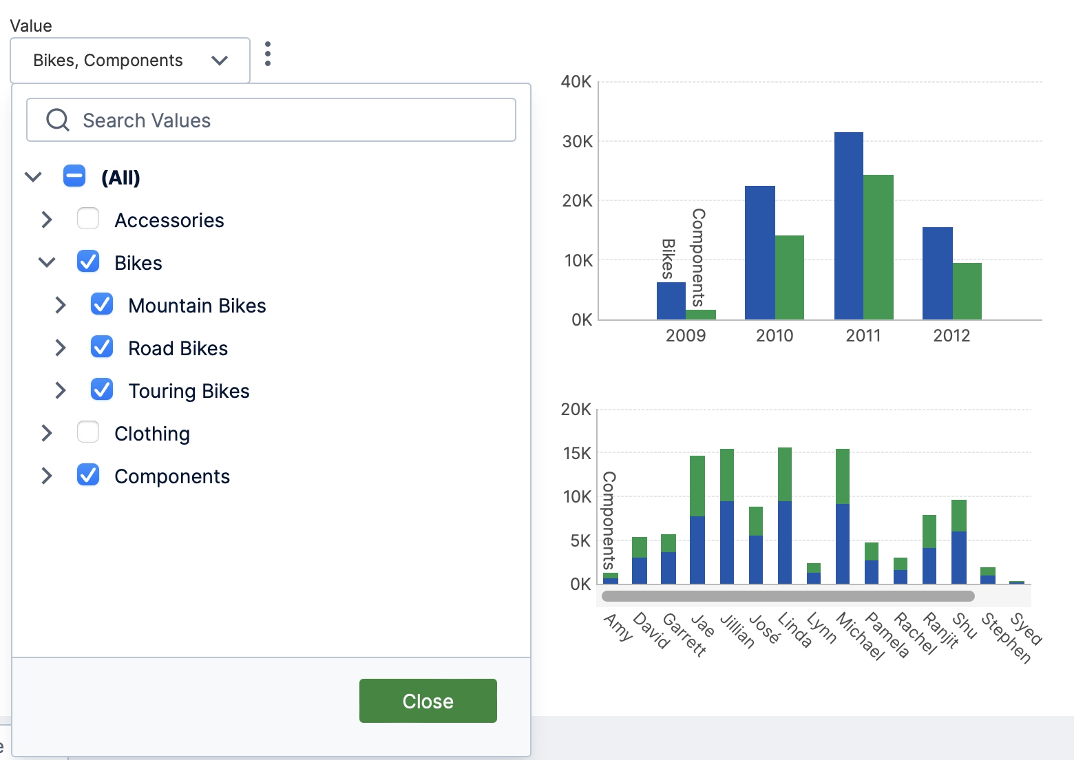
With the metric sets added to a dashboard, you can add dedicated filters that can be used to more easily filter the data while viewing. For example, you can add one filter used to choose the products displayed in both charts at once.
- If one of the charts is selected, click an empty area of the canvas to de-select it if you don't want to filter only that chart (as in this example).
- Click Filter in the toolbar, and then choose Value under Hierarchy.
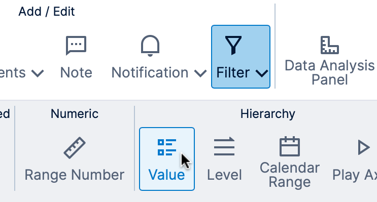
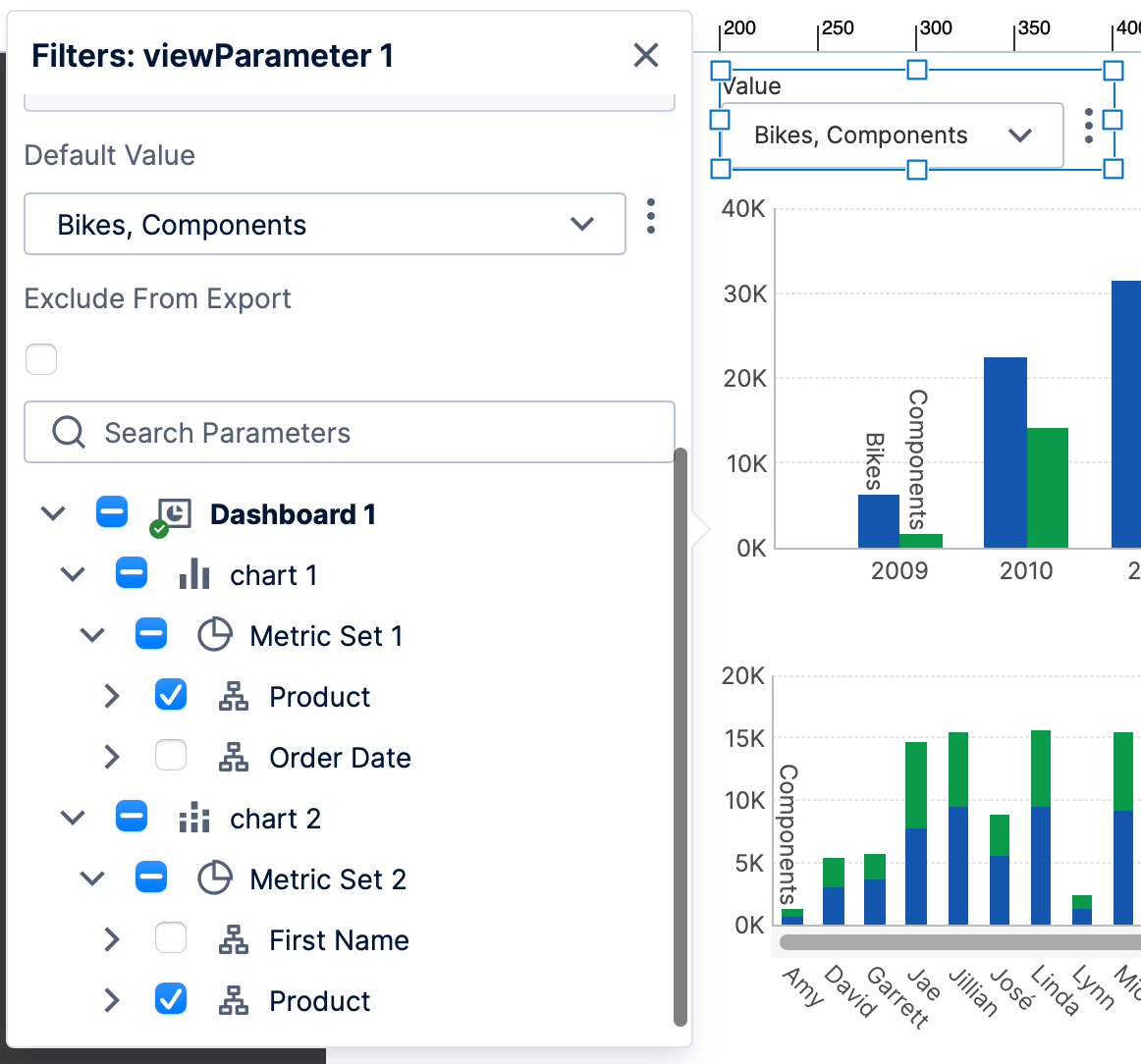
Adding a hierarchy value filter - In the filter connections popup that appears next to the new filter, scroll down if necessary and confirm that Product in both charts is selected for filtering.
- You can choose the default selection for this filter by setting the Default Value as shown in the image below.
To use the filter directly, click View in the toolbar.