
1. Overview
The status bar normally appears at the bottom of the screen, and contains several key features. The status bar is also known as a 'taskbar'.
2. Elements of the status bar
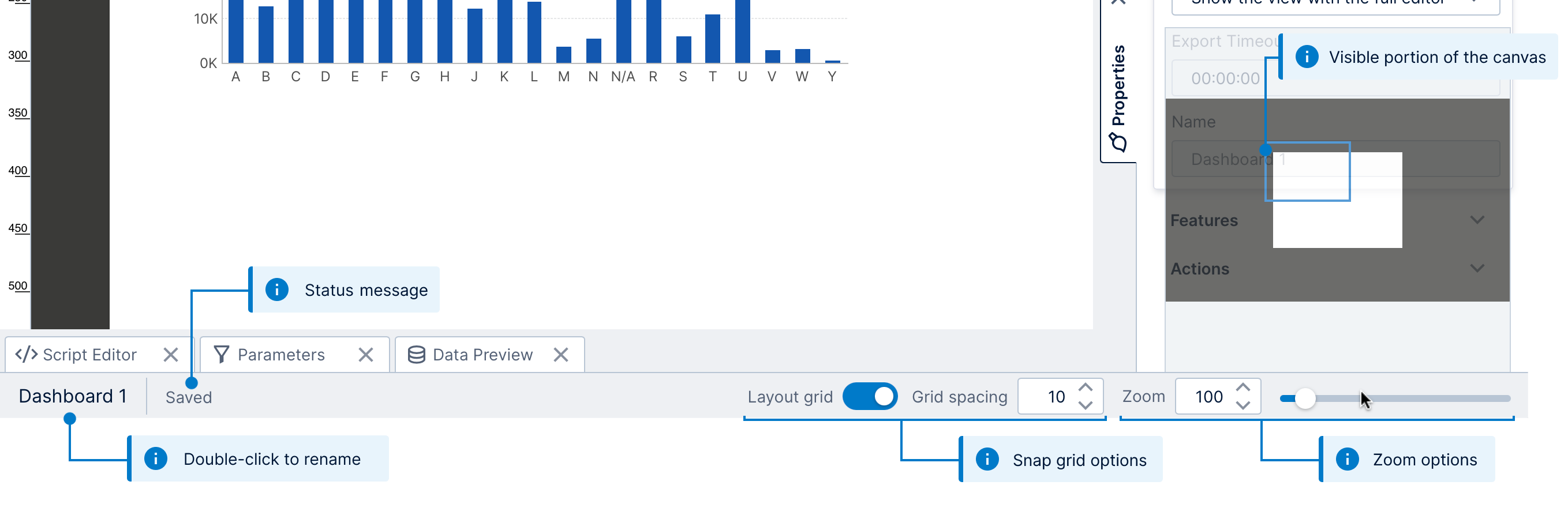
After opening any file that you work with full screen like a dashboard or metric set, the status bar normally appears and contains some or all of these common elements.
The figure below illustrates the different parts of the status bar as seen when editing a dashboard:
2.1. Name of the item
The name of the file you currently have open (e.g., metric set or dashboard) is displayed on the left side of the status bar. Double-click the name in the status bar to rename it.
To find out which project and folder contains the current item, you can hover over (or long-tap) the name to view its full location in a tooltip popup.
2.2. Status message
Beside the name of the item is a section for status messages. For example, if you make any changes to the file you're working on, you'll see a Saved message appear in the status bar when your progress is automatically saved.
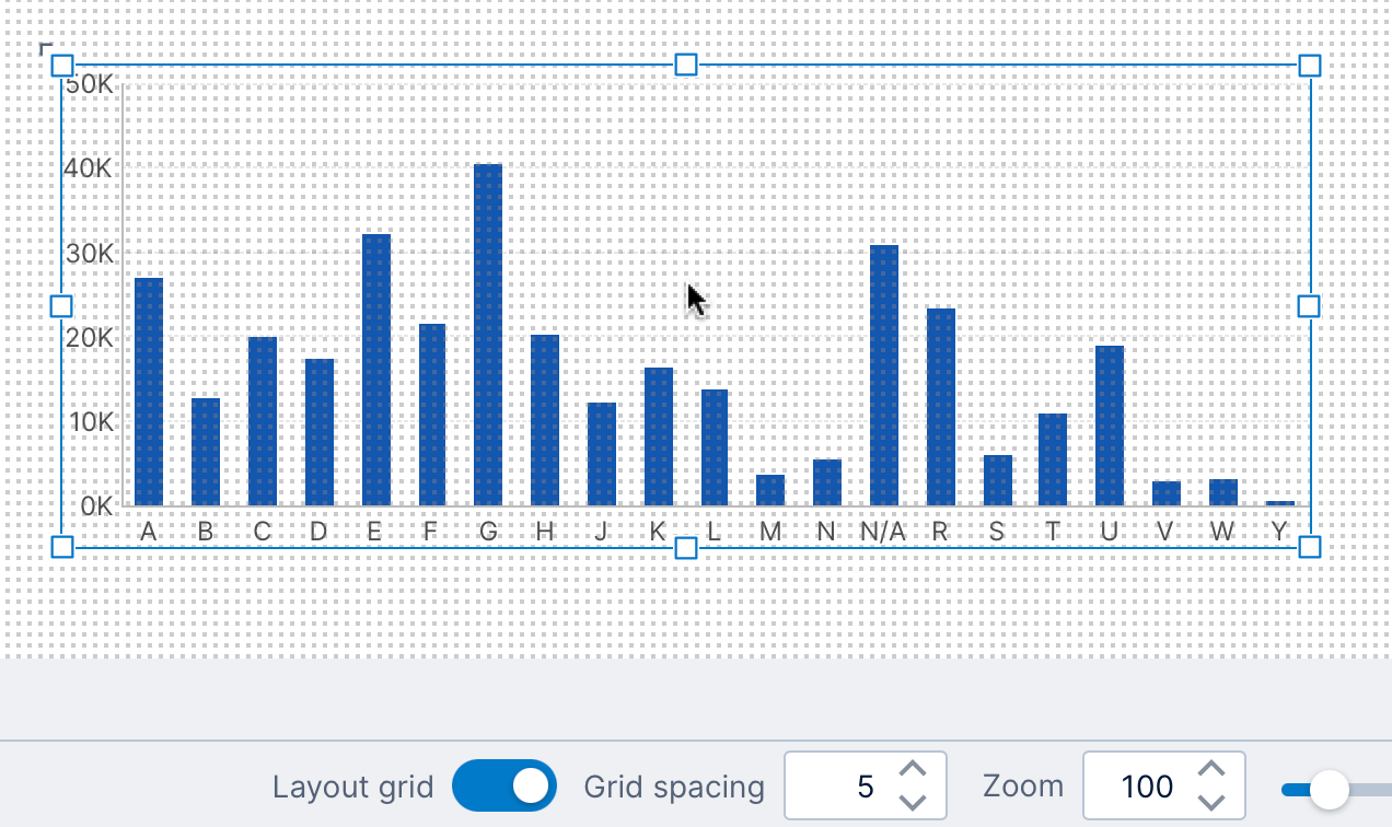
2.3. Snap to grid
When editing a view with a canvas, such as a dashboard or report, the snap grid options are available.
If the snap to grid option is enabled in the status bar, you'll see the grid of dots while you drag components around on the canvas. Positionally, components will always be lined up with the grid dots when snap to grid is enabled, which makes it easy for you to align and leave consistent spacing between components.
The default spacing between grid dots is 10 pixels. You can increase or decrease this from the status bar.
2.4. Zoom level
Screens such as dashboards, reports, and data cubes allow you to zoom in or out.
The canvas zoom level is normally 100 percent but may be set up to scale automatically to fit your screen. A higher value for the zoom level means you are zoomed in (everything appears larger). To change the zoom level, type in a new zoom percent value, use the up/down controls, or move the zoom slider.
You can reset the zoom level back to its initial level by double-clicking the zoom slider or by using the Reset Zoom button.
2.5. View panel
When zooming and scrolling is available on the screen, a view panel popup appears when moving the mouse over the zoom level controls on the right side of the status bar.
This indicates what part of the entire canvas is currently visible using a blue rectangle. Dragging this rectangle is an easy way to quickly pan across your dashboard, and an alternative to using scrollbars to access the parts of your dashboard that are scrolled out of view.
2.6. Data summary
When selecting rows or columns in a table visualization, or data points in a chart, some basic statistics of that data will appear in the status bar.
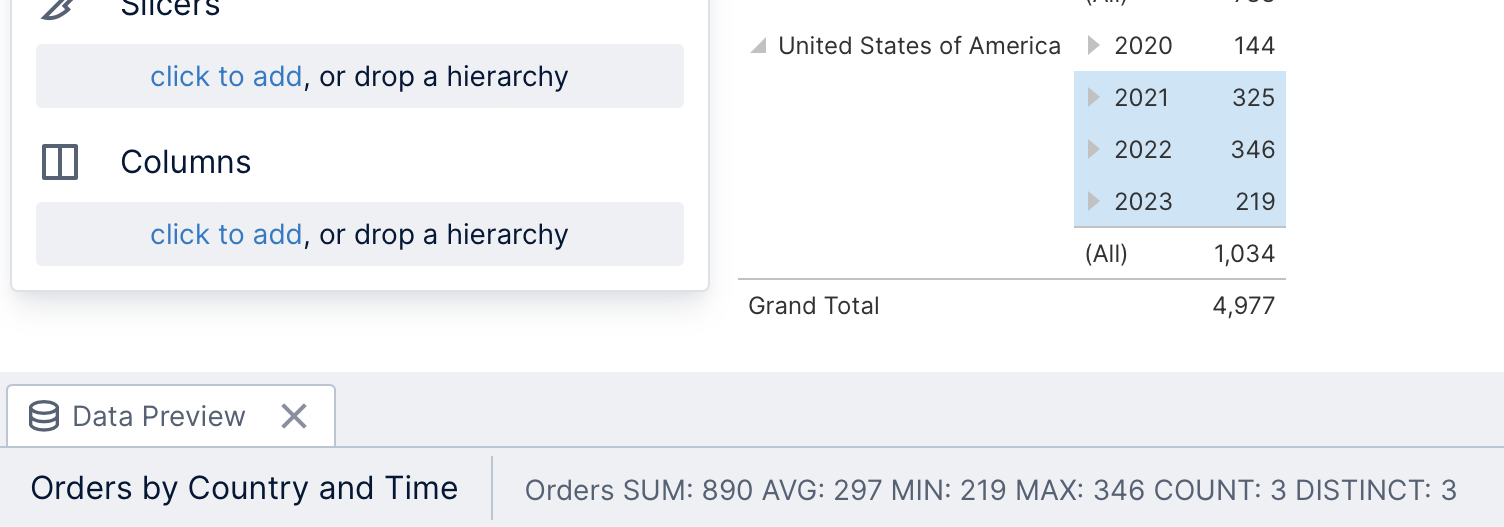
When editing a dashboard or other view, you can either open Data Preview and select data in its table, or switch to View in the toolbar to select data in visualizations.
See Metric set analysis tools for more details on displaying a data summary.