1. Overview
A state indicator can display different colors, shapes, and more based on conditions in your data.
States are set up in your metric set to check for conditions in your data that you define, and then you can customize the state styles to determine how each state looks.
2. Example data
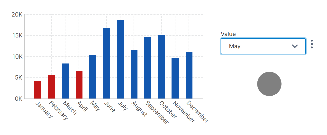
As an example, consider the following metric set visualized as a chart, where a state is comparing each sales value against a constant formula value.
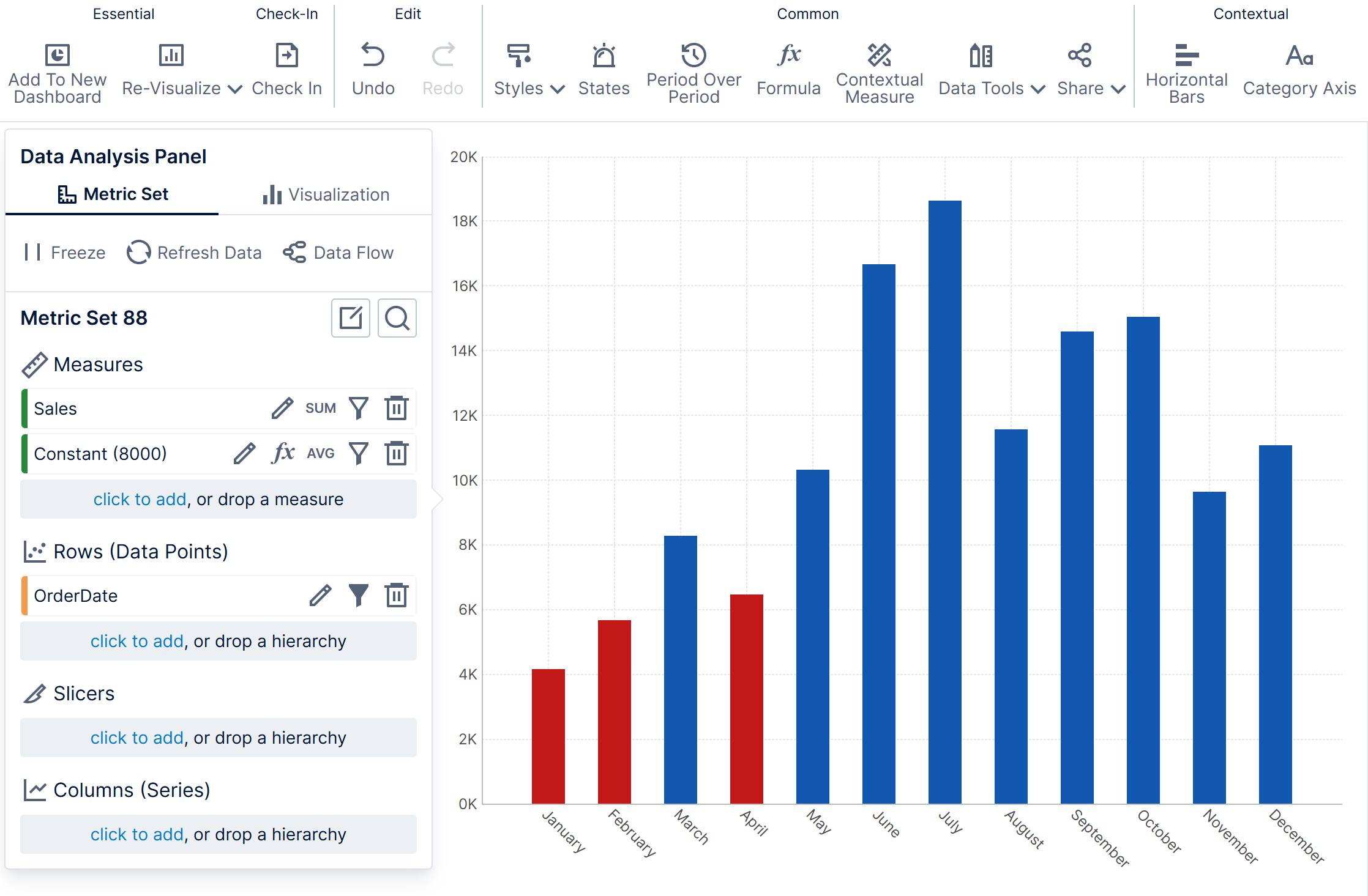
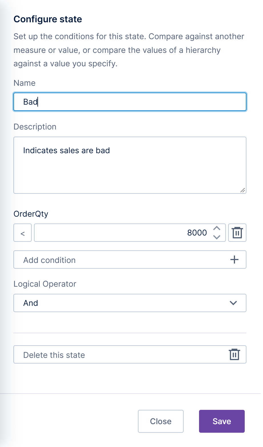
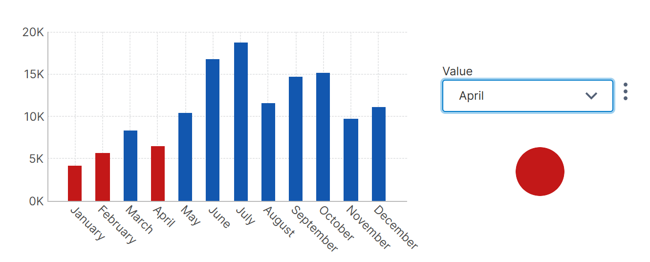
The red bars correspond to a Bad state which is defined as sales numbers less than a constant formula value of 8,000 for a particular month.
3. Example dashboard
State indicators are typically sized very small and combined with other visualizations on views such as dashboards rather than visualized on their own.
For this example, we created a new dashboard from the main menu, then dragged the metric set from the Explore window to the canvas. It appears as a bar chart like the one displayed in the full screen editor.
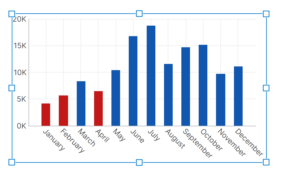
The purpose of the chart in this example is just for confirmation that the state indicator (to be added later) shows the expected result.
4. Add a state indicator
Go to the dashboard toolbar, click Data Visualization, and then select State Indicator.
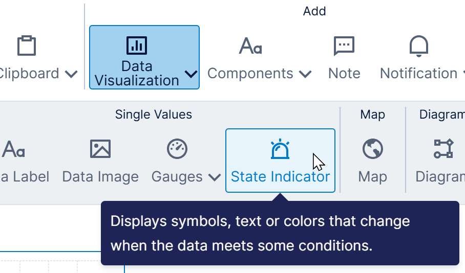
An empty state indicator appears on the canvas without any data. To add our existing metric set, we drag it from the Explore window onto the state indicator.
You can also drag data directly from a data source onto a state indicator, but will then need to set up states from Data Tools in the toolbar, or you can click to edit the States the from the Properties window as a shortcut.
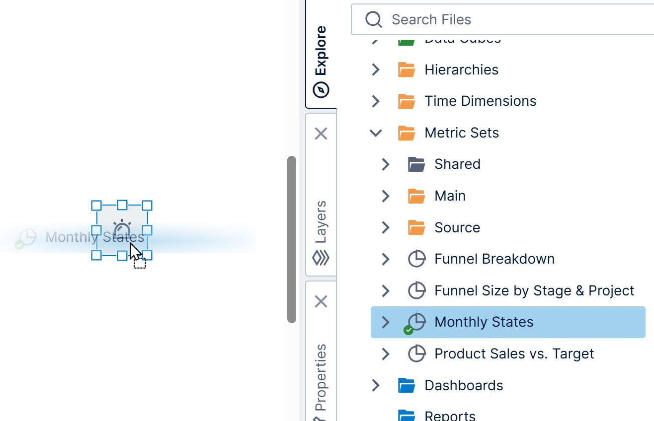
The state indicator is now connected to data and appears as an ellipse (circle) by default.
With the state indicator selected on the canvas, go to the toolbar, click Filter, and then select a filter such as Calendar. This connects the filter just to the state indicator by default.
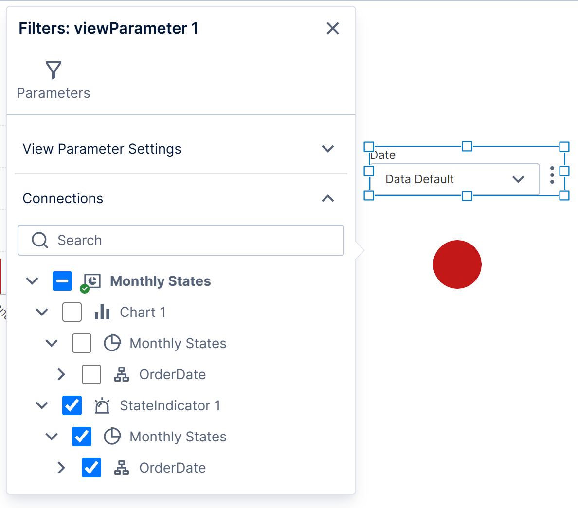
The purpose of the calendar filter in this example is to show the effect on a state indicator when the filter is set to different months (e.g., there are good and bad months concerning the monthly data).
Switch to View mode in the toolbar and use the calendar filter. You'll see the state indicator change color accordingly and you can verify that this is correct by comparing against the chart.
State indicators can be used in different ways:
- When displaying a state indicator on its own like this, you have the option of filtering it to a token such as Year to date so that it updates automatically over time (you can filter data from the Data Analysis Panel rather than add a filter to the canvas). It can display some text as described in the next section, or you could add a separate data label.
- A table visualization column can be set to the State Indicator column type. In the column's properties, you can set the same state indicator properties that are shown below for states added to the table's metric set. For example, a table can include a column next to some numeric values with icons indicating good or bad values, or values that are higher or lower than a previous time period.
- You can add state indicators to repeating views such as scorecards, which provide another way to display a column of state indicators, for example.
5. State styles
When you add a metric set with states to a state indicator, the State Group is automatically set and State Styles are added for each state in the Properties window.
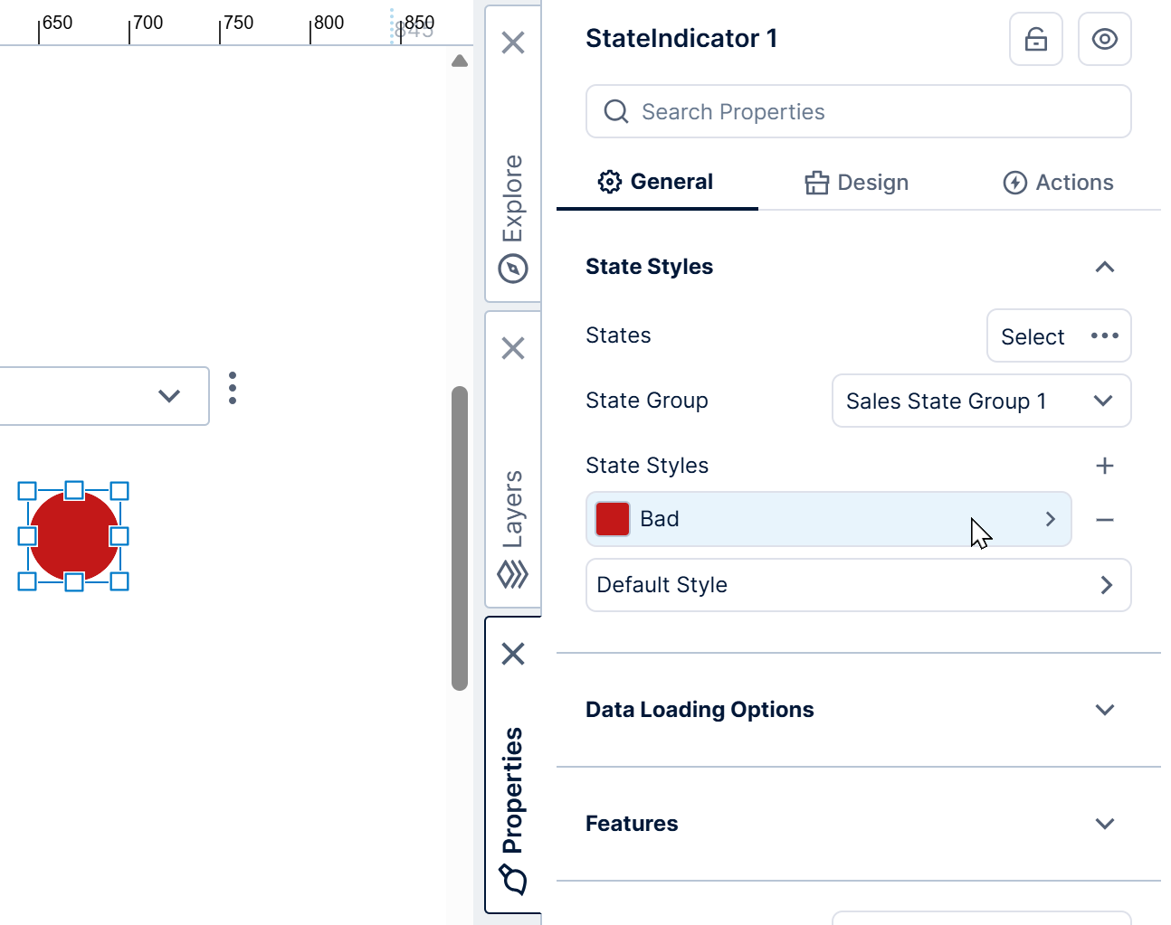
Click on a state style to edit its properties, such as Symbol and Fill.
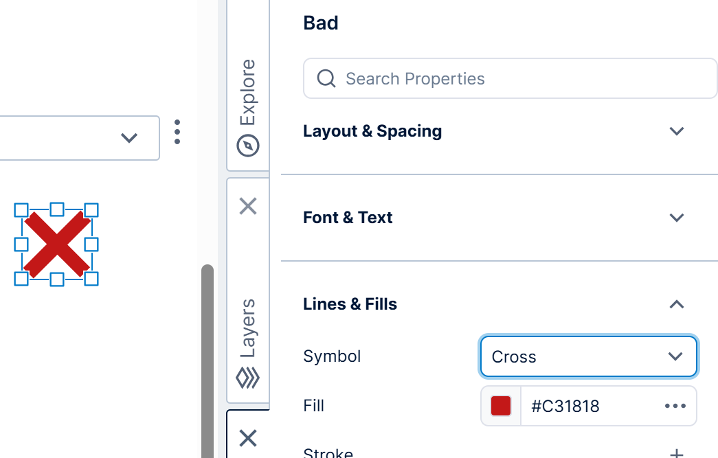
Each state style also has other properties such as:
- State - Identifies the metric set state associated with this state style (e.g., Bad).
- Background Symbol - Can be used to layer the main Symbol on top of another symbol, such as a Dash on top of an Ellipse. The Padding property can be used to make the foreground symbol smaller.
- Tooltip Text - Displays text in a popup when viewers hover over or long-taps the state indicator. This can display more details, including keywords referring to data added to the Data Analysis Panel. You can also set this from the Data Analysis Panel's Visualization tab.
- Text - Displays text over the symbol, optionally including keywords referring to data added to the Data Analysis Panel. You can also set this from the Data Analysis Panel's Visualization tab. To display text outside the symbol, consider using a data label or a table's text column as an alternative.
- Legend Text - The text to be displayed to identify this state in a legend if you add and connect one.
- Enable Animation - Use with the Animated Fill property to call attention to particular states by repeatedly fading back and forth between two different fill colors.
5.1. Default style
When the data does not fall within any state, the default style is displayed instead.
Click Default Style next to the list of state styles to edit its settings. You can set its Symbol to None if you want to display nothing in this case.
5.2. Using an image for a state
Instead of displaying a built-in symbol for each state, you can upload and use your own images for the different states.
To do this, first prepare your images (one for each state) and upload them as image resources.
For example, drag a PNG image file from your device to the Explore window, or right-click/long-tap the Images folder and select Upload File.
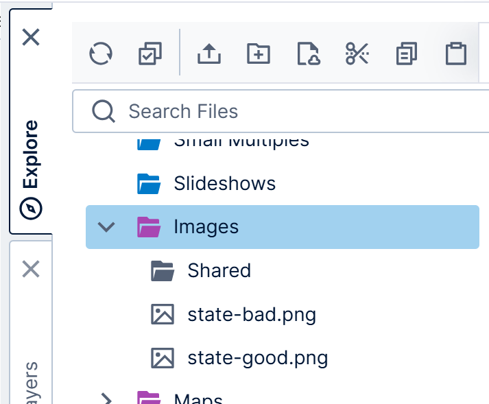
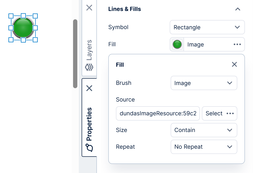
Next, edit the properties of each state style. Go to the Lines & Fills section (formerly the Look tab) and do the following:
- Set Symbol to Rectangle to allow the entire image to be visible.
- Open the Fill property's additional options and set its Brush to Image.
- Click the Select
5.3. Custom symbols
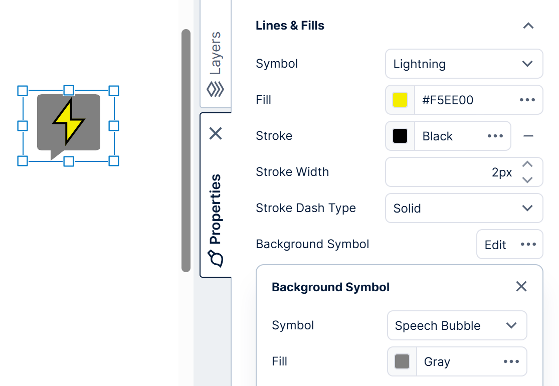
In version 26.3 and higher, another way to display custom symbols is for an administrator to set up Custom Symbols in the configuration settings. Custom symbols have the benefit of being reused more easily and assigned different fill colors and stroke (border) styles, just like built-in symbol options.
This configuration setting is set in JSON format where each custom symbol has a Name to display and a Value in SVG path data syntax, corresponding to how a path element's d attribute is set. The coordinates should be relative to a 100×100 pixel area, and will adjust automatically according to each state indicator's set size. This syntax supports combining various lines and shapes of different types into one symbol, for example:
[
  {
    "name": "Lightning",
    "value": "M55,5 L25,55 L45,55 L45,95 L75,45 L55,45 Z"
  },
  {
    "name": "Speech Bubble",
    "value": "M15,10 Q15,5 20,5 L80,5 Q85,5 85,10 L85,80 Q85,85 80,85 L45,85 L30,100 L30,85 L20,85 Q15,85 15,80 Z"
  }
]
Once set, the custom symbols appear to all users in the same lists as the built-in symbol options in the Properties window for state indicators and legends.