
1. Overview
The Pareto principle states that, for many events, roughly 80% of the effects come from 20% of the causes.
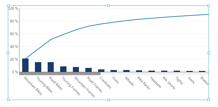
A Pareto chart displays bars sorted in descending order and a line displaying the cumulative total.
2. Create a Pareto chart
You can choose to create a Pareto chart based by adding a new data visualization or by re-visualizing an existing visualization of a set of numbers:
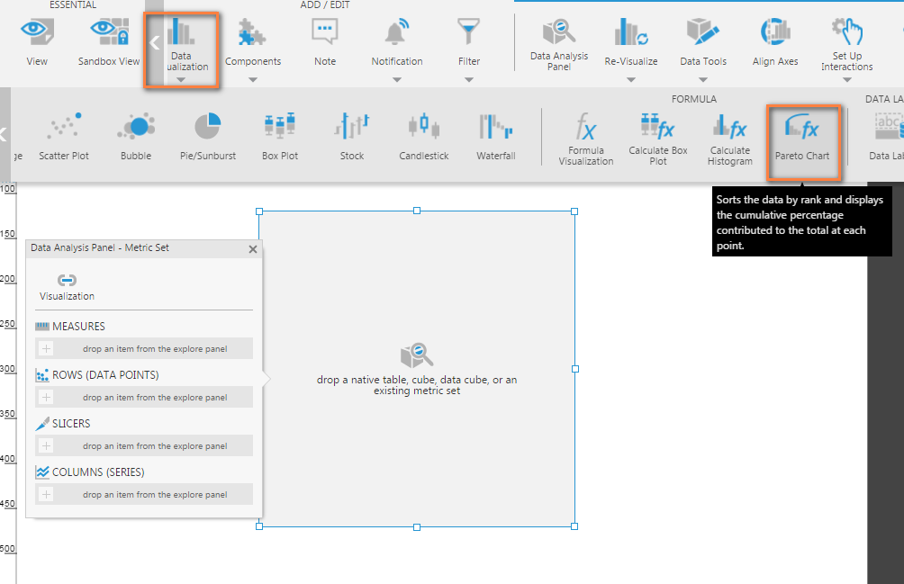
2.1. Using the Create Pareto chart option
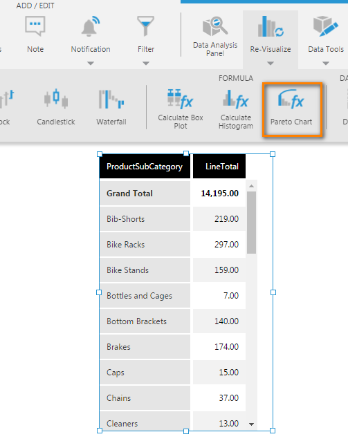
To add a pareto chart to your dashboard, go to the toolbar, click Data Visualization, and then select Pareto Chart. An empty pareto chart is added to the canvas.
Drag and drop the LineTotal measure onto the empty pareto chart. The chart will show a single bar.
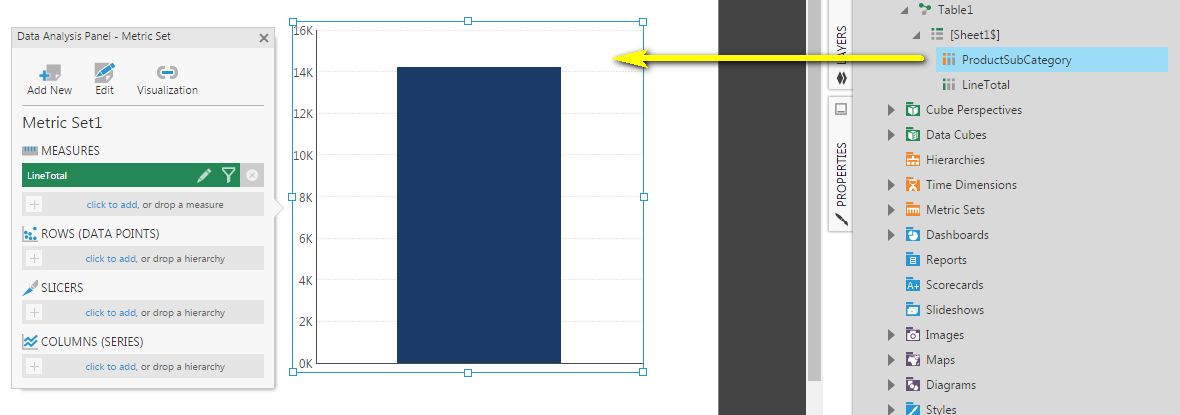
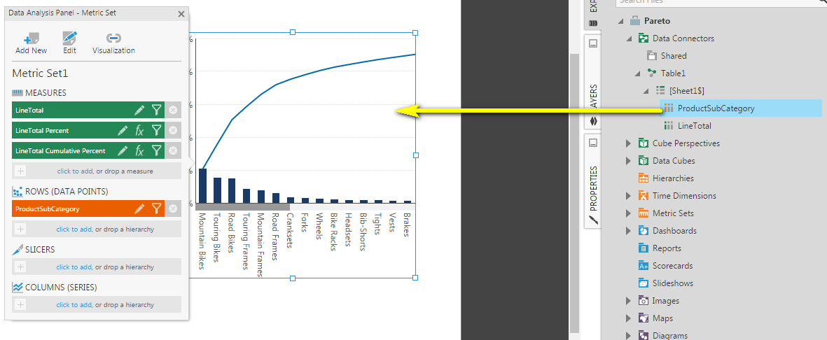
Drag a hierarchy or a column of non-numeric data from the Explore window onto the Pareto chart, or to Rows in the Data Analysis Panel. You'll see the Pareto chart animate and automatically show a bar chart together with a line chart. The bar chart is sorted in descending order based on the measure, and the line chart shows the cumulative percentage contributed to the total of each point.
2.2. Using the re-visualize option
If you have an existing metric set and visualization, you can re-visualize it to a Pareto chart.
Select Re-Visualize in the toolbar.
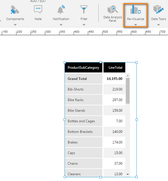
Select Pareto Chart.
3. Data analysis panel
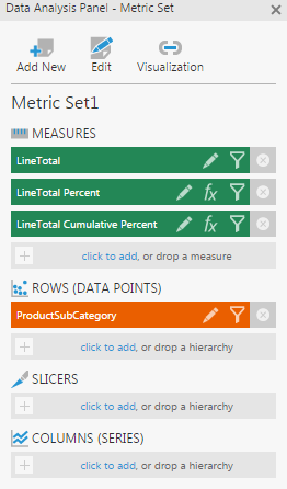
In the Data Analysis Panel, you will notice that 2 additional measures were created automatically:
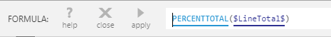
The first formula generated is the Percent of Total:
The second formula generated is the Cumulative Total (or running sum) of the Percent of Total:

4. Viewing the Pareto chart
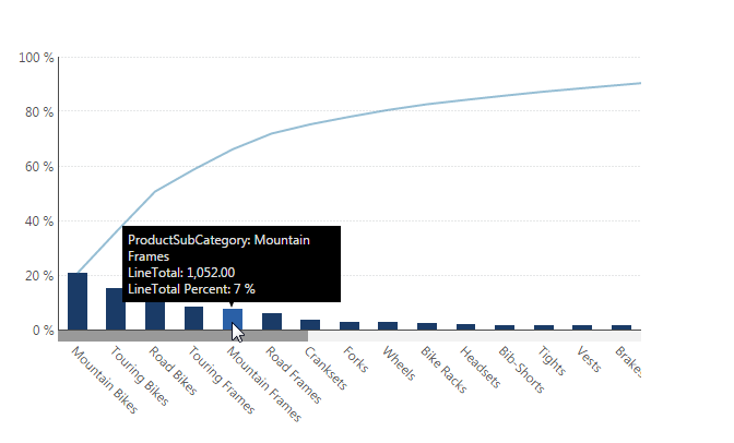
- Switch to View mode and hover over a bar to see a tooltip showing the measure value and corresponding percentage.
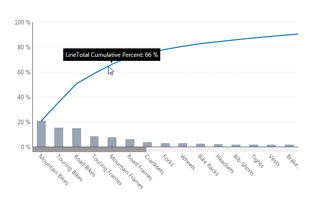
- Hover over the line chart to see a tooltip showing the measure's cumulative percent value, which indicates how much each bar and the bars to its left contribute to the total.
5. See also