1. Overview
The Menu component lays out a menu of items that users can click to navigate to content, expand submenus, and trigger other interactions. You can customize it a variety of ways to suit your design and layout needs.
2. Add a menu component
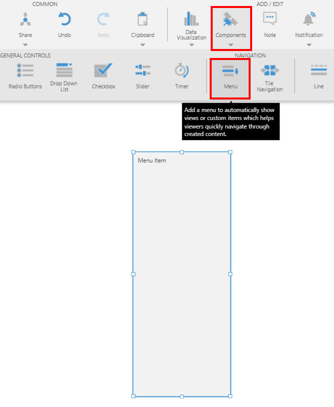
Go to the toolbar, click Components, and then click Menu.
3. Add menu items
You can add items to the menu by dragging them directly from the Explore window or you can add them manually by specifying which items to include from the Properties window.
3.1. Drag views or folders
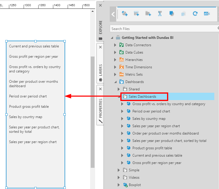
From the Explore window, drag a view or a folder of views onto the empty menu to populate the menu items. For this example we chose to drag a folder containing various views.
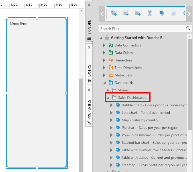
The views contained in the folder are listed as menu items in the menu component, and you can click to navigate to each one.
3.2. Menu item properties
Alternatively, you can use the Properties window to add individual items manually or select a folder to populate the menu.
3.2.1. Enter manual items
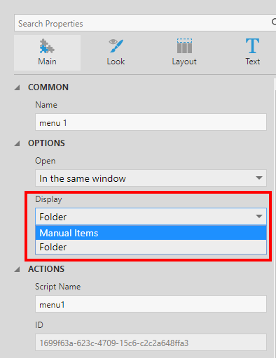
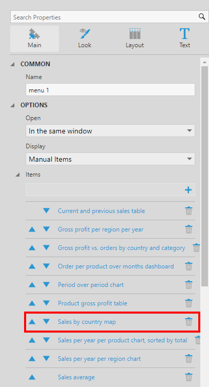
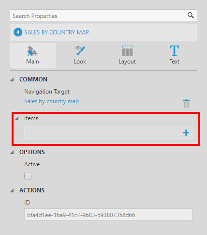
Go to the Properties window and select the menu component on the canvas.
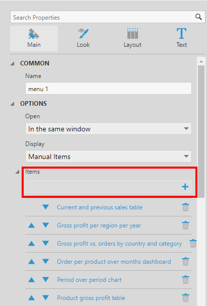
Set the Display property to Manual Items.
In our example, we have some existing Items already listed below that we added by dragging.
Click the + button to add a new item, and click on the item to edit it.
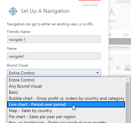
Typically, menu items have a navigation target set up on them directly. Click the + button next to Navigation Target, found under Animation & Interaction in recent versions, then click to Select the target.
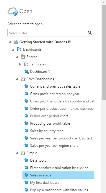
In the Open dialog, select a view to navigate to. For this example, we selected the Sales average dashboard.
Click Open at the bottom of the dialog.
You can customize other properties such as the Text displayed for this item.
3.2.2. Select a folder
You can populate items automatically from a folder, which will also keep your menu up to date with changes to the folder's files over time.
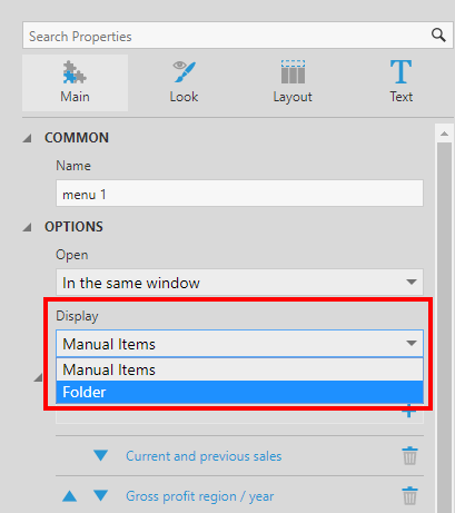
With the menu component selected, go to the Properties window and set the Display property to Folder.
Click the button to select your Display Folder, and select a folder from the Open dialog to add to the menu.
For this example, we selected the Performance Dashboards folder.
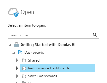
Click Open at the bottom of the dialog. All the views from the folder are displayed as items in the menu.
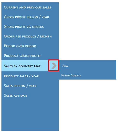
3.3. Add submenu items
You can add additional levels of menu items or submenus, which you can access under another menu item.
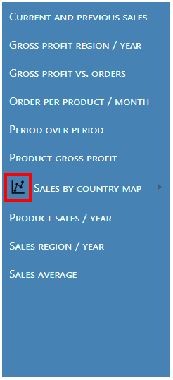
To add an item under an existing menu item, drag a file from the Explore window and drop it onto the existing item.
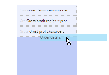
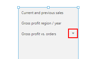
An arrow is displayed to the right of the menu item, called an indicator icon, indicating that it can be expanded when viewing. This icon can be customized in the menu properties.
You can also add submenu items manually in the Properties window. Select one of the items in the menu's Items property to edit it, or click the item in the menu directly.
Now click to add an item to this Items property.
Click on the new item to edit its settings.
This submenu item can be set up manually just like the top level menu item shown earlier. You can also add another level of submenu items below this item.
4. Customization properties
You can customize the appearance of the menu and its items in the Properties window.
4.1. Style menu items
4.1.1. Style individual menu items
You can choose to style each menu item individually. In this case, the menu's Display property should be set to Manual Items.
You can click to select a menu item directly on the menu component itself, or click to edit an item under the Items property. Use the settings in each category to change the background, border or icon when the menu item is in various states during viewing such as at rest, when hovered over or when active.
4.1.2. Level styles
You can also specify styles for all the items at once in each level of the menu. This option will work even if you are dynamically populating items from the file system. If you have submenus, you can set up a distinct style for each level.
To add a new style, go to the menu's properties, click on the Design (or Look) tab, and click + under Level Styles (formerly Item Styles).
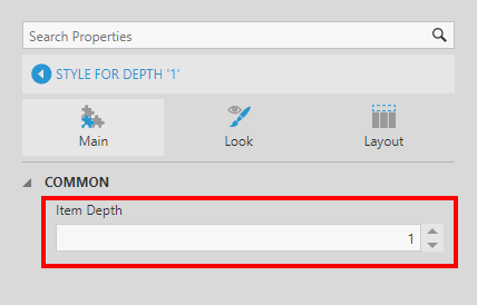
Click the new item to edit it. If you have multiple levels of items (or submenus), increase the Item Depth property to the submenu level you want to customize. For example, if set to 1, items displayed directly under a top-level menu item will be styled.
You can add more than one item style for the same item depth. In this case, the styles act as a palette, for example if you wanted to alternate the items between two background colors.
4.2. Open
Use the menu's Open property to specify what happens or how the navigation works when a menu item is clicked. In recent versions, find this in the Design tab of the menu's properties, under Animation & Interaction.
The available options are:
- Open the clicked item in the same window
- Open the clicked item in a new window
- Open the clicked item in an embedded view (i.e., a view container elsewhere on the canvas)
- Invoke a custom interaction (Nothing option)
If you choose the Nothing option, you can add custom actions for each item instead as described in a later section.
4.3. Submenu properties
You can use the following properties of the menu in the Design (or Look) tab to customize how submenus are displayed when viewed, found under Animation & Interaction in recent versions:
- Show As Popup - Enable to display submenus as a popup, otherwise they are expanded below or to the right of the parent item.
- Show On Hover - Displays submenus by hovering over the parent item rather than clicking. When enabled, the Hover Delay property can be set in milliseconds.
- Disable Auto Collapse - Selecting this option allows multiple menu items to be expanded at the same time.
4.4. Horizontal layout
In the Design tab under Layout & Spacing (formerly the Layout tab), select the menu's Horizontal Layout property to display the items side-by-side horizontally rather than in a vertical column.
4.5. Set menu items to active
If needed, you can use the Active property checkbox on an individual menu item to ensure that a menu item is initially in the Active state when the dashboard is loaded during viewing. If this item contains submenu items, this expands the submenu.
Find this in the properties of a menu item, under Animation & Interaction in recent versions.
4.6. Icons
You can add your own icons to identify each menu item and/or to indicate a submenu, for each of the various states of the menu items:
- Rest
- Active
- Hover
4.6.1. Add item icons
To add an icon to the left of the item's text, edit the menu item's or level style's properties and expand Lines & Fills (formerly the Look tab). Click + next to the Rest Item Icon property, for example, to set it.
To use an uploaded image, click the Select button, select an image in the Open dialog, then click Open.
The selected icon is added to the left of the text.
You can add different icons for the other states of the menu item, or allow the rest icon to display for the other states.
4.6.2. Add indicator icons
You can add your own icon to the right of the text to indicate that a menu item can be expanded to show submenu items rather than use the default indicator.
Edit the menu item's or level style's properties and expand Lines & Fills (formerly the Look tab), then click the + next to the Rest Indicator Icon property, for example. Click Select to use an uploaded image.
The selected icon is added to the right of the text.
You can enable the Always Show Indicator Icon option (previously found in the Layout tab) if you want it to appear even if there are no submenu items.
4.6.3. Change icon size
The Icon Size property under Layout & Spacing (or Layout tab) allows you to set the icon size for both the item and the indicator icons. The size specified applies to the height and width of the icons.
5. Custom interactions
You can set up your own interactions for menu items rather than set a navigation target on them directly. The menu's Display property should be set to Manual Items for this to work.
For example, go to the Properties window for the menu, go to the Actions tab in recent versions, and click to add an Item Clicked action. You can choose which type of action to add, such as Navigate or Show/Hide.
You would typically need to add a separate action for each item: click on an action to edit it, then set the Bound Visual to a specific menu item so that action does something different.