1. Overview
The Sankey diagram displays how quantities are distributed among items between two or more stages.
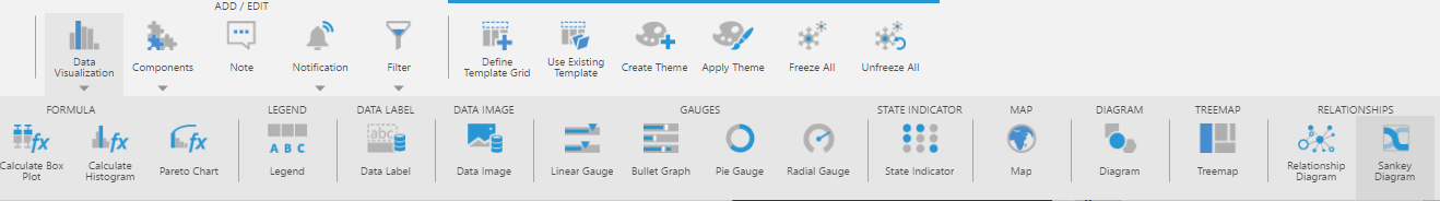
2. Add a Sankey diagram
Choose the Data Visualization or Re-Visualize option from the toolbar and select Sankey Diagram.
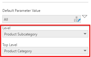
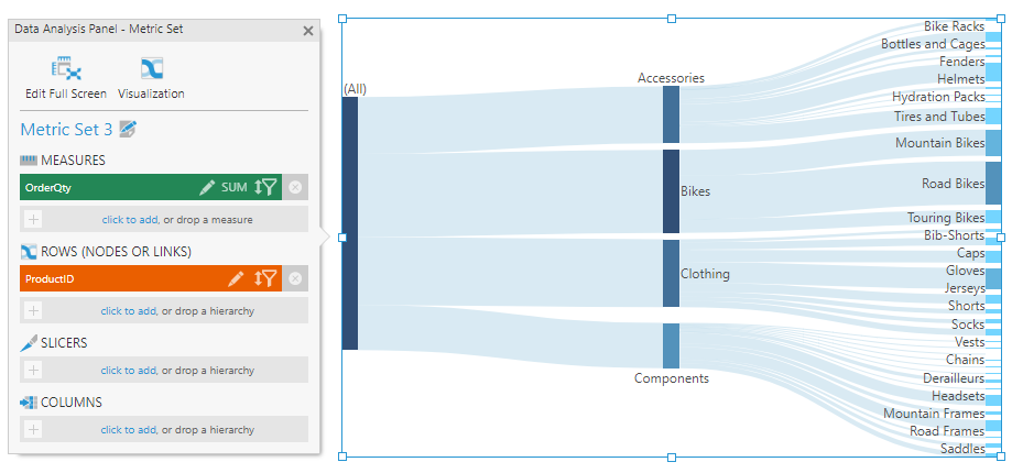
Drag one or more columns of data or hierarchy levels to Rows in the Data Analysis Panel. Each hierarchy (e.g., non-numeric data) will be displayed as another level or stage in the diagram if you select multiple hierarchies, or you can also select multiple levels of a hierarchy that contains multiple levels.
In our example, we have selected a multi-level hierarchy. To visualize multiple levels of a hierarchy at once, click to edit it in the Data Analysis Panel and set the Top Level and Level to a range of levels, or drag a lower level from under the hierarchy in the Explore window.
The diagram is displayed in a river-like arrangement based on the hierarchies and their levels. Each value in the hierarchy is displayed as a rectangle called a "node".
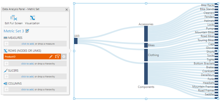
An essential part of a Sankey diagram is a measure that determines the widths of the links between each node. Drag a measure (numeric data) to Measures in the Data Analysis Panel to visualize its quantities flowing between the items.
2.1. Display custom flow
If your data has information about quantities transferring between pairs of items, the Sankey diagram can assemble these into the correct structure and visualize them according to the connections in your data instead of displaying a hierarchical structure.
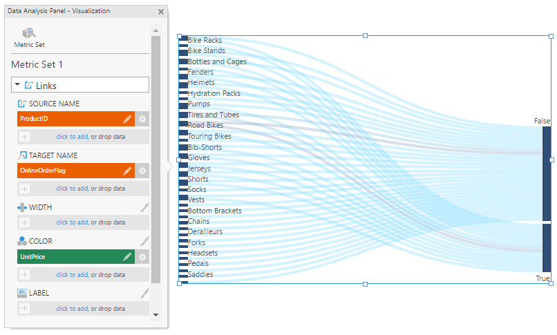
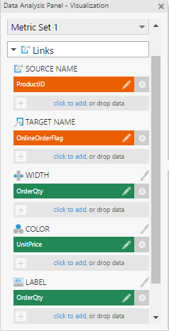
The Data Analysis Panel's Visualization tab for a Sankey diagram allows you set up a custom flow based on your data as shown in the figure below. By default, the hierarchies you add to the metric set are assigned under Source Name.
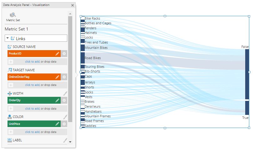
Move or remove all of these except the column(s) identifying the source, and add the data identifying each target under Target Name to display the custom flow between each source-target pair. Your measure should be assigned under Width.
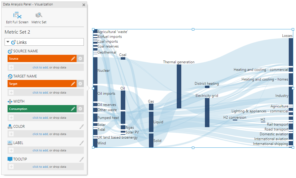
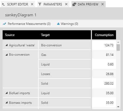
The Sankey diagram example pictured above is based on a dataset containing a column coincidentally named Source, a column named Target, and a measure named Consumption, where each row describes a single connection between a pair of nodes and the corresponding quantity moving between them.
The following image shows the rows of data that specify these connections as seen when expanding the Data Preview window:
2.2. Adding a second metric set
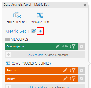
When setting up a custom flow as described above, note that the dataset contains source-target pairs describing the links in the diagram between pairs of nodes. If you want to customize or display further information about each individual node based on your data, you will need a second metric set providing a row of information describing each node rather than each pair of nodes.
To add a second metric set, the Sankey diagram will need to be added to a dashboard or other view. If you are currently editing a metric set full screen, you can click Add To New Dashboard in the toolbar to switch to one easily.
In the Data Analysis Panel's Metric Set tab, click the + button.
Drag data corresponding with the names already used as sources and targets onto Rows. You can then add additional data to use in tooltips, for colors, or other visualization options in the Visualization tab. (If you already have another metric set containing this data, you can also drag the entire metric set onto the Sankey diagram.)
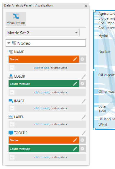
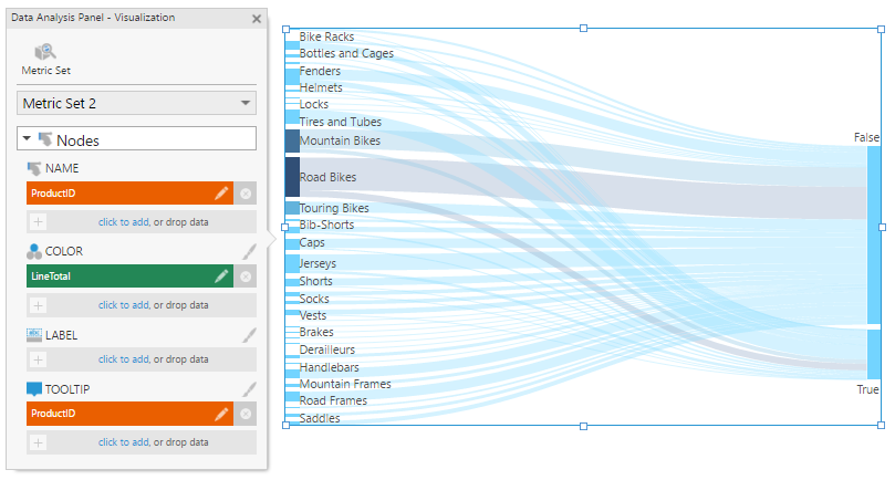
In the Visualization tab, the options for this second metric set are labeled as Nodes whereas the first metric set's options are labeled Links. Your column identifying nodes should be assigned under Name and should match the values used as link sources and targets.
3. Change link color and width
To display the links in different colors according to data, assign it under Color in the Data Analysis Panel's Visualization tab in the Links section.
One or more color rules are applied to the links in the diagram. You can modify the the color rules by clicking the brush icon next to Color, or by going to the Design (or Look) tab of the Properties window. These settings work the same way as in other visualizations, such as charts.
To change what measure is used to determine the widths of the links, remove the measure assigned under Width in the Links section if there is one and add the measure of your choice.
4. Change node color
To display the nodes in different colors according to data, assign it under Color in the Data Analysis Panel's Visualization tab in the Nodes section.
As with the links, one or more color rules are applied to the nodes in the diagram, and can be customized in the Properties window.
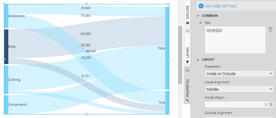
5. Change labels and tooltips
In the Design tab of the Properties window under Font & Text (formerly the Text tab), you can customize the label and tooltip text for both the links and the nodes.
These properties accept regular text, as well as keywords such as [Member] and [Level] for the hierarchy member and level captions, respectively. For additional information about available keywords, refer to the Formatting text article.
In can be easier to use the Visualization tab in the Data Analysis Panel. For example, assign data under Label in either the Nodes or Links section to display it as a label over each node or link.
Click the brush icon next to the Label heading to open the relevant properties. The keyword (e.g., [OrderQty]) has already been added to the Text property.