Using the checkbox list filter
1. Overview
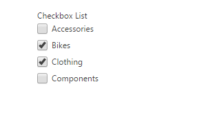
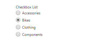
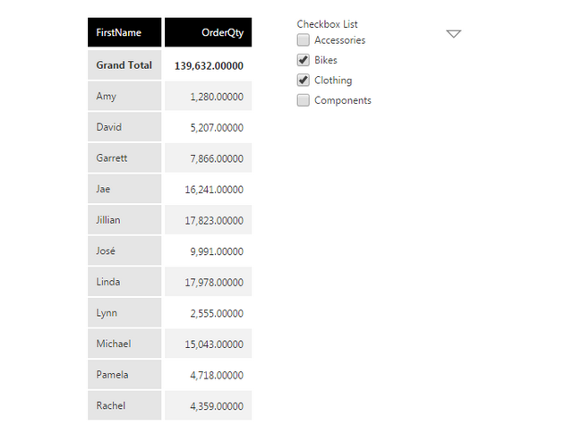
A checkbox list filter shows a list of values with checkboxes directly on your dashboard or filter bar, allowing you to select one or multiple. When set up for single value selection, the checkboxes appear as 'radio buttons'.
Only the first level of the hierarchy is visible in the checkbox list.
2. Adding the checkbox list
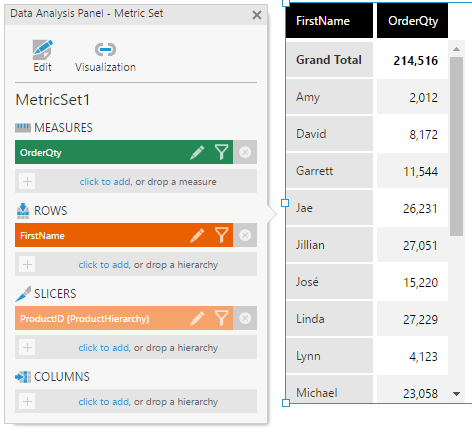
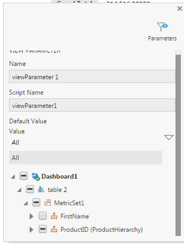
The checkbox list filter can be connected to any hierarchy selected in your metric set.
In the following example, the checkbox list could be connected to either FirstName or ProductID.
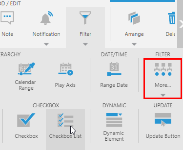
With the visualization selected that you want to filter, add a Checkbox List filter from the toolbar (found under More).
If not already connected, select your hierarchy to filter it in the popup or window that appears. You might need to uncheck a hierarchy before the other can be listed.
You can now switch to View mode in the toolbar and select one or more values from the hierarchy from the checkbox list displayed directly on the dashboard, or in the parameter bar for a report, scorecard, or small multiple.
3. Properties
Properties including the following can be customized in the Properties window:
- Hide Token Menu: If this is checked, the token menu button will not be displayed.
- Manual Items: If enabled, the item(s) displayed in the control are manually controlled instead of auto-populated from any associated view parameters. This can allow you to set up an interaction for each item. This is not applicable if the filter is connected to a hierarchy, like in the example above.
- Single Selection Mode: If enabled, the checkbox list will allow only single selection and display as 'radio buttons' instead of checkboxes.
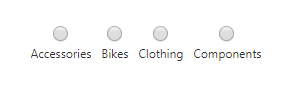
- Vertical Layout: If this option under Layout & Spacing (or Layout tab) is un-checked, the checkbox list will be laid out horizontally instead of vertically.