1. Overview
Styles and themes give you an easy way to apply predefined settings to your visualizations, components, or filters to give them a consistent style or to reuse previous settings.
A typical scenario for creating styles and themes is when you have several related dashboards or reports and you want all their contents to have a consistent appearance from one dashboard to the next. You can also apply one of the existing themes or styles provided.
Related video: Styles and Themes
2. Styles
A style contains the settings for most of the properties of a component, filter, or data visualization. The only exclusions are properties that are typically never shared, such as references to a specific metric set, or the specific text displayed in a label or button.
You can save your own style and then easily apply it to another of the same type of element, or you can apply one of the existing provided styles. The following steps work the same way for any component, filter or visualization, including the visualization in a full screen metric set.
2.1. Save a style
As an example, create a new blank dashboard, and click Components and then Button in the toolbar to add a button component.
Use Quick Access Properties or the Properties window to change some settings for the button. For example, switch to the Design (or Look) tab in the Properties window and customize some of the 'rest' properties.
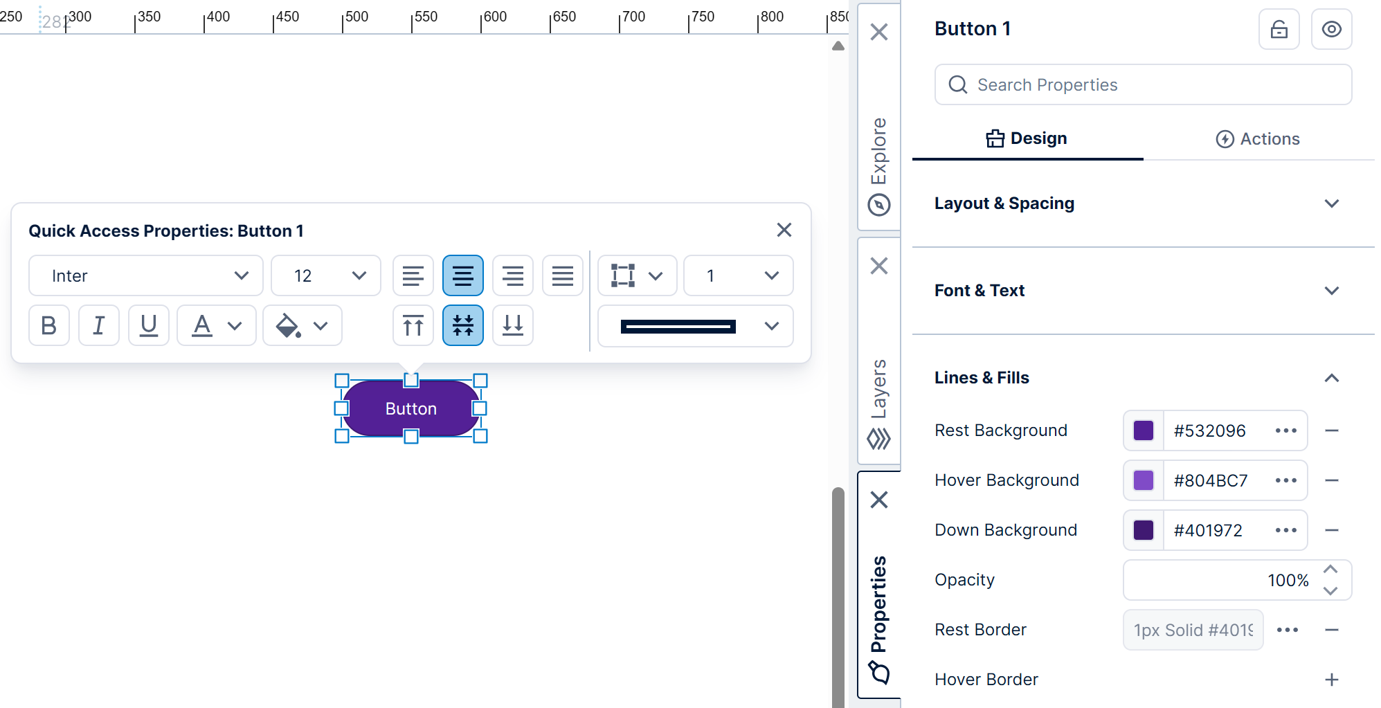
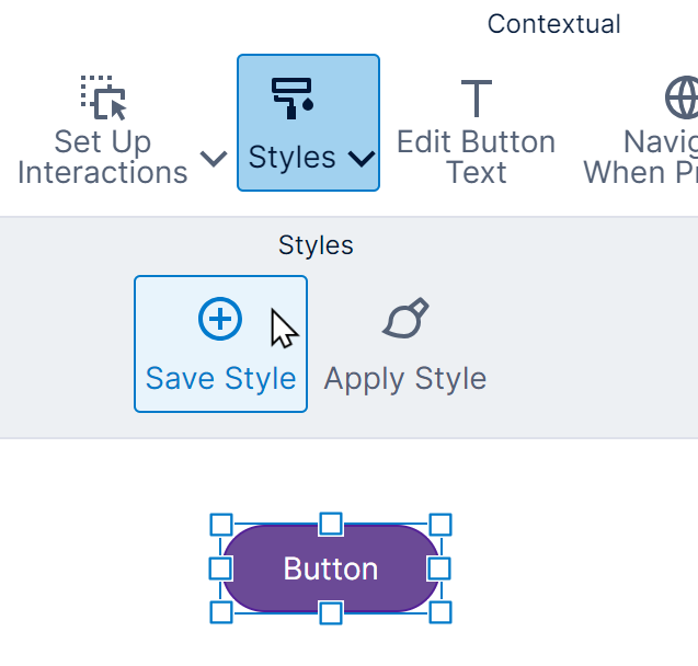
In the toolbar, click Styles, and then click Save Style.
In the Save dialog, select a folder location and enter a file name for the style. You may want to include the type of the element in the name for easy reference.
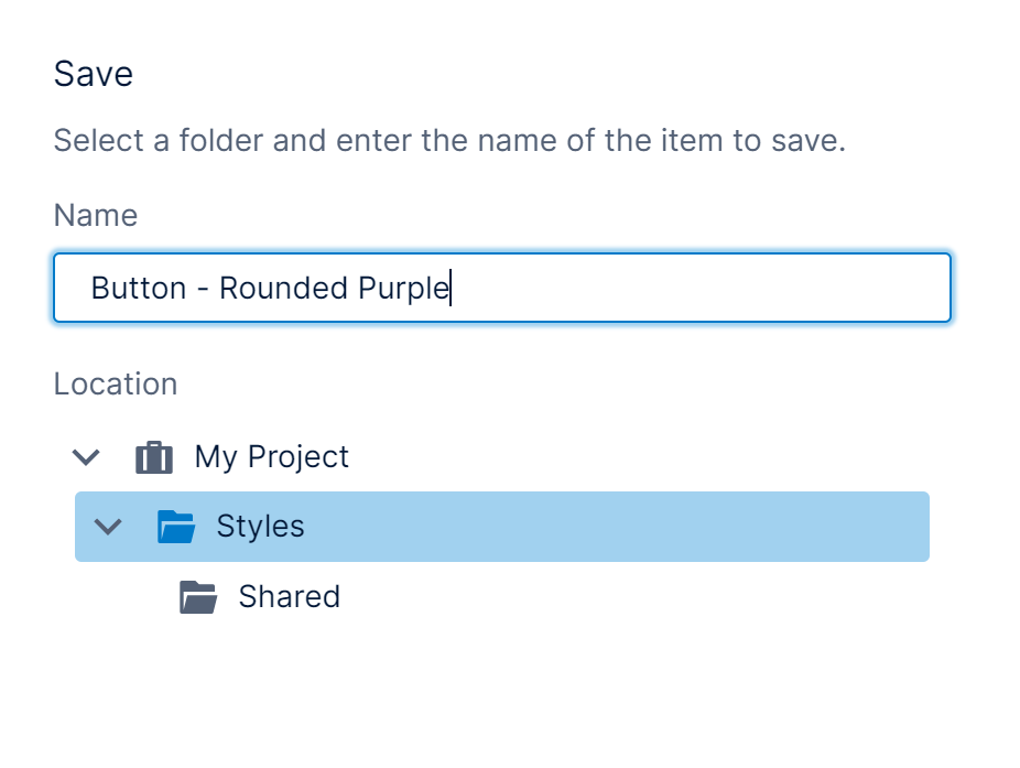
Click Save at the bottom of the dialog.
If you expanded the Styles folder earlier in the Explore window as shown below, your new style may not appear until you right-click the folder and choose Refresh.
2.2. Apply a style
Continuing the example, add a new button to the dashboard. There are a couple of ways to apply a saved style:
- You can go to the Explore window and expand the Styles folder, then drag a style onto an element (the button in our example).
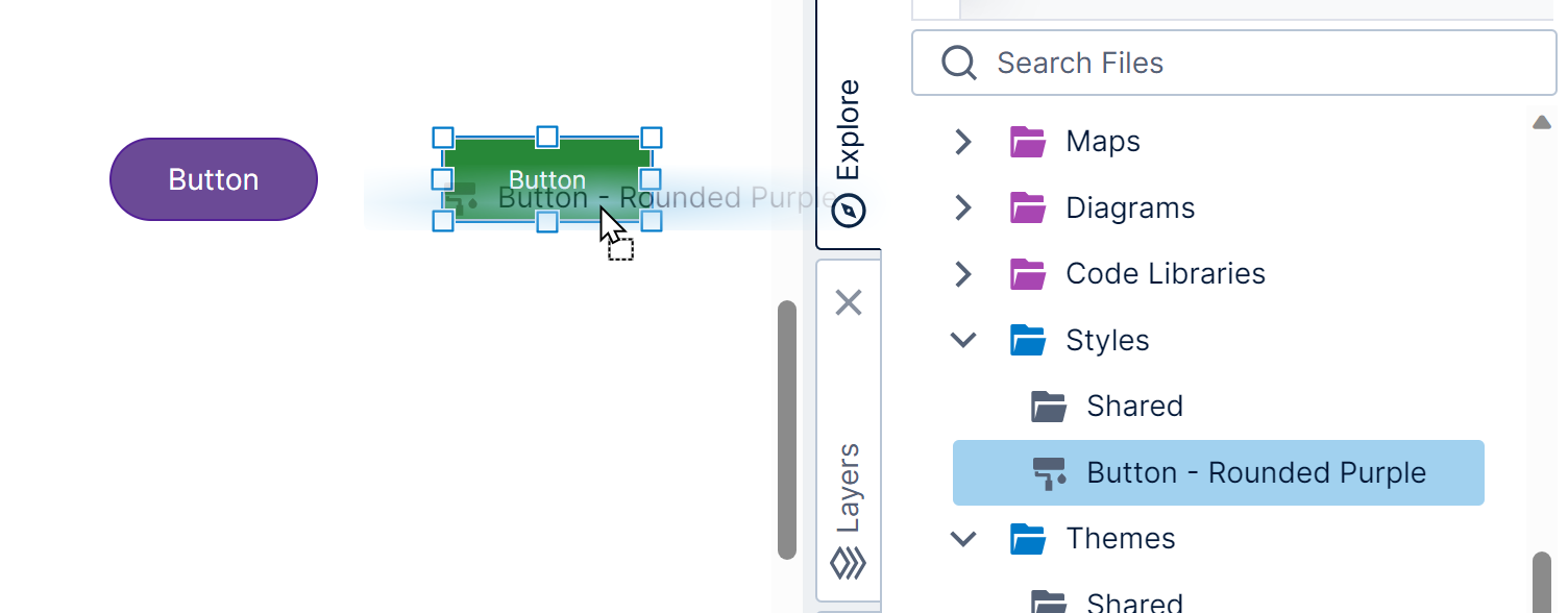
Drag a style onto the button - Another way is to click to select an element on the canvas if applicable, then click Styles in the toolbar and Apply Style. Select a style in the list that appears, then click Open.
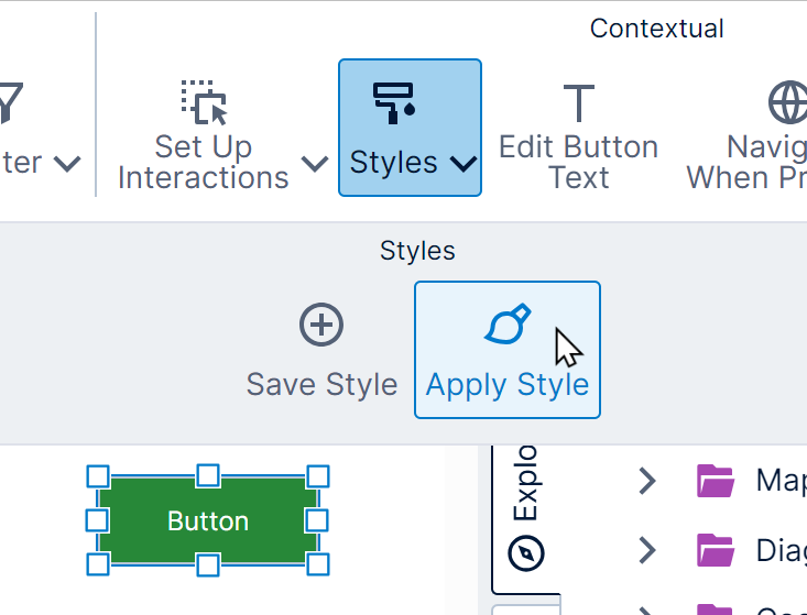
Click Apply Style in the toolbar
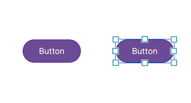
In our example, we now have two similarly-styled buttons.
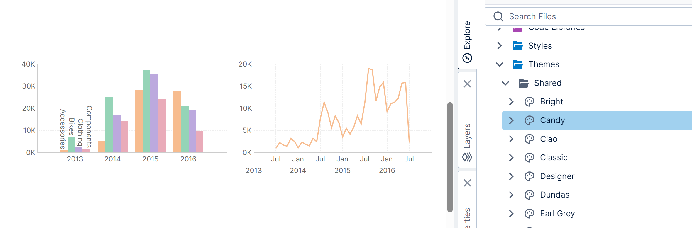
When applying a style, you can expand the Shared subfolder under Styles to find various styles provided for you. Choose one named with an element type that matches your element (e.g., Button).
2.3. Compatibility
You can usually only apply a style to the same type of element that was used to save the style. For example:
- Each type of gauge uses separate styles (e.g., radial vs. linear gauges). A single gauge can have multiple pointers with different pointer types, so pointer properties are only applied to matching pointers.
- Sparkline, Data Bar, and Horizontal Plot are specialized versions of charts in reports and scorecards, which are not compatible with regular charts so that a theme can contain separate styles for line charts (with visible axes) and for sparklines (without visible axes), for example.
For visualizations, there are certain exceptions where you can apply the same style to different visualization types:
- A single chart can contain different chart types on each data point series, so any chart style can be applied to any other chart. Data Point Series properties from the style are only applied to series with a similar chart type setting: for example, a style created from a line chart can be applied to a bar chart, but the styling of a line series will not be applied to the bar series because these are very different.
- Styles for all of the relationship diagram types are compatible with each other because they are each made up of nodes and links that have similar settings.
3. Themes
A theme is a collection of existing styles, which you can apply all at once to a view such as a dashboard or report.
3.1. Create a theme
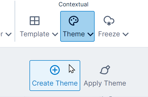
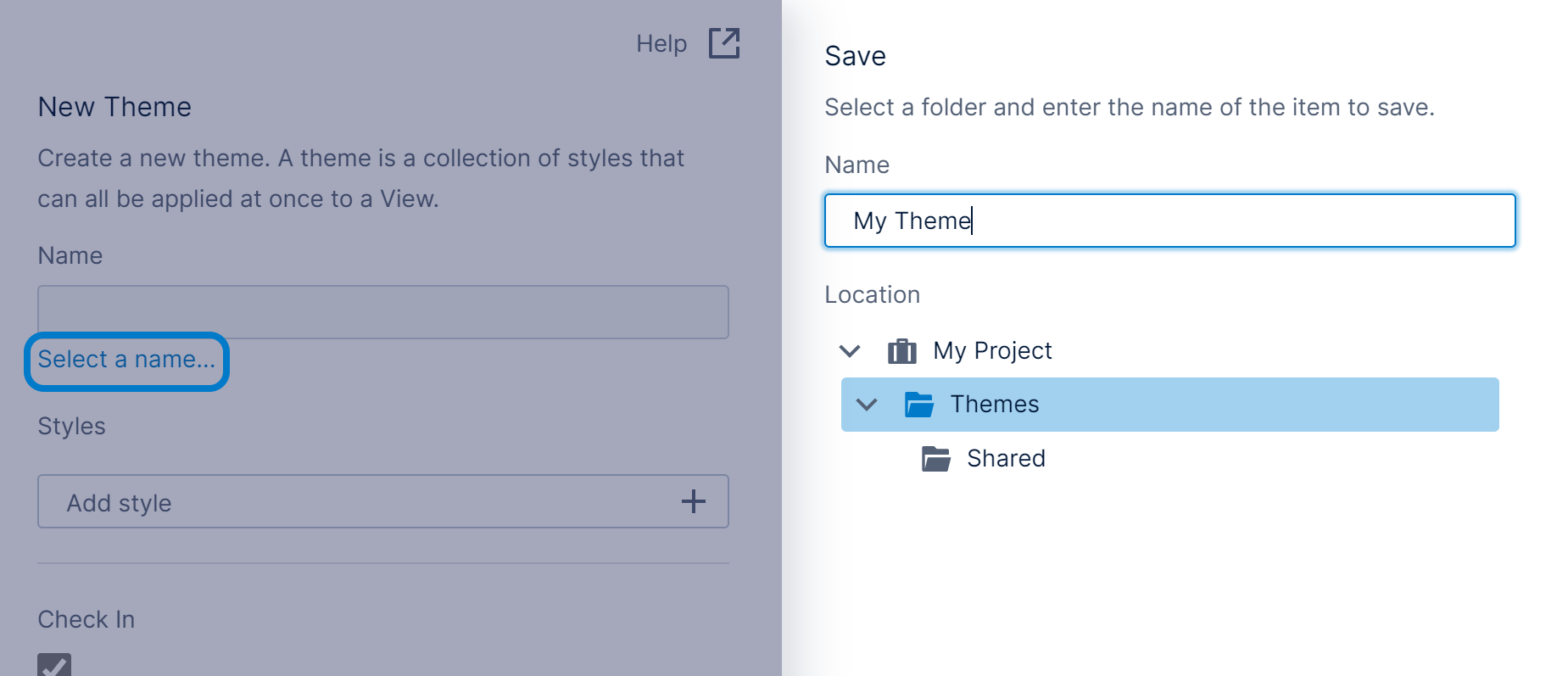
To create a theme, click Theme in the toolbar, then Create Theme. (If an element on the canvas is selected, click an empty area first to de-select it.)
In the New Theme dialog, set a Name. In the Save dialog that appears, optionally also change the selected folder Location for the theme, then click Save at the bottom.
Returning to the New Theme dialog, click Add style. In the Open dialog, select an existing style to be added to the theme and click Open at the bottom.
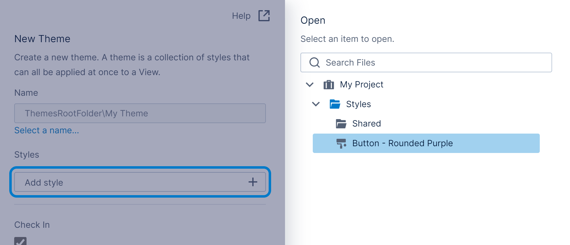
Add other styles to the theme as desired.
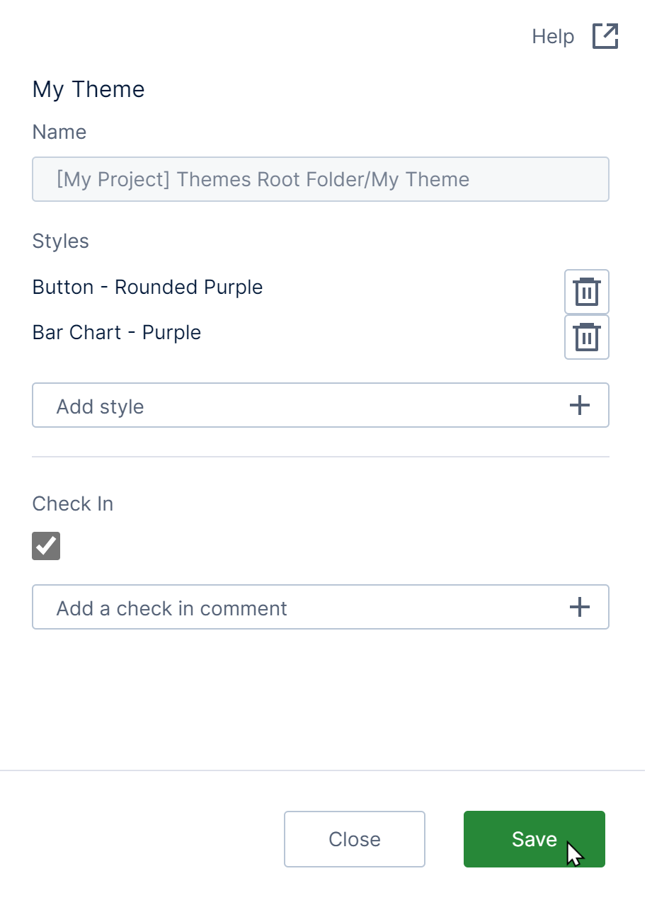
Click the Save button at the bottom.
If you expanded the Themes folder earlier in the Explore window as shown below, your new theme might not appear until you right-click the folder and choose Refresh.
3.2. Apply a theme
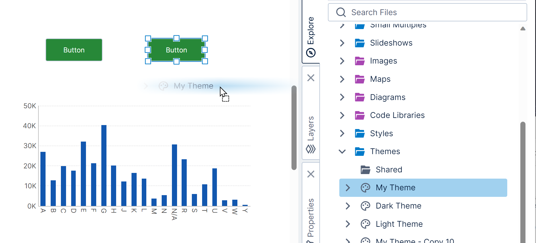
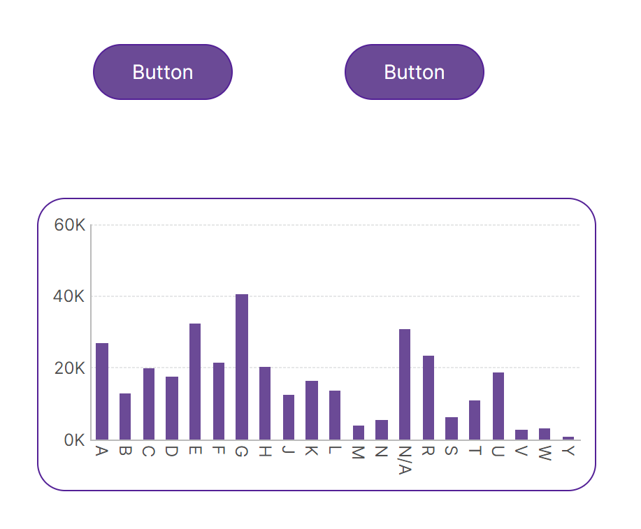
In this example, we added a couple of button components and a bar chart with some data to a dashboard.
There are a couple of ways to apply a theme to your dashboard, report, or other view:
- You can drag a theme from the Explore window and drop it onto an empty area of the canvas.
Drag theme to canvas - With no elements selected on the canvas, click Theme in the toolbar, and then Apply Theme. Select a theme and then click Open.
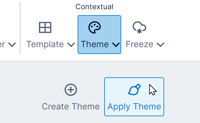
Click Apply Theme in the toolbar
The theme is applied to the current view, applying its styles to every element that's compatible.
3.3. Setting a default theme
Administrators can configure the application so that a default theme is automatically applied when first creating visualizations, components, and filters, to customize their default colors and other appearance. This includes when data is first added to a visualization, or when re-visualizing the entire visualization when editing or viewing.
See the article on setting a default theme for details.
4. Built-in styles and themes
The Global project includes a set of built-in styles and themes you can use.
You don't need to switch to the <Global> project to access these styles and themes: just expand the Shared subfolder under Styles or Themes in your current project.