
1. Overview
This walkthrough shows you how to set up a box plot chart, also known as a box-and-whisker diagram. Box plots are used to visualize at once several key indicators of how the data is distributed in a dataset.
2. Background
The following diagram shows the elements of a box plot.
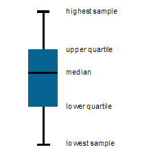
There are typically five measure values associated with a box plot data point:
- Upper Whisker (95th Percentile): Exactly 5 percent of the values in the data are greater than this value. (May instead be the highest value if not displayed separately as dots).
- Lower Whisker (5th Percentile): Exactly 5 percent of the values in the data are less than this value. (May instead be the smallest value if not displayed separately as dots).
- Upper Box (Upper Quartile): Exactly 25 percent of the values in the data are greater than this value.
- Lower Box (Lower Quartile): Exactly 25 percent of the values in the data are less than this value.
- Solid Band (Median): Represents the median (middle) value in the data.
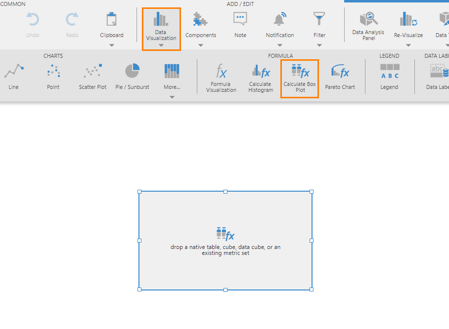
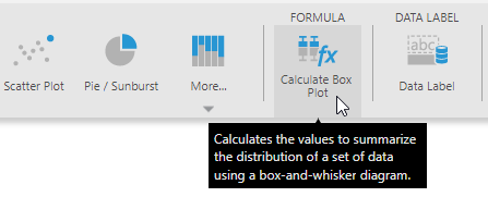
In the toolbar, Calculate Box Plot with an fx in its icon will handle the setup and calculations for you, creating a formula metric set visualized as box plots, with some outlier points visible beyond the ends of each box plot.
There is also a Box Plot chart type in the toolbar, which is what is used to plot the box plots but does not calculate and summarize the values of a dataset. Use this chart type directly if you have already calculated the statistical values above from your dataset, and assign them to each part of the box plot in the Data Analysis Panel's Visualization tab. Otherwise, the following walkthrough demonstrates using the Calculate Box Plot option.
3. Walkthrough
This walkthrough demonstrates the results when adding data step-by-step to a new Calculate Box Plot visualization on a dashboard. Adventure Works sample data for Analysis Services is used, but you could use any data with comparable numbers of values.
3.1. New calculate box plot visualization
Create a new dashboard using the Blank template.
Go to the toolbar, click Data Visualization, and then select Calculate Box Plot. This adds a blank data visualization to the canvas.
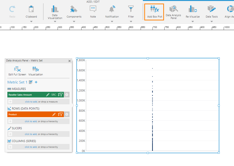
3.2. Set up a single strip plot
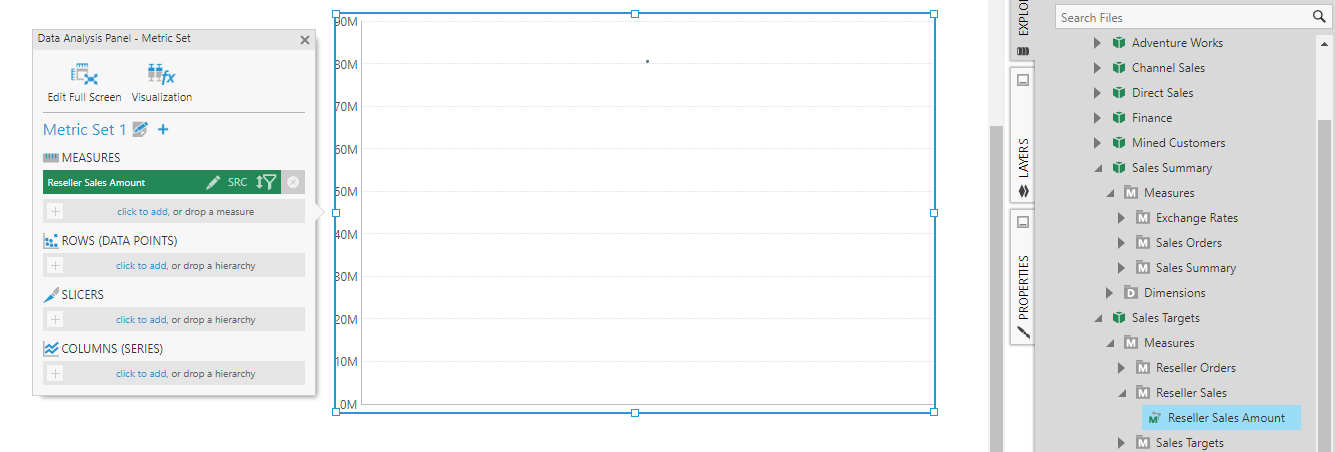
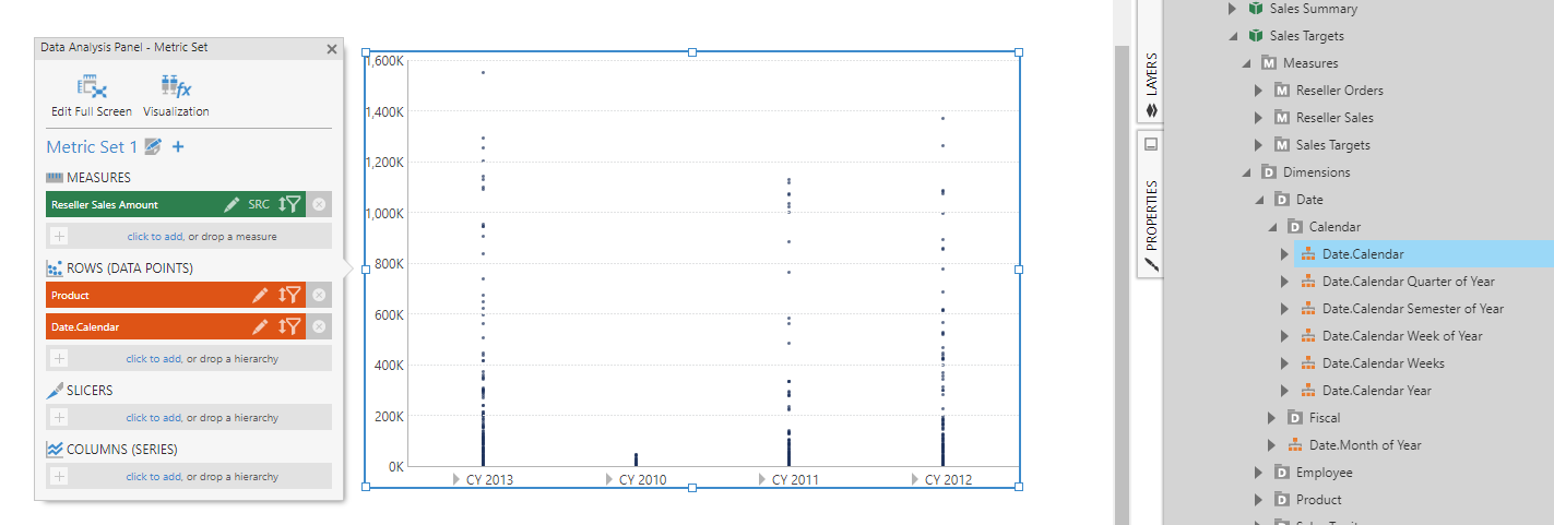
Go to Explore and drag the Reseller Sales Amount measure onto the data visualization. A single dot or data point is displayed.
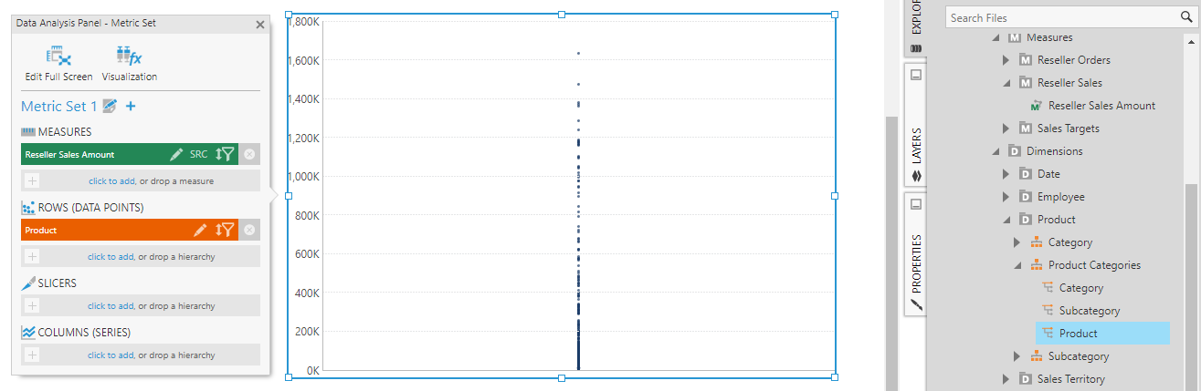
Next, add Product under Rows (Data Points). The result is a strip plot, which displays a vertical arrangement of dots or data points – one for each product.
A strip plot like this can already give you an idea about the distribution of data. For example, the dots are drawn semi-transparently so that darker areas indicate where there are many data points close together.
3.3. Add box plot
If you want to group your data into multiple points or series each with separate box plots, you can do so first as shown in the following sections.
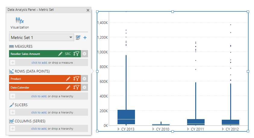
Once you are ready to add box plots over the data you have in your chart, with the chart selected, go to the toolbar and click Add Box Plot.
The chart now displays the box-and-whisker diagram as a second series which is actually a formula metric set. Use the dropdown at the top of the Data Analysis Panel to switch to this newly added metric set. You'll see five formula measures listed which represent the necessary calculations for the box plot.
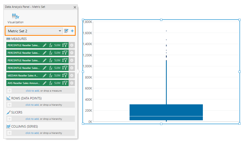
Above the box-and-whisker diagram portion of the chart, you'll see a set of dots. These data points are outliers which belong to the first series.
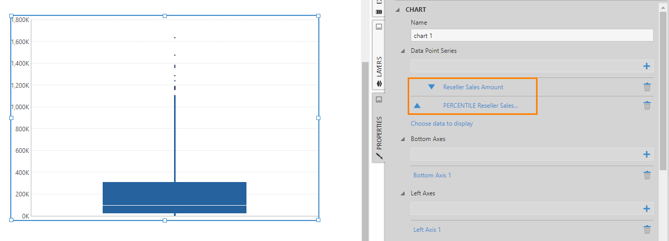
Go to the Properties for the chart to see two series listed. The first series is displayed as a Point chart while the second series is displayed as a Box Plot chart.
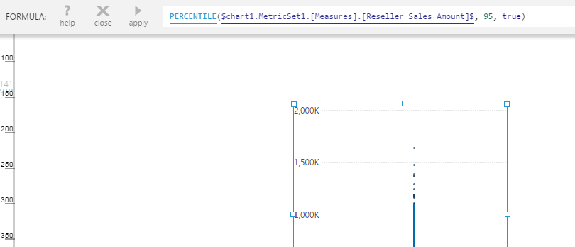
In the Data Analysis Panel, click the Edit button of the first formula measure. In the Configure Metric Set Element dialog, scroll down and click Formula. In the formula bar, you can see that it calculates the 95th percentile which you can modify as needed (e.g., some box plots use 90th percentile for the highest sample).
3.4. Remove box plot
If you followed the steps above and want to continue below, you will need to remove the second metric set that calculates the statistical values so that you can first change the grouping of your data.
In the Data Analysis Panel, with the formula metric set selected in the dropdown, click the Edit icon next to the dropdown. In the Metric Set Configuration dialog, scroll all the way down and click Remove this metric set from the visualization.
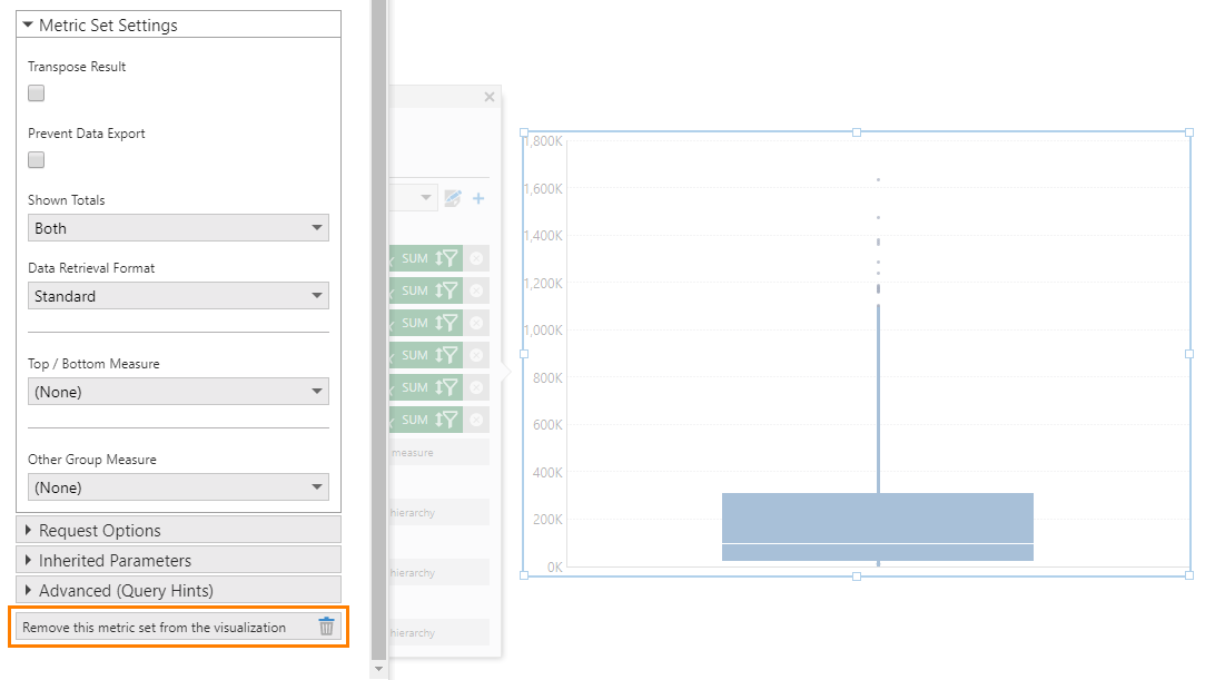
This will remove the box plot series that was displaying the data from this metric set.
3.5. Multiple box plot data points
Go to Explore and add Date.Calendar as a second hierarchy under Rows in the Data Analysis Panel. You'll now see a separate strip plot displayed for each date value.
With the chart still selected, go to the toolbar and click Add Box Plot. A box-and-whisker diagram is displayed for each date (year).
3.6. Multiple box plot series
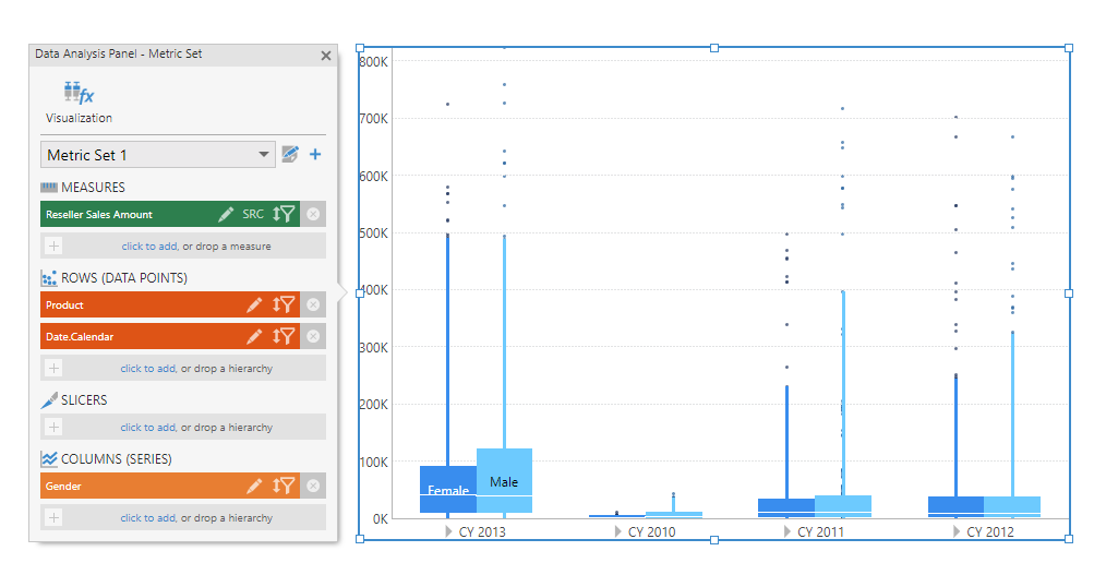
As a variation of the above example, set up a strip plot chart by also adding Gender as a Columns hierarchy to the metric set, to group your data into a separate series for each gender. You could also add a second measure instead for comparison with your first measure.
In our example, this gives us a cluster of strip plots for each year, where each cluster has a male and female strip plot.

Go to the toolbar and click Add Box Plot to get the following result.
4. Re-visualizing to calculated box plot
If you have already selected your data in a full screen metric set or in a metric set on a dashboard, you can also find Calculate Box Plot under Re-Visualize in the toolbar.
You can find it either under Recommended to the left, or under the Formula category.
This re-visualize option automatically applies the same formulas and visualization settings as shown in the walkthrough above, but does it all at once based on whichever data you have in your metric set. The first hierarchy under Rows is used to group your data into a strip plot and typically contains many values, while additional hierarchies can group your data into multiple strip plots. A box plot is added over each strip plot.