
1. Overview
Many users may want to be able to view a dashboard on their phone or on a tablet in portrait mode. This is possible for any dashboard, or you might create a mobile-optimized version, but you can also design a single version of a dashboard that specially adapts to fit its content onto the current screen size using the Responsive re-size mode. This mode automatically re-organizes the content as needed so that it fills the given screen real estate but scrolls to additional content that would not fit at the same time.
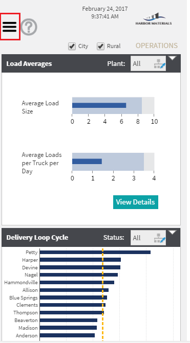
For the smallest screen sizes, you may need to further minimize the amount of space taken up for navigation or other options on your dashboard. This article explains how to add a hamburger menu (also known as the menu button or navigation drawer) for those devices to navigate between dashboards.
2. Understanding the browser window resizing event
To determine when to show the full-size navigation buttons and when to show the hamburger menu button, it is important to understand when the dashboard window resizing event is fired. When the dashboard loads for the first time, it detects the browser’s window size and adjusts the dashboard canvas to fit. For this example, it is required to detect the browser window size when loading the dashboard and hide or show the navigation buttons accordingly.
When using smartphones or tablets, users may rotate the device to change the display orientation between portrait and landscape mode. This is another case to consider for hiding or showing different navigation buttons, and if you decide to handle it, the dashboard's Re-Size actions can be used in a similar way as done for the dashboard's Ready actions below.
3. Example dashboard
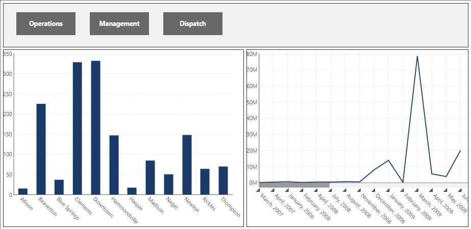
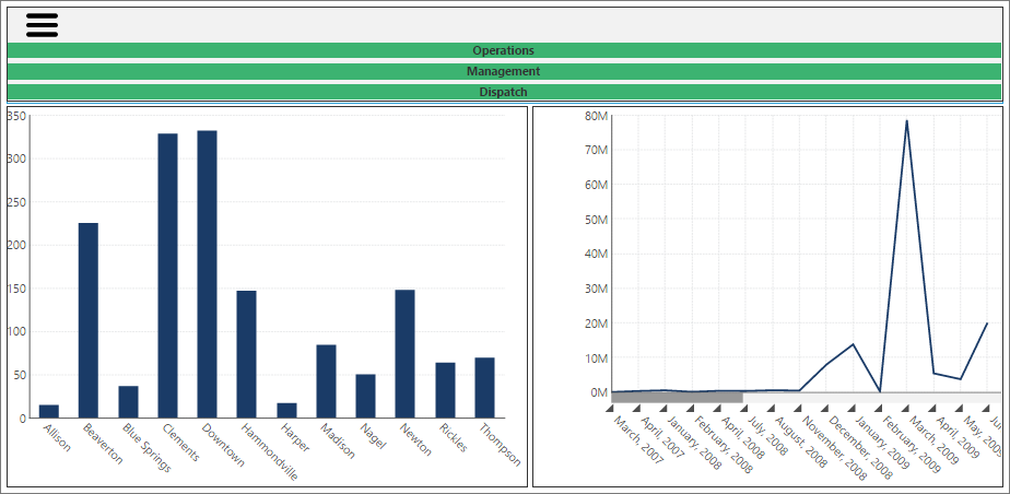
Consider a simple dashboard based on the template grid example.
For the above dashboard, the default settings are given below:
- Re-Size Mode: Responsive
- Width: 1024
- Height: 500
The dashboard also has two layers:
- MainLayer, which contains two charts.
- NavigationLayer, which contains three navigation buttons (Operations, Management, and Dispatch).
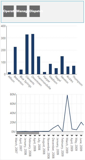
When the dashboard is viewed on a large monitor, it looks fine. However, when the dashboard is viewed on a smaller screen, the space is too small to fit them and their labels in one row.
4. Adding the hamburger menu
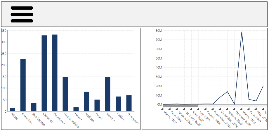
To replace the buttons above with a collapsible menu, add a new layer (HamburgerLayer) in the Layers window and add an Image component to that layer that displays the icon image.
Next, add another layer (DropdownLayer) and add three buttons to that layer, which will make up the menu.
5. Adding the scripts
For this example, we will show the hamburger menu if the browser window is less than 1020 pixels in width. In this case, we want to show the HamburgerLayer and hide the NavigationLayer; otherwise, we want to show the NavigationLayer and hide the HamburgerLayer.
To achieve this, use the following script under the Ready action of the dashboard:
// Get the current window width
var windowWidth = $(window).width();
// Get the canvas service
var canvasService = this.getService("CanvasService");
// Get the navigation layer
var navigationLayer = canvasService.getLayersByFriendlyName("NavigationLayer")[0];
// Get the hamburger layer
var hamburgerLayer = canvasService.getLayersByFriendlyName("HamburgerLayer")[0];

// Check the window width and show/hide appropriate layers
if (windowWidth < 1020){
    if (hamburgerLayer.hidden) {
        canvasService.showLayers([hamburgerLayer]);
        canvasService.hideLayers([navigationLayer]);
    }
} else {
    if (navigationLayer.hidden) {
        canvasService.showLayers([navigationLayer]);
        canvasService.hideLayers([hamburgerLayer]);
    }
}
While the dashboard is being viewed on a smaller screen, you want to show a dropdown menu if the user clicks/taps on the hamburger menu button. The idea is to show the DropdownLayer if it is hidden, and vice versa. To achieve this, add the following script under the Click action of the Hamburger menu button image.
// Get the canvas service
var canvasService = this.getService("CanvasService");
var dropdownLayer = canvasService.getLayersByFriendlyName("DropdownLayer")[0];

if (dropdownLayer.hidden) {
    canvasService.showLayers([dropdownLayer]);
}
else {
    canvasService.hideLayers([dropdownLayer]);
}
6. Testing the hamburger menu button
If you open the dashboard on a small screen device, it will detect the browser window size when the dashboard is at the Ready state and will show the Hamburger menu button on the top left corner, as per the design.
If you tap the Hamburger menu button, a dropdown menu with three buttons will appear underneath the Hamburger button.
7. See also
- Using a template grid for resizing
- JavaScript API Reference
- Script Library: Show or hide a layer
- Script Library: Animated sliding content layer
- Samples: Material Operations Dashboard
- Writing scripts using browser developer tools