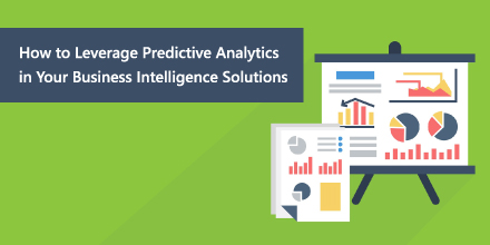
On their own, business intelligence solutions are geared towards providing you insight into what has already happened or is happening right now. With the addition of predictive analytics, however, you suddenly become an expert in what happens next.
Data is powerful, and can be brought to life and made even more compelling if consumers are able to understand it in the context of their business. A unique twist in how data is presented can heavily impact context, and bring about meaningful and actionable insights.
This is part two of a two part series on why companies should consider replacing Excel with a Business Intelligence platform for more effective decision making. If you’d like to read part one, click here. Part two of this series will focus on two processes: Scalability and Indifference.
3D charts are frowned upon in the data visualization world, especially when it comes to 3D Pie and Bar Charts. Those 3D visualizations usually go against data visualization best practices as they don’t provide any additional information that cannot be achieved using their 2D counterparts. Furthermore, studies show that people make more errors when reading 3D visualizations and so the best practice is to stick with 2D. That begs the question – are there any valuable 3D visualizations?
Excel is, undeniably, the single most popular data analytics tool in the world. I’m not here to dispute that, and I’ll be the first to admit that even I’m a fan of the spreadsheet application and find myself using it frequently (along with 750,000,000+ others) to organize data. As organizations acquire greater volumes of data from a dizzying array of sources, there’s a growing need to be able to consolidate and analyze the information as quickly and effectively as possible. And in order to do so, most companies turn to Excel and do so for good reason.