1. Overview
Radar charts plot data points as symbols, lines or areas in a circular layout.
This can be useful for data that can be considered circular such as periods of time, data that indicates a direction, or plotting a set of variables as a series of shapes that can help to track patterns and irregularities.
2. Parts of a radar chart
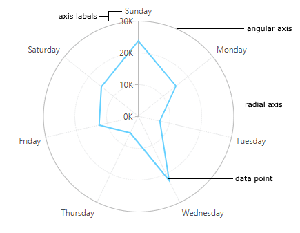
When a radar chart type is chosen in a chart visualization, a different layout is used for the axes and for plotting the data points.
There are two types of axes in a radar chart, which can be displayed as a reference for data points:
- Angular (X) axis - Displayed as a circle, where each value is is represented by some angle.
- Radial (Y) axis - Displayed as a radial line, where each value is some distance away from the center.
3. Creating a radar chart
When choosing a new radar chart from the toolbar, the initial chart settings will be different than for other chart types, to produce a more readable radar chart.
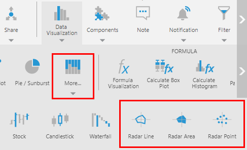
For example, when creating a chart or when first re-visualizing to a chart, choose More... under Charts, and then under More Charts choose a radar chart.
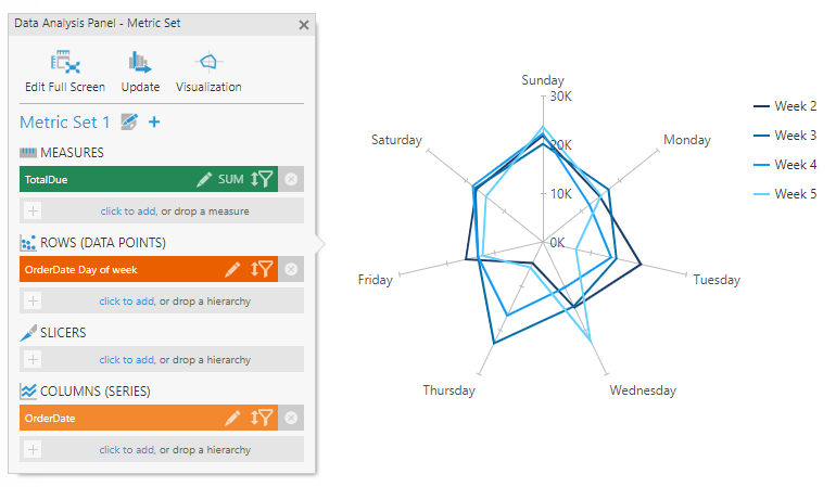
The metric set in the example below selects the time dimension attribute Day of week on Rows and a time dimension hierarchy's weeks level on Columns.
By default, the outer angular axis line itself will be set as hidden, although its labels and grid lines will appear at various angles. Instead of displaying circular grid lines for each radial (Y) axis value, tick marks are displayed near where each data point is plotted.
These settings can be changed in the Properties window, or you can change the chart type from another type of chart that is already displaying axis lines and grid lines.
4. Radar chart properties
Most features and properties are the same for radar charts as for most other chart types, but some chart settings apply only to a radar chart's circular layout.
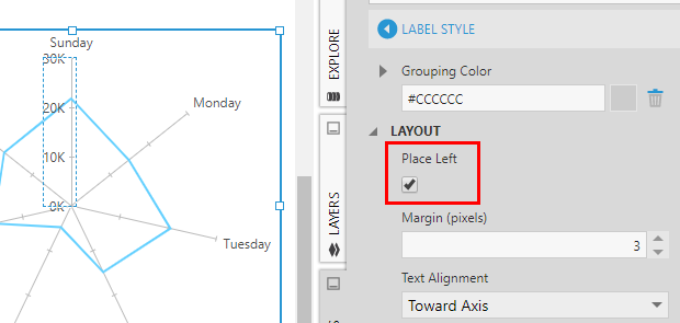
4.1. Label placement
A radar chart's radial axis is centered horizontally in the middle of the chart, and its labels could be placed on either side.
To place its labels on the left side:
- Click to select the radial axis labels and open the Properties window, or right-click and choose Axis Properties.
- Open Font & Text (formerly the Text tab) and click Label Style.
- Under Layout & Spacing, select Place Left.
If tick marks are placed Outside (to the right), their Placement property can be changed to Inside.
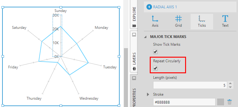
4.2. Repeat tick marks circularly
Radial axis tick marks can be repeated along each angular axis grid line, so that the grid lines can function like axes at each angle for reference for nearby data points.
In the tick mark settings of the radial axis, found under Lines & Fills in recent versions, use the Repeat Circularly option to determine this behavior.
4.3. Advanced chart types
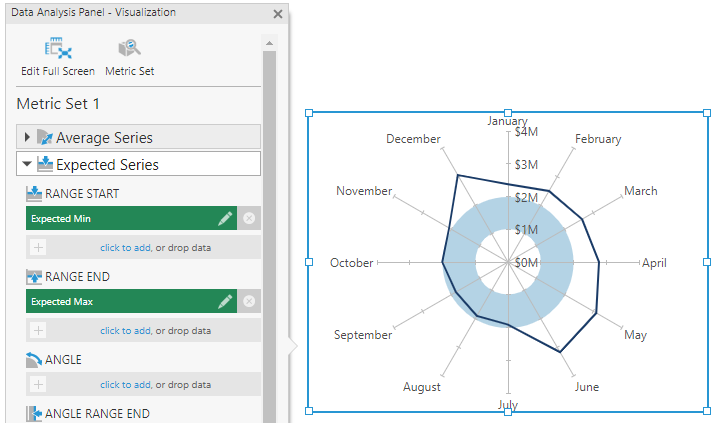
Two less common chart types can be selected using the Series Chart Type property of a series: Radar Stacked Area and Radar Range. These work the same way as the regular Stacked Area and Range chart types.
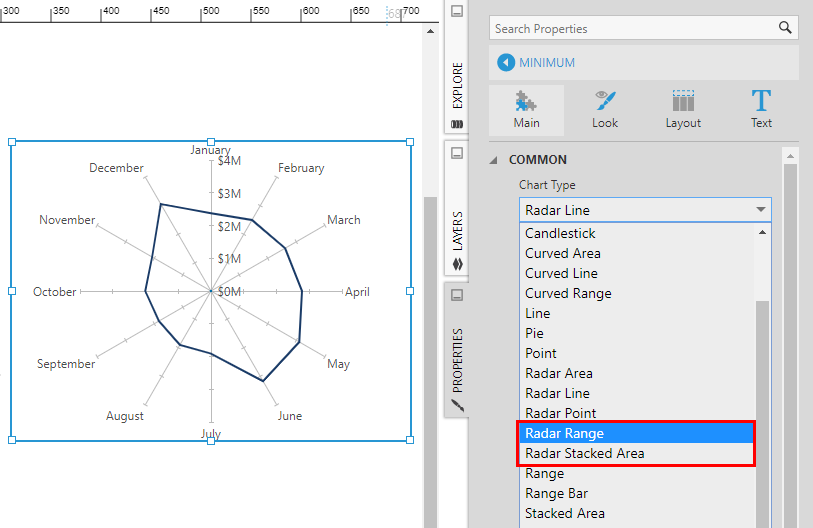
You can change the chart type to one of these options for an existing series, or on a new series.
If you've changed the chart type to Radar Range, check the Data Analysis Panel's Visualization tab to see the new Range Start and Range End options, which don't exist for the other chart types. This is how you can use a pair of measures to define a circular range, for example.