When it comes to evaluating BI and Analytics software, you are probably finding yourself hard-pressed for time. Your decision-makers might be pressuring you to quickly assess different BI tools and vendors. If you are like the majority, your data is most likely a mess, and perhaps it is unclear how you should even proceed with your testing. Each tool you look at will be a little bit different, and it is going to take you time to learn the basics so you can evaluate properly and identify the top contenders.
Luckily there is a Dundas BI learning channel called Off the Charts (with Jeff) to help. The purpose of this educational (and fun!) video series is to teach software evaluators, users and our customers about specific key BI topics and features in a short, bite-sized video format. From data analytics, to visualizations, to reporting and embedded BI, this series has content for everyone.
If you are a new user evaluating Dundas BI, here is a list of the “Getting Started” videos I’d recommend you watch to help get you going:
Installation
The first step for testing any software is getting it installed and up and running. Dundas BI can be installed on either a Windows or a Linux Service computer. If you are new to this type of installation, go for Windows if you can, as it is the most straightforward installation. To help you understand the installation's different components involved in the installer, Off the Charts (with Jeff) has two videos on the subject.
Understanding the Installer (Windows)

Well worth the time as these will help you understand the architecture and purpose behind each choice being presented to you.
Getting Started
Once everything is up and running, look at our quick video entitled 5 Tips for Getting Started with Dundas BI.
This will help you get a clear picture of content organization, data flows, and additional general tips for new users.
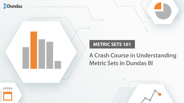
Metric Sets and Data Aggregation
Next, you will want to start exploring your own data. You will find yourself immediately exposed to the idea of a Metric Set. Metric Sets are exceptionally featured rich and are filled to the brim with settings that you can customize to help you get the data you want to see.
To help get a better understanding of this concept, we have a video called Metric Sets: 101 A Crash Course in Understanding Metric Sets in Dundas BI.
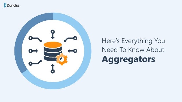
Once you have a basic understanding of Metric Sets, learning to aggregate your data to group it the way you require will be next. Data aggregation is any process where information is expressed in a summary form for analysis. It can be a new concept if you have never used a BI tool before. Our video “Here's Everything You Need to Know About Aggregators” will give you an excellent tour in this regard to help expand your knowledge of Metric Sets.
Filtering, Formulas & Tokens
While you are exploring and learning how to create Metric Sets to visualize your data, you will quickly find yourself thinking about filtering. Whether the goal is to prefilter data or simply bake filtering into your Metric Set to return the right information, this is an important concept to understand. Good thing the video entitled Parameters Demystified will help you get there.

Next, your source data will not always precisely have the structure/values you need for your envisioned visualizations. Formulas are a great way to augment what you already must improve your ability to understand your data.
Introduction to Formulas in Dundas BI will give you a great start in learning how to extend your data to get better insights.

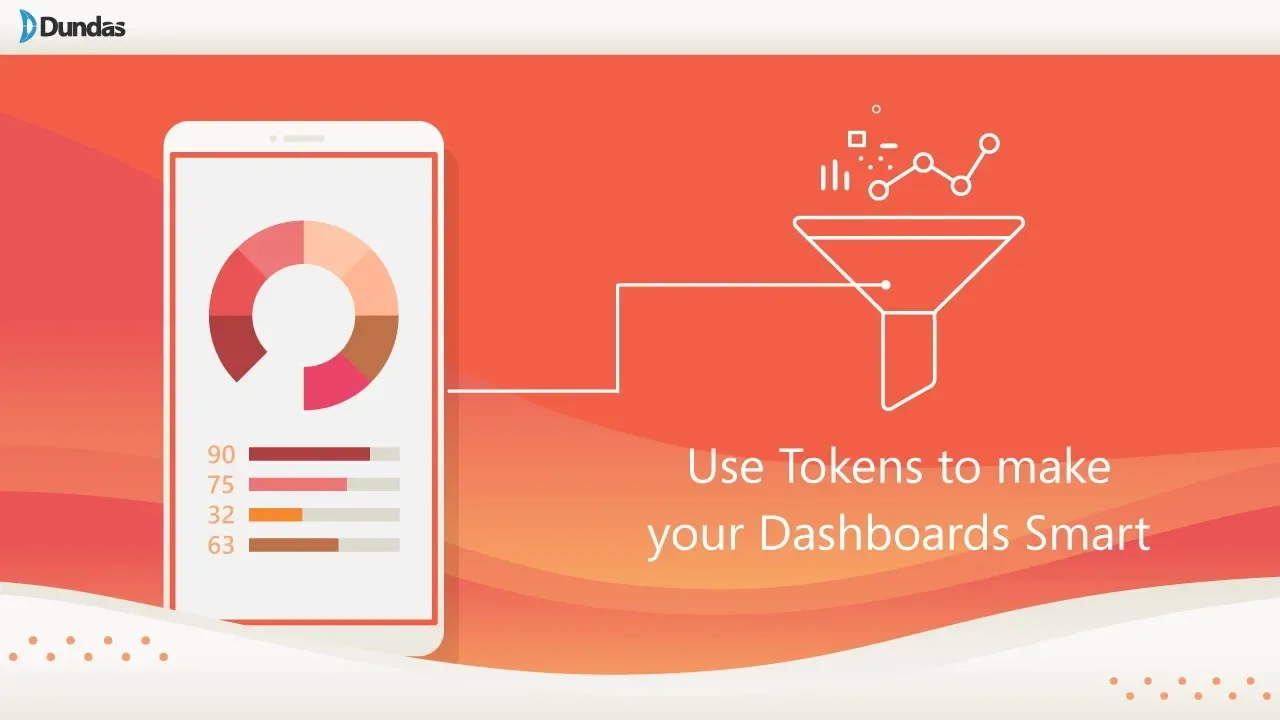
Once you have these insights, let us go one step beyond and make your visualizations intelligent! Use Tokens to make your Dashboards Smart a fantastic technique to have your dashboards/reports return the data you need.
There are lots of great videos available through Off the Charts (with Jeff), with new content being added all the time.
Enjoy and Happy Evaluating!
Jeff
About the Author

Jeff Hainsworth is a Senior Solutions Architect at Dundas Data Visualization with over a decade and a half of experience in Business Intelligence. He has a passion for building, coding and everything visual – you know, shiny things! Check out "Off the Charts (with Jeff)", his platform for great content on all things analytics, data visualizations, dashboards, and business intelligence. There’s something for everyone!