Data visualization reveals unnoticed information (especially in large data sets), gives answers faster, and helps journalists investigate cause-effect relationship.
In an article about patterns for information visualization, the author says there are a number of reasons why visualization is desirable, among which,
Visualization lets you see things that would rather go unnoticed. Any data contain information but if there’s no visual data you’re missing out on trends, behavior patterns and dependencies.
A good visualization gives way to research data, to play with them, to investigate some curious cause-effect relationships. This is very important for investigation and research work, as in journalism.
To illustrate the points above, let’s take a look at a sample data set:

With a quick look, we can tell this is a group of data showing GDPs of seven countries/regions in five different years. But, other than that, what other information or message can you tell from looking at this table? I mean, notable information or message that you want to tell other people by saying, “you know what…”
Now let’s look at a visualized version of the data set and the messages it conveys:

Visualization lets us see things that would rather go unnoticed. In this visualization, we can see patterns that are not (quickly) obvious in the table. For instance, among others, we see that GDPs of the five economies are roughly the same in 1870; but since 1913, GDPs of Western Europe and USA grow at a much faster pace than those of other economies.
A good visualization gives way to research data, to investigate some curious cause-effect relationships. Now seeing the pattern in this visualization, a reporter may be interested in finding out what caused the accelerated growth of U.S. GDP since 1913. Or the reporter may feel intrigued to note that, since 1973, China’s GDP grows at an accelerated pace similar to that of the U.S., why is that? And why, after several decades in stagnation, GDPs of Japan, India, China and African all begin to grow in 1950?
Visualization gives answers faster. To answer the question, “which economy’s GDP consistently ranks the lowest?” it’s much quicker to find that out looking at the graph than reading and comparing rows of number in the table.
If this illustration shows how visualization can facilitate, or help with, the reading of tabular data, then in many other cases, it is literally impossible to make sense of a data set without some form of visualization. This is especially the case with large data sets.
Let’s take a look at a data set that shows the life expectancy of UK people by areas.

After you have examined this data set, is there any noteworthy message you can tell? If you feel lost and overwhelmed looking at this giant table, look at screenshot of a map visualization created by Guardian:
Now what is that most noteworthy message we can instantly tell?
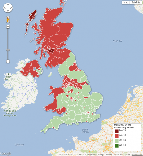
Most people would ask this question: why people in the South are expected to live longer than people in the North? If we inquire further – what is it with that one particular spot in the North, in darker red color, where people are expected to live shorter than most other Northerners?
Follow Us
Support