For the average BI and analytics platform buyer all tools look the same. We hear it almost every day. They all provide a list of data connectors covering most common sources, feature a bar and line chart with drill down capabilities, assure there is data security and promise ease of use so even a non-technical user can build the most complex data models and analysis.
Are buyers left to choose based on which tools produce the “prettiest” output?
Buyers sit through demos that look great and work perfectly on a canned dataset ending up with the cost as the only obvious differentiator for their decision making process. This is of course a dumbed down description of the decision making process which often also includes an excel check list. Unfortunately, that list is often not very valuable as almost all categories get “checked” by all compared vendors, as there is always a way to claim that “we have that functionality” to a certain degree. Sometimes, there is also a short proof of concept that proves you can connect to the data and build a simple visual, but it doesn’t go much beyond that. Ultimately, buyers often choose their BI tool without knowing if it will really solve their problems with the least pain possible, discovering only later if it will really bring value to the entire organization.
At the 2016 Gartner BI Summit in March, Gartner held a ”BI Bake Off” which was designed to try and help with that difficult task of comparing the vendors’ offerings. The goal of this BI bake off was to allow companies to see a side-by-side comparison of modern BI tools, via scripted demos as provided by Gartner. Effectively for the skilled/experienced BI user, it’s quite a fun session to watch having a public, competitive BI/analytics vendor demo showdown. Yet for those who are less familiar with the different capabilities of the tools, and with the demo script itself, it’s still not an easy task to pick a clear winner. The truth is that vendors use great presenters that are able to gracefully distract the viewer with other stuff the tool has when asked to show a capability where the product isn’t as strong. In addition, often vendors will demo extensions and custom development that are not part of the tool (hence of the planned cost). While being called on those at times, the “damage” is already done having the viewer think the capability is available “out of the box” or is easily achieved.
The reality (especially in the BI and analytics space) is that the devil is in the details. To truly evaluate a BI and analytics platform these days, you need to go into a deeper trial (not months, but a concentrated 2 weeks is required) to see if the vendor can really help you get to the solution you need. Then you will discover the real questions you need to ask and what points make a difference. It will also help you associate a weight with each evaluation criteria so you can highlight which offering shines the most based on what really matters to you.
Another option would be to use a scripted demo like Gartner offered to the different vendors and see how they fulfill your different requirements. Then it becomes much easier to sit down with the excel check list to see which requirement the vendor showcased and which one he “danced around”. Then you’ll be able to make a better decision, not just based on which BI tool is the prettiest, but also on which BI tool will help you solve your problems the best.
Gartner extended their demo script to all vendors at the Summit this year. Only a few opted to participate. We gladly participated using Dundas BI. Our video showcases our ability to comply with all of the different requirements Gartner requested.
We are not sure how much time the other vendors spent on building their demos, though it was mentioned during the bake off session that they all released new versions just prior to the session in order to be able to showcase more of the requirements. For the Dundas team (1 analyst creating the exercise and another demoing it) it took 3 days in total (including understanding the requirements and data, building the different exercises, styling it a bit and recording the demo). I would guess that the other vendors spent much more than that.
You can then compare it to the other vendors by watching their "Bake Off" submissions. Watch all Gartner "Bake Off" videos.
If you do take the time to watch these videos, make sure to take note of which functionality is being demoed out of the demo script outlined below and which ones are “nicely avoided.”
If you don’t have the time to watch it all – here is a teaser of how the dashboards looked for each vendor. You can see the Dundas BI dashboard below and compare it to the other dashboards as shown in Gartner’s “Bake Off” Blog by Cindi Howson.
Dashboard created for the Gartner "Bake Off" Using Dundas BI
I think the message is clear – if you are in the market for a new BI tool, make sure you set your priorities and truly evaluate based on those.
Gartner “Bake Off” Demo Script (Using the public data sets of the College Scorecard):
1. Panel Introductions (2 minutes each/10)
- Introduce yourself, the company, product name, and key differentiators.
- Any particular industry focus?
- You may show a conceptual slide or “about us."
2. Introductory demo for look and feel (3 minutes each/15)
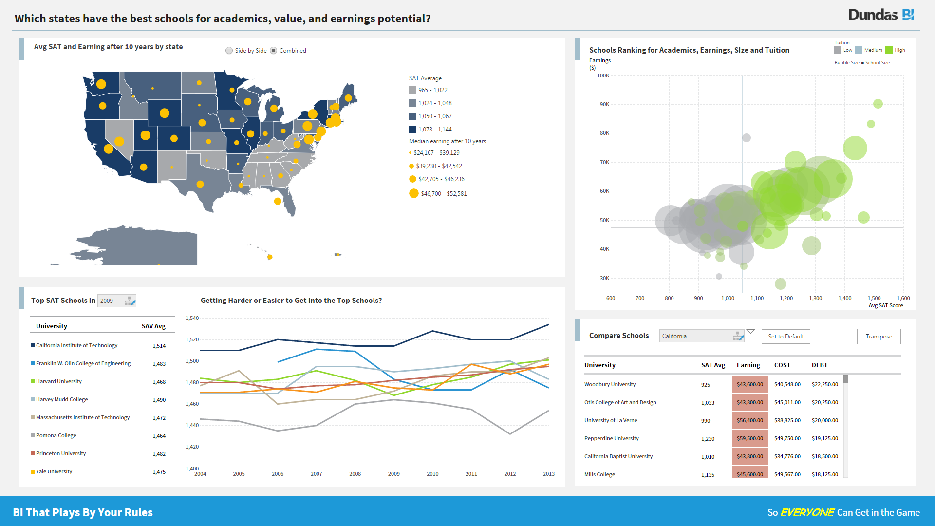
Business question: Which states have the best schools for academics, value, and earnings potential?
Start with one dashboard from a consumer view.
- Two geographic maps by state (highest SAT averages, highest earnings). Trend over time for average SAT scores or for declining enrollment numbers. This should rank the top SAT scores, or biggest percentage decline in enrollment.
- Cross tab comparing several schools for scores, cost, earnings, debt. Have fun with this – you can pick University of Texas as we are there versus A&M – big rivalry and Rice (Cindi grad school) or pick the schools you wish you had gone to, or rivals in March Madness.
Demonstrate:
- Resorting of data in cross tab
- Filter on page within one element filtering by state or county within the crosstab
- Filtering of data across the elements (select state in map, for example) to drive other elements on page
- Filter of data values with sliders
- Drill down to detail, from state to individual school.
3. Self-Service Data Preparation (3 mins/15)
- Start with basic flat file of using MERGED2013 as it is smaller and show how someone creates an initial visualization with filters. (note, I need to see if loading too slowly in tools else I will create a small extract from one of these). This is the smallest file.
- Show smarts in data profiling and automatic join detection with Crosswalk file CW2009. IPEDSMatch = MERGE2009.UNITID (You will have to get rid of some stacked headers in the CW2009file first).
- Show how data can be cleansed and transformed. Convert md_earn_wne_p6 from text to number, dimension to measure. Replace State TX to Texas. – AK-500 and AK501 to form Alaska either by script or point and click. You may choose own state.
- You may show data blending with external data file of your choice.
4. Dashboard Design & Story Telling (3 minutes each/15)
- Show basic building of a dashboard with two visualizations and one filter that works across the visualizations. Here, you are showing how you build the dashboard in step 2. Show how snapshots and content can be woven in into an analysis of findings.
5. Share the Information (2 minutes /10) (Time permitting)
- Assume the Governor of the state asks for a scheduled report on debt amounts and default rates for all schools in the state. The Governor does not have direct access to the Bi tool. Show dashboard scheduling on daily basis or event basis (defaults above N%). What are the output options (native, Excel, PDF)? For vendors who do not have this functionality, can mention partners and/or roadmap item.
6. Governance (3 minutes, 15)
- Once the data is modeled, show how the model can be shared and promoted to governed data model. Also show how security can be set by row level by person and state. For example, Cindi can only see details for New Jersey.
7. Differentiator or Cool Innovation (3 minutes / 15)
- Choose an innovation or differentiator that sets your product apart from others. This could be mobile, predictive, natural language query or generation – your choice.