
Every year, hundreds of thousands of data fanatics, from various industries and walks of life, tap into the raw power of Dundas BI to deliver magnificent dashboards, reports and data analytics that fundamentally transform the way they do business.
Much of the creativity and mastery of analytics these users display can be rightly attributed to their own expertise and virtuosity that comes from years of practice, but every so often, they get a jolt of inspiration from our kick-ass content – or so I tell myself…
Our content tends to have that effect on people. Whether you’ve just begun to dip your toes in the (data) pools of business intelligence, or are a celebrated wunderkind, we’ve got the knowledge, insights, and revelatory resources you need to master data analytics and invigorate your performance.
So, with 2020 squarely in the rearview mirror, what better time to rewind and examine the best business intelligence and data analytics content of the last 12 months? From blogs and case studies, to videos and dashboards, I invite you to bury your nose in our not-so-modest, curated list of content that’ll empower you to visualize and analyze data like never before.
The following list is by no means exhaustive, but it is indicative of the content our readers found most valuable in helping them better their knowledge of Dundas BI – and analytics in general – and develop their skills. For anyone interested in interactive data visualizations, APIs and data analysis, or the wonderful world of business intelligence, please enjoy the following content as we get all misty-eyed reflecting on the great work our colleagues and peers made happen.
Feel free to jump to whichever section you’re most interested in – or pour yourself a tea, kick your feet up, and spend some quiet, quality time totally engrossed in our stories
Blogs
1) Sales managers care deeply about exploring data and performing analyses that illuminate trends in their Sales numbers and dictate their decision-making. They want insights that help them identify activities to correct and improve corporate results but are unsure about where to look for them and what their next steps should be. That’s why we built a Sales Management Dashboard and followed it up with a highly detailed blog on how it can be used to drive revenue and maximize performance.
2) The year 2020 saw more workers working remotely than ever before. And if the small nook in my room I call an office is any indication, not many of us were prepared for these changes. The segue I’m getting at, is that many businesses in turn, were equally as unprepared and poorly-equipped to rapidly respond to changes. As this year dragged on, it became abundantly clear that successful businesses were those that were certain of what was happening. Rather than leave their actions to chance, businesses who rose to the top were the ones who attacked the storm head-on and helped their remote workers thrive with business intelligence.

3) Data analytics buyers are all-too-often unpleasantly surprised at how much higher the cost of ownership is immediately after purchasing licenses. And that’s simply not cool. In an effort to remedy that shock, we took a stab at educating our readers on how they can more accurately calculate the total cost of ownership of business intelligence and data analytics. In this blog, we cover three of the most important factors in helping people determine the total cost of ownership and put an end to blind decision-making based on sticker price.
4) Crystal balls are, unfortunately, largely unreliable, making it quite difficult for businesses to make informed decisions in times of great uncertainty, when situations are changing on a daily, even hourly basis. And it’s during times such as these, that rationale tends to take a backseat to gut feelings and hunches. So, how can businesses make better decisions amid uncertainty and fear, and rapidly react and adjust to changes in real-time? By using facts and data as the driving force behind decision-making. Analytics can be that single source of truth businesses need for crisis management.
Success Stories
1) Evergreen Health – operators of a comprehensive healthcare delivery system that provides multiple services – wanted the freedom to work with their data how they wanted to, when they wanted to. They weren’t willing to compromise when it came to their analytics and refused the restrictions other business intelligence platforms imposed upon them. By choosing Dundas BI, Evergreen stepped free from the constraints of Excel and realized their dream of becoming a data-driven organization. No spoilers in this summary, but the results of this partnership have been staggering.
2) After automating nearly every process within the harbor, Curaçao Ports Authority (CPA) – the coordinating force behind port operations in Curaçao – was in a position to leverage the massive volumes of data it had suddenly found itself in possession of. Dundas BI was the catalyst for taking and adding clarity to that data, and empowering CPA to embrace a data-driven culture – that’s clearly the theme of these stories! As a result, CPA has been able to aggregate and analyze enterprise-level data, slash its reporting cycles from monthly to real-time, and empower its employees to perform their jobs with higher levels of precision.
Despite the travel and tourism industry being heavily impacted by COVID19, Curaçao Ports Authority recognized the opportunity in front of them and relied on business intelligence to drive their business forward.

Videos
1) Are you struggling to justify the implementation and software costs of proceeding with a business intelligence solution? Is your apprehension amplified during times of uncertainty – such as everything that’s occurred in the year 2020? You’re not alone. Businesses such as yours often raise the question of how BI activities can lead to a return on investment (ROI), and in this video, we use a dashboard we’ve built to calculate the costs and savings of a realistic business intelligence scenario.
2) Your Dundas BI dashboard is built using a variety of controls – charts, tables, buttons, labels, etc. Each of these controls has properties that can be modified to style your visualizations in any manner imaginable. As Dundas BI is an incredibly flexible and customizable platform, it’s highly possible your dashboards contain several controls, each with an assortment of properties. Rather than style every element on every dashboard you’re able to save an immense amount of time by leveraging styles and themes. Save individual elements as styles, and save collections of styles as themes for faster, better designing.
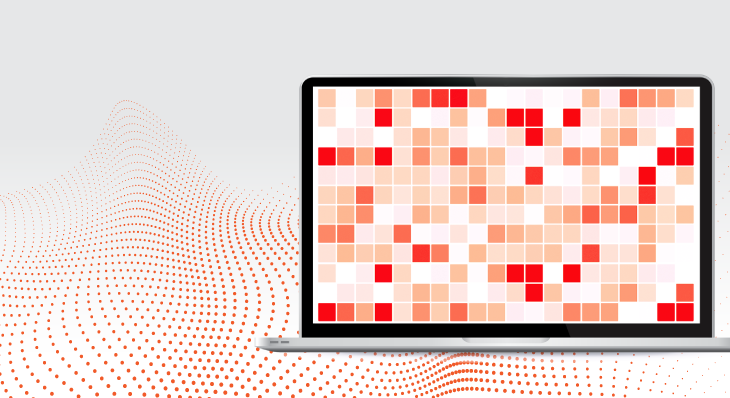
3) The map control/data visualization is synonymous with Dundas BI. In fact, it’s so extensive, it could very well be a product unto itself. But, despite the multi-faceted role it plays, we weren’t satisfied, and wanted to squeeze every last bit of value from it. Which is why we’ve introduced the heat map chart; a new type of map visualization that allows for quick storytelling and pattern recognition! This unique visualization can help illuminate trends in your data that you never even knew existed.
4) Did you know that allowing non-technical users the create their own dashboards is commonly accepted as one of the leading causes of high failure rate for business intelligence projects? This is because of the misconception that all users need self-service, and complete creation capabilities. In fact, what there needs to be, is a balance between self-service and the creation of a usable system for users. This is where the slicer comparison – touted as the coolest self-service tool you’ve never heard of – comes in. It’s an amazing feature for measuring values against different filter values and is perfect for users who think they want self-service capabilities.
Dashboards
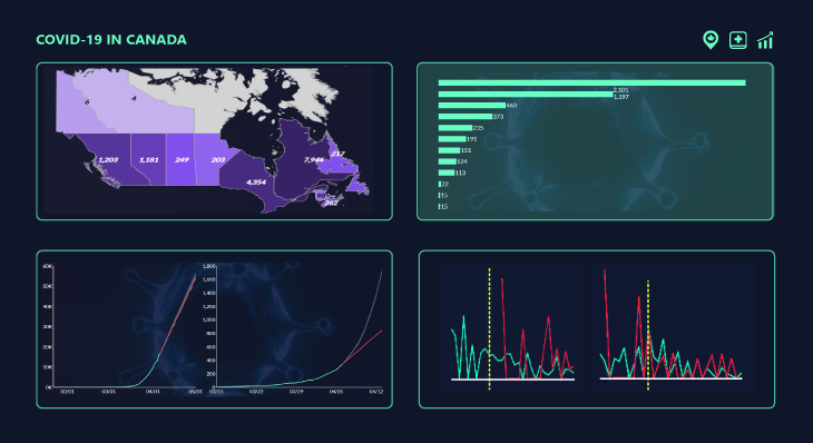
We know you’re probably tired of hearing us reference COVID19, but the fact of the matter is, much of our content during the first half of the year was largely driven by the very serious and very real implications of the virus. We wholly believed – and still do – that interactive dashboards and data analytics can help businesses fuel real-time critical decision-making. This is why we developed four dashboards in Dundas BI to keep everyone abreast of the situation and highlight the impact dashboards can have on all types of businesses. When information is displayed, utilized, and made easier to consume, everyone benefits.
1) Current status of COVID19 in Canada dashboard – Stay up-to-date on the status of COVID19 in Canada with this real-time dashboard. Explore critical cases and resources by geography and perform social distancing what-if analysis.
2) Impact of COVID19 on Canadian business and employment dashboard – Explore the impact of COVID19 on employment rates, participation rates, and wages across Canada, to better understand how businesses and individuals have been affected.
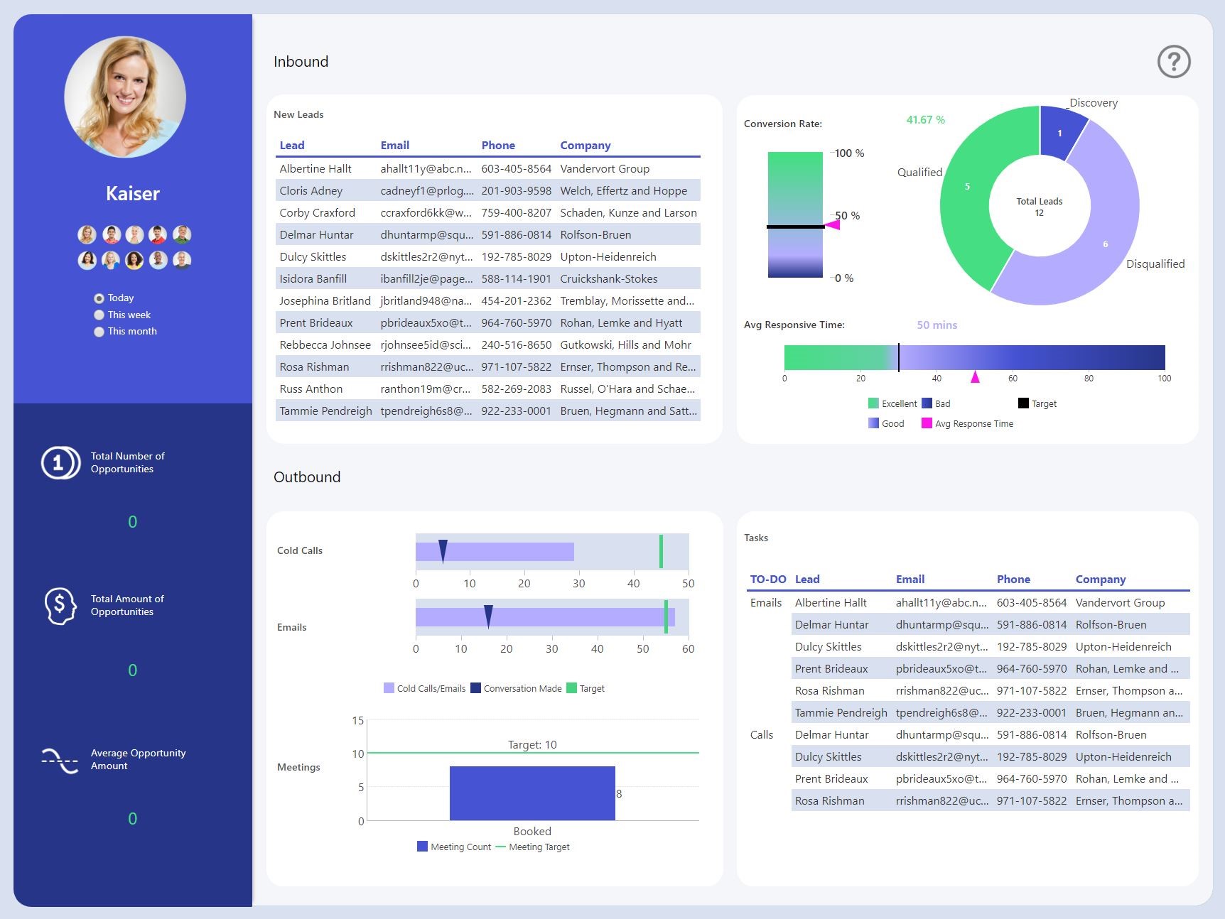
3) Sales management and revenue dashboard – Diagnose performance issues based on activities that lead to opportunity creation and identify the leads and activities that will lead to future revenue.
4) Individual sales performance dashboard – Understand where individual sales reps sit in relation to overall and personal objectives and empower them to change processes in real-time to impact their efficiencies.
Infographics
1) We really stressed the importance of business intelligence this year, especially when faced with one seemingly insurmountable challenge after another. And we’ve done so, because we’ve seen time and time again that the businesses who invest in BI and data analytics are the ones who are most adaptable and competitive. Business intelligence keeps everyone – and everything – connected in your business. Enterprises are swimming in oceans of data and the smart ones know how to make use of BI to understand and analyze their data, deliver exceptional reporting and data analytics experience, make critical business decisions and gain that elusive, competitive edge. The future of business is business intelligence, and this infographic proves that point.
Awards & Comparison Reports
We have the literal best customers in the world. They rely on us to be the spark that fuels their success, so it’s only right we return the favor by committing to deliver the highest-quality software and incomparable service. It’s the absolute least we can do – and we are beyond happy to do so! We’ve long had a reputation for delivering unmatched, personalized analytics experiences, and the recognition we’ve received reflects that. But 2020 was something else, and we just needed to share with you the awards both analysts and real users bestowed upon us. We’re utterly humbled by these accolades.
1) The BI and analytics community has spoken, and they love Dundas BI. So much, in fact, that our software was awarded 13 top rankings and 80 leading positions in the BARC BI & Analytics Survey 21, the world’s largest survey of BI software users.
2) Software buyers don’t care about what a vendor has to say about themselves these days. Who and what they want to hear from, are current, real users of the software and their experiences, both with the software and the vendor. SoftwareReviews compiles in-depth business intelligence reports that evaluate, and rank vendors based on feedback from real users of the software.
3) At Dundas, support is more than a buzzword, it’s a guiding sentiment. It’s what we provide our customers at every stage of their journey to make sure they achieve their goals. Our mission is to be the preeminent provider of support in the BI and data analytics industry, so, we dug into our review data on G2 to see how well we were supporting our customers. What they had to say was uplifting and validated every decision we’ve made in regard to customer enablement up until this point.
4) This year, SelectHub analysts spent over 2000 hours evaluating over 300 business intelligence tools, in order to ensure they understood each software’s capabilities, strengths, and limitations. From this, they recognized which software leads the pack and delivers the features and capabilities companies actually need. In a crowded BI and data analytics market, we are ecstatic to be awarded with 5 SelectHub Software Awards.
—
That’s a wrap on 2020 folks! We’ll be back at it with even more content in the new year to help you perform your job more effectively and elevate your data analytics game to unseen heights. We’re continuously inspired by our community and look to it often for inspiration on what to produce, so if you have any recommendations on what you’d like more of, feel free to give us a shout.